


css3的@media属性
@media mediatype and|not|only(media feature){
//…
}
举个栗子:
@media screen and (max-width:480px){
h1{color:red;}
}
当屏幕宽度小于480px的时候生效
换成sass写法
这里我们要借助@mixin
首先我们要定义不同的屏幕尺寸(使用变量)
xs:′screenand(max−width:480px)′;//手机屏幕
sm:’screen and (max-width:750px)’; //pad屏幕
md:′screenand(max−width:970px)′;//中等屏幕
lg:’screen and (max-width:1170px)’; //大屏幕
1.在vars.scss文件中定义好变量:
$blue-font:#1b85ff;

$gray-border:solid 1px gray;

/*字体大小和文字颜色*/
$title-font-size:48px;
$title-font-color:#666;

$xs:'screen and (max-width:480px)';    //手机屏幕
$sm:'screen and (max-width:750px)';    //pad屏幕
$md:'screen and (max-width:970px)';    //中等屏幕
$lg:'screen and (max-width:1170px)'; //大屏幕
2.写@mixin
我们项目中是单独的mixin.scss文件:
@mixin media-xs(){
  $title-font-color:red;
  $title-font-size:36px;  //重新设置了变量的值,这个值修改不能写到@media里面
  @media #{$xs} {
    h1:first-child{ //大标题
      color: $title-font-color;
      font-size: $title-font-size;
    };
  }
}
3.index.css中使用
@include media-xs;4.最后用gulp编译的文件index.css:
@charset "UTF-8";
* {
margin: 0;
padding: 0;
font-size: 14px; }
/*字体大小和文字颜色*/
.container div {
text-align: center; }
.container div h1 {
font-size: 24px;
color: #999999; }
.container div h1:first-child {
color: #666;
font-size: 48px; }
@media screen and (max-width: 480px) {
.container div h1:first-child {
color: red;
font-size: 36px; } }
.container .searchdiv input {
height: 40px;
width: 60%;
border: solid 1px gray; }
.container .searchdiv button {
height: 40px;
width: 60px;
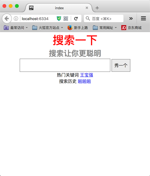
border: solid 1px gray; }预览效果:
屏幕宽度小于 480px,大标题字体为36,颜色为红色


 5322
5322


 被折叠的 条评论
为什么被折叠?
被折叠的 条评论
为什么被折叠?
 到【灌水乐园】发言


