


 本文介绍如何在Qt Quick中自定义ComboBox的样式,包括使用QML进行扁平化设计,调整颜色、边框、圆角等属性,以及使用图片替代形状绘制图标。提供了两种版本的自定义ComboBox实现代码。
测试版本:Qt5.15.2,参考Qt源码及文档示例
代码链接:https://github.com/gongjianbo/QmlComponentStyle.git
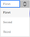
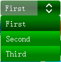
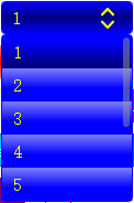
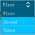
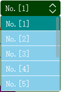
自定义样式与默认样式的对比,第一个为默认样式:
扁平样式的实现代码:
import QtQuick 2.15
import QtQuick.Templates 2.15 as T
import QtQuick.Controls 2.15
import QtQuick.Controls.impl 2.15

// Qt5下拉框样式自定义
// 龚建波 2025-03-10
// 参考:qt-everywhere-src-5.15.2\qtquickcontrols2\src\imports\controls\ComboBox.qml
T.ComboBox {
    id: control

    // 可以像源码一样,定义一个全局的样式,然后取全局样式中对应的颜色
    // 定义主题颜色
    property color themeColor: "darkCyan"
    // 定义文本颜色
    property color textColor: "white"
    // 定义背景颜色
    // down按下或下拉状态,hovered悬停状态
    property color backgroundColor: control.down
                                    ? Qt.darker(themeColor)
                                    : control.hovered
                                      ? Qt.lighter(themeColor)
                                      : themeColor
    // 定义边框宽度
    property int borderWidth: 1
    // 定义边框颜色
    property color borderColor: Qt.darker(themeColor)
    // 定义边框圆角
    property int radius: 0
    // 定义每个item的高度
    property int itemHeight: height
    // 定义文本的左右padding
    property int itemPadding: 10
    // 定义下拉选项高亮颜色
    property color itemHighlightColor: Qt.darker(themeColor)
    // 定义下拉选项默认颜色
    property color itemNormalColor: themeColor
    // 定义下拉图标宽度,小于0就用图标宽度
    property int indicatorWidth: -1
    // 定义下拉按钮左右边距,不然rightPadding和indicator宽度循环引用计算
    property int indicatorPadding: 3
    // 定义下拉按钮图标
    property url indicatorSource: "qrc:/qt-project.org/imports/QtQuick/Controls.2/images/double-arrow.png"
    // 定义下拉图标颜色
    property color indicatorColor: textColor
    // 定义下拉列表展示选项个数,多余的需要滚动
    property int showCount: 5
    // 定义文本显示的回调
    // 如文字左右加[],{ return String('[%1]').arg(value); }
    // 如根据编码显示对应文字,{ return switch(value) { case:... }; }
    // 不能用在编辑的场景
    property var showFunc: function(value){
        return value;
    }

    // 默认宽度,参考Qt源码的写法,实际应用可以删减
    // Math.max表示取两者中最大值,1为默认背景宽度+左右偏移值,2为默认内容宽度+左右边距
    // inset和padding都是Control基类定义的,默认为0
    // implicitWidth: Math.max(implicitBackgroundWidth + leftInset + rightInset,
    //                         implicitContentWidth + leftPadding + rightPadding)
    // 默认高度
    // implicitHeight: Math.max(implicitBackgroundHeight + topInset + bottomInset,
    //                          implicitContentHeight + topPadding + bottomPadding)
    // 默认固定宽高
    implicitWidth: 120
    implicitHeight: 30
    // 边距
    padding: 0
    // 左右边距可以直接用horizontalPadding,因为遇到过相关bug就单独设置下
    leftPadding: 0
    // 右边距需要把按钮位置留出来
    rightPadding: indicator.width
    // 图标和文字间距,用indicatorPadding计算,这里为0
    spacing: 0
    // 字体设置
    // 也可以给QApplication设置全局的默认字体
    font{
        family: "SimSun"
        pixelSize: 16
    }
    // 是否检测hover鼠标悬停,默认会跟随父组件的设置
    hoverEnabled: true

    // Control组件点击之后,后续按空格也会触发点击,可以把空格过滤掉
    Keys.onPressed: event.accepted = (event.key === Qt.Key_Space)
    Keys.onReleased: event.accepted = (event.key === Qt.Key_Space)
    // 切换选项时currentIndexChanged先触发,编辑时editTextChanged先触发
    // 当前项在model的序号currentIndex
    // onCurrentIndexChanged: console.log("index", currentIndex)
    // 当前项文本currentText
    // onCurrentTextChanged: console.log("text", currentText)
    // 当前项显示文本,只在不可编辑时修饰contentItem文本的显示
    // 而我们自定义的showFunc是contentItem和delegate的文本都会修饰
    // displayText: "Display:" + currentText
    // onDisplayTextChanged: console.log("display", displayText)
    // 当前编辑的文本editText,如果对应不到model中的值则currentIndex=-1,其他值为空
    // onEditTextChanged: console.log("edit", editText)
    // 当前项内容currentValue
    // onCurrentValueChanged: console.log("value", currentValue)
    // 从model的哪个role获取值显示
    // valueRole: "displayRole"
    // 数据源model
    // 元素个数count
    // 组件在视觉上是否处于按下状态,而pressed只读属性是物理意义上的按下
    // down: false
    // 编辑框是否可以鼠标拖选文本,此处编辑框自定义没绑定这个属性直接设置的true
    // selectTextByMouse: true
    // 对输入内容限制,如字符隐藏/只允许输入数字等
    // 区别于echoMode,如密码非明文显示 echoMode: TextInput.Password
    // inputMethodHints: Qt.ImhNoPredictiveText
    // 输入的正则限制
    // validator: IntValidator{ bottom: 0; top: 100; }

    // 列表中enter或return选中触发
    // onAccepted: console.log("accepted")
    // 用户选择某项后触发
    // onActivated: console.log("activated", index)
    // 高亮项变化时触发,如鼠标hover移动
    // onHighlighted: console.log("highlighted", index)

    // 递减currentIndex
    // void decrementCurrentIndex()
    // 递增currentIndex
    // void incrementCurrentIndex()
    // 选中编辑框中文本
    // void selectAll()
    // 根据index获取文本,未匹配返回空
    // string textAt(int index)
    // 根据值查找index,未匹配返回-1
    // int indexOfValue(object value)
    // 根据文本查找index,未匹配返回-1
    // 枚举可以指定文本匹配规则,如区分大小写/正则等
    // int find(string text, enumeration flags)

    // 下拉选项样式
    // 源码用的ItemDelegate继承自AbstractButton,多了一个highlighted属性
    // 且background设置了默认宽高
    delegate: T.ItemDelegate {
        // 选项宽高
        width: ListView.view.width
        height: control.itemHeight
        // 选项边距
        padding: control.padding
        leftPadding: control.itemPadding
        rightPadding: control.itemPadding
        // 每个选项可以设置icon,一般用不到,暂略
        // icon.color: control.textColor
        contentItem: Text {
            // 选项文字内容
            text: control.showFunc(control.textRole
                                   ? (Array.isArray(control.model)
                                      ? modelData[control.textRole]
                                      : model[control.textRole])
                                   : modelData)
            // 字体设置
            font: control.font
            // 颜色设置
            color: control.textColor
            // 文字对齐方式
            horizontalAlignment: Text.AlignLeft
            verticalAlignment: Text.AlignVCenter
            // 单独设置文本组件的渲染方式
            renderType: Text.NativeRendering
            // 文字超出按钮范围显示省略号
            elide: Text.ElideRight
        }
        // 是否检测hover鼠标悬停
        hoverEnabled: control.hoverEnabled
        // 选项背景
        background: Rectangle {
            // radius: control.radius
            // 选项背景色
            color: (control.highlightedIndex === index)
                   ? control.itemHighlightColor
                   : control.itemNormalColor
            // 底部一条分隔线
            Rectangle {
                height: 1
                width: parent.width
                anchors.bottom: parent.bottom
                color: Qt.lighter(itemNormalColor)
            }
        }
    }

    // 下拉按钮图标
    indicator: Item {
        id: box_indicator
        // 下拉图标定位
        x: control.width - width
        y: control.topPadding + (control.availableHeight - height) / 2
        // 下拉按钮区域占的尺寸
        width: (indicatorWidth < 0 ? box_indicator_img.width : indicatorWidth) + control.indicatorPadding * 2
        height: control.height
        // 下拉按钮图标
        ColorImage {
            id: box_indicator_img
            anchors.centerIn: parent
            // 图标颜色
            color: control.indicatorColor
            // 图标url
            source: control.indicatorSource
        }
    }

    // 当前展示内容项,可以单独封装然后组合在这里
    // 如果不需要支持编辑,用Text或者Label也行
    contentItem: T.TextField {
        id: content_edit
        // 左右边距
        leftPadding: control.itemPadding
        rightPadding: control.itemPadding
        // 文字内容
        text: control.editable
              ? control.editText
              : control.showFunc(control.displayText)
        // 字体设置
        font: control.font
        // 文字颜色
        color: control.textColor
        // 默认鼠标选取文本设置为false
        selectByMouse: true
        // 选中文本的颜色
        selectedTextColor: "white"
        // 选中文本背景色
        selectionColor: "black"
        // 超出区域后截断不显示
        clip: true
        // 单独设置文本组件的渲染方式
        renderType: Text.NativeRendering
        // 文字对齐方式
        horizontalAlignment: Text.AlignLeft
        verticalAlignment: Text.AlignVCenter
        // 设置为可编辑时,才允许编辑
        enabled: control.editable
        // 设置为可编辑时,填充的文本自动滚动到末尾
        autoScroll: control.editable
        // 下拉时只读
        readOnly: control.down
        // 对输入内容限制,如字符隐藏/只允许输入数字等
        // 区别于echoMode,如密码非明文显示 echoMode: TextInput.Password
        inputMethodHints: control.inputMethodHints
        // 输入的正则限制
        validator: control.validator
        // 编辑框背景
        background: Item {
            // 可编辑时才显示
            visible: control.enabled && control.editable
            // 文字和下拉按钮之间的分割线
            Rectangle {
                // 编辑框有焦点才显示
                visible: content_edit.activeFocus
                anchors.left: parent.right
                // 分割线宽高
                height: parent.height
                width: control.borderWidth
                // 分割线颜色
                color: control.borderColor
            }
        }
    }

    // 背景
    background: Rectangle {
        // control设置了背景无关的宽高,这里也可以不设置默认宽高
        implicitWidth: control.implicitWidth
        implicitHeight: control.implicitHeight
        // 背景圆角
        radius: control.radius
        // 背景颜色
        color: control.backgroundColor
        // 背景边框
        border.width: control.borderWidth
        border.color: control.borderColor
    }

    // 弹出框
    popup: T.Popup {
        // 默认向下弹出,如果距离不够,y会自动调整(Popup的特性,会被限制在Window内)
        y: control.height
        width: control.width
        // 根据定义的showCount来设置最多显示item个数
        implicitHeight: control.delegateModel
                        ? (control.delegateModel.count < showCount
                           ? contentItem.implicitHeight
                           : control.showCount * control.itemHeight) + control.borderWidth * 2
                        : 0
        // 留给边框的位置
        padding: control.borderWidth
        contentItem: ListView {
            implicitHeight: contentHeight
            // 超出区域后截断不显示
            clip: true
            // 列表内容
            model: control.popup.visible ? control.delegateModel : null
            // 选中项同步
            currentIndex: control.highlightedIndex
            // 滚动效果
            // - NoSnap 默认任意位置停止NoSnap
            // - SnapToItem 滑动结束时顶部对齐(不会只漏半截),滑到末尾才是底部对齐
            // - SnapOneItem 滑动结束时最多移动一项
            // SnapToItem可能会导致原地来回跳无法滚动,SnapOneItem不适合做滚动
            // snapMode: ListView.NoSnap
            // 高亮移动动画时间,源码设置为0
            highlightMoveDuration: 0
            // ScrollBar.horizontal: ScrollBar { visible: false }
            // 竖向滚动条,可以单独封装然后组合在这里
            ScrollBar.vertical: ScrollBar {
                id: box_bar
                // 滚动条宽度
                implicitWidth: 10
                visible: (control.delegateModel && control.delegateModel.count > showCount)
                // 滚动条整体背景
                // background: Rectangle { }
                // 拖动的滑动条样式
                contentItem: Rectangle {
                    implicitWidth: 10
                    radius: width / 2
                    color: box_bar.pressed
                           ? Qt.rgba(0.6, 0.6, 0.6)
                           : Qt.rgba(0.6, 0.6, 0.6, 0.5)
                }
            }
        }

        // 弹出框背景(只有popup.padding显示出来了,其余部分被delegate背景遮挡)
        background: Rectangle {
            border.width: control.borderWidth
            border.color: control.borderColor
            // color: Qt.lighter(themeColor)
            radius: control.radius
        }
    }
}
//main.qml
        Row {
            id: combobox_row
            spacing: 10
            Text {
                width: 90
                height: 30
                renderType: Text.NativeRendering
                text: "ComboBox:"
            }
            ComboBox {
                editable: true
                width: 120
                height: 30
                model: ["First", "Second", "Third"]
            }
            BasicComboBox {
                width: 80
                editable: true
                model: ["First", "Second", "Third"]
                indicatorWidth: 20
            }
            BasicComboBox {
                editable: true
                model: ["First", "Second", "Third"]
                textColor: "white"
                themeColor: "deepskyblue"
                // onEditTextChanged: { console.log(editText); }
            }
            BasicComboBox {
                model: ["1", "2", "3", "4", "5", "6", "7", "8", "9"]
                textColor: "white"
                radius: 4
                indicatorSource: "qrc:/updown.png"
                themeColor: "green"
                itemNormalColor: "skyblue"
                itemHighlightColor: "darkCyan"
                showFunc: function(value) {
                    return String('No.[%1]').arg(value);
                }
            }
            BasicComboBox {
                width: 80
                model: ["1", "2", "3", "4", "5", "6", "7", "8", "9"]
                textColor: "white"
                radius: 4
                indicatorSource: "qrc:/updown.png"
                themeColor: "green"
                itemNormalColor: "skyblue"
                itemHighlightColor: "darkCyan"
                showFunc: function(value) {
                    // 65是大写A
                    return String.fromCharCode(Number(value) + 64);
                }
            }
            BasicComboBox {
                width: 80
                // 测试空model
            }
        }


 扫一扫
扫一扫


 2490
2490

 被折叠的 条评论
为什么被折叠?
被折叠的 条评论
为什么被折叠?
 到【灌水乐园】发言


