


<!DOCTYPE html>
<html lang="en">
<head>
    <meta charset="UTF-8">
    <title>Title</title>
    <style>
        * {
            padding: 0;
            margin: 0;
        }


        .yin-yang1 {
            width: 200px;
            height: 200px;
            background: black;
            border-radius: 50%;
            border: 1px solid black;
            position: relative;
            animation: spin 1s linear infinite; /*动画设置*/
        }
        @keyframes spin {
            0%{
                transform: rotate(0deg);
            }
            100%{
                transform: rotate(360deg);
            }
        }

        .yin-yang2 {
            width: 200px;
            height: 100px;
            background: white;
            border-radius: 100px 100px 0 0;
            position: absolute;
            z-index: 5;
        }

        .yin-yang3 {
            width: 100px;
            height: 100px;
            background: white;
            position: absolute;
            z-index: 6;
            top:50px;
            border-radius: 50%;
        }
        .yin-yang4{
            width: 100px;
            height: 100px;
            background: black;
            position: absolute;
            top:50px;
            left:100px;
            z-index: 7;
            border-radius: 50%;
        }
        .yin-yang5{
            width: 30px;
            height: 30px;
            background: black;
            position: absolute;
            top:85px;
            left:35px;
            z-index: 8;
            border-radius: 50%;
        }
        .yin-yang6{
            width: 30px;
            height:30px;
            background: white;
            position: absolute;
            top:85px;
            left:135px;
            z-index: 9;
            border-radius: 50%;
        }
    </style>
</head>
<body>

<div class="yin-yang1">
    <div class="yin-yang2"></div>
    <div class="yin-yang3"></div>
    <div class="yin-yang4"></div>
    <div class="yin-yang5"></div>
    <div class="yin-yang6"></div>
</div>
</body>
</html>
如图
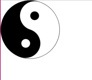
加上一个 旋转动画,


 扫一扫
扫一扫
 1698
1698

 被折叠的 条评论
为什么被折叠?
被折叠的 条评论
为什么被折叠?
 到【灌水乐园】发言


