


小学生必须来40张基础matplotlib图标
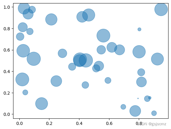
1气泡图
import matplotlib.pyplot as plt
import numpy as np

# create data
x = np.random.rand(40)
y = np.random.rand(40)
z = np.random.rand(40)

# use the scatter function
plt.scatter(x, y, s=z*1000, alpha=0.5)

# show the graph
plt.show()
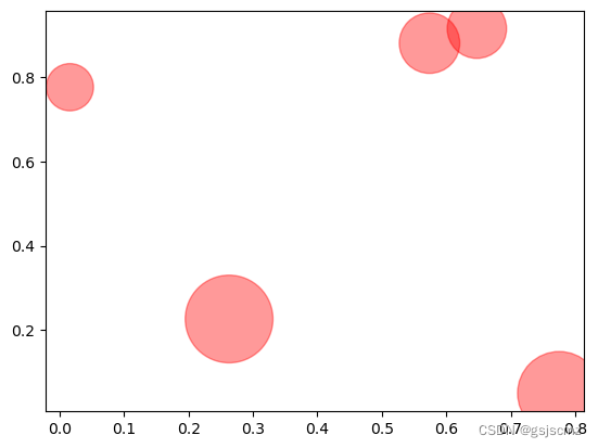
2自定义气泡图
import matplotlib.pyplot as plt
import numpy as np

# create data
x = np.random.rand(5)
y = np.random.rand(5)
z = np.random.rand(5)

# Change color with c and alpha
plt.scatter(x, y, s=z*4000, c="red", alpha=0.4)

# show the graph
plt.show()
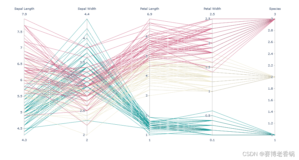
3平行-坐标-画图
import plotly.express as px

# Load the iris dataset provided by the library
df = px.data.iris()

# Create the chart:
fig = px.parallel_coordinates(
    df,
    color="species_id",
    labels={
   "species_id": "Species","sepal_width": "Sepal Width", "sepal_length": "Sepal Length", "petal_width": "Petal Width", "petal_length": "Petal Length", },
    color_continuous_scale=px.colors.diverging.Tealrose,
    color_continuous_midpoint=2)

# Hide the color scale that is useless in this case
fig.update_layout(coloraxis_showscale=False)

# Show the plot
fig.show()
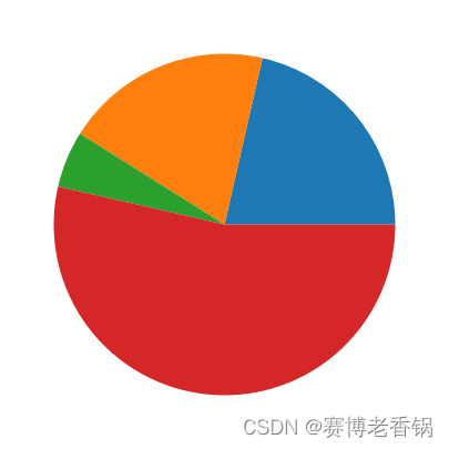
4饼图
import matplotlib.pyplot as plt
plt.rcParams["figure.figsize"] = (20,5)
# create random data
values=[12,11,3,30]

# Create a pieplot
plt.pie(values);
plt.show();
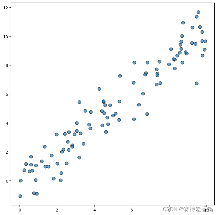
5散点图
import matplotlib.pyplot as plt
import numpy as np
rng = np.random.default_rng(1234)
x = rng.uniform(0, 10, size=100)
y = x + rng.normal(size=100)

fig, ax = plt.subplots(figsize = (9, 9))

ax.scatter(x, y, s=60, alpha=0.7, edgecolors="k")

# Fit linear regression via least squares with numpy.polyfit
# It returns an slope (b) and intercept (a)
# deg=1 means linear fit (i.e. polynomial of degree 1)
b, a = np.polyfit(x, y, deg=1)

# Create sequence of 100 numbers from 0 to 100
xseq = np.linspace(0, 10, num=100)
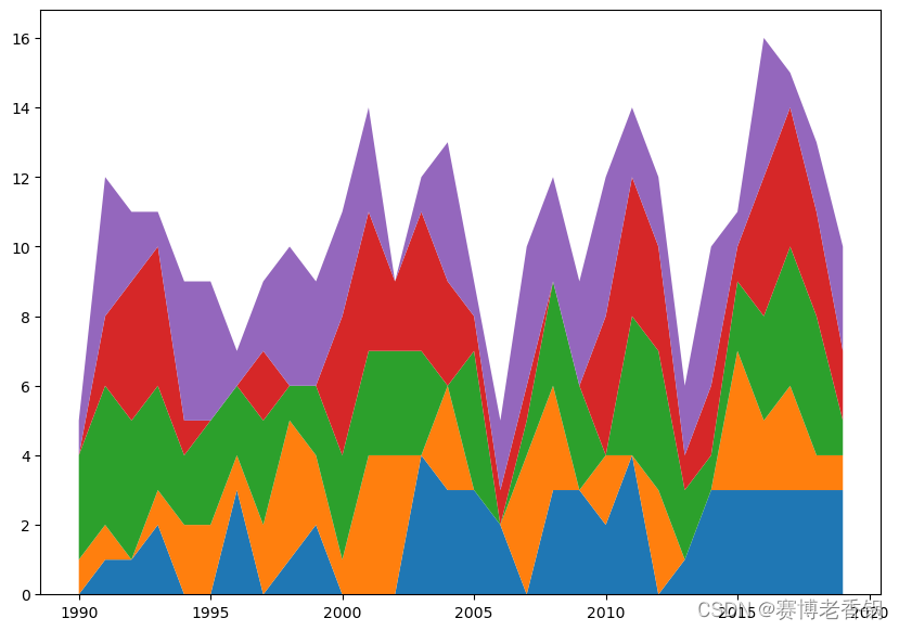
6基本堆积面积图
import matplotlib.pyplot as plt
import numpy as np
from scipy import stats

x = np.arange(1990, 2020) # (N,) array-like

y = [np.random.randint(0, 5, size=30) for _ in range(5)] # (M, N) array-like

fig, ax = plt.subplots(figsize=(10, 7))
ax.stackplot(x, y);
7平滑堆积面积图
grid = np.linspace(-3, 3, num=100)
plt.plot(grid, stats.norm.pdf(grid));

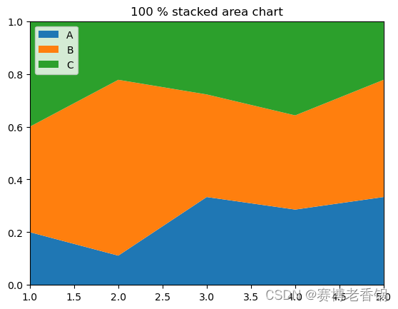
8百分比堆积面积图
import numpy as np
import matplotlib.pyplot as plt
import seaborn as sns
import pandas as pd

# Make data
data = pd.DataFrame({
     'group_A':[1,4,6,8,9], 'group_B':[2,24,7,10,12], 'group_C':[2,8,5,10,6], }, index=range(1,6))

# We need to transform the data from raw data to percentage (fraction)
data_perc = data.divide(data.sum(axis=1), axis=0)

# Make the plot
plt.stackplot(range(1,6),  data_perc["group_A"],  data_perc["group_B"],  data_perc["group_C"], labels=['A','B','C'])
plt.legend(loc='upper left')
plt.margins(0,0)
plt.title('100 % stacked area chart')
plt.show()
9基本面积图
import numpy as np
import matplotlib.pyplot as plt
x=range(1,6)
y=[1,4,6,8,4]

# Area plot
plt.fill_between(x, y)

# Show the graph
plt.show()

10改进面积图
import numpy as np
import matplotlib.pyplot as plt

# create data
x=range(1,15)
y=[1,4,6,8,4,5,3,2,4,1,5,6,8,7]

# Change the color and its transparency
plt.fill_between( x, y, color="skyblue", alpha=0.4)

# Show the graph
plt.show()

# Same, but add a stronger line on top (edge)
plt.fill_between( x, y, color="skyblue", alpha=0.2)
plt.plot(x, y, color="Slateblue", alpha=0.6)
# See the line plot function to learn how to customize the plt.plot function

# Show the graph
plt.show()


import numpy as np
import matplotlib.pyplot as plt

# create data
x=range(1,15)
y=[1,4,6,8,4,5,3,2,4,1,5,6,8,7]

# Change the style of plot
plt.style.use('seaborn-darkgrid')

# Make the same graph
plt.fill_between( x, y, color="skyblue", alpha=0.3)
plt.plot(x, y, color="skyblue")

# Add titles
plt.title("An area chart", loc="left")
plt.xlabel("Value of X")
plt.ylabel("Value of Y")

# Show the graph
plt.show()

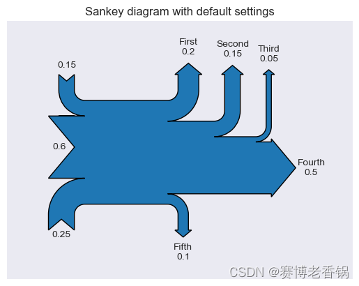
11带matplotlib的sankey图
import numpy as np
import matplotlib.pyplot as plt
from matplotlib.sankey import Sankey

# basic sankey chart
Sankey(flows=[0.25, 0.15, 0.60, -0.20, -0.15, -0.05, -0.50, -0.10], labels=['', '', '', 'First', 'Second', 'Third', 'Fourth', 'Fifth'], orientations=[-1, 1, 0, 1, 1, 1, 0,-1]).finish()
plt.title("Sankey diagram with default settings")
plt.show()
12关于matplotlib边距
import matplotlib.pyplot as plt
import numpy as np

# Let's consider a basic barplot.
# Data
bars = ('A','B','C','D','E')
height = [3, 12, 5, 18, 45]
y_pos = np.arange(len(bars))
# Plot
plt.bar(y_pos, height)

# If we have long labels, we cannot see it properly
names = ("very long group name 1","very long group name 2","very long group name 3","very long group name 4","very long group name 5")
plt.xticks(y_pos, names, rotation=90)

# Thus we have to give more margin:
plt.subplots_adjust(bottom=0.4)

# Show the graph
plt.show()

# It's the same concept if you need more space for your titles

# Plot
plt.bar(y_pos, height)
# Title
plt.title("This is\na very very\nloooooong\ntitle!")
# Set margin
plt.subplots_adjust(top=0.7)
# Show the graph
plt.show()


13垂直线和水平线
import matplotlib.pyplot as plt
import numpy as np
import pandas as pd

# Data
df=pd.DataFrame({
   'x_pos': range(1,101), 'y_pos': np.random.randn(100)*15+range(1,101) })

# Plot
plt.plot( 'x_pos', 'y_pos', data=df, linestyle='none', marker='o')

# Annotation
plt.axvline(40, color='r')
plt.axhline(40, color='green')

# Show the graph
plt.show()

14椭圆
import matplotlib.patches as patches
import matplotlib.pyplot as plt
import numpy as np
import pandas as pd

# Data
df=pd.DataFrame({
   'x_pos': range(1,101), 'y_pos': np.random.randn(100)*15+range(1,101) })

# Plot
fig1 = plt.figure()
ax1 = fig1.add_subplot(111)
ax1.plot( 'x_pos', 'y_pos', data=df, linestyle='none', marker='o')
ax1.add_patch(
patches.Ellipse(
(40, 35), # (x,y)
30, # width
100, # height
45, # radius
alpha=0.3, facecolor="green", edgecolor="black", linewidth=1, linestyle='solid'
)
)

# Show the graph
plt.show()

 最低0.47元/天 解锁文章


 635
635


 被折叠的 条评论
为什么被折叠?
被折叠的 条评论
为什么被折叠?
 到【灌水乐园】发言


