


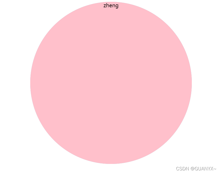
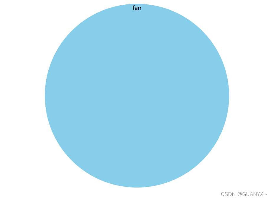
一、效果
鼠标滑过切换正反面
二、代码
<!DOCTYPE html>
<html>
	<head>
		<meta charset="utf-8">
		<title></title>
		<style type="text/css">
			.father {
				position: relative;
				width: 500px;
				height: 500px;
				margin: 10px auto;
			}
			.zheng,
			.fan {
				width: 500px;
				height: 500px;
				border-radius: 50%;
				transition: all 0.5s;
				position: absolute;
				top: 0;
				text-align: center;
			}
			.zheng {
				background-color: pink;
				z-index: 1;
				backface-visibility: hidden;
				/* 当元素不是正面对向屏幕就隐藏 */
			}
			.fan {
				background-color: skyblue;
			}
			.father:hover .zheng {
				background-color: #f9f;
				transform: rotateY(180deg);
			}

		</style>
	</head>
	<body>
		<div class="father">
			<div class="zheng">zheng</div>
			<div class="fan">fan</div>
		</div>
	</body>
</html>


 801
801


 被折叠的 条评论
为什么被折叠?
被折叠的 条评论
为什么被折叠?
 到【灌水乐园】发言


