


@keyframes规则
在介绍animation属性之前,先来认识一下@keyframes规则。
通过@keyframes规则可以创建动画,创建动画是逐步改变一个CSS样式到另一个CSS样式来实现的,CSS样式可以设置多个来实现动画过程,指定动画变化时用%,或者用关键字从"from"到"to",这是和"0%"开始到"100%"结束相同效果的。
为了获得浏览器的稳定支持,建议使用%来实现。
书写:@keyframes my_animation_name {0% {css_styles;} 50% {css_styles;} 100% {css_styles;}}
或者 @keyframes my_animation_name {from {css_styles;} to {css_styles;}}
举例一个总体效果:
<!DOCTYPE html>
<html lang="zh">
  <head>
    <meta charset="utf-8">
	<title>帧动画(animation)属性</title>
	<style>

	  @keyframes myanimation { /* 开始创建动画帧 */
	    % {
		  width: 100px;
		  background-color: red;
		}
		20% {
		  width: 160px;
		  background-color: blue;
		}
		40% {
		  width: 220px;
		  background-color: blue;
		}
		60% {
		  width: 280px;
		  background-color: yellow;
		}
		80% {
		  width: 340px;
		  background-color: yellow;
		}
		100% {
		  width: 400px;
		  background-color: orange;
		}
	  }

	  div {
	    width: 100px;
		height: 100px;
		background-color: red;

		/* 设置帧动画效果 */

		-webkit-animation-name: myanimation;
		-webkit-animation-duration: 5s;
		-webkit-animation-timing-function: linear;
		-webkit-animation-delay: .5s;
		-webkit-animation-iteration-count: infinite; /* 设置动画的播放次数 */
		/*-webkit-animation-direction: reverse; 动画是否反向播放 */
		-webkit-animation-state: runing; /* 指定动画是否正在播放或暂停 */

		animation-name: myanimation;
		animation-duration: 5s;
		animation-timing-function: linear;
		animation-delay: .5s;
		animation-iteration-count: infinite;
		/*animation-direction: reverse; 动画是否反向播放 */
		animation-state: runing;
	  }

	</style>
  </head>
  <body>

    <div><div>

  </body>
</html>
效果如下:
可以看出,所谓帧动画,就是通过创建帧改变CSS样式的实现的。
animation属性
animation属性设置动画的效果,它是一个复合属性。
书写:
animation: animation-name||animation-duration||animation-timing-function||animation-delay||animation-iteration-count||animation-direction||animation-state;
animation-name、animation-duration、animation-timing-function属性
这三个属性与过渡(transition)的三个属性是相似的。
-name,表示定义的帧动画名称,这里的name就是"my_animation_name"。
@keyframes my_animation_name {}-duratin,表示动画完成所需的时间。
-timing-function,表示动画的过渡类型。linear表示匀速;ease表示慢速开始,中间加速,慢速结束;ease-in表示慢速开始;ease-out表示慢速结束;ease-in-out表示慢速开始和结束;
animation-delay属性
animation-delay表示动画延迟多少时间后开始执行。
animation-iteration-count
animation-iteration-count表示动画执行的次数。
书写:animation-iteration-count: n||infinite; 有限的循环次数或者是无限循环。
animation-direction
animation-direction表示动画在循环中是否反向播放。
属性值:
- normal,正常播放
- reverse,反向播放。
- alternate,奇数次正常播放,偶数次反向播放。
- alternate-reverse,奇数次反向播放,偶数次正常播放。
正常播放:
animation-direction: normal;效果如下:
正常播放就是根据 设置的帧(如从0%到100%)的过程。
反向播放:
animation-direction: reverse;效果如下:

反向播放就是根据 设置的帧(如从0%到100%)的反向过程播放(从100%到0%)。
animation-play-state
animation-play-state指定动画是否运行或暂停。
属性值:
- running,动画运行
- paused,动画暂停
animation-fill-mode属性
animation-fill-mode属性规定当动画不播放(动画播放完成,或因有延迟而未播放)时,应用到元素的样式。
属性值:
- forwards
- backwards
- both,同时遵循以上两个
下面就以animation实现一个逐帧动画效果:
先以"from""to"关键字实现的动画为例。
<!DOCTYPE html>
<html lang="zh">
  <head>
    <meta charset="utf-8">
	<title>帧动画(animation)属性</title>
	<style>

	  @keyframes myanimation { /* 开始创建动画帧 */
	    from {
		  background-position: 0 0;
		}
		to {
		  background-position: -1540px 0;
		}
	  }


	  div {
	    width: 140px;
		height: 140px;
		border: 1px solid red;
		background-image: url('run.png');

		/* 设置帧动画效果 */
		 -webkit-animation-name: myanimation;
		 -webkit-animation-duration: 5s;
		 -webkit-animation-timing-function: linear
-webkit-animation-iteration-count: infinite;
}
</style>
</head>
<body>
<div><div>
</body>
</html>效果如下:
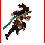
我们可以看出,动画是滑动的,并不是我们想要的效果,这是为什么呢?
原来animation是以ease为默认方式过渡的,它会在每个关键帧之间插入补间动画,所以是连贯的。
解决思路就是:
@keyframes myanimation {
    0%, 8%{  /*动作一*/  }
    9.2%, 17.2%{  /*动作二*/  }
    ...
}
step1:动作之间停留8帧,0%设置动作一,动作一结束在8%
step2:动作之间过渡1.2帧,9.2%设置动作二,动作二结束在17.2%
以下以"0%"到"100%"为例
<!DOCTYPE html>
<html lang="zh">
  <head>
    <meta charset="utf-8">
	<title>帧动画(animation)属性</title>
	<style>

	  @keyframes myanimation { /* 开始创建动画帧 */
	    0%, 8% {  background-position: 0 0;  }
        9.2%, 17.2% {  background-position: -140px 0;  }
        18.4%, 26.4% {  background-position: -280px 0 ;  }
        27.6%, 35.6% {  background-position: -420px 0 ;  }
        36.8%, 44.8% {  background-position: -560px 0 ;  }
        46%, 54% {  background-position: -700px 0 ;  }
        55.2%, 63.2% {  background-position: -840px 0 ;  }
        64.4%, 72.4% {  background-position: -980px 0 ;  }
        73.6%, 81.6% {  background-position: -1120px 0 ;  }
        82.8%, 90.8% {  background-position: -1400px 0 ;  }
        92%, 100% {  background-position: -1540px 0 ;  }
	  }


	  div {
	    width: 140px;
		height: 140px;
		border: 1px solid red;
		background-image: url('run.png');

		/* 设置帧动画效果 */
		 -webkit-animation-name: myanimation;
		 -webkit-animation-duration: 1s;
		 -webkit-animation-timing-function: linear;
		 -webkit-animation-iteration-count: infinite;
		 -webkit-animation-fill-mode: backwards;

	  }

	</style>
  </head>
  <body>

    <div><div>

  </body>
</html>
效果如下:
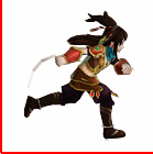
以上只是animation属性的一个简单应用,它还有其它更为强大的功能用处,以后再介绍。


 474
474


 被折叠的 条评论
为什么被折叠?
被折叠的 条评论
为什么被折叠?
 到【灌水乐园】发言


