


关于HTML与CSS的小作品之二:
本作品完整代码:点击查看本作品的完整代码
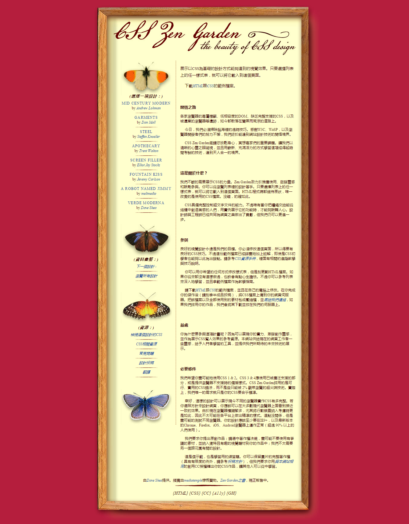
作品效果如下所示:
准备工作:
1、开发软件Notepad++
2、Photoshop(切图)
3、浏览器
首先,拿到此图后,观察发现,这个作品的主要内容是在屏幕中居中显示的,先用画图软件画一下如何进行布局,在心中有一个大概的了解:

接着可以用代码写出大概的框架:
<body>
  <div class="page-wrapper">
    <section class="intro">
      <header></header>
      <div class="summary"></div>
      <div class="preamble"></div>
    </section>

    <div class="supporting">
      <div class="expanation"></div>
      <div class="participaton"></div>
      <div class="benefits"></div>
      <div class="requirements"></div>
      <footer></footer>
    </div>

    <div class="sidebar">
      <div class="wrapper">
        <div class="design-section"></div>
        <div class="design-archives"></div>
        <div class="design-resources"></div>
      </div>
    </div>
  </div>
<body>
最后完善一下细节,如:
<!DOCTYPE html>
<html lang="zh-en">
  <head>
    <meta http-equiv="Content-Type" content="text/html; charset=UTF-8">
	<title>CSS Zen Garden: CSS設計之美</title>
	<link rel="stylesheet" media="screen" href="029/029.css">

	<meta name="author" content="Changjiu Huang">
	<meta name="description" content="展示CSS设计的美丽。">
	<meta name="robots" content="all">

	<!--[if lt IE 9]>
	<script src="script/html5shiv.js"></script>
	<![endif]-->
  </head>

<body>
<div class="page-wrapper">

	<section class="intro" id="zen-intro">
		<header role="banner">
			<h1>CSS Zen Garden</h1>
			<h2><abbr title="Cascading Style Sheets">CSS</abbr>設計之美</h2>
		</header>

		<div class="summary" id="zen-summary" role="article">
			<p></p>
			<p></p>
		</div>

		<div class="preamble" id="zen-preamble" role="article">
			<h3>開悟之路</h3>
			<p> </p>
			<p></p>
			<p></p>
		</div>
	</section>

	<div class="main supporting" id="zen-supporting" role="main">
		<div class="explanation" id="zen-explanation" role="article">
			<h3>這是關於什麼?</h3>
			<p></p>
			<p></p>
		</div>

		<div class="participation" id="zen-participation" role="article">
			<h3>參與</h3>
			<p> </p>
			<p></p>
			<p></p>
		</div>

		<div class="benefits" id="zen-benefits" role="article">
			<h3>益處</h3>
			<p></p>
		</div>

		<div class="requirements" id="zen-requirements" role="article">
			<h3>必要條件</h3>
			<p></p>
			<p> </p>
			<p></p>
			<p></p>
			<p></p>
		</div>

		<footer>
			<a href="javascript:void(0);" title="檢查網站的HTML是否合乎標準" class="zen-validate-html">HTML</a>
			<a href="javascript:void(0);" title="檢查網站的CSS是否合乎標準" class="zen-validate-css">CSS</a>
			<a href="javascript:void(0);" title="檢視本網站的創用CC版權聲明:姓名標示-非商業性-相同方式分享" class="zen-license">CC</a>
			<a href="javascript:void(0);" title="閱讀關於本網站的親和力說明" class="zen-accessibility">A11y</a>
			<a href="javascript:void(0);" title="在GitHub建立本網站的分支" class="zen-github">GH</a>
		</footer>

	</div>


	<aside class="sidebar" role="complementary">
		<div class="wrapper">

			<div class="design-selection" id="design-selection">
				<h3 class="select">選擇一項設計:</h3>
				<nav role="navigation">
					<ul>
					  <li></li>
					  <li></li>
					  <li></li>
					  <li></li>
					  <li></li>
					  <li></li>
					  <li></li>
				    </ul>
				</nav>
			</div>

			<div class="design-archives" id="design-archives">
				<h3 class="archives">資料彙整:</h3>
				<nav role="navigation">
					<ul>
						<li class="next">
							<a href="javascript:void(0);">
								下一個設計 <span class="indicator">›</span>
							</a>
						</li>
						<li class="viewall">
							<a href="javascript:void(0);" title="瀏覽所有設計。">
								瀏覽所有設計							</a>
						</li>
					</ul>
				</nav>
			</div>

			<div class="zen-resources" id="zen-resources">
				<h3 class="resources">資源:</h3>
				<ul>
				  <li></li>
				</ul>
			</div>
		</div>
	</aside>


</div>
</body>
</html>
CSS代码部分:
/* basic css */
body {
  padding: 0;
  margin: 0;
  font-family:  "Times New Roman", Times, serif;
  font-size: 12px;
  line-height: 16px;
  color: #390404;
  background: #b61e3d url("../images/bkgd.jpg");
}


/* 兄弟选择器 */
p+p {
  text-indent: 15px;
}


/* wrapper css */
.page-wrapper {
  position: absolute;
  left: 50%;
  width: 760px;
  margin-left: -380px;
  background: #ffc url("../images/mid.jpg") repeat-y center;
}


.intro {
  padding-top: 186px;
  margin: 0;
  background: url("../images/top.jpg") no-repeat center top;
}

/* 隐藏h1, h2 */
header h1, header h2 {
  display: none;
}


.summary {
  margin-top: 30px;
}

.summary p {
  font-size: 13px;
  line-height: 22px;
}


/* 布局在右边 */
.summary,
.preamble,
.supporting {
  margin-right: 80px;
  margin-left: 300px;
}


.supporting p:nth-Child(6) {
  height: 30px;
  margin-left: -300px;
  margin-right: -80px;
  margin-top: 30px;
  text-align: center;
  background: url("../images/line.jpg") no-repeat center bottom;
}

h3 {
  font-size: 13px;
  margin-top: 4em;
}


/* footer css*/

/* 为footer底部添加背景图片 */
footer {
  height: 110px;
  margin-left: -300px;
  margin-right: -80px;
  text-align: center;
  background: url("../images/bot.jpg") no-repeat center bottom;
}

footer a:before  {
content: "{";
}

footer a:after {
content: "}";
}

footer a:link {
  font-size: 15px;
  color: #390404;
}


/* sidebar css */
.sidebar {
  position: absolute;
  left: 90px;
  top: 200px;
  width: 195px;
  border-right: 1px dotted #930;
  padding-bottom: 150px;
  background: url("../images/b5.jpg") no-repeat center bottom;
}


.sidebar h3 {
  font-style: italic;
  text-align: center;
  letter-spacing: 0.1em;
}

.sidebar h3:before {
  content: "(";
}

.sidebar h3:after {
  content: ")";
}

.sidebar h3.select {
  padding-top: 110px;
  margin-top: 0;
  background: url("../images/b1.jpg") no-repeat center top;
}

.sidebar h3.archives {
  padding-top: 110px;
  margin-top: 30px;
  background: url("../images/b3.jpg") no-repeat center top;
}

.sidebar h3.resources {
  padding-top: 110px;
  margin-top: 30px;
  background: url("../images/b4.jpg") no-repeat center top;
}


.sidebar ul {
  padding: 0;
  margin: -0.5em 0 0 0;
  list-style: none;
  text-align: center;
}

.sidebar ul li {
  padding-bottom: 15px;
  background: url("../images/listline.gif") no-repeat center bottom;
}

.sidebar .design-selection a {
  display: block;
  font-style: normal;
  text-transform: uppercase;
  letter-spacing: 0.1em;
}

.sidebar .design-selection a.designer-name {
  display: inline;
  margin-bottom: -1em;
  font-style: italic;
  text-transform: none;
  letter-spacing: 0em;
}

a:link, a:visited {
  font-style: italic;
  text-decoration: none;
  color: #039
}

a:visited {
  font-style: normal
}

a:hover, a:active {
  background: #ffe699;
}
开发过程中所遇问题及解决思路:
1、如何使box居中显示(定位)?
答:
margin: 0 auto;position: absolute; left: 50%; margin-left: -box.width/2 px;
2、当为page-wrapper设置背景图片时,page-wrapper周围出现了空白区域,该如何解决?
答:page-wrapper的宽度过宽,而背景图片的宽度小于page-wrapper的宽度,可以减小page-wrapper的宽度,如减小为“760px”,同时“margin-left: 280px”。
3、关于蝴蝶图片,是另设置一个<img>元素放置图片,还是用其它办法?
答:可以将蝴蝶图片作为sidebar下各h3的背景图。当然可也可以在sidebar下的各小部分中设置一个<img>用于放置蝴蝶背景,这里推荐将蝴蝶背景作为h3的背景图。实现方式:设置h3的"padding-top: 110px; "用于放置背景图片,接着"background: url("");"。
4、怎样为sidebar下的h3、footer下的h3添加圆括号和花括号?
答:可以使用伪对象选择器,:before()在元素前面添加内容,:after()在元素后面添加内容。
footer a:before  {
content: "{";
}

footer a:after {
content: "}";
}
.sidebar h3:before {
content: "(";
}
.sidebar h3:after {
content: ")";
}6、关于CSS样式,不同类选择器拥有相同的CSS样式时,应该用逗号隔开选择器且分行书写?
.summary,
.preamble,
.supporting {
  margin-right: 80px;
  margin-left: 300px;
}
7、关于"E:nth-child()"与"E:nth-of-style()"的区别?
E:nth-child(n)
匹配父元素的第n个子元素E,如果该元素不是E,则选择无效。
<div>
	<p>第1个p</p>
	<p>第2个p</p>
	<span>第1个span</span>
	<p>第3个p</p>
	<span>第2个span</span>
	<p>第4个p</p>
	<p>第5个p</p>
</div>
例子1:
p:nth-child(2){color:#f00;}
例子2:
p:nth-child(3){color:#f00;}这样会命中第3个p吗?答案是否定的,因为div的第三个子元素不是p而是span,而这里又要匹配p,因为此选择符无效,但n会递增的。
例子3:
p:nth-child(4){color:#f00;}这样会命中第4个p吗?不会,它会命中第3个p,因为它在div的子元素中排序在第四个位置,它是div的第四个子元素,n表示的是div的子元素中的位置,而这里要匹配p,所以这里匹配上了。
E:nth-child(n)会选择父元素的第n个子元素E,如果第n个子元素不是E,则是无效选择符,但n会递增。
也就是说,n表示的是div子元素的位置索引,表示div的第n个子元素。如上面的例子"p:nth-child(3)"选择div的第3位置上的p元素,但第3个位置的元素不是p而是span,所以选择无效,但若是"span:nth-child(3)"那么就会匹配该span元素,因为span元素就在第3个位置上。
假设不确定是不是元素E,但又想匹配到E,就可以使用"E:nth-of-style(n)",这样它就会匹配div元素中的第n个子元素E了。它会路过非E的元素。
如:
p:nth-of-style(3)
总结:对于 E:nth-child(n)来说 ,n表示 的是在子元素中的位置索引。对于E:nth-of-style(n)来说,n表示的是第n个E元素。


 683
683


 被折叠的 条评论
为什么被折叠?
被折叠的 条评论
为什么被折叠?
 到【灌水乐园】发言


