


本次作品与前几次的作品的不同之处在于:这次页面是横排显示的,即用鼠标左右滚动来查看网页。
本作品完整代码:点击查看本作品完整代码
作品效果:
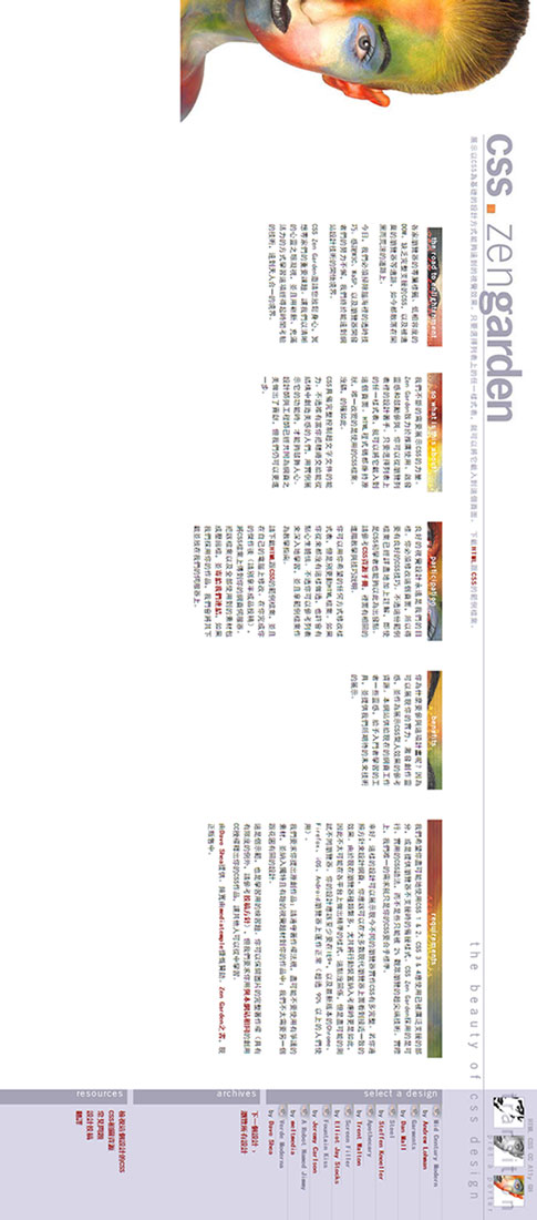
可以看出,这个文档的width是远远大于height,因为使用横排的显示方式来布局页面,使用鼠标左右滚动来显示。
HTML代码:
<!DOCTYPE html>
<html lang="zh-en">
  <head>
    <meta http-equiv="Content-Type" content="text/html; charset=UTF-8">
    <title>CSS Zen Garden: CSS設計之美</title>
    <link rel="stylesheet" media="screen" href="029/029.css">

    <meta name="author" content="Changjiu Huang">
    <meta name="description" content="展示CSS设计的美丽。">
    <meta name="robots" content="all">

    <!--[if lt IE 9]>
    <script src="script/html5shiv.js"></script>
    <![endif]-->
  </head>

<body>
<div class="page-wrapper">

    <section class="intro" id="zen-intro">
        <header role="banner">
            <h1>CSS Zen Garden</h1>
            <h2><abbr title="Cascading Style Sheets">CSS</abbr>設計之美</h2>
        </header>

        <div class="summary" id="zen-summary" role="article">
            <p></p>
            <p></p>
        </div>

        <div class="preamble" id="zen-preamble" role="article">
            <h3>開悟之路</h3>
            <p> </p>
            <p></p>
            <p></p>
        </div>
    </section>

    <div class="main supporting" id="zen-supporting" role="main">
        <div class="explanation" id="zen-explanation" role="article">
            <h3>這是關於什麼?</h3>
            <p></p>
            <p></p>
        </div>

        <div class="participation" id="zen-participation" role="article">
            <h3>參與</h3>
            <p> </p>
            <p></p>
            <p></p>
        </div>

        <div class="benefits" id="zen-benefits" role="article">
            <h3>益處</h3>
            <p></p>
        </div>

        <div class="requirements" id="zen-requirements" role="article">
            <h3>必要條件</h3>
            <p></p>
            <p> </p>
            <p></p>
            <p></p>
            <p></p>
        </div>

        <footer>
            <a href="javascript:void(0);" title="檢查網站的HTML是否合乎標準" class="zen-validate-html">HTML</a>
            <a href="javascript:void(0);" title="檢查網站的CSS是否合乎標準" class="zen-validate-css">CSS</a>
            <a href="javascript:void(0);" title="檢視本網站的創用CC版權聲明:姓名標示-非商業性-相同方式分享" class="zen-license">CC</a>
            <a href="javascript:void(0);" title="閱讀關於本網站的親和力說明" class="zen-accessibility">A11y</a>
            <a href="javascript:void(0);" title="在GitHub建立本網站的分支" class="zen-github">GH</a>
        </footer>

    </div>


    <aside class="sidebar" role="complementary">
        <div class="wrapper">

            <div class="design-selection" id="design-selection">
                <h3 class="select">選擇一項設計:</h3>
                <nav role="navigation">
                    <ul>
                      <li></li>
                      <li></li>
                      <li></li>
                      <li></li>
                      <li></li>
                      <li></li>
                      <li></li>
                    </ul>
                </nav>
            </div>

            <div class="design-archives" id="design-archives">
                <h3 class="archives">資料彙整:</h3>
                <nav role="navigation">
                    <ul>
                        <li class="next">
                            <a href="javascript:void(0);">
                                下一個設計 <span class="indicator">›</span>
                            </a>
                        </li>
                        <li class="viewall">
                            <a href="javascript:void(0);" title="瀏覽所有設計。">
                                瀏覽所有設計                          </a>
                        </li>
                    </ul>
                </nav>
            </div>

            <div class="zen-resources" id="zen-resources">
                <h3 class="resources">資源:</h3>
                <ul>
                  <li></li>
                </ul>
            </div>
        </div>
    </aside>


</div>
</body>
</html>
CSS代码部分:
/* 基本样式 */
body {
  width: 2048px;
  padding: 0;
  margin: 0;
  font: 11px/1.5em 黑体, Arial, Verdana, sans-serif;
}

a:link, a:visited {
  color: #A52A2A;
  font-weight: bold;
  text-decoration: none;
}

a:hover {
  text-decoration: underline;
}


/* 文档左边的面部 */
div.extra2 {
  position: fixed;
  left: 0;
  top: 0;
  width: 265px;
  height: 600px;
  background: url("../images/bg_face.jpg") no-repeat left bottom;
  z-index: 2;
}


/* 为了实现左边模糊效果引入的空白图片 */
div.extra3 {
  position: fixed;
  left: 0;
  top: 0;
  width: 225px;
  height: 100px;
  background: url("../images/bg_white.png");
  z-index: 1;
}


/* header部分 */
header {
  position: relative;
  left: 220px;
  width: 1828px;
}


header h1 {
  width: 493px;
  height: 83px;
  margin: 20px 0 0;
  background: url("../images/csszengarden.jpg") no-repeat right;
  text-indent: 100%;
  overflow: hidden;
  white-space: nowrap;
}


header h2 {
  width: 1826px;
  height: 27px;
  margin-top: -10px;
  background: url("../images/thebeautyofcssdesign.jpg") no-repeat right bottom;
  text-indent: 100%;
  overflow: hidden;
  white-space: nowrap;
}


/* summary 部分 */
div.summary {
  position: absolute;
  left: 228px;
  top: 98px;
  width: 1300px;
  letter-spacing: 0.1em;
  color: #A5A3B5;
  background: transparent;
}


div.summary p:last-child,
div.summary p:first-child {
  display: inline;
  margin: 0;
}

/* h1 与 h2 之间的线条 */
div.extra1 {
  position: absolute;
  left: 225px;
  top: 90px;
  width: 1823px;
  height: 1px;
  background: #A5A3B5;
}


/* preamble 部分 */
.preamble {
  position: absolute;
  left: 375px;
  top: 160px;
  width: 200px;
  text-align: justify;
}


.preamble h3 {
  width: 200px;
  height: 25px;
  margin: 0 0 0 0.5em;
  text-indent: 100%;
  overflow: hidden;
  white-space: nowrap;
  background-image: url("../images/theroad.jpg");
}


.preamble p {
  maring: 0 0.5em 0.5em;
}


/* supporting 部分 */
/*-----------共性-------------- */
div.explanation , div.participation,
div.benefits, div.requirements {
  position: absolute;
  top: 160px;
  width: 200px;
  text-align: justify;
}

/*-----------特性---------------*/
div.explanation {
  left: 625px;
}

div.participation {
  left: 875px;
}

div.benefits {
  left: 1125px;
}

div.requirements {
  width: 400px;
  left: 1375px;
}


/* supporting 下 h3的共性 */
div.explanation h3 , div.participation h3,
div.benefits h3, div.requirements h3 {
  width: 200px;
  height: 25px;
  margin: 0 0 0.5em;
  text-indent: 100%;
  overflow: hidden;
  white-space: nowrap;
}

/* supporting 下 h3的特性 */
div.explanation h3 {
  background: transparent url("../images/sowhatisthisabout.jpg") no-repeat left bottom;
}

div.participation h3 {
  background: transparent url("../images/participation.jpg") no-repeat left bottom;
}

div.benefits h3 {
  background: transparent url("../images/benefits.jpg") no-repeat left bottom;
}

/* 独有的特性 */
div.requirements h3 {
  width: 400px;
  overflow: hidden;
  white-space: nowrap;
  background: transparent url("../images/requirements.jpg") no-repeat left bottom;
}


div.explanation p , div.participation p,
div.benefits p, div.requirements p {
  margin: 0 0.5em 0.5em;
}


/* sidebar 部分 */
.sidebar {
  position: absolute;
  left: 1828px;
  top: 160px;
  width: 220px;
  background: url("../images/bg_linklist.jpg") repeat-y;
}


.design-selection li a:link,
.design-selection li a:visited {
  display: block;
  padding-left: 26px;
  margin-left: -10px;
  border-top: 1px solid #C6C6D3;
  color: #8B879E;
  background: url("../images/linklistlink.jpg") no-repeat;
}


.design-selection li a.designer-name:link,
.design-selection li a.designer-name:visited {
  display: inline;
  padding: 0;
  margin: 0;
  background: none;
  color: #A52A2A;
}


.sidebar ul {
  padding: 0;
  margin: 0 0 0 25px;
  list-style: none;
}


.sidebar ul li {
  padding-left: 10px;
}


.design-selection  h3{
  float: left;
  width: 25px;
  height: 200px;
  margin-top: 0;
  background: url("../images/selectadesign.jpg") no-repeat;
  text-indent: 100%;
  overflow: hidden;
  white-space: nowrap;
}


div .design-archives,div .zen-resources {
  clear: left;
  border-top: 10px solid #D9D6E7;
  margin-top: 0;

}


/* sidebar 下 h3的共性 */
div .design-archives h3,div .zen-resources h3 {
  float: left;
  width: 25px;
  height: 200px;
  margin-top: 0;
  text-indent: 100%;
  overflow: hidden;
  white-space: nowrap;
}

/* sidebar 下 h3的特性 */
div .design-archives h3 {
  background: transparent url("../images/archives.jpg") no-repeat left top;
}

div .zen-resources h3 {
  background: transparent url("../images/resources.jpg") no-repeat left top;
}


/* footer 部分 */
footer {
  position: absolute;
  left: 1828px;
  top: 3px;
  width: 220px;
  height: 20px;
  text-align: center;
  word-spacing: 0.1em;
  overflow: hidden;
}


footer a:link, footer a:visited {
  color: #B2AFC0;
  background: transparent;
}


/* 遮罩层 */
.extra4 {
  position: absolute;
  left: 1828px;
  top: 20px;
  width: 214px;
  height: 65px;
  background: #d9d6e7 url("../images/transition.jpg");
}


.extra5 {
  position: absolute;
  left: 1828px;
  top: 0;
  width: 220px;
  height: 902px;
  background: #d9d6e7 url("../images/bg_body.jpg");
  z-index: -1;
}
1、定位position: fixed;的意义
答:固定定位,固定在窗口某位置,不会随着滚动条滚动。使用偏移四属性(left right top bottom)控制位置。
2、如何使图片看起来有点模糊的感觉。
答:在图片位置上定义一个空白图片,作为遮罩层,使其z-index: 1; 而该图片的z-index: 2;这样在最低层有文字就是z-index: 0;,图片看起来就有种模糊的感觉。注:空白的图片必需重复显示,才能使其周围也有模糊的感觉。
如:
div.extra3 {
  position: fixed;
  left: 0;
  top: 0;
  width: 225px;
  height: 100px;
  background: url("../images/bg_white.png");
  z-index: 1;
}


 扫一扫
扫一扫
 359
359

 被折叠的 条评论
为什么被折叠?
被折叠的 条评论
为什么被折叠?
 到【灌水乐园】发言


