


 本文深入探讨CSS3 Flex布局,重点解析flex-direction如何决定主轴方向,justify-content如何控制主轴上的元素对齐,以及align-items如何调整交叉轴上的元素对齐方式。详细介绍了各种方向和对齐选项,帮助开发者更好地掌握Flex布局技巧。
flex布局(二) : 位置与排列方式
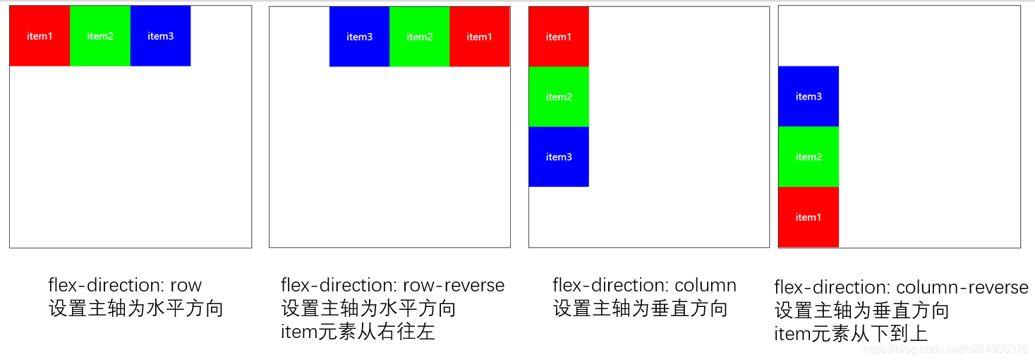
1. flex-direction 决定主轴方向
改变主轴方向为:水平row(默认) 或者 垂直column
并且设置item元素的排序方式start->end(默认) 或者 end->start
- row
- row-reverse
- column
- column-reverse
<style>
.container{
    /* 改变主轴方向 */
    display: flex;
    flex-direction: row;
    flex-direction: row-reverse;
    flex-direction: column;
    flex-direction: column-reverse;
}
</style>
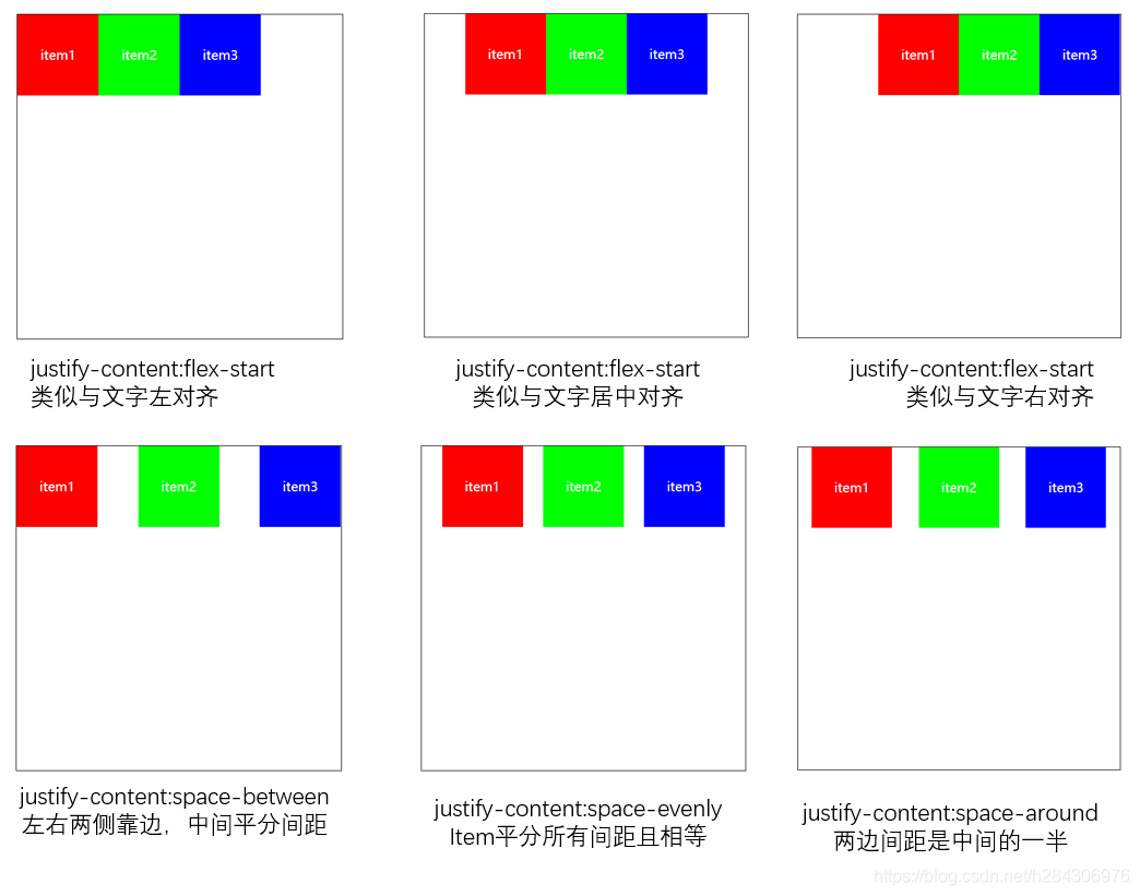
2. justify-content 决定主轴上的对齐方式
改变item元素在主轴main(水平)上的对齐方式
- flex-start
- flex-center
- flex-end
- space-between
- space-evently
- space-around
<style>
.container{
    display: flex;
    /* 改变item在主轴上的对齐方式 */
    justify-content: flex-start;
    justify-content: flex-end;
    justify-content: center;
    justify-content: space-between;
    justify-content: space-evenly;
    justify-content: space-around;
}
</style>
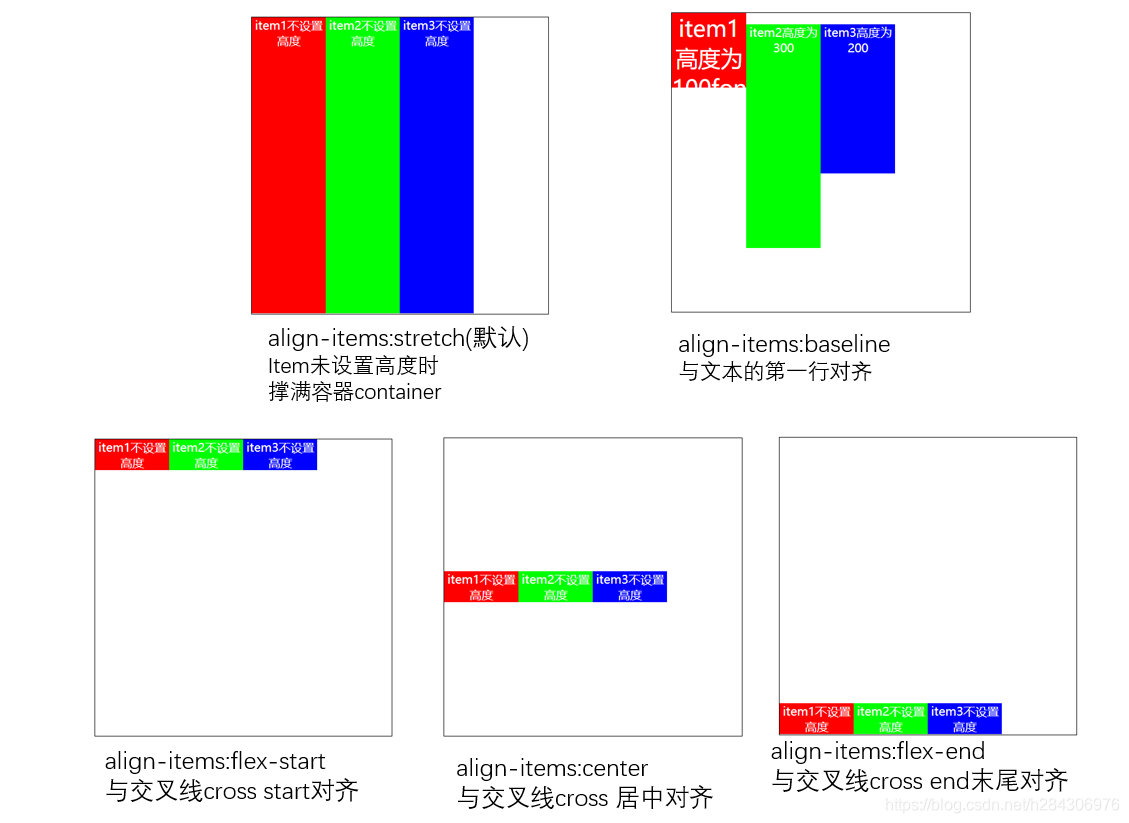
3. align-items 决定交叉轴上的对齐方式
改变item元素在在交叉轴cross(垂直)上的对齐方式
- stretch
- baseline
- flex-start
- center
- flex-end
<style>
.container{
    display: flex;
    flex-direction: row;
    justify-content: flex-start;

    /* 改变item在交叉轴(垂直)cross的对齐方式 */
    align-items: stretch;
    align-items: flex-start;
    align-items: center;
    align-items: flex-end;
    align-items: baseline;

}
.item{
    width: 100px;
    /* 不设置item高度 */
    /* height: 100px; */
    color: #fff;
    text-align: center;
}
</style>


 扫一扫
扫一扫


 4112
4112

 被折叠的 条评论
为什么被折叠?
被折叠的 条评论
为什么被折叠?
 到【灌水乐园】发言


