


flex布局也叫弹性布局
目录
2.2 设置主轴子元素排列方式 justify-content
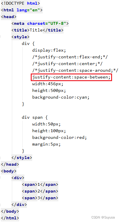
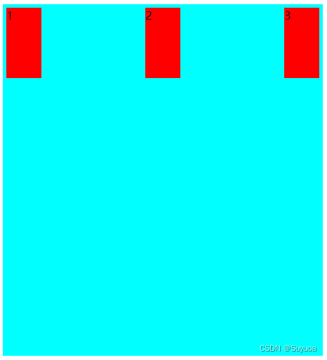
2.2.5 首尾两个元素贴边,其余元素平分剩余空间 space-between
2.5.1 先占一行(列),然后平分剩余空间 stretch
2.5.6 首尾两行(列)元素贴边,其余元素平分剩余空间 space-between
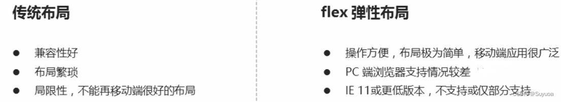
1 初识flex布局
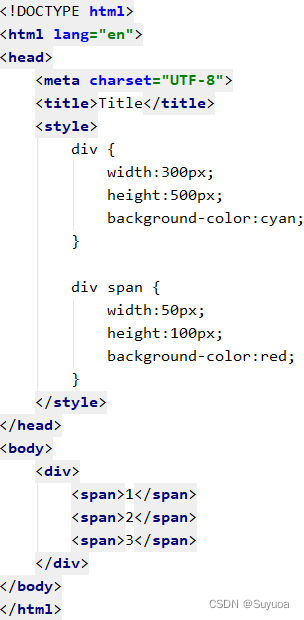
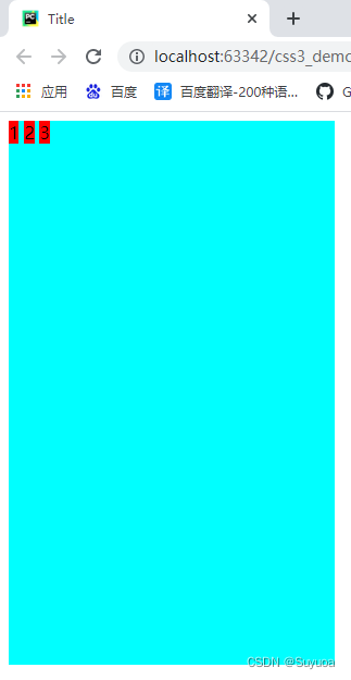
如果使用传统布局,对行内块元素设置宽高是没有用的
现在我们使用flex布局
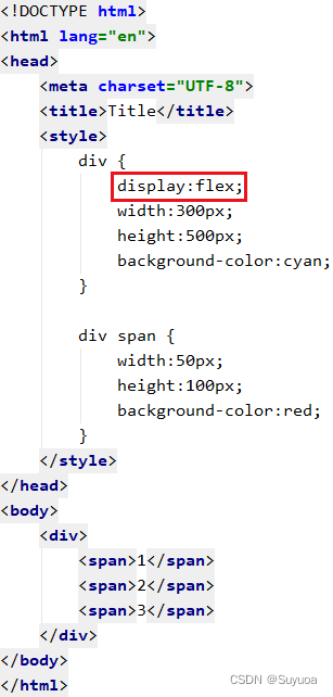
此时对行内块设置的宽高生效了
如果我们想让其分布均匀一点,可以加入一些flex布局独有的属性

- 任何一个容器元素都可以被指定为flex布局
- 当父元素被设置为flex布局,父元素中的子元素的float,clear,vertcal-align属性将失效
- flex布局也叫伸缩布局,弹性布局,伸缩盒布局,弹性盒布局
- 采用flex布局的元素(父元素)称为flex容器(flex container),容器中的子元素称为flex项目(flex item)
2 flex父项常见属性
下面这六个是父项的常见属性
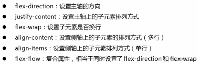
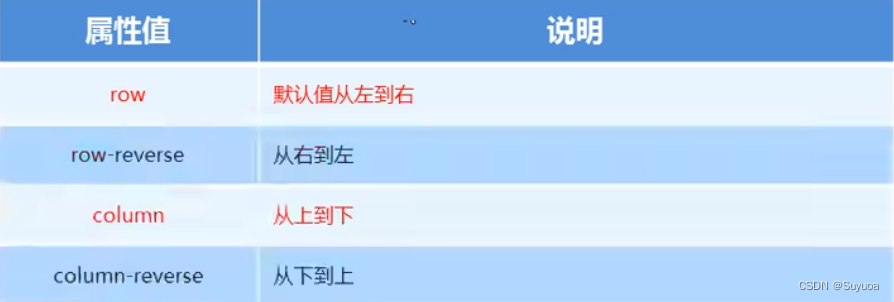
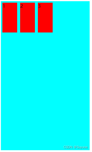
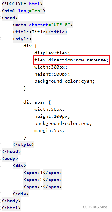
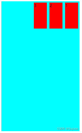
2.1 设置主轴方向 flex-direction
flex布局中分为主轴与侧轴。默认主轴方向为x轴方向,水平向右。默认侧轴方向是y轴方向,竖直向下。
我们如果将主轴定义为横向,侧轴就自动为纵向
侧轴总是向右或者向下的

flex-direction可以跟下面四种值
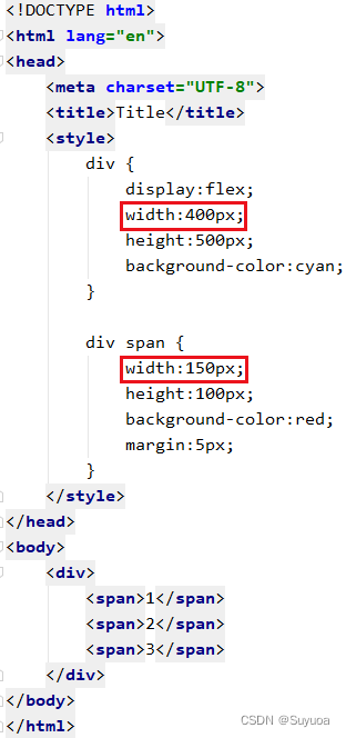
我们现在搞一个大盒子,再搞三个小盒子
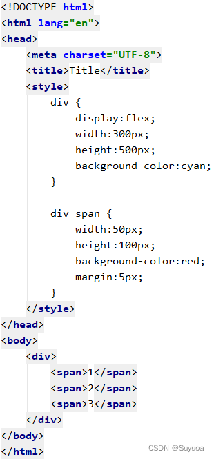
2.1.1 由左到右 row
默认值为row,主轴为x轴,方向由左到右
2.1.2 从右到左 row-reverse
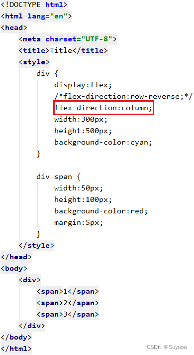
2.1.3 从上到下 column

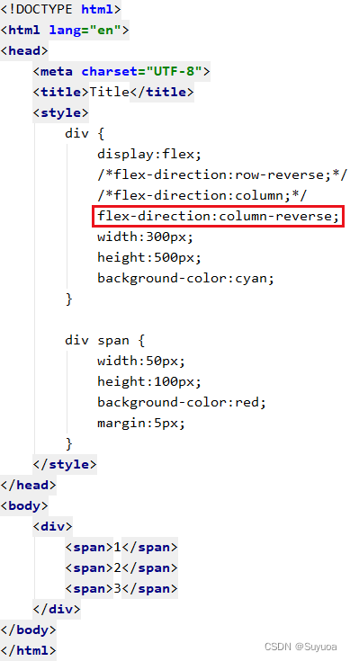
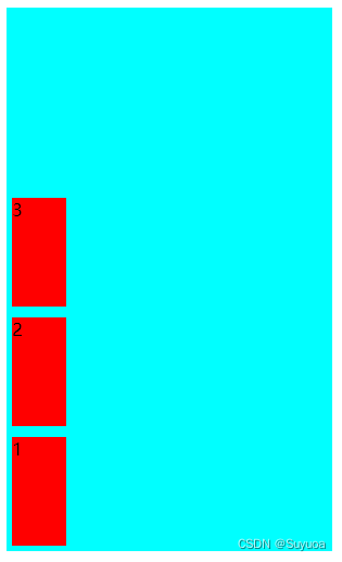
2.1.4 从下到上 column-reverse
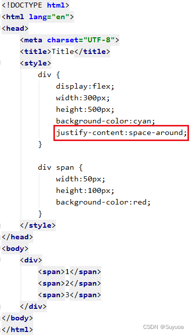
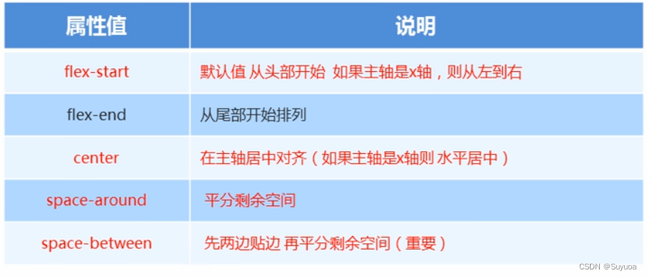
2.2 设置主轴子元素排列方式 justify-content
可以跟下面这些值
我们首先搞一个大盒子,里面放三个小盒子
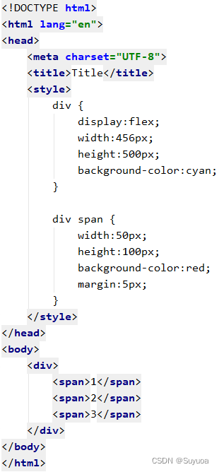
2.2.1 从头排列 flex-start
默认值是flex-start
2.2.2 从尾排列 flex-end
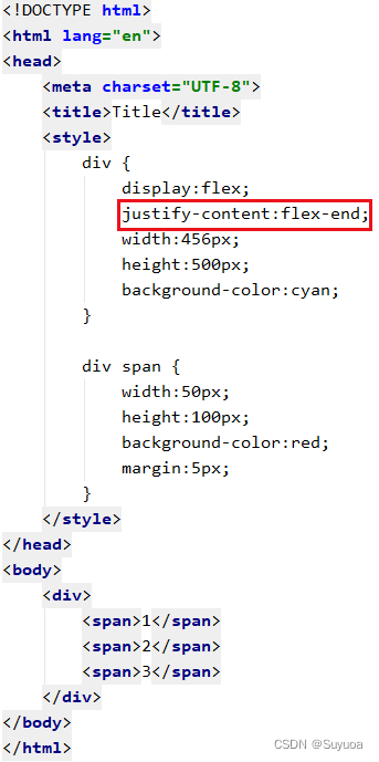
与逆向主轴的效果是不同的,上面的逆向主轴小盒子的顺序是3 2 1,这里是1 2 3
2.2.3 整体居中 center

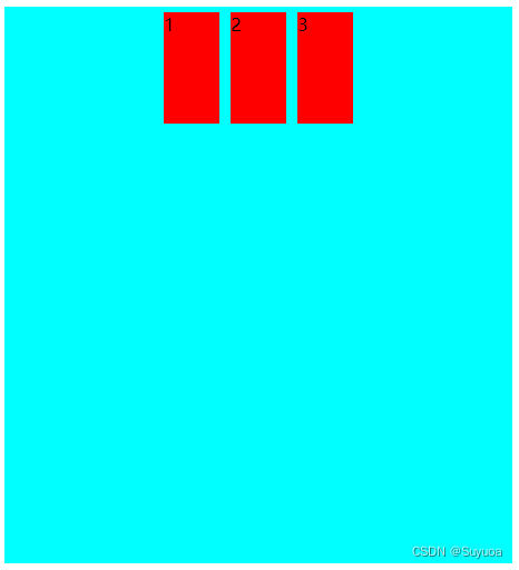
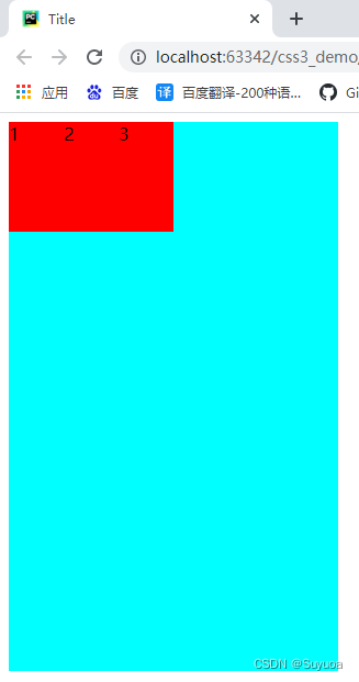
2.2.4 平分空间 space-around
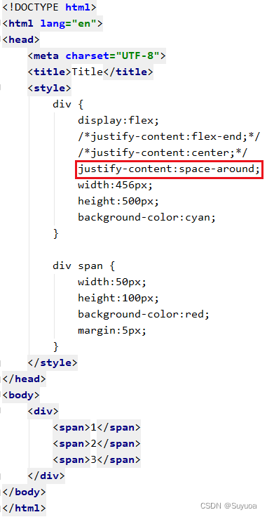

space-around是含义是让每个元素都有相似的margin

2.2.5 首尾两个元素贴边,其余元素平分剩余空间 space-between
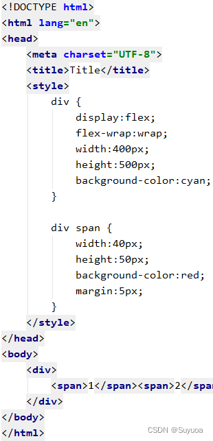
2.3 子元素是否换行 flex-wrap
flex-wrap可以跟下面两个值
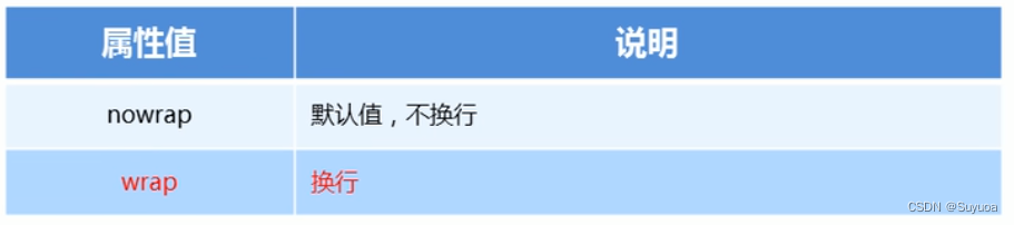
2.3.1 不换行 nowrap
默认为不换行,当我们处于不换行状态且子元素尺寸超过父元素宽度,子元素会自动缩小
我们现在搞一个大盒子和三个小盒子
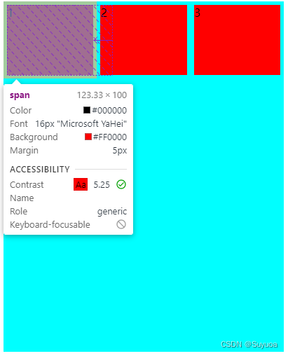
我们发现三个小盒子的宽度总和大于大盒子的宽度,但还是摆开了
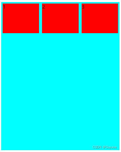
说明现在三个小盒子的尺寸不是150px
2.3.2 换行 wrap

侧轴元素默认会平均分配空间
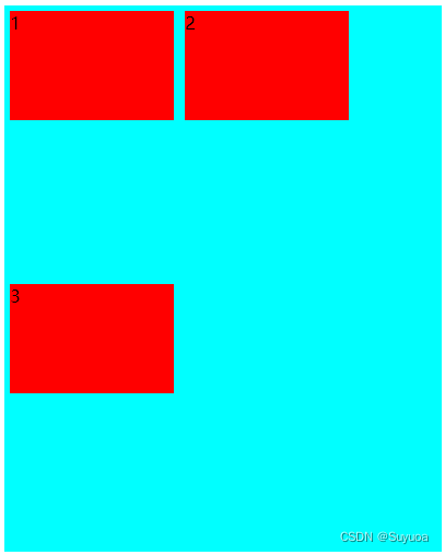
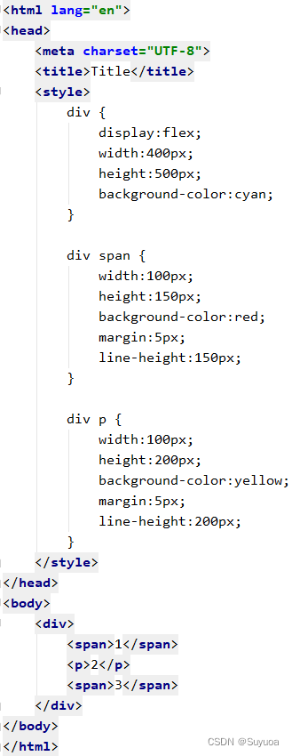
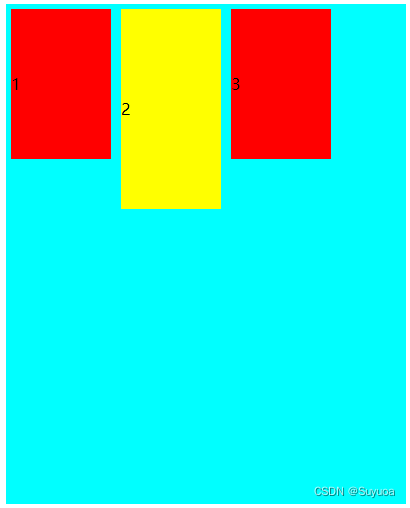
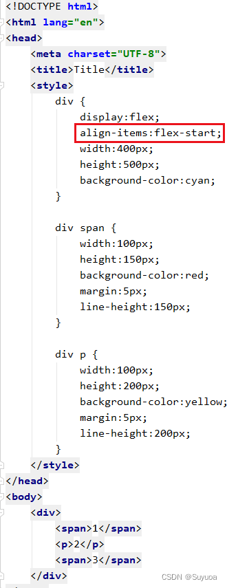
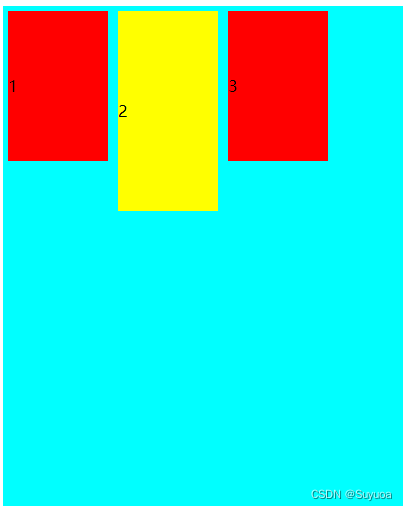
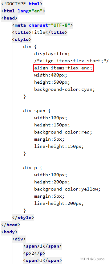
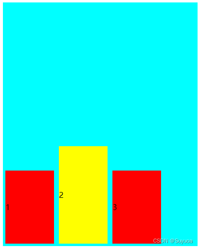
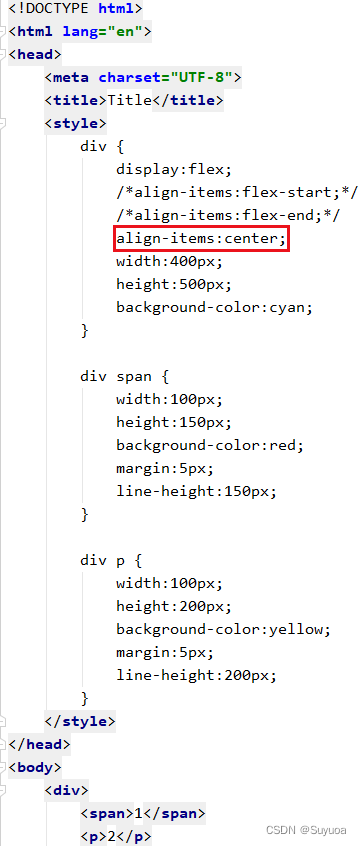
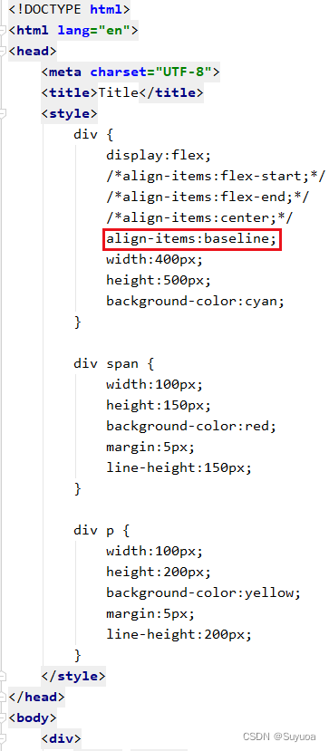
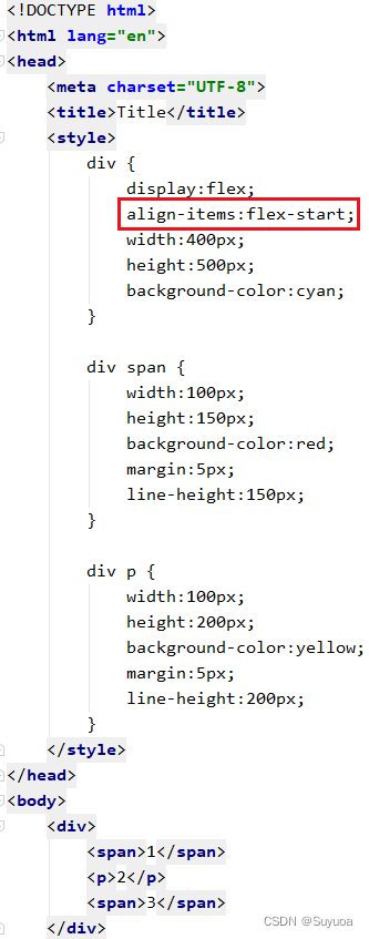
2.4 单行(列)侧轴排列方式 align-items
align-content只在单行(列)内容时生效,在多行(列)内容时无效
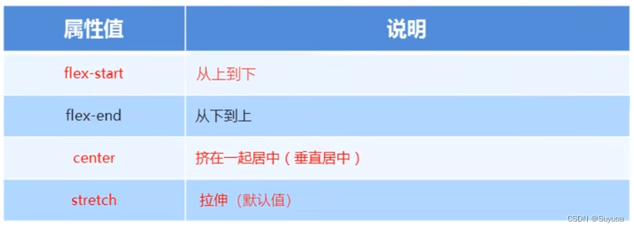
2.4.1 stretch 拉伸
默认是拉伸,所有元素都会放在轴的开始端,与下面的flex-start显示上没有区别
2.4.2 从头排列 flex-start
2.4.3 从尾排列 flex-end
2.4.4 整体居中 center
2.4.5 第一行文字基线对齐 baseline
这个基本用不到,我们知道有这个东西就行
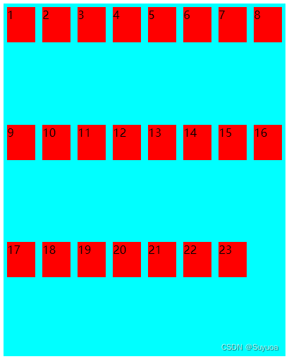
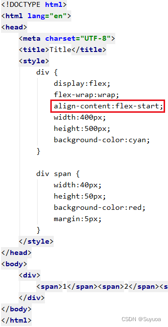
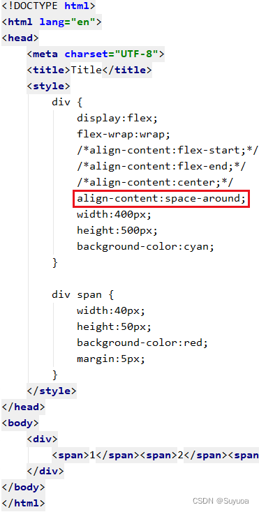
2.5 多行(列)侧轴排列方式 align-content
align-content只在多行(列)内容时生效,在单行(列)内容时无效
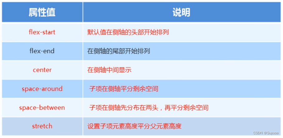
2.5.1 先占一行(列),然后平分剩余空间 stretch
这个是默认值,我们搞一个大盒子然后搞23个小盒子,允许换行
2.5.2 从头排列 flex-start

2.5.3 从尾排列 flex-end
2.5.4 整体居中 center
2.5.5 平分空间 space-around
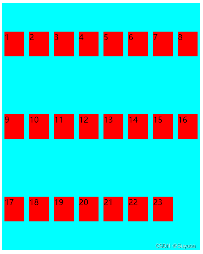
2.5.6 首尾两行(列)元素贴边,其余元素平分剩余空间 space-between


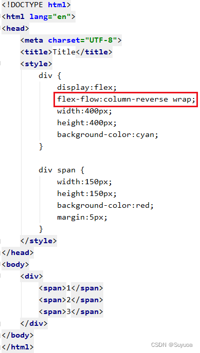
2.6 复合属性 flex-flow
flex-flow可以同时设置flex-direction(主轴方向)和felx-wrap(是否换行)
默认是x轴从左到右为主轴,不换行。我们现在设置为y中从下到上为主轴,换行
没设置之前是这样的

设置之后是这样的
3 flex子项常见属性
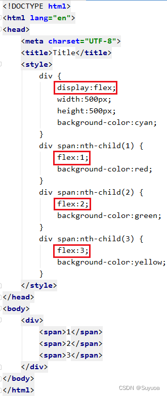
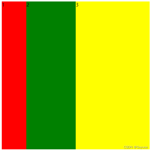
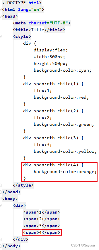
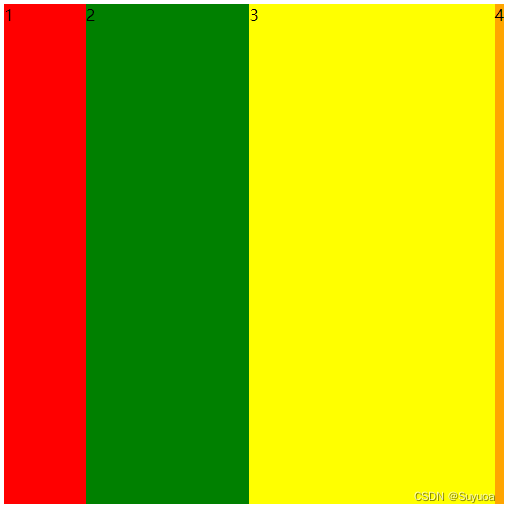
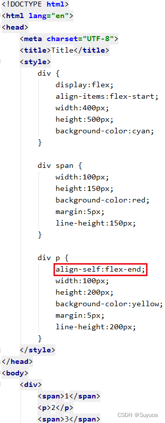
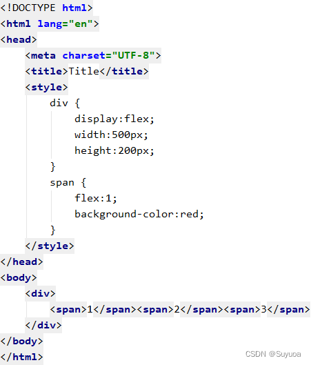
3.1 份数 flex
使用份数后会优先分配固定大小的元素空间,之后将剩余空间按份数分给带有份数的元素
我们现在搞一个大盒子,里面有三个小盒子,分别占1份,2份,3份
默认0份,0份只有内容的宽度。我们现在再搞一个四号盒子
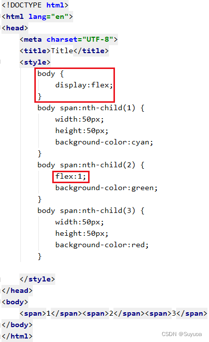
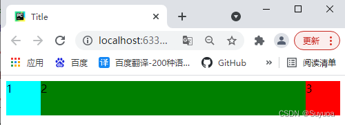
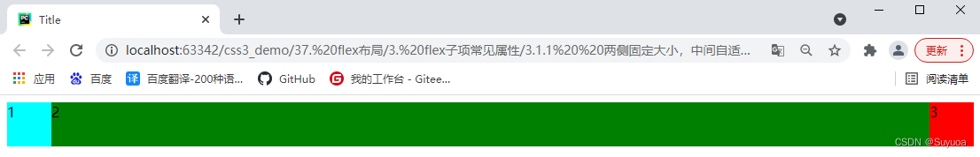
3.1.1 两侧固定大小,中间自适应
我们可以使用flex做出两侧固定大小,中间自适应的效果
我们需要对父对象设置flex布局,之后让自适应盒子的份数为1
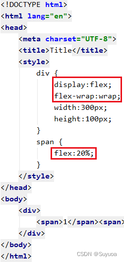
3.1.2 flex接百分比
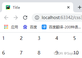
除了数值之外flex还可以接百分比,比如我现在要在一个大盒子中放两排10个小盒子就可以这样写
3.2 自身在侧轴上的排列方式 align-self
使用align-self可以让某一个或某几个元素有自己独特的排列顺序
可以跟的值有下面这些
- flex-start 从头排列
- flex-end 从尾排列
- center 居中
- stretch 拉伸
- auto 继承 align-items,如果父对象没有align-items则默认使用stretch
我现在有一个大盒子,三个小盒子,小盒子在侧轴上从头到尾排列
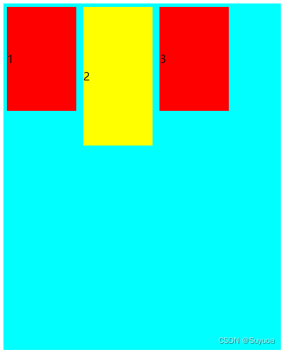
我现在让第二个盒子在侧轴上从尾到头排列

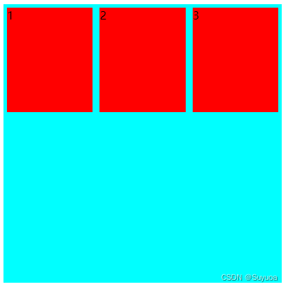
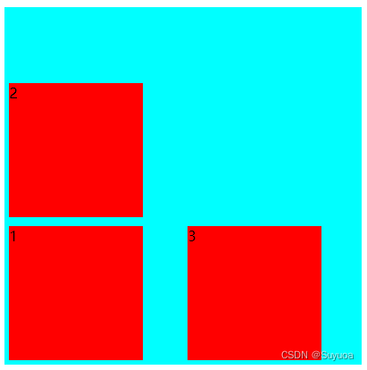
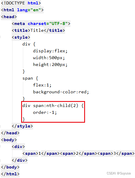
3.3 子元素排列顺序 order
order后跟数值,默认数值为0,数值越小,排列越靠前
我现在有标号为1,2,3的三个盒子

我现在将2号盒子提到最前面
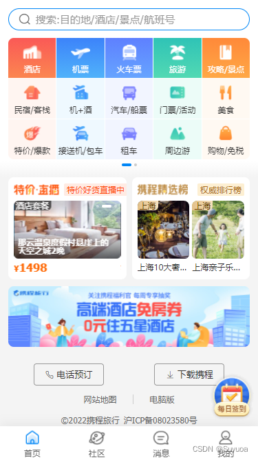
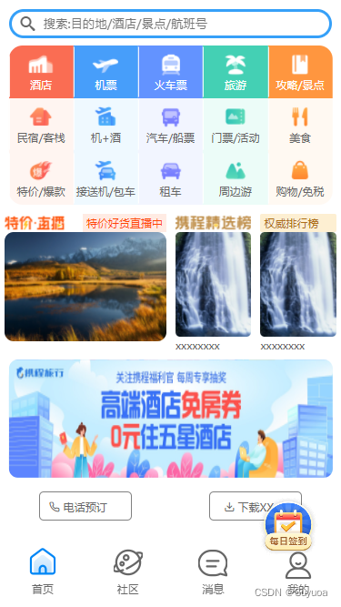
4 携程网首页模拟
携程网移动端首页地址 m.ctrip.com
我当前的页面是这样的
做完是这样的
我们会用到flex布局,当然之前使用的百分比方法也会用到
有fixed定位就找一个一样大小的块把位置占住,这样就不用复杂的调整后面的高度了
css
@font-face {
    font-family: 'icomoon';
    src:  url('../fonts/fonts/icomoon.eot?209gaw');
    src:  url('../fonts/fonts/icomoon.eot?209gaw#iefix') format('embedded-opentype'),
    url('../fonts/fonts/icomoon.ttf?209gaw') format('truetype'),
    url('../fonts/fonts/icomoon.woff?209gaw') format('woff'),
    url('../fonts/fonts/icomoon.svg?209gaw#icomoon') format('svg');
    font-weight: normal;
    font-style: normal;
    font-display: block;
}


/*头部*/
.header_position {
    position:relative;
    width:100%;
    height:50px;
}

.header {
    position:fixed;
    min-width:320px;
    max-width:540px;
    display:flex;
    justify-content:center;
    width:100%;
    z-index:998;
}

.header input {
    flex:1;
    height:32px;
    line-height:32px;
    border:3px solid rgb(54,160,248);
    border-radius:16px;
    margin:10px;
    color:rgb(153,153,153);
    text-indent:10%;
}

.header span::before {
    position:absolute;
    left:6%;
    top:14px;
    content:'\e986';
    font-family:'icomoon';
    font-size:16px;
    z-index:999;
}

/*功能区域*/
.function_area {
    overflow:hidden;
    display:flex;
    flex-wrap:wrap;
    position:relative;
    left:50%;
    transform:translate(-50%,0);
    width:95%;
    height:175px;
    border-radius:15px;
}

.function_area a {
    position:relative;
    display:flex;
    justify-content:center;
    align-items:center;
    flex-direction:column;
    width:20%;
}

.function_area a::before {
    position:absolute;
    left:0px;
    top:50%;
    transform:translate(0,-50%);
    content:'';
    width:1px;
    height:55px;
    background-color:white;
}


.function_area a span {
    display:inline-block;
    width:28px;
    height:28px;
    background-size:contain;
}

.function_area a:nth-child(-n+5) p {
    color:white;
}

/*第一列*/
.function_area a:nth-child(1) {
    background-color:rgb(250,109,83);
}

.function_area a:nth-child(1) span{
    background-image:url(../images/function_area/first_column/hotel.png);
}

.function_area a:nth-child(6), .function_area a:nth-child(11){
    background-color:rgb(255,245,241);
}

.function_area a:nth-child(6) span{
    background-image:url(../images/function_area/first_column/hotel_inn.png);
}

.function_area a:nth-child(11) span{
    background-image:url(../images/function_area/first_column/hotel_sale.png);
}

/*第二列*/
.function_area a:nth-child(2) {
    background-color:rgb(71,158,250);
}

.function_area a:nth-child(2) span{
    background-image:url(../images/function_area/second_column/flight.png);
}

.function_area a:nth-child(7), .function_area a:nth-child(12){
    background-color:rgb(239,249,255);
}

.function_area a:nth-child(7) span{
    background-image:url(../images/function_area/second_column/flight_package.png);
}

.function_area a:nth-child(12) span{
    background-image:url(../images/function_area/second_column/airport_transfer.png);
}

/*第三列*/
.function_area a:nth-child(3) {
    background-color:rgb(99,147,255);
}

.function_area a:nth-child(3) span{
    background-image:url(../images/function_area/third_column/train_ticket.png);
}

.function_area a:nth-child(8), .function_area a:nth-child(13){
    background-color:rgb(242,245,255);
}

.function_area a:nth-child(8) span{
    background-image:url(../images/function_area/third_column/bus_ticket.png);
}

.function_area a:nth-child(13) span{
    background-image:url(../images/function_area/third_column/car.png);
}

/*第四列*/
.function_area a:nth-child(4) {
    background-color:rgb(68,208,180);
}

.function_area a:nth-child(4) span{
    background-image:url(../images/function_area/fourth_column/vacation.png);
}

.function_area a:nth-child(9), .function_area a:nth-child(14){
    background-color:rgb(236,252,248);
}

.function_area a:nth-child(9) span{
    background-image:url(../images/function_area/fourth_column/ticket.png);
}

.function_area a:nth-child(14) span{
    background-image:url(../images/function_area/fourth_column/weekend.png);
}


/*第五列*/
.function_area a:nth-child(5) {
    background-color:rgb(255,150,63);
}

.function_area a:nth-child(5) span{
    background-image:url(../images/function_area/fifth_column/introduction.png);
}

.function_area a:nth-child(10), .function_area a:nth-child(15){
    background-color:rgb(255,249,242);
}

.function_area a:nth-child(10) span{
    background-image:url(../images/function_area/fifth_column/food.png);
}

.function_area a:nth-child(15) span{
    background-image:url(../images/function_area/fifth_column/shop.png);
}

/*热点部分*/
.hot_point {
    position:relative;
    justify-content:space-around;
    display:flex;
    height:150px;
    margin-top:5px;
}

/*直播部分*/
#live_report {
    display:flex;
    flex:1;
    flex-direction:column;
    margin:5px;
}

/*直播头部*/
#live_report_header {
    display:flex;
    justify-content:space-between;
}

#live_report_header img {
    height:20px;
}

#live_report_header span {
    padding:1px 4px;
    color:#ff4607;
    background-color:#ffebe3;
}

/*直播内容部分*/
#live_report_pic {
    border-radius:10px;
    flex:1;
    background-image:url(../upload/hot_point/live_report/1.png);
    background-size:100% 100%;
}

/*排行榜*/
.rank_list {
    display:flex;
    flex-direction:column;
    margin:5px;
}

/*精选排行榜*/
#carefully_select_img {
    height:20px;
}

/*权威排行榜*/
.rank_list span{
    padding:1px 4px;
    color:#ae6e15;
    background-color:#fdefd2;
    border-radius:2px;
}

.rank_list_content {
    height:115px;
    border-radius:5px;
}
/*广告部分*/
.advertisement {
    position:relative;
    left:50%;
    width:95%;
    transform:translate(-50%,0);
    height:130px;
    background-image:url(../upload/advertisement.jpg);
    background-size:100% 100%;
    border-radius:10px;
    margin-top:15px;
}

/*电话预订与下载*/
.phone_download {
    margin-top:15px;
    position:relative;
    display:flex;
    justify-content:space-around;
}

.phone_download span {
    position:relative;
    width:102px;
    height:32px;
    text-align:center;
    line-height:32px;
    border:1px solid gray;
    border-radius:5px;
}

.phone_download span:nth-child(1)::before {
    position:absolute;
    left:10px;
    content:'\e901';
    font-family:'icomoon';
}

.phone_download span:nth-child(2)::before {
    position:absolute;
    left:15px;
    content:'\e900';
    font-family:'icomoon';
}

/*两个链接*/

.two_link {
    display:flex;
    justify-content:center;
}

.two_link a{
    text-align:center;
    margin:30px;
}

/*版权*/
.copyright {
    text-align:center;
}


.footer_position {
    position:relative;
    height:65px;
}
/*尾部*/
.footer {
    position:fixed;
    width:100%;
    min-width:320px;
    max-width:540px;
    bottom:0px;
    display:flex;
    height:65px;
    justify-content:space-around;
    background-color:white;
}

.footer span {
    width:32px;
    height:45px;
    text-align:center;
    line-height:90px;
    background-image:url(../images/footer/tabbar.png);
    background-size:48px auto;
}

.footer span:nth-child(1) {
    background-position:-8px -8px;
}

.footer span:nth-child(2) {
    background-position:-8px -56px;
}

.footer span:nth-child(3) {
    background-position:-8px -103px;
}

.footer span:nth-child(4) {
    background-position:-8px -148px;
}

/*签到部分*/
.sign_in {
    position:fixed;
    right:20px;
    bottom:50px;
    width:76px;
    height:76px;
    background-image:url(../images/signin-d.png);
    background-size:76px 76px;
}
html
<!DOCTYPE html>
<html lang="en">
<head>
    <meta charset="UTF-8">
    <title>Title</title>
    <meta name="viewport" content="width=device-width,user-scalable=no,initial-scale=1.0,maximum-scale=1.0,minimum-scale=1.0">
    <link rel="stylesheet" href="css/initialization.css">
    <link rel="stylesheet" href="css/index.css">
</head>
<body>

    <section class="header">
        <span id="magnifier"></span>
        <input type="text" placeholder="搜索:目的地/酒店/景点/航班号">
    </section>
    <section class="header_position"></section>
    <section class="function_area">
        <a href="#"><span></span><p>酒店</p></a>
        <a href="#"><span></span><p>机票</p></a>
        <a href="#"><span></span><p>火车票</p></a>
        <a href="#"><span></span><p>旅游</p></a>
        <a href="#"><span></span><p>攻略/景点</p></a>

        <a href="#"><span></span><p>民宿/客栈</p></a>
        <a href="#"><span></span><p>机+酒</p></a>
        <a href="#"><span></span><p>汽车/船票</p></a>
        <a href="#"><span></span><p>门票/活动</p></a>
        <a href="#"><span></span><p>美食</p></a>

        <a href="#"><span></span><p>特价/爆款</p></a>
        <a href="#"><span></span><p>接送机/包车</p></a>
        <a href="#"><span></span><p>租车</p></a>
        <a href="#"><span></span><p>周边游</p></a>
        <a href="#"><span></span><p>购物/免税</p></a>
    </section>

    <section class="hot_point">
        <div id="live_report">
            <div id="live_report_header">
                <img src="images/hot_point/live_report.png" alt="">
                <span>特价好货直播中</span>
            </div>
            <div id="live_report_pic"></div>
        </div>

        <div class="rank_list">
            <img src="images/hot_point/carefully_select.png" id="carefully_select_img">
            <img src="upload/hot_point/1.png" alt="" class="rank_list_content">
            <p>xxxxxxxx</p>
        </div>

        <div class="rank_list">
            <span>权威排行榜</span>
            <img src="upload/hot_point/1.png" alt="" class="rank_list_content">
            <p>xxxxxxxx</p>
        </div>
    </section>

    <section class="advertisement"></section>

    <section class="phone_download">
        <span>电话预订</span>
        <span>下载XX</span>
    </section>

    <section class="two_link">
        <a href="#">网站地图</a>
        <a href="#">电脑版</a>
    </section>
    <p class="copyright">©2022XX旅行 XXX备XXXXXXX号</p>
    <section class="footer_position"></section>
    <section class="footer">
        <span>首页</span>
        <span>社区</span>
        <span>消息</span>
        <span>我的</span>
    </section>

    <section class="sign_in"></section>
</body>
</html>


 1297
1297


 被折叠的 条评论
为什么被折叠?
被折叠的 条评论
为什么被折叠?
 到【灌水乐园】发言


