


 本文详细介绍了Android中的多种布局方式,包括LinearLayout、RelativeLayout、TableLayout等,深入解析了它们的使用场景和属性配置。
最近痴迷上了android , 因为有java 语言的基础学起来自己感觉很快。但是毕竟是做java ee的,这一下转到手机上还是有那么点不适应。为了把自己的学习成果总结一下,特写了这个android系列的学习笔记,下面进入正题
我的android开发环境是搭建在windows xp系统下的,搭建过程很简单。使用了MyEclipse6.5,sdk1.5_r2,jdk_1.6,以及ADT。最后输出了一个hello word。 有了这一步,我便进入了下一步的学习。我认为学android还是应该先学他的 布局方式以及控件的用途。这也是今天我想写在我的学习笔记里的内容。
第一次仔细看android的一个程序,发现他有很多的xml文件。当时想的第一个问题就是,这些xml文件之间是如何进行关联的?假如我要自己写一个android程序,我应该先写什么?或者先配置什么?还是写完以后可以实现自动配置?带着这些问题 我进入了android布局的学习。
android我目前所学习到的布局方式有以下几种:
1. LineraLayout局部 线性布局
感觉这个布局方式是最常见的一种。它有两种布局方式:行 与列。是由参数orientation(方位)决定的。vertical表示竖直排列,horizontal表示横向排列.
具体代码如
每个参数都要以android:开头。一般都有android:layout_width和android:layout_height 具体的值有两个一个是fill_parent 一个是wrap_content 每一个布局都是一个容器,layout_width与height表示这个容器的宽 与高是填充满父容器,还是依赖于他本身的内容
2. FrameLayout布局 框架布局
这个布局一般是放图片的,放入其中的所有元素都被放置在FrameLayout区域最左上的区域,而且无法为这些元素指定一个确切的位置。如果一个FrameLayout里有多个子元素,那么后边的子元素的显示会重叠在前一个元素上。这个布局方式的宽与高的参数一般是用wrap_content。
3. RelativeLayout布局 相对布局
这个布局很常见。具体代码比如:
在这个容器里放置了一些组件,每个组件里多了一些对他们位置关系的描述,比如android:layout_below="@id/label" 表示放在id为label的控件下面== 要注意的是,如果组件B依赖于A,那么必须要让A出现在B的前面。
padding表示填充,margin表示边距。android当中最常见的支持描述大小区域的类型如下 px像素 dip依赖于设备的像素.
4. TableLayout 表格布局
里面是由多个TableRow组成的。一行一行的很好理解。
布局方式是可以组合在一起的。这个也不难理解。
======================================================================
Android Layout 布局
Android 2010-11-20 20:37:36 阅读116 评论0 字号:大中小 订阅
一个Android视图有很多控件,那么怎么来控制它们的位置排列呢?我们需要容器来存放这些控件并控制它们的位置排列,就像HTML中div, table一样,Android布局也起到同样的作用。
Android布局主要有以下几种: LinearLayout, RelativeLayout,TableLayout,AbsoluteLayout. 最后一种AbsoluteLayout是通过指定控件的x/y坐标来定位的,不太灵活所以已经不推荐使用了。
(1) LinearLayout
LinearLayout线性布局,包含在LinearLayout里面的控件按顺序排列成一行或者一列,类似于Swing里的FlowLayout和Silverlight里的StackPanel,它的常用的属性主要包括:
Orientation方向,即指定LinearLayout是代表一行还是一列,可以为horizontal或vertical,如android:orientation="vertical",当然也在可以在代码里通过setOrientation()方法来设置。
Fill Mode填充方式,所有在LinearLayout的控件都必须指定它的填充方式, 即设置android:layout_width和android:layout_height,可以为三种值(1)具体的像素值,如20px (2) wrap_content, 表示按控件文本实际长度显示 (3) fill_parent, 表示填充剩下的所有可用空间。
Weight权重,如果你想让一行或一列的控件按比例显示,这时候权重就起到作用了,如想让一行里面两控件其中一控件占两倍于另一控件的空间,可以把其中一控件的android:layout_weight设置为1, 另一个为2 即可。
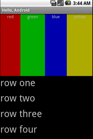
在前面一篇Android消息提示框和对话框也有个LinearLayout的例子, 现在来看一下Android官方的一个Demo:
| 01 | <?xml version="1.0" encoding="utf-8"?> | |
| 02 | <LinearLayout xmlns:android="http://schemas.android.com/apk/res/android" | |
| 03 | android:orientation="vertical" android:layout_width="fill_parent" | |
| 04 | android:layout_height="fill_parent"> | |
| 05 | <LinearLayout android:orientation="horizontal" | |
| 06 | android:layout_width="fill_parent" android:layout_height="fill_parent" | |
| 07 | android:layout_weight="1"> | |
| 08 | <TextView android:text="red" android:gravity="center_horizontal" | |
| 09 | android:background="#aa0000" android:layout_width="wrap_content" |
| 10 | android:layout_height="fill_parent" android:layout_weight="1" /> |
| 11 | <TextView android:text="green" android:gravity="center_horizontal" |
| 12 | android:background="#00aa00" android:layout_width="wrap_content" |
| 13 | android:layout_height="fill_parent" android:layout_weight="1" /> |
| 14 | <TextView android:text="blue" android:gravity="center_horizontal" |
| 15 | android:background="#0000aa" android:layout_width="wrap_content" |
| 16 | android:layout_height="fill_parent" android:layout_weight="1" /> |
| 17 | <TextView android:text="yellow" android:gravity="center_horizontal" |
| 18 | android:background="#aaaa00" android:layout_width="wrap_content" |
| 19 | android:layout_height="fill_parent" android:layout_weight="1" /> | |
| 20 | </LinearLayout> | |
| 21 | <LinearLayout android:orientation="vertical" | |
| 22 | android:layout_width="fill_parent" android:layout_height="fill_parent" | |
| 23 | android:layout_weight="1"> | |
| 24 | <TextView android:text="row one" android:textSize="15pt" | |
| 25 | android:layout_width="fill_parent" android:layout_height="wrap_content" | |
| 26 | android:layout_weight="1" /> | |
| 27 | <TextView android:text="row two" android:textSize="15pt" | |
| 28 | android:layout_width="fill_parent" android:layout_height="wrap_content" | |
| 29 | android:layout_weight="1" /> | |
| 30 | <TextView android:text="row three" android:textSize="15pt" | |
| 31 | android:layout_width="fill_parent" android:layout_height="wrap_content" | |
| 32 | android:layout_weight="1" /> | |
| 33 | <TextView android:text="row four" android:textSize="15pt" | |
| 34 | android:layout_width="fill_parent" android:layout_height="wrap_content" | |
| 35 | android:layout_weight="1" /> | |
| 36 | </LinearLayout> | |
| 37 | </LinearLayout> |
可以看到父类LinearLayout包含了一个水平布局的LinearLayout和一个垂直布局的LinearLayout,它们分别包含了四个平分宽度和高度的TextView,运行效果如下:
(2) RelativeLayout
相对布局,它是依靠与父容器,同一容器中其它控件的相对位置来排列显示的。主要常用的属性如下:
相对父容器的属性:
android:layout_alignParentTop: 控件的顶部与父容器的顶部对齐,类似的几个属性从名字可以看出它们的作用:android:layout_alignParentBottom, android:layout_alignParentLeft, android:layout_alignParentRight.
相对同一容器中其它控件的属性:
android:layout_above: 表示此控件在另一控件的上面,类似的还有android:layout_below, android:layout_toLeftOf, android:layout_toRightOf.
android:layout_alignTop: 表示此控件与另一控件顶部对齐,类似的还有android:layout_alignBottom, android:layout_alignLeft, android:layout_alignRight.
既然是相对于另一个控件,就必须在定义这控件时候指定是哪个控件,如控件A的ID为@+id/widget_a, 控件B若要在控件A下面可以这样设置android:layout_below="@id/widget_a"。
来看一下官方的一个Demo:
| 01 | <RelativeLayout xmlns:android="http://schemas.android.com/apk/res/android" |
| 02 | android:layout_width="fill_parent" android:layout_height="fill_parent"> |
| 03 | <TextView android:id="@+id/label" android:layout_width="fill_parent" |
| 04 | android:layout_height="wrap_content" android:text="Type here:" /> |
| 05 | <EditText android:id="@+id/entry" android:layout_width="fill_parent" |
| 06 | android:layout_height="wrap_content" android:background="@android:drawable/editbox_background" |
| 07 | android:layout_below="@id/label" /> | |
| 08 | <Button android:id="@+id/ok" android:layout_width="wrap_content" | |
| 09 | android:layout_height="wrap_content" android:layout_below="@id/entry" |
| 10 | android:layout_alignParentRight="true" android:layout_marginLeft="10dip" |
| 11 | android:text="OK" /> | |
| 12 | <Button android:layout_width="wrap_content" | |
| 13 | android:layout_height="wrap_content" android:layout_toLeftOf="@id/ok" | |
| 14 | android:layout_alignTop="@id/ok" android:text="Cancel" /> | |
| 15 | </RelativeLayout> |
运行效果如下:
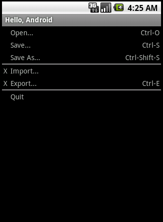
(3) TableLayout
表格布局,类似于HTML的Table和Silverlight的Grid。通过TableRow来定义一行,如果一个控件占用多列可以设置android:layout_span, 类似于HTML的colspan。默认情况下一个控件是按顺序放置在每一列的(column 0, column 1….), 也可以通过android:layout_column指定放在哪一列。如果一列内容过长或者过短,可以通过android:stretchColumns和android:shrinkColumns来增加或者减少此列的宽度。
来看一下官方的一个Demo:
| 01 | <TableLayout xmlns:android="http://schemas.android.com/apk/res/android" |
| 02 | android:layout_width="fill_parent" android:layout_height="fill_parent" |
| 03 | android:stretchColumns="1"> | |
| 04 | <TableRow> | |
| 05 | <TextView android:layout_column="1" android:text="Open..." | |
| 06 | android:padding="3dip" /> | |
| 07 | <TextView android:text="Ctrl-O" android:gravity="right" | |
| 08 | android:padding="3dip" /> | |
| 09 | </TableRow> | |
| 10 | <TableRow> | |
| 11 | <TextView android:layout_column="1" android:text="Save..." | |
| 12 | android:padding="3dip" /> | |
| 13 | <TextView android:text="Ctrl-S" android:gravity="right" | |
| 14 | android:padding="3dip" /> | |
| 15 | </TableRow> | |
| 16 | <TableRow> | |
| 17 | <TextView android:layout_column="1" android:text="Save As..." | |
| 18 | android:padding="3dip" /> | |
| 19 | <TextView android:text="Ctrl-Shift-S" android:gravity="right" | |
| 20 | android:padding="3dip" /> | |
| 21 | </TableRow> | |
| 22 | <View android:layout_height="2dip" android:background="#FF909090" /> | |
| 23 | <TableRow> | |
| 24 | <TextView android:text="X" android:padding="3dip" /> | |
| 25 | <TextView android:text="Import..." android:padding="3dip" /> | |
| 26 | </TableRow> | |
| 27 | <TableRow> | |
| 28 | <TextView android:text="X" android:padding="3dip" /> | |
| 29 | <TextView android:text="Export..." android:padding="3dip" /> | |
| 30 | <TextView android:text="Ctrl-E" android:gravity="right" | |
| 31 | android:padding="3dip" /> | |
| 32 | </TableRow> | |
| 33 | <View android:layout_height="2dip" android:background="#FF909090" /> | |
| 34 | <TableRow> | |
| 35 | <TextView android:layout_column="1" android:text="Quit" | |
| 36 | android:padding="3dip" /> | |
| 37 | </TableRow> | |
| 38 | </TableLayout> | |
这个表格有三列,通过设置android:stretchColumns="1"来增加了第二列的宽度。运行效果如下:
============================================================================================================================================《宅男的android开发指南》(翻译)--4
2010-06-13 02:01
=====================================这一次的内容比较多,下面是节选====================================使用Containers容器来进行布局简单而言,我们使用各种layout布局类,来保存系统提供的小部件(Widget)。在前面我们已经介绍了,android中使用基于xml文件的布局,所以我们要了解,在android中,有哪些布局,以及如何使用xml来显示各种界面。 Android,虽然有LinearLayout(线性布局),也提供了其他的一些支持。我们接下来会先介绍Linearlayout。然后会介绍其他的:RelativeLayout(相对布局)和Tablelayout(表格布局),以及使用ScrollView(可滚动视图) 了解LinearLayout 可以看到,线性布局是继承自ViewGroup的
刚才说了,LinearLayout是线性布局,也成为盒子(Box)模型:其中的小部件或者子容器(布局是可以嵌套的哦),都是按照线性(行,或者列)的方式一个挨着一个的排列的。类似于javaswing中的FlowLatout。 概念和属性 要是用LinearLayout,你可能会遇到下面的几个需要设置的属性,以控制容器的内容: 分别是 the orientation(水平方向),the fill model (填充方式),the weight(重量),the gravity(排列方向),以及the padding(间距)、下面分别介绍 the orientation(水平方向) the orientation(水平方向)表示布局中的小部件,是按照行还是按照列排列。 添加android:orientation属性,可以设置horizontal水平(按行)排列,或者vertical垂直(按列)排列 Ps: orientation的值可以在运行时,通过调用LinearLayout类的setOrientation()方法来设置。以调整水平还是垂直排列。 Fill Model(填充模式) 一般来说,小部件都需要设置宽度和高度。那么宽度和高度的值,就称为填充. 我们可以通过 Android:layout_width和android:layout_height属性来设置。 我们一般可以通过如下三种方式来设置值: l 可以提供具体的尺寸(dimension),比如125px,表示125个像素 l 可以提供wrap_content ,表示这个小部件会填充它的自然(初始)空间大小,一般除非它很大,都会按照系统自带的属性来填充属于它本来自己的空间的。 l 可以使用fill_parent ,表示小部件会填充满从它的位置开始,到所在的容器剩余的位置,其他的在它之后的小部件就会被掩盖掉(忽视掉,屏幕中看不到后面的小部件了) 后面的两种填充模式是常用的。因为他们是独立于屏幕尺寸的,会自适应。根据不同的设备,会自己调整大小一遍适应设备。 Weight(比重) 但是,如果我们需要两个小部件来分配容器中剩余的空间,我们该怎么办呢?比如,有两个多行输入的文本区域,按照列的方式排列。我们希望两个把剩余的填充满(什么意思呢?如果按照之前的wrap_方式,只能填充小部件自己的尺寸,如果按照fill_方式,只会显示其中一个,除非按照第一种方式,但是这种方式不能保证手机设备的自适应),所以我们这个时候就会用到weight这个属性了 为了达到这种目的,我们可以添加 android:weight属性(不论是按照列还是行来排列,他们都是采用 fill的填充方式),这个weight属性表示这些小部件所占据的剩余空间的比例。 如果,你设置了这两个小部件的 weight的值都一样,那么他们俩就会占据剩下空间的1/2(此时, android:weight都可以设置为1,表示1:1),如果一个设置1,另一个设置 2,那么前面一个就占有1/3,后一个占有2/3 Gravity(对齐方向) 默认情况下,所有的小部件都是左对齐 (left)和置顶(Top)的。如果你希望按照自己的方式来对齐的话,可以设置一些特殊的值。 我们可以通过属性 Android:layout_gravity 或者调用方法 setGravity()来设置。 一般对应的值有 Left,center_horizontal,center_vertical right,等。。 Padding(间距) 默认情况下,小部件之间都是紧紧挨着的。如果你希望部件之间有些间距,那么可以通过设置padding来达到目的。 使用 android:padding 或者 setpadding() 我们直接通过下面的图来看就很容易明白这个属性的意思(其实,学习了html的同学,会很容易理解的) Android:padding 设置的是四个方向都一样的值 如果希望设置某一边的,可以选择 Android:paddingLeft ,android:paddingRight,android:paddingTop,android:paddingBottom 他们对应的值均是像素值,比如 5px 下面我们看一个例子吧: 首先是布局文件 布局文件显示 界面中有两组单选按钮,只要选中一个按钮,就会让界面布局发生变化 分别是:水平,垂直,左,中,右的效果 那么我们看下Activity代码 代码很简单,在onCreate()方法中,我们实例化了布局中的两个RadioGroup,并分别给他们注册了监听器。用于监听单选按钮的状态,即setOnCheckedChangeListener(this).. 因为我们定义的Activity这个类的时候,让它实现了OnCheckedChangeListener这个接口。那么这个Activity本身就是一个监听器啦~~~^_^ 在回调方法onCheckedChange()中,我们看到了每个按钮组的变化。
Activity是Android程序的显示层,每一个显示窗口都是一个Activity;可是Activity本身无法显示在屏幕上,我们可以把它理解成是一个抽象层,一个壳子;就譬如一个JSP页面,它本身并没有显示出来任何东西,负责显示的是他生成的HTML标签。那么Android里谁才是真正显示出来的部分?--是View和ViewGroup,而ViewGroup其实也是View的子类。
有了上述的概念,我们现在可以讲明白一个Activity中的显示元素是如何显示出来的了。首先UI组件是按层次结构来由外到内的方式逐步展示的。要将一个屏幕元素层次树绑定在一个屏幕上显示,Activity会调用它的setContentView()方法并且传入这个层次树的根节点引用。当Activity被激活并且获得焦点时,系统会通知activity并且请求根节点去计算并绘制树,根节点就会请求它的子节点去绘制它们自己。每个树上的ViewGroup节点会负责绘制它的子节点。ViewGroup会计算它的有效空间,布局所有的子显示对象,并最终调用所有的子显示对象的 Draw()方法来绘制显示对象。各个子显示对象可以向父对象请求它们在布局中的大小和位置,但最终决定各个子显示对象的大小和位置的是父对象。 Android程序借助View和ViewGroup对象来构建用户界面。Android提供了比HTML多得多的,现成的用户界面组件
ViewGroup是个特殊的View,它继承于Android.view.View。它的功能就是装载和管理下一层的View对象或ViewGroup对象,也就说他是一个容纳其它元素的的容器。ViewGroup是布局管理器(layout)及view容器的基类。 ViewGroup中,还定义了一个嵌套类ViewGroup.LayoutParams。这个类定义了一个显示对象的位置、大小等属性,view通过LayoutParams中的这些属性值来告诉父级,它们将如何放置。
View的布局显示方式有下面几种:线性布局(Linear Layout)、相对布局(Relative Layout)、表格布局(Table Layout)、网格视图(Grid View)、标签布局(Tab Layout)、列表视图(List View)、绝对布局(AbsoluteLayout)。
线性布局(Linear Layout)线性布局:是一个ViewGroup以线性方向显示它的子视图(view)元素,即垂直地或水平地。 如果你在android:orientation="horizontal"设置为vertical,则是是垂直或者说是纵向的。 Tips:android:layout_weight="1" "weight"顾名思义是权重的意思,layout_weight 用于给一个线性布局中的诸多视图的重要程度赋值。所有的视图都有一个layout_weight值,默认为零,意思是需要显示多大的视图就占据多大的屏幕空间。这就不难解释为什么会造成上面的情况了:Button1~Button5都设置了layout_height和layout_width属性为wrap_content即包住文字内容,他们都没有设置layout_weight 属性,即默认为0.,这样Button1和Button2根据需要的内容占据了整个屏幕,别的就显示不了啦! 若赋一个高于零的值,则将父视图中的可用空间分割,分割大小具体取决于每一个视图的layout_weight值以及该值在当前屏幕布局的整体layout_weight值和在其它视图屏幕布局的layout_weight值中所占的比率而定。举个例子:比如说我们在 水平方向上有一个文本标签和两个文本编辑元素。该文本标签并无指定layout_weight值,所以它将占据需要提供的最少空间。如果两个文本编辑元素每一个的layout_weight值都设置为1,则两者平分在父视图布局剩余的宽度(因为我们声明这两者的重要度相等)。如果两个文本编辑元素其中第一个的layout_weight值设置为1,而第二个的设置为2,则剩余空间的三分之二分给第一个,三分之一分给第二个(数值越小,重要度越高)。
相对布局(Relative Layout)相对布局:是一个ViewGroup以相对位置显示它的子视图(view)元素,一个视图可以指定相对于它的兄弟视图的位置(例如在给定视图的左边或者下面)或相对于
网格视图(Grid View)ImageAdapter类扩展自
如果View传到getView()不是空的,则本地的ImageView初始化时将循环再用View对象。在getView()方法末尾,position整数传入setImageResource()方法以从mThumbIds数组中选择图片。 xml:
code:
标签布局(Tab Layout)标签布局:是一个ViewGroup以标签的方式显示它的子视图(view)元素,就像在Firefox中的一个窗口中显示多个网页一样。 为了狂创建一个标签UI(tabbed UI),需要使用到
设置每个标签的文字和图标,并分配每个标签一个活动(这里为了方便三个标签都有相同的图标)。TabHost的引用第一次通过
2. 实现TabContentFactory方式
3.结合xml定义View方式 xml:
code:
下面介绍一下RelativeLayout用到的一些重要的属性:
|


 扫一扫
扫一扫


 646
646

 被折叠的 条评论
为什么被折叠?
被折叠的 条评论
为什么被折叠?
 到【灌水乐园】发言


