


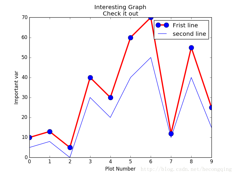
折线图:
import matplotlib.pyplot as plt
 y1=[10,13,5,40,30,60,70,12,55,25]
 x1=range(0,10)
 x2=range(0,10)
 y2=[5,8,0,30,20,40,50,10,40,15]
 plt.plot(x1,y1,label='Frist line',linewidth=3,color='r',marker='o',
 markerfacecolor='blue',markersize=12)
 plt.plot(x2,y2,label='second line')
 plt.xlabel('Plot Number')
 plt.ylabel('Important var')
 plt.title('Interesting Graph\nCheck it out')
 plt.legend()
 plt.show()
条形图
import matplotlib.pyplot as plt
y1=[10,13,5,40,30,60,70,12,55,25]
x1=range(0,20,2)
x2=range(1,21,2)
y2=[5,8,0,30,20,40,50,10,40,15]
plt.bar(x1,y1,label='Frist line')
#plt.bar(x2,y2,label='second line',color='r')
plt.xlabel('Plot Number')
plt.ylabel('Important var')
plt.title('Interesting Graph\nCheck it out')
plt.legend()
plt.show()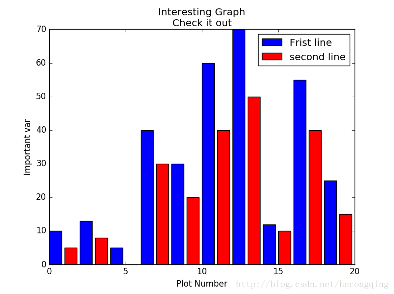
直方图:
import matplotlib.pyplot as plt
population_ages = [22,55,62,45,21,22,34,42,42,4,99,102,
                   110,120,121,122,130,111,115,112,80,75,
                   65,54,44,43,42,48]
x=range(0,130,10)
plt.hist(population_ages,x,rwidth=0.8,color='r',histtype='stepfilled')

plt.xlabel('Plot Number')
plt.ylabel('Important var')
plt.title('Interesting Graph\nCheck it out')
plt.legend()
plt.show()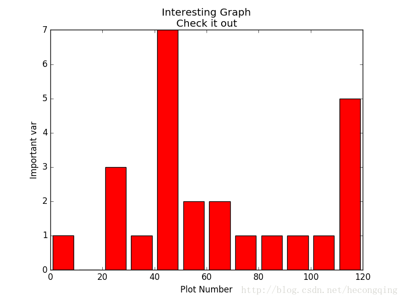
散点图:
import matplotlib.pyplot as plt
population_ages = [22,55,62,45,21,22,34,42,42,4,99,102,
                   110,120,121,122,130,111,115,112,80,75,
                   65,54,44,43,42,48]
x=range(0,len(population_ages))
plt.scatter(x,population_ages,label='frist label',s=20)
help(plt.scatter)
plt.xlabel('x')
plt.ylabel('y')
plt.title('Interesting Graph\nCheck it out')
plt.legend()
plt.show()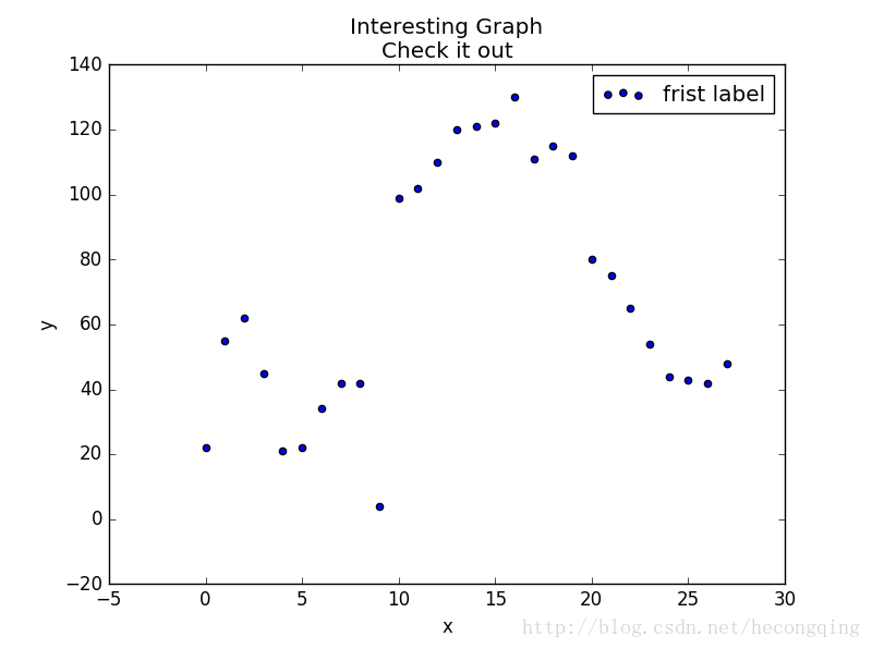


 8054
8054


 被折叠的 条评论
为什么被折叠?
被折叠的 条评论
为什么被折叠?
 到【灌水乐园】发言


