


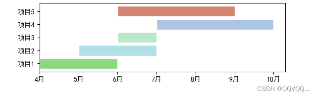
一、方式一
import matplotlib.pyplot as plt

plt.rcParams['font.sans-serif'] = ['SimHei']  # 替换sans-serif字体
plt.rcParams['axes.unicode_minus'] = False  # 解决坐标轴负数的负号显示问题

plt.barh(y=1, width=2, left=0, edgecolor='white', color='#8CD77F')
plt.barh(y=2, width=2, left=1, edgecolor='white', color='#B1DFE7')
plt.barh(y=3, width=1, left=2, edgecolor='white', color='#B9E9C8')
plt.barh(y=4, width=3, left=3, edgecolor='white', color='#AEC4E5')
plt.barh(y=5, width=3, left=2, edgecolor='white', color='#D28670')

# plt.text(1, 2, "AS00", verticalalignment="center", horizontalalignment="center")

plt.title("甘特图")  # 图形标题
# plt.xlabel("当前时间")  # x轴标签
# plt.ylabel("人员")  # y轴标签

# y轴坐标显示
plt.yticks([1, 2, 3, 4, 5], ['项目1', '项目2', '项目3', '项目4', '项目5'])
# x轴坐标显示
plt.xticks([0, 1, 2, 3, 4, 5, 6], ['4月', '5月', '6月', '7月', '8月', '9月', '10月'])

plt.show()
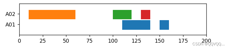
二、方式二
import matplotlib.pyplot as plt

fig, ax = plt.subplots()

# 设置xy轴的范围
ax.set_ylim(5, 35)
ax.set_xlim(0, 200)

# 更改y轴记号标签
ax.set_yticks([15, 25], labels=['A01', 'A02'])

# 设置条形数据
ax.broken_barh([(110, 30), (150, 10)], (10, 9), facecolors='tab:blue')
ax.broken_barh([(10, 50), (100, 20), (130, 10)], (20, 9), facecolors=('tab:orange', 'tab:green', 'tab:red'))

plt.show()
broken_barh(xranges, yrange, **kwargs)参数说明:
- xranges : (xmin, xwidth)元组构成的列表
矩形的x轴起点和宽度。每对(xmin,xwidth)将绘制一个从xmin到xmin+xwidth的矩形。
- yrange : (ymin, yheight)元组
所有矩形的y轴起点和高度。
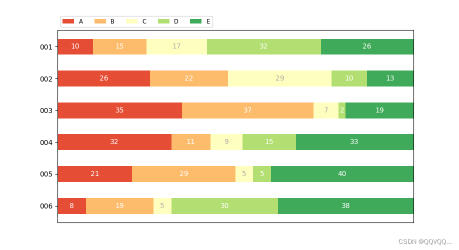
三、方式三
import numpy as np
import matplotlib.pyplot as plt


def survey(results, category_names):
    """
    Parameters
    ----------
    results : 字典
        案例的数据源,且字典值的长度与category_names对应
    category_names : 字符串列表
        每个种类的标签
    """
    labels = list(results.keys())
    data = np.array(list(results.values()))
    data_cum = data.cumsum(axis=1)
    category_colors = plt.colormaps['RdYlGn'](
        np.linspace(0.15, 0.85, data.shape[1]))

    fig, ax = plt.subplots(figsize=(9.2, 5))
    ax.invert_yaxis()
    ax.xaxis.set_visible(False)
    ax.set_xlim(0, np.sum(data, axis=1).max())

    for i, (colname, color) in enumerate(zip(category_names, category_colors)):
        widths = data[:, i]
        starts = data_cum[:, i] - widths
        rects = ax.barh(labels, widths, left=starts, height=0.5,
                        label=colname, color=color)

        r, g, b, _ = color
        text_color = 'white' if r * g * b < 0.5 else 'darkgrey'
        ax.bar_label(rects, label_type='center', color=text_color)
    ax.legend(ncol=len(category_names), bbox_to_anchor=(0, 1),
              loc='lower left', fontsize='small')

    return fig, ax

# 修改以下代码即可 #
#######################################################################

category_names = ['A', 'B', 'C', 'D', 'E']
results = {
    '001': [10, 15, 17, 32, 26],  # 列表为每个种类对应的长度
    '002': [26, 22, 29, 10, 13],
    '003': [35, 37, 7, 2, 19],
    '004': [32, 11, 9, 15, 33],
    '005': [21, 29, 5, 5, 40],
    '006': [8, 19, 5, 30, 38]
}
survey(results, category_names)
plt.show()

#######################################################################


 1327
1327

 被折叠的 条评论
为什么被折叠?
被折叠的 条评论
为什么被折叠?
 到【灌水乐园】发言


