


直方图
- 题目:

输出:
代码:
import numpy as np
import matplotlib.pyplot as plt
print(plt.style.available) # 打印图像风格
plt.style.use('seaborn-talk') # 设置图像风格
fig, ax = plt.subplots()
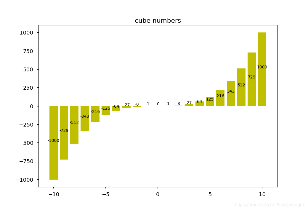
ax.set_title('cube numbers')
x = np.array([-10, -9, -8, -7, -6, -5, -4, -3, -2, -1, 0, 1, 2, 3, 4, 5, 6, 7, 8, 9, 10])
y = x*x*x
plt.bar(x, y, color='y')
for a, b in zip(x, y):
plt.text(a, b/2, '%d'%b, ha='center', va='bottom', fontsize=10)
plt.show()
- 题目:

输出:
代码:
import matplotlib.pyplot as plt
import random
plt.style.use('ggplot')
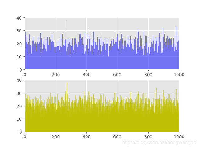
fig, ax = plt.subplots(ncols=1, nrows=2)
ax1, ax2 = ax.ravel()
# 创建20001个范围为0-1000的随机数
L = []
for i in range(20001):
L.append(random.randint(0, 1000))
# 用字典D1统计每个数值的个数,将每5作为一个数段,用字典D2统计每个数段的个数
D1, D2 = {}, {}
for i in L:
D1[i] = D1.get(i, 0) + 1 # 累加每个值的个数
D2[i/5*5] = D2.get(i/5*5, 0) + 1
# 利用直方图展示数据分布情况
ax1.axis([0, 1000, 0, 40]) # 设置x轴和y轴的最小和最大值
ax1.bar(D1.keys(), D1.values(), 1, alpha=0.5, color='b') # 第三个参数是宽度,第四个是透明度
ax2.axis([0, 1000, 0, 40])
ax2.bar(D2.keys(), D2.values(), 5, alpha=0.5, color='y')
plt.show()
- 题目:

输出:
代码:
import numpy as np
import matplotlib.pyplot as plt
fig, ax = plt.subplots()
plt.rcParams['font.sans-serif'] = ['SimHei'] # 添加对中文字体的支持
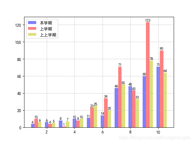
# 创建每个学生三个学期的排名
S1 = [4, 6, 8, 10, 11, 14, 46, 48, 60, 71]
S2 = [10, 4, 1, 8, 23, 34, 71, 43, 123, 90]
S3 = [6, 5, 7, 10, 25, 20, 50, 33, 78, 64]
x = np.arange(1, 11) # 生成横轴数据
plt.bar(x, S1, 0.25, alpha=0.5, color='b') # 生成本学期排名直方图,宽度为0.25
plt.bar(x+0.25, S2, 0.25, alpha=0.5, color='r')
plt.bar(x+0.5, S3, 0.25, alpha=0.5, color='y')
for a, b in zip(x, S1):
plt.text(a, b+0.2, '%d'%b, ha='center', va='bottom', fontsize=9)
for a, b in zip(x, S2):
plt.text(a+0.25, b+0.2, '%d'%b, ha='center', va='bottom', fontsize=9)
for a, b in zip(x, S3):
plt.text(a+0.5, b+0.2, '%d'%b, ha='center', va='bottom', fontsize=9)
plt.legend(['本学期', '上学期', '上上学期'], loc='upper left')
plt.grid(True, linestyle='--', alpha=0.8) # 设置网格线
plt.show()
线形图
- 题目:

输出:
代码:
import numpy as np
import matplotlib.pyplot as plt
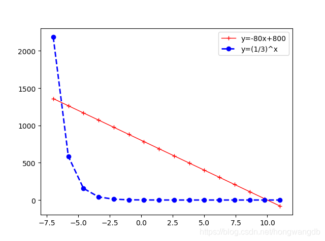
fig, ax = plt.subplots()
x = np.linspace(-7, 11, 16) # 在-7到11的区间内产生16个数据
y1 = -80*x + 800
y2 = (1/3)**x
plt.plot(x, y1, 'r+', color='red', linewidth=1.0, linestyle='-', label='line1')
plt.plot(x, y2, 'bo', color='blue', linewidth=2.0, linestyle='--', label='line2')
plt.xlim(-8, 12)
ax.legend(['y=-80x+800', 'y=(1/3)^x'], loc='upper right')
plt.show()
- 题目:
输出:
代码:
import numpy as np
import matplotlib.pyplot as plt
fig, ax = plt.subplots()
x = np.linspace(-5*np.pi, 5*np.pi, 512) # 生成从-5π到5π的512个数据
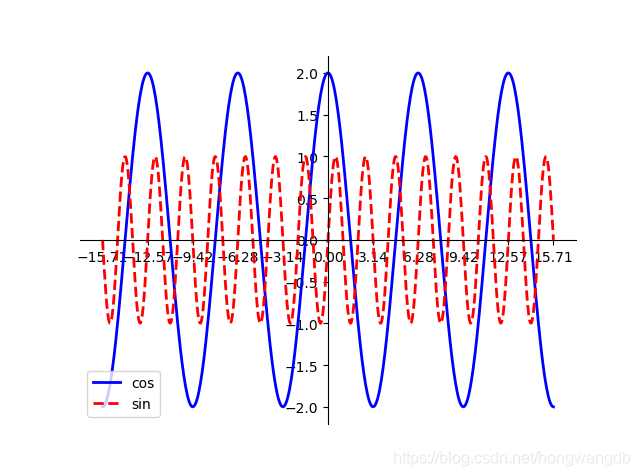
cos, sin = 2*np.cos(x), np.sin(3*x)
ax.set_xticks([-5*np.pi, -4*np.pi, -3*np.pi, -2*np.pi, -1*np.pi, 0, np.pi, 2*np.pi, 3*np.pi, 4*np.pi, 5*np.pi]) # 设置x轴刻度
plt.plot(x, cos, color='blue', linewidth=2.0, linestyle='-', label='cos')
plt.plot(x, sin, color='red', linewidth=2.0, linestyle='--', label='sin')
ax.spines['right'].set_visible(False) # 隐藏右边框
ax.spines['top'].set_visible(False)
ax.spines['left'].set_position(('data', 0)) # 设置左边框到x轴0的位置
ax.yaxis.set_ticks_position('left') # 刻度值设置在左侧
ax.spines['bottom'].set_position(('data', 0))
ax.xaxis.set_ticks_position('bottom')
ax.legend(['cos', 'sin'], loc='lower left')
plt.show()
- 题目:

输出:

代码:
		import pandas as pd
		import matplotlib.pyplot as plt
		import matplotlib.dates as dt

		# 求五个城市的以天为单位的雾霾数据
		df1 = pd.read_csv(r'BeijingPM.csv', encoding='gbk')
		df1['sum'] = df1[['PM_Dongsi', 'PM_Dongsihuan', 'PM_Nongzhanguan', 'PM_US Post']].sum(axis=1)
		df1['count'] = df1[['PM_Dongsi', 'PM_Dongsihuan', 'PM_Nongzhanguan', 'PM_US Post']].count(axis=1)
		df1['avg'] = round(df1['sum']/df1['count'], 2)
		df1 = df1.groupby(['year', 'month', 'day'], as_index=False).mean()

		df2 = pd.read_csv(r'GuangzhouPM.csv', encoding='gbk')
		df2['sum'] = df2[['PM_City Station', 'PM_5th Middle School', 'PM_US Post']].sum(axis=1)
		df2['count'] = df2[['PM_City Station', 'PM_5th Middle School', 'PM_US Post']].count(axis=1)
		df2['avg'] = round(df2['sum']/df2['count'], 2)
		df2 = df2.groupby(['year', 'month', 'day'], as_index=False).mean()

		df3 = pd.read_csv(r'ShenyangPM.csv', encoding='gbk')
		df3['sum'] = df3[['PM_Taiyuanjie', 'PM_US Post', 'PM_Xiaoheyan']].sum(axis=1)
		df3['count'] = df3[['PM_Taiyuanjie', 'PM_US Post', 'PM_Xiaoheyan']].count(axis=1)
		df3['avg'] = round(df3['sum']/df3['count'], 2)
		df3 = df3.groupby(['year', 'month', 'day'], as_index=False).mean()

		df4 = pd.read_csv(r'ShanghaiPM.csv', encoding='gbk')
		df4['sum'] = df4[['PM_Jingan', 'PM_US Post', 'PM_Xuhui']].sum(axis=1)
		df4['count'] = df4[['PM_Jingan', 'PM_US Post', 'PM_Xuhui']].count(axis=1)
		df4['avg'] = round(df4['sum']/df4['count'], 2)
		df4 = df4.groupby(['year', 'month', 'day'], as_index=False).mean()

		df5 = pd.read_csv(r'ChengduPM.csv', encoding='gbk')
		df5['sum'] = df5[['PM_Caotangsi', 'PM_Shahepu', 'PM_US Post']].sum(axis=1)
		df5['count'] = df5[['PM_Caotangsi', 'PM_Shahepu', 'PM_US Post']].count(axis=1)
		df5['avg'] = round(df5['sum']/df5['count'], 2)
		df5 = df5.groupby(['year', 'month', 'day'], as_index=False).mean()

		fig, ax = plt.subplots(figsize=(15, 8))
		plt.rcParams['font.sans-serif'] = ['SimHei']  # 添加对中文字体的支持

		# 时间坐标
		df1['date'] = list(df1['year'].map(str) + '-' + df1['month'].map(str) + '-' + df1['day'].map(str))
		df1['date'] = pd.to_datetime(df1['date'])
		ax.xaxis.set_major_formatter(dt.DateFormatter('%Y-%m-%d'))  # 设置x轴为时间格式

		plt.plot(df1['date'], df1['avg'], color='r')
		plt.plot(df1['date'], df2['avg'], color='g')
		plt.plot(df1['date'], df3['avg'], color='b')
		plt.plot(df1['date'], df4['avg'], color='m')
		plt.plot(df1['date'], df5['avg'], color='y')
		plt.gcf().autofmt_xdate()  # 自动旋转日期标记
		ax.legend(['北京', '广州', '沈阳', '上海', '成都'], loc='best')

		plt.show()
散点图
- 题目:

输出:

代码:
		import pandas as pd
		import matplotlib.pyplot as plt

		# 读取数据
		df = pd.read_csv('iris.csv')
		Species = df.Species.unique()  # 对类别去重
		l = len(Species)

		colors = ['b', 'y', 'g']  # 定义三种散点颜色
		fig, ax = plt.subplots(figsize=(14, 18))

		plt.subplot(4, 4, 1)
		for i in range(l):
		    plt.scatter(df.loc[df.Species == Species[i], 'Sepal.length'], df.loc[df.Species == Species[i], 'Sepal.width'], s=35, c=colors[i], label=Species[i])
		# plt.xlabel('Sepal.length')
		plt.ylabel('Sepal.width')
		plt.grid(True, linestyle='--', alpha=0.8)  # 设置网格线
		plt.legend(loc='lower right')

		plt.subplot(4, 4, 2)
		for i in range(l):
		    plt.scatter(df.loc[df.Species == Species[i], 'Sepal.length'], df.loc[df.Species == Species[i], 'Petal.Length'], s=35, c=colors[i], label=Species[i])
		# plt.xlabel('Sepal.length')
		plt.ylabel('Petal.Length')
		plt.grid(True, linestyle='--', alpha=0.8)
		plt.legend(loc='lower right')

		plt.subplot(4, 4, 3)
		for i in range(l):
		    plt.scatter(df.loc[df.Species == Species[i], 'Sepal.length'], df.loc[df.Species == Species[i], 'Petal.Width'], s=35, c=colors[i], label=Species[i])
		# plt.xlabel('Sepal.length')
		plt.ylabel('Petal.Width')
		plt.grid(True, linestyle='--', alpha=0.8)
		plt.legend(loc='lower right')

		plt.subplot(4, 4, 4)
		for i in range(l):
		    plt.scatter(df.loc[df.Species == Species[i], 'Sepal.length'], df.loc[df.Species == Species[i], 'Sepal.length'], s=35, c=colors[i], label=Species[i])
		# plt.xlabel('Sepal.length')
		plt.ylabel('Sepal.length')
		plt.grid(True, linestyle='--', alpha=0.8)
		plt.legend(loc='lower right')

		plt.subplot(4, 4, 5)
		for i in range(l):
		    plt.scatter(df.loc[df.Species == Species[i], 'Sepal.width'], df.loc[df.Species == Species[i], 'Sepal.length'], s=35, c=colors[i], label=Species[i])
		# plt.xlabel('Sepal.width')
		plt.ylabel('Sepal.length')
		plt.grid(True, linestyle='--', alpha=0.8)
		plt.legend(loc='lower right')

		plt.subplot(4, 4, 6)
		for i in range(l):
		    plt.scatter(df.loc[df.Species == Species[i], 'Sepal.width'], df.loc[df.Species == Species[i], 'Petal.Length'], s=35, c=colors[i], label=Species[i])
		# plt.xlabel('Sepal.width')
		plt.ylabel('Petal.Length')
		plt.grid(True, linestyle='--', alpha=0.8)
		plt.legend(loc='lower right')

		plt.subplot(4, 4, 7)
		for i in range(l):
		    plt.scatter(df.loc[df.Species == Species[i], 'Sepal.width'], df.loc[df.Species == Species[i], 'Sepal.width'], s=35, c=colors[i], label=Species[i])
		# plt.xlabel('Sepal.width')
		plt.ylabel('Sepal.width')
		plt.grid(True, linestyle='--', alpha=0.8)
		plt.legend(loc='lower right')

		plt.subplot(4, 4, 8)
		for i in range(l):
		    plt.scatter(df.loc[df.Species == Species[i], 'Sepal.width'], df.loc[df.Species == Species[i], 'Petal.Width'], s=35, c=colors[i], label=Species[i])
		# plt.xlabel('Sepal.width')
		plt.ylabel('Petal.Width')
		plt.grid(True, linestyle='--', alpha=0.8)
		plt.legend(loc='lower right')

		plt.subplot(4, 4, 9)
		for i in range(l):
		    plt.scatter(df.loc[df.Species == Species[i], 'Petal.Length'], df.loc[df.Species == Species[i], 'Petal.Width'], s=35, c=colors[i], label=Species[i])
		# plt.xlabel('Petal.Length')
		plt.ylabel('Petal.Width')
		plt.grid(True, linestyle='--', alpha=0.8)
		plt.legend(loc='lower right')

		plt.subplot(4, 4, 10)
		for i in range(l):
		    plt.scatter(df.loc[df.Species == Species[i], 'Petal.Length'], df.loc[df.Species == Species[i], 'Petal.Length'], s=35, c=colors[i], label=Species[i])
		# plt.xlabel('Petal.Length')
		plt.ylabel('Petal.Length')
		plt.grid(True, linestyle='--', alpha=0.8)
		plt.legend(loc='lower right')

		plt.subplot(4, 4, 11)
		for i in range(l):
		    plt.scatter(df.loc[df.Species == Species[i], 'Petal.Length'], df.loc[df.Species == Species[i], 'Sepal.length'], s=35, c=colors[i], label=Species[i])
		# plt.xlabel('Petal.Length')
		plt.ylabel('Sepal.length')
		plt.grid(True, linestyle='--', alpha=0.8)
		plt.legend(loc='lower right')

		plt.subplot(4, 4, 12)
		for i in range(l):
		    plt.scatter(df.loc[df.Species == Species[i], 'Petal.Length'], df.loc[df.Species == Species[i], 'Sepal.width'], s=35, c=colors[i], label=Species[i])
		# plt.xlabel('Petal.Length')
		plt.ylabel('Sepal.width')
		plt.grid(True, linestyle='--', alpha=0.8)
		plt.legend(loc='lower right')

		plt.subplot(4, 4, 13)
		for i in range(l):
		    plt.scatter(df.loc[df.Species == Species[i], 'Petal.Width'], df.loc[df.Species == Species[i], 'Petal.Width'], s=35, c=colors[i], label=Species[i])
		# plt.xlabel('Petal.Width')
		plt.ylabel('Petal.Width')
		plt.grid(True, linestyle='--', alpha=0.8)
		plt.legend(loc='lower right')

		plt.subplot(4, 4, 14)
		for i in range(l):
		    plt.scatter(df.loc[df.Species == Species[i], 'Petal.Width'], df.loc[df.Species == Species[i], 'Petal.Length'], s=35, c=colors[i], label=Species[i])
		# plt.xlabel('Petal.Width')
		plt.ylabel('Petal.Length')
		plt.grid(True, linestyle='--', alpha=0.8)
		plt.legend(loc='lower right')

		plt.subplot(4, 4, 15)
		for i in range(l):
		    plt.scatter(df.loc[df.Species == Species[i], 'Petal.Width'], df.loc[df.Species == Species[i], 'Sepal.width'], s=35, c=colors[i], label=Species[i])
		# plt.xlabel('Petal.Width')
		plt.ylabel('Sepal.width')
		plt.grid(True, linestyle='--', alpha=0.8)
		plt.legend(loc='lower right')

		plt.subplot(4, 4, 16)
		for i in range(l):
		    plt.scatter(df.loc[df.Species == Species[i], 'Petal.Width'], df.loc[df.Species == Species[i], 'Sepal.length'], s=35, c=colors[i], label=Species[i])
		# plt.xlabel('Petal.Width')
		plt.ylabel('Sepal.length')
		plt.grid(True, linestyle='--', alpha=0.8)
		plt.legend(loc='lower right')

		plt.show()
饼图
- 题目:

输出:

代码:
		import matplotlib.pyplot as plt
		import matplotlib
		from matplotlib import font_manager as fm

		matplotlib.rcParams['font.sans-serif'] = ['SimHei']  # 支持中文细黑体

		label_list = ['保送外校读研', '保送本校读研', '本校硕博连读', '家里蹲', '考研', '出国']  # 各部分标签
		size = [10, 8, 6, 6, 5, 3]  # 各部分人数
		explode = [0, 0, 0.1, 0, 0, 0.2]  # 各部分突出显示比例
		patches, texts, autotexts = plt.pie(size, explode=explode, labels=label_list, labeldistance=1.2, autopct='%1.2f%%', shadow=True, startangle=90, pctdistance=0.7)

		# 调整字体大小
		proptease = fm.FontProperties()
		proptease.set_size('xx-large')
		plt.setp(texts, fontproperties=proptease)
		plt.setp(autotexts, fontproperties=proptease)

		plt.show()
地图
- 题目:

输出:

代码:
		from pyecharts import options as opts
		from pyecharts.charts import Map
		import pandas as pd

		df = pd.read_csv(r'data.csv', encoding='gbk')  # 先删除文件第一行
		df['大学数量'] = df[['211&985大学数量', '公办本科大学数量']].sum(axis=1)

		def map() -> Map:
		    c = (Map().add('各省大学数量', [list(z) for z in zip(df['省/市'], df['大学数量'])], 'china').set_global_opts(title_opts=opts.TitleOpts(title='Map(连续型)'), visualmap_opts=opts.VisualMapOpts(min_=3, max_=90)).set_series_opts(label_opts=opts.LabelOpts(is_show=True)))
		    return c

		map().render('9-output.html')
- 题目:

输出:

代码:
		from pyecharts.charts import Geo
		from pyecharts import options as opts
		from pyecharts.globals import ChartType
		from pyecharts.render import make_snapshot
		from snapshot_phantomjs import snapshot
		import random

		class Data:
		    L = ['长春市', '吉林市', '四平市', '辽源市', '通化市', '松原市', '白山市', '白城市', '延边朝鲜族自治州']
		    def values(start: int = 10, end: int = 26) -> list:
		        return [random.randint(start, end) for _ in range(9)]

		def geo_jilin(title) -> Geo:
		    c = (Geo().add_schema(maptype='吉林').add(title, [list(z) for z in zip(Data.L, Data.values())], type_=ChartType.HEATMAP).set_global_opts(visualmap_opts=opts.VisualMapOpts(max_=26, is_piecewise=True), title_opts=opts.TitleOpts(title='吉林省10月份各地市温度变化情况')))
		    return c

		for i in range(11):
		    date = '10月' + str(i+1) + '日'
		    make_snapshot(snapshot, geo_jilin(date).render(), str(i+1)+'.png', pixel_ratio=1)
		# 最后用在线工具将这些图片合成gif
三维图
1. 三维直方图
输出:

代码:
from mpl_toolkits.mplot3d import Axes3D
import matplotlib.pyplot as plt
import numpy as np
fig = plt.figure()
ax = fig.add_subplot(111, projection='3d')
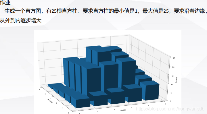
x = [0.5, 1.5, 2.5, 3.5, 4.5,
0.5, 1.5, 2.5, 3.5, 4.5,
0.5, 1.5, 2.5, 3.5, 4.5,
0.5, 1.5, 2.5, 3.5, 4.5,
0.5, 1.5, 2.5, 3.5, 4.5]
y = [0.5, 0.5, 0.5, 0.5, 0.5,
1.5, 1.5, 1.5, 1.5, 1.5,
2.5, 2.5, 2.5, 2.5, 2.5,
3.5, 3.5, 3.5, 3.5, 3.5,
4.5, 4.5, 4.5, 4.5, 4.5]
z = [1, 2, 3, 4, 5,
16, 17, 18, 19, 6,
15, 24, 25, 20, 7,
14, 23, 22, 21, 8,
13, 12, 11, 10, 9]
# 长宽高
dx = 0.7*np.ones_like(x)
dy = dx.copy()
dz = z.copy()
z = np.zeros_like(z)
# 设置三个维度的标签
ax.set_xlabel('X Label')
ax.set_ylabel('Y Label')
ax.set_zlabel('Z Label')
ax.bar3d(x, y, z, dx, dy, dz, color='b', zsort='average')
plt.show()
2. 三维折线图
输出:

代码:
		from mpl_toolkits.mplot3d import Axes3D
		import matplotlib.pyplot as plt

		fig = plt.figure(figsize=(15, 8))
		# 坐标
		x1 = [-1, 0, 1, 1, 1, 0, -1, -1, -1]
		y1 = [-1, -1, -1, 0, 1, 1, 1, 0, -1]
		z1 = [0, 0, 0, 0, 0, 0, 0, 0, 0]
		x2 = [-1, 0, 1]
		y2 = [-1, 0, 1]
		z2 = [0, 1, 0]
		x3 = [-1, 0, 1]
		y3 = [1, 0, -1]
		z3 = [0, 1, 0]
		x4 = [-1, 0, 1]
		y4 = [-1, 0, 1]
		z4 = [0, -1, 0]
		x5 = [-1, 0, 1]
		y5 = [1, 0, -1]
		z5 = [0, -1, 0]

		# 图1
		ax1 = fig.add_subplot(121, projection='3d')
		ax1.set_xlabel('X Label')
		ax1.set_ylabel('Y Label')
		ax1.set_zlabel('Z Label')
		ax1.plot(x1, y1, z1, color='r', linestyle='-')
		ax1.plot(x2, y2, z2, color='r', linestyle='-')
		ax1.plot(x3, y3, z3, color='r', linestyle='-')

		# 图2
		ax2 = fig.add_subplot(122, projection='3d')
		ax2.set_xlabel('X Label')
		ax2.set_ylabel('Y Label')
		ax2.set_zlabel('Z Label')
		ax2.plot(x1, y1, z1, color='r', linestyle='-')
		ax2.plot(x2, y2, z2, color='r', linestyle='-')
		ax2.plot(x3, y3, z3, color='r', linestyle='-')
		ax2.plot(x4, y4, z4, color='b', linestyle='-')
		ax2.plot(x5, y5, z5, color='b', linestyle='-')

		plt.show()
3. 三维散点图
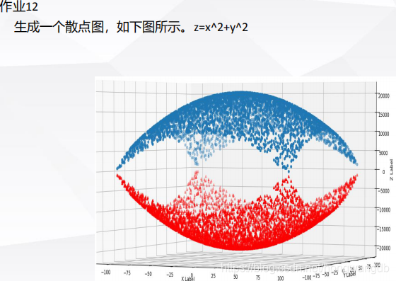
输出:

代码:
		from mpl_toolkits.mplot3d import Axes3D
		import matplotlib.pyplot as plt
		import numpy as np

		fig = plt.figure(figsize=(9, 8))
		ax = fig.add_subplot(111, projection='3d')

		ax.set_xlabel('X Label')
		ax.set_ylabel('Y Label')
		ax.set_zlabel('Z Label')

		x = np.arange(-100, 100, 5.5)
		y = np.arange(-100, 100, 5.5)
		X, Y = np.meshgrid(x, y)  # 生成绘制3维图形所用数据
		Z = X**2+Y**2

		ax.scatter(X, Y, Z-20000, marker='^', color='r')
		ax.scatter(X, Y, 20000-Z, marker='o', color='b')

		plt.show()
任意画四个三维图形
输出:

代码:
		from matplotlib.collections import PolyCollection as pc
		from mpl_toolkits.mplot3d import Axes3D
		import matplotlib.pyplot as plt
		from matplotlib import colors as mc
		from matplotlib import cm
		import numpy as np

		fig = plt.figure(figsize=(12, 10))
		# 子图1
		ax1 = fig.add_subplot(221, projection='3d')
		t = np.arange(-100, 100, 0.1)
		x = np.sin(4*t)
		y = 2*np.sin(2*t)
		z = np.cos(3*t)
		ax1.scatter(x, y, z, color='r')
		# 子图2
		ax2 = fig.add_subplot(222, projection='3d')
		x = np.arange(-8, 8, 0.2)
		y = np.arange(-8, 8, 0.2)
		X, Y = np.meshgrid(x, y)
		Z = np.sin(0.8*np.sqrt(X**2+Y**2))
		ax2.plot_surface(X, Y, Z, rstride=1, cstride=1, linewidth=0, color='pink', antialiased=False)
		# 子图3
		ax3 = fig.add_subplot(223, projection='3d')
		t = np.linspace(0, 2*np.pi, 66)
		s = np.linspace(0, np.pi, 66)
		x = np.outer(np.cos(t), np.sin(s))
		y = np.outer(np.sin(t), np.cos(s))
		z = np.outer(np.ones(np.size(t)), np.cos(s))
		ax3.plot_surface(x, y, z, cmap=cm.coolwarm, linewidth=0, antialiased=False)
		# 子图4
		ax4 = fig.add_subplot(224, projection='3d')
		L = []
		x = np.arange(0, 5, 0.2)
		for i in range(4):
		    k = len(x)
		    y = np.random.rand(k)
		    y[0], y[-1] = 0, 0
		    L.append(list(zip(x, y)))
		PC = pc(L, facecolors=[mc.to_rgba('g', alpha=0.5), mc.to_rgba('r', alpha=0.5), mc.to_rgba('b', alpha=0.5), mc.to_rgba('y', alpha=0.5)])
		PC.set_alpha(0.6)
		z = [0.0, 1.0, 2.0, 3.0]
		ax4.add_collection3d(PC, zs=z, zdir='y')
		ax4.set_xlim3d(0, 5)
		ax4.set_ylim3d(-1, 4)
		ax4.set_zlim3d(0, 1)

		plt.show()


 511
511

 被折叠的 条评论
为什么被折叠?
被折叠的 条评论
为什么被折叠?
 到【灌水乐园】发言


