


场景一:反向进度条
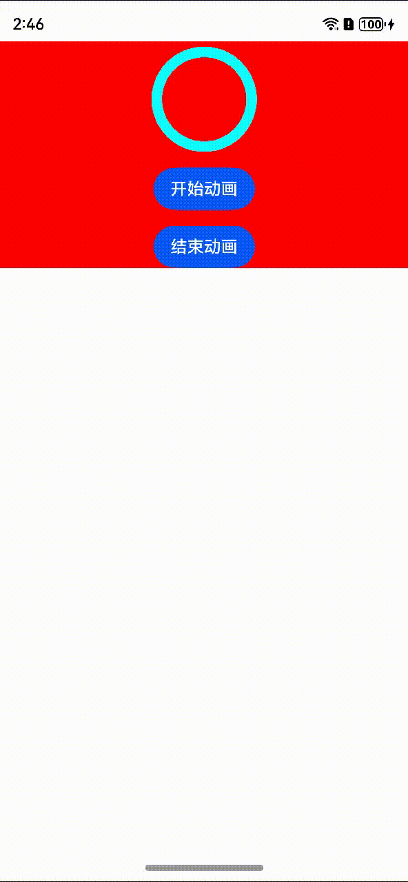
效果
倒计时样式的进度条
方案
注意:这个Progress组件最常见的是和通用属性rotate一起使用,除了上图这种逆向倒计时,还有那种类似于温度计(从下到上加载)的效果,全都是利用rotate。
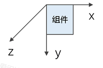
ArkUI中组件的方向轴示意图:
一般而言,我们的Progress组件都是顺时针从0→100加载的。
1.Progress组件从100→0加载。
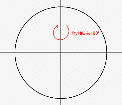
2.把这个圆形Progress按照y轴旋转180°,也就是想象一枚硬币翻转一面的样子。
核心代码
@Component
export struct ReverseProgress {
  @State progressValue: number = 100
  @State animationId: number | null = null
  build() {
    NavDestination() {
      Column({ space: 15 }) {
        Progress({ value: 0, total: 100, type: ProgressType.Ring })
          .color('#A97CF9')
          .value(this.progressValue)
          .width(100)
          .style({
            strokeWidth: 10,
            scaleCount: 20,
            scaleWidth: 5,
            enableSmoothEffect: true
          })
          .backgroundColor(Color.White)
          .rotate({
            x: 0,
            y: 1,
            z: 0,
            centerX: '50%',
            centerY: '50%',
            angle: 180
          })
        Button('开始动画')
          .onClick(() => {
            if (this.animationId === null) {
              this.animationId = setInterval(() => {
                this.progressValue--
                if (this.progressValue == 0) {
                  this.progressValue = 100
                }
              }, 10)
            }
            console.log(this.animationId.toString())
          })
        Button('结束动画').onClick(() => {
          clearInterval(this.animationId)
          this.animationId = null
          this.progressValue = 100
        })
      }.width('100%').padding({ top: 5 }).backgroundColor(Color.Red)
    }

  }
}
场景二:自定义电池电量的显示
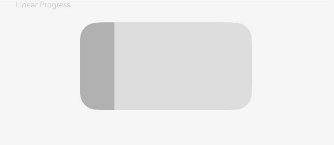
效果
方案
clip(value: boolean | CircleAttribute | EllipseAttribute | PathAttribute | RectAttribute)
按指定的形状对当前组件进行裁剪。
卡片能力: 从API version 9开始,该接口支持在ArkTS卡片中使用。
系统能力: SystemCapability.ArkUI.ArkUI.Full
参数:
| 参数名 | 类型 | 必填 | 说明 |
| value | boolean | CircleAttribute | EllipseAttribute | PathAttribute | RectAttribute | 是 | 参数为相应类型的组件,按指定的形状对当前组件进行裁剪;参数为boolean类型时,设置是否按照父容器边缘轮廓进行裁剪。默认值:false |
在使用Progress的时候要注意像如上场景中的电池型的进度条,中间的进度条是横线,而我们的这个组件Linear类型中进度条默认是带有弧度的,若要改变其边角半径就要使用clip属性,而大多数开发者往往会忽略这一点,注意使用Progress组件的时候一定要使用clip属性。
核心代码
@Component
export struct ClipProgress {
  build() {
    NavDestination() {
      Column({ space: 15 }) {
        Text('Linear Progress').fontSize(9).fontColor(0xCCCCCC).width('90%')
        Progress({ value: 20, total: 100, type: ProgressType.Linear })
          .width(200)
          .backgroundColor('#DDDDDD')
          .style({ strokeRadius: 0, strokeWidth: 100, })
          .color('#B1B1B1')
          .borderColor('#00000000')
          .borderRadius(20)
          .clip(true)
      }.width('100%').height('100%').margin({ top: 30 }).backgroundColor('#F6F6F6')
    }
  }
}
场景三:扇形圆弧进度条
效果
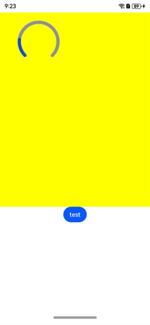
方案
场景一和场景二是可以用progress组件配合其他属性来实现,但是有的不行,例如互联网运营商的app中的流量码表,这种建议不使用progress,使用canvas来自己绘制,具体实现代码如下。
核心代码
@Component
export struct WidgetsProgress {
  private settings: RenderingContextSettings = new RenderingContextSettings(true)
  private context: CanvasRenderingContext2D = new CanvasRenderingContext2D(this.settings)
  private offCanvas: OffscreenCanvas = new OffscreenCanvas(600, 600)
  @State @Watch('onCountUpdated') radianTest: number = 0
  @State color: string = '#ff8c909b'

  onCountUpdated(): void {
    this.canvasTest()
  }

  canvasTest = (): void => {
    let offContext = this.offCanvas.getContext('2d', this.settings)
    offContext.lineCap = 'round'
    offContext.lineWidth = 8
    offContext.beginPath()
    offContext.arc(
      100,
      75,
      50,
      (225 - 90) * Math.PI / 180,
      (135 - 90) * Math.PI / 180
    )
    offContext.strokeStyle = '#ff8c909b'
    offContext.stroke()

    offContext.beginPath()
    offContext.arc(
      100,
      75,
      50,
      (225 - 90) * (Math.PI / 180),
      this.radianTest === 0 ? (135 - 90) * (Math.PI / 180) : (135 - 270 * (1 - this.radianTest) - 90) * (Math.PI / 180),
    )
    offContext.strokeStyle = this.color
    offContext.stroke()
    let image = this.offCanvas.transferToImageBitmap()
    this.context.transferFromImageBitmap(image)
  }

  build() {
    NavDestination() {
      Column() {
        Canvas(this.context)
          .width('100%')
          .height('100%')
          .backgroundColor('#ffff00')
          .onReady(
            this.canvasTest
          )

        Button('test')
          .onClick(() => {
            this.color = '#ff144cd2'
            this.radianTest = Number(this.radianTest + 0.01)
            if (this.radianTest > 1) {
              this.radianTest = 0
            }
          })
      }
      .width('100%')
      .height(500)
    }
  }
}
常见问题
1.progress有没有设置速度的属性?
暂时没有。
2.progress为什么有些类型设置渐变色生效有些不生效?
目前progress组件只支持ring类型的渐变色,其它类型暂不支持。


 2826
2826

 被折叠的 条评论
为什么被折叠?
被折叠的 条评论
为什么被折叠?
 到【灌水乐园】发言


