纯CSS3实现滑动开关效果

35 篇文章 0 订阅

实现效果如下:


HTML结构代码:
<label class="ui-switch">
      <input type="checkbox" checked="">
</label>


CSS代码:
/*表单开关样式*/
.ui-switch {
    position: absolute;
    font-size: .16rem;
    right:0.07rem;
    top: 50%;
    margin-top: -0.16rem;
    width: .7rem;
    height: .3rem;
    line-height: .3rem;
}
.ui-switch input {
    width: .7rem;
    height: .3rem;
    position: absolute;
    top: 0;left: 0;  
    z-index: 2;
    border: 0;
    background: 0 0;
    -webkit-appearance: none;
    outline: 0
}
.ui-switch input:before {
    content: '';
    width: .68rem;
    height: .3rem;
    border: 1px solid #dfdfdf;
    background-color: #fdfdfd;
    border-radius: .2rem;
    cursor: pointer;
    display: inline-block;
    position: relative;
    vertical-align: middle;
    -webkit-box-sizing: content-box;
    box-sizing: content-box;
    border-color: #dfdfdf;
    -webkit-box-shadow: #dfdfdf 0 0 0 0 inset;
    box-shadow: #dfdfdf 0 0 0 0 inset;
    -webkit-transition: border .4s,-webkit-box-shadow .4s;
    transition: border .4s,box-shadow .4s;
    -webkit-background-clip: content-box;
    background-clip: content-box
}

.ui-switch input:checked:before {
    border-color: #64bd63;
    -webkit-box-shadow: #64bd63 0 0 0 0.16rem inset;
    box-shadow: #64bd63 0 0 0 0.16rem inset;
    background-color: #64bd63;
    transition: border .4s,box-shadow .4s,background-color 1.2s;
    -webkit-transition: border .4s,-webkit-box-shadow .4s,background-color 1.2s;
    background-color: #64bd63
}
.ui-switch input:checked:after {
    left: .4rem
}
.ui-switch input:after {
    content: '';
    width:.3rem;
    height: .3rem;
    position: absolute;
    top: 50%;
    left: 0;
    -webkit-transform:translateY(-50%);
    border-radius: 100%;
    background-color: #fff;
    -webkit-box-shadow: 0 0.01rem 0.03rem rgba(0,0,0,.4);
    box-shadow: 0 0.01rem 0.03rem rgba(0,0,0,.4);
    -webkit-transition: left .2s;
    transition: left .2s
}


  • 1
    点赞
  • 8
    收藏
    觉得还不错? 一键收藏
  • 4
    评论
可以使用CSS3中的伪类和过渡属性来实现滑动按钮的效果。以下是一个简单的实现示例: HTML代码: ```html <label class="switch"> <input type="checkbox"> <span class="slider"></span> </label> ``` CSS代码: ```css .switch { position: relative; display: inline-block; width: 60px; height: 34px; } .switch input[type="checkbox"] { display: none; } .slider { position: absolute; cursor: pointer; top: 0; left: 0; right: 0; bottom: 0; background-color: #ccc; transition: .4s; } .slider:before { position: absolute; content: ""; height: 26px; width: 26px; left: 4px; bottom: 4px; background-color: white; transition: .4s; } input:checked + .slider { background-color: #2196F3; } input:focus + .slider { box-shadow: 0 0 1px #2196F3; } input:checked + .slider:before { transform: translateX(26px); } .slider.round { border-radius: 34px; } .slider.round:before { border-radius: 50%; } ``` 解释: - `.switch`类设置了开关按钮的基本样式,包括宽高、定位等。 - `input[type="checkbox"]`选择器隐藏了原生的复选框。 - `.slider`类设置了按钮的背景色、过渡效果等。 - `.slider:before`伪类设置了按钮内部的小圆点,以及其过渡效果。 - `input:checked + .slider`选择器设置了按钮选中时的背景色。 - `input:focus + .slider`选择器设置了按钮获取焦点时的阴影效果。 - `input:checked + .slider:before`选择器设置了按钮选中时,内部小圆点的位移效果。 - `.slider.round`和`.slider.round:before`类用于设置圆形按钮的样式,可根据需要选择使用。 这样就可以实现一个简单的滑动按钮效果了。

“相关推荐”对你有帮助么?

  • 非常没帮助
  • 没帮助
  • 一般
  • 有帮助
  • 非常有帮助
提交
评论 4
添加红包

请填写红包祝福语或标题

红包个数最小为10个

红包金额最低5元

当前余额3.43前往充值 >
需支付:10.00
成就一亿技术人!
领取后你会自动成为博主和红包主的粉丝 规则
hope_wisdom
发出的红包
实付
使用余额支付
点击重新获取
扫码支付
钱包余额 0

抵扣说明:

1.余额是钱包充值的虚拟货币,按照1:1的比例进行支付金额的抵扣。
2.余额无法直接购买下载,可以购买VIP、付费专栏及课程。
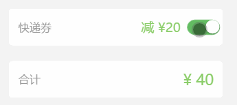
余额充值