


源码介绍
闪动文字动态效果404单页源码,将源码放到空白的404.html里面即可,上传到服务器设置好重定向就可以使用了,喜欢的同学拿去使用吧
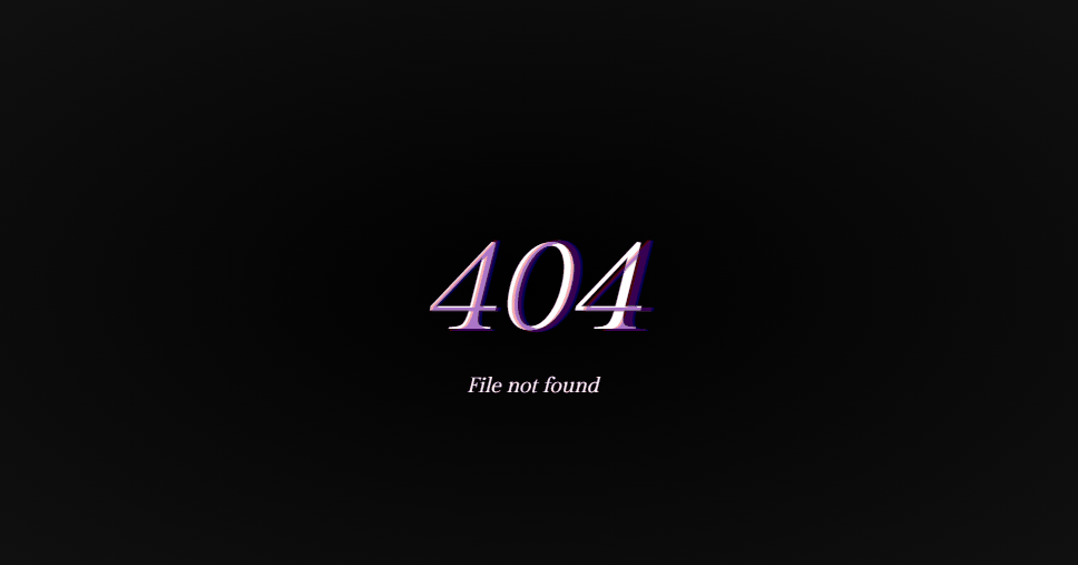
效果预览
完整源码
<!DOCTYPE html>
<html>
	<head>
		<meta charset="utf-8">
		<title>Glitchy 404 Page</title>
		<style>@import url(https://fonts.googleapis.com/css?family=Gilda+Display);

html {
  background: radial-gradient(#000, #111);
  color: white;
  overflow: hidden;
  height: 100%;
  user-select: none;
}

.static {
  width: 100%;
  height: 100%;
  position: relative;
  margin: 0;
  padding: 0;
  top: -100px;
  opacity: 0.05;
  z-index: 230;
  user-select: none;
  user-drag: none;
}

.error {
  text-align: center;
  font-family: 'Gilda Display', serif;
  font-size: 95px;
  font-style: italic;
  text-align: center;
  width: 100px;
  height: 60px;
  line-height: 60px;
  margin: auto;
  position: absolute;
  top: 0;
  bottom: 0;
  left: -60px;
  right: 0;
  animation: noise 2s linear infinite;
  overflow: default;
}

.error:after {
  content: '404';
  font-family: 'Gilda Display', serif;
  font-size: 100px;
  font-style: italic;
  text-align: center;
  width: 150px;
  height: 60px;
  line-height: 60px;
  margin: auto;
  position: absolute;
  top: 0;
  bottom: 0;
  left: 0;
  right: 0;
  opacity: 0;
  color: blue;
  animation: noise-1 .2s linear infinite;
}

.info {
  text-align: center;
  font-family: 'Gilda Display', serif;
  font-size: 15px;
  font-style: italic;
  text-align: center;
  width: 200px;
  height: 60px;
  line-height: 60px;
  margin: auto;
  position: absolute;
  top: 140px;
  bottom: 0;
  left: 0;
  right: 0;
  animation: noise-3 1s linear infinite;
}

.error:before {
  content: '404';
  font-family: 'Gilda Display', serif;
  font-size: 100px;
  font-style: italic;
  text-align: center;
  width: 100px;
  height: 60px;
  line-height: 60px;
  margin: auto;
  position: absolute;
  top: 0;
  bottom: 0;
  left: 0;
  right: 0;
  opacity: 0;
  color: red;
  animation: noise-2 .2s linear infinite;
}

@keyframes noise-1 {
  0%, 20%, 40%, 60%, 70%, 90% {opacity: 0;}
  10% {opacity: .1;}
  50% {opacity: .5; left: -6px;}
  80% {opacity: .3;}
  100% {opacity: .6; left: 2px;}
}

@keyframes noise-2 {
  0%, 20%, 40%, 60%, 70%, 90% {opacity: 0;}
  10% {opacity: .1;}
  50% {opacity: .5; left: 6px;}
  80% {opacity: .3;}
  100% {opacity: .6; left: -2px;}
}

@keyframes noise {
  0%, 3%, 5%, 42%, 44%, 100% {opacity: 1; transform: scaleY(1);}
  4.3% {opacity: 1; transform: scaleY(1.7);}
  43% {opacity: 1; transform: scaleX(1.5);}
}

@keyframes noise-3 {
  0%,3%,5%,42%,44%,100% {opacity: 1; transform: scaleY(1);}
  4.3% {opacity: 1; transform: scaleY(4);}
  43% {opacity: 1; transform: scaleX(10) rotate(60deg);}
}</style>
	</head>
	<!--QQ沐编程 www.qqmu.com 学习QQ群:290987565   -->
	<body>
		<div class="error">404</div>
		<br/><br/>
		<span class="info">File not found</span>
		<img src="http://images2.layoutsparks.com/1/160030/too-much-tv-static.gif" class="static" />
	</body>
</html>


 2255
2255


 被折叠的 条评论
为什么被折叠?
被折叠的 条评论
为什么被折叠?
 到【灌水乐园】发言


