


目录
一、轮播组件 Swiper
@Entry
@Component
struct PageSwiper {
  @State message: string = 'Hello World'
  private SwCon: SwiperController = new SwiperController()

  build() {
    Column() {
      Swiper(this.SwCon) {
        Text("龙").backgroundColor(Color.Red).textStyle()
        Text("兔").backgroundColor(Color.Yellow).textStyle()
        Text("神").backgroundColor(Color.Orange).textStyle()
      }
      // .autoPlay(true)
      .interval(2000)
      .indicatorStyle({
        color: Color.White,
        selectedColor: Color.Pink,
        size: 20
      }).onChange(index=>{
        console.log(`${index}`)
      })
      // .vertical(true)
      Row() {
        Button("上一个").onClick(v => {
          this.SwCon.showPrevious();
        }).margin({ top: 10, right: 10 })
        Button("下一个").onClick(v => {
          this.SwCon.showNext()
        }).margin({ left: 10, top: 10 })
      }.width("100%").justifyContent(FlexAlign.Center)

    }
    .height('100%')
  }
}

@Extend(Text) function textStyle() {
  .width("100%").height(200)
}
二、列表-List
列表是一种复杂的容器,当列表项达到一定数量,内容超过屏幕大小时,可以自动提供滚动功能。它适合用于呈现同类数据类型或数据类型集,例如图片和文本。在列表中显示数据集合是许多应用程序中的常见要求(如通讯录.音乐列表、购物清单等)。
ListltemGroup用于列表数据的分组展示,其子组件也是Listltem。Listltem表示单个列表项,可以包含单个子组件。
1、简单的List
@Entry
@Component
struct PageList {
  @State message: string = 'Hello World'
  @State list: string[] = ["子(鼠)", "丑(牛)", "寅(虎)", "卯(兔)"
    , "辰(龙)", "巳(蛇)", "午(马)", "未(羊)", "申(猴)", "酉(鸡)", "戌(狗)", "亥(猪)"]
  ScrollList: Scroller = new Scroller()
  @State isNoBottom:boolean=true;

  build() {
    Row() {
      Column() {
        List({ scroller: this.ScrollList }) {
          ForEach(this.list, (item, index) => {
            ListItem() {
              Text(item).fontSize(25)
            }
            .height(100)
            .width("100%")
            .backgroundColor(Color.Pink)
            .align(Alignment.Center) //控制item的字体位置
            .margin({ top: 10 })
            .swipeAction({ //侧滑删除的样式
              end: this.Delete(index)
            })
          })
        }.width("100%").height("50%").backgroundColor(Color.Gray)
        // .listDirection(Axis.Horizontal)//控制滑动的方向
        .alignListItem(ListItemAlign.Center) //控制list内部的位置
        .onScrollIndex((star,end)=>{

          if(this.list.length-1===end&&this.isNoBottom){
            this.isNoBottom=false
            console.log(end+"---------------到底了")
          }
        })

        Button("回顶部").onClick(v => {
          this.ScrollList.scrollToIndex(0)
        }).margin({top:10})
      }
      .height('100%').width('100%').justifyContent(FlexAlign.Center)
    }.height('100%')
  }

  @Builder
  Delete(index: number) {
    Text("删除")
      .backgroundColor(Color.Orange)
      .height(100)
      .width(80)
      .textAlign(TextAlign.Center)
      .fontSize(26)
      .fontColor(Color.Grey)
      .onClick(v => {
        this.list.splice(index, 1)
      })
  }
}
2、嵌套的List
@Entry
@Component
struct PageList2 {
  @State message: string = 'Hello World'
  @State cityList: Object[] =
    [{ type: "A", name: ["安顺", "安庆", "安康"] }, { type: "B", name: ["北京", "北大荒", "保定"] }, { type: "C", name: ["长春", "长安", "长冶"] }]

  // 嵌套的list列表。
  build() {
    Row() {
      List(){
        ForEach(this.cityList,item=>{
            ListItemGroup({header:this.head(item.type)}){
                ForEach(item.name,item1=>{
                  ListItem(){
                    Text(item1)
                  }.height(80).width('100%').align(Alignment.Start)
                })
            }
        })
      }.width('100%').height('30%').margin({left:10})
      .sticky(StickyStyle.Header)//悬浮一级目录
    }
    .height('100%')
  }

  @Builder
  head(type){
    Text(type).fontSize(25).fontColor(Color.Red)
      .backgroundColor(Color.White)
  }
}
三、Tabs容器组件
当页面信息较多时,为了让用户能够聚焦于当前显示的内容,需要对页面内容进行分类,提高页面空间利用率。[Tabs]组件可以在一个页面内快速实现视图内容的切换,一方面提升查找信息的效率,另一方面精简用户单次获取到的信息量。
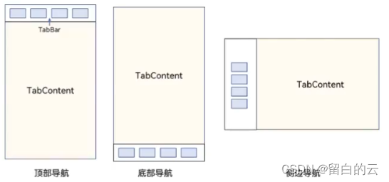
Tabs组件的页面组成包含两个部分,分别是TabContent和TabBar。TabContent是内容页,TabBar是导航页签栏,页面结构如下图所示,根据不同的导航类型,布局会有区别,可以分为底部导航、顶部导航、侧边导航,其导航栏分别位于底部、顶部和侧边。
每一个TabContent对应的内容需要有一个页签,可以通过TabContent的tabBar属性进行配置。在如下TabContent组件上设置属性tabBar,可以设置其对应页签中的内容,tabBar作为内容的页签。
1、系统自带tabs案例
@Entry
@Component
struct PageTabs {
  @State message: string = 'Hello World'

  build() {
    Tabs({barPosition:BarPosition.End}){
      TabContent(){
        spring()
      }.tabBar("春天")
      TabContent(){
        summmer()
      }.tabBar("夏天")
      TabContent(){
        autumn()
      }.tabBar("秋天")
    }
    // .vertical(true)
    .scrollable(true)
    .barMode(BarMode.Scrollable)//tabbar可以滚动
  }
}

@Component
struct spring{
  build(){
    Row(){
      Text("春天来了")
    }
  }
}
@Component
struct summmer{
  build(){
    Row(){
      Text("夏天来了")
    }
  }
}
@Component
struct autumn{
  build(){
    Row(){
      Text("秋天来了")
    }
  }
}
2、自定义导航栏:
对于底部导航栏一般作为应用主页面功能区分,为了更好的用户体验,会组合文字以及对应语义图标表示页签内容,这种情况下,需要自定义导航页签的样式。
@Entry
@Component
struct PageTabs {
  @State message: string = 'Hello World'
  @State indexSelected:number=0
  controller:TabsController=new TabsController()

  @Builder
  tabStyle(path:string,name:string ,pathSelected:string,index:number){
    Column(){
      Image(this.indexSelected===index?pathSelected:path).size({width:25,height:25})
      Text(name).fontColor(this.indexSelected===index?"#14c145":Color.Black)
    }.width("100%").height(50).onClick(v=>{
         this.indexSelected=index
         this.controller.changeIndex(index)
    })

  }

  build() {
    Tabs({barPosition:BarPosition.End,
     controller:this.controller}){
      TabContent(){
        spring()
      }.tabBar(this.tabStyle('images/admin_.png',"春天",'images/admin.png',0))
      TabContent(){
        summmer()
      }.tabBar(this.tabStyle('images/baoxiu_.png',"夏天",'images/baoxiu.png',1))
      TabContent(){
        autumn()
      }.tabBar(this.tabStyle('images/hetong_.png',"秋天",'images/hetong.png',2))
    }
    // .vertical(true)
    .scrollable(true)
    .onChange(index=>{
      console.log(index+"--------滑动到")
      this.indexSelected=index
    })
    // .barMode(BarMode.Scrollable)//tabbar可以滚动 会导致tabitem充满屏幕
  }
}

@Component
struct spring{
  build(){
    Row(){
      Text("春天来了")
    }
  }
}
@Component
struct summmer{
  build(){
    Row(){
      Text("夏天来了")
    }
  }
}
@Component
struct autumn{
  build(){
    Row(){
      Text("秋天来了")
    }
  }
}


 1700
1700


 被折叠的 条评论
为什么被折叠?
被折叠的 条评论
为什么被折叠?
 到【灌水乐园】发言


