


相信大家能够在网上搜到各种效果的星空背景,写的方法也是各种各样。这里给大家分享一个用sass来写的星空效果。(星星是会动的,这里就不用git动图了,最后的效果以及源码放在末尾)
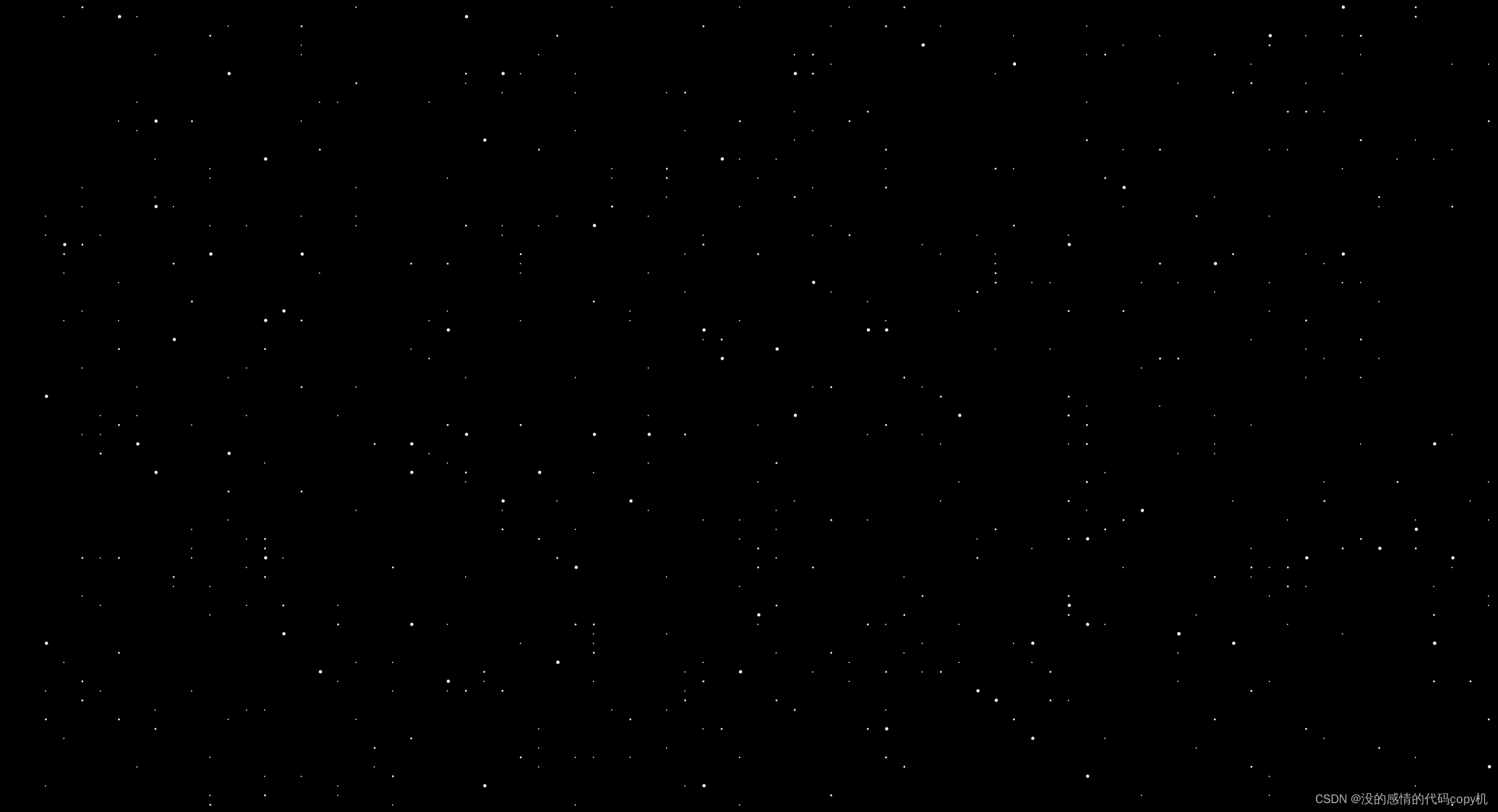
首先我们看到图片中星星有大有小,所以我们的星星应该有多层。这里三个div就代表三层星星,只要一层写好了,那么其他两次也是改一下大小复制一下就可以了。
<!DOCTYPE html>
<html lang="en">
<head>
<meta charset="UTF-8">
<title>Title</title>
</head>
<body>
<div class="layer1"></div>
<div class="layer2"></div>
<div class="layer3"></div>
</body>
<style>
@import url(./index.css);
</style>
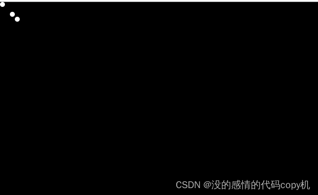
</html>开始写layer1的星星,星星就是小圆点。我这里通过box-shadow这个属性来生成,应为他可以写多个阴影。box-shadow
.layer1{
    position: fixed;
    width: $size;
    height: $size;
    top: 0;
    left: 0;
    border-radius: $size;
    background-color: white;
    box-shadow: 10px 10px #fff, 15px 15px #fff;
}
最重要的是如果去写一个函数去生成一个我们想要的阴影,这里用到了 unquote 去掉字符串的引号,在scss中类似模板字符串的 #{ 变量} ,还有就是为什么for循环从2开始,因为我们先声明$shadow的时候已经给了第一个点的值了。还有scss中取随机数的函数 random 一定要注意字符串的空格,不然运行出来css识别不了。
@function getShow($n){
    $shadow: unquote('#{random(100)}vw') unquote('#{random(100)}vh') #fff;
    @for $i from 2 through $n {
        $shadow: '#{$shadow}' + ',' + '#{unquote('#{random(100)}vw') unquote('#{random(100)}vh') #fff}'
    }


    @return unquote($string: $shadow)
}
写完过后我们再给一个向上的动画,让星星动起来。
@keyframes moveUp {
    100% {
        transform: translateY(-100vh);
    }
}
这里有个问题就是动画一直是循环播放的,网上其他大部份的星空就是在这里有个问题,页面会卡顿一下。看起来不连贯。所以这里需要在生成一个利用伪元素生成一个元素放在它的下面,当他向上平移的时候下面的页面也会平移。看起来就非常连贯且丝滑。
.layer1{
    position: fixed;
    width: $size;
    height: $size;
    top: 0;
    left: 0;
    border-radius: $size;
    background-color: white;
    box-shadow: 10px 10px #fff, 15px 15px #fff;
    box-shadow: getShow(100);
    animation: moveUp 10s linear infinite;
    // 利用为元素
    &::after{
        content: '';
        position: fixed;
        left: 0;
        top: 100vh;
        width: $size;
        height: $size;
        border-radius: inherit;
        box-shadow: inherit;
    }
}
基本上我们的第一层就大功告成了。
关于第二层和第三层我们不可能使用复制粘贴这种办法,当然使用到我们的for循环来完成。再次此前我们要想清楚进大远小的原理。三层的大小速度肯定是会有区别的。
最后就达到了我们想要的效果。

最后把源码附上。(html在文章开头)
*{
padding: 0;
margin: 0;
}
body{
width: 100vw;
height: 100vh;
background-color: black;
}
@function getShow($n){
$shadow: unquote('#{random(100)}vw') unquote('#{random(100)}vh') #fff;
@for $i from 2 through $n {
$shadow: '#{$shadow}' + ',' + '#{unquote('#{random(100)}vw') unquote('#{random(100)}vh') #fff}'
}
@return unquote($string: $shadow)
}
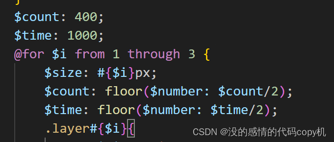
$count: 400;
$time: 1000;
@for $i from 1 through 3 {
$size: #{$i}px;
$count: floor($number: $count/2);
$time: floor($number: $time/2);
.layer#{$i}{
position: fixed;
width: $size;
height: $size;
top: 0;
left: 0;
border-radius: $size;
background-color: white;
box-shadow: 10px 10px #fff, 15px 15px #fff;
box-shadow: getShow($count);
animation: moveUp #{$time}s linear infinite;
// 利用为元素
&::after{
content: '';
position: fixed;
left: 0;
top: 100vh;
width: $size;
height: $size;
border-radius: inherit;
box-shadow: inherit;
}
}
}
@keyframes moveUp {
100% {
transform: translateY(-100vh);
}
}


 1671
1671


 被折叠的 条评论
为什么被折叠?
被折叠的 条评论
为什么被折叠?
 到【灌水乐园】发言


