


*本篇文章已授权微信公众号 guolin_blog(郭霖)独家发布
最近产品增加了两个小功能,一个是头像加一个进度条,用于升级提示,一个是身份标识功能,也就是标识Vip的功能,如图:
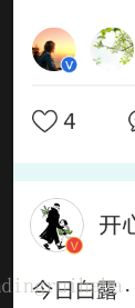
,
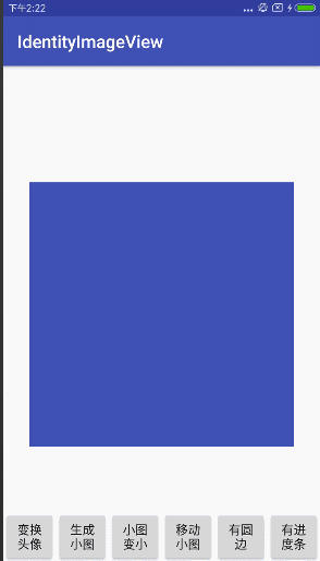
很多朋友看见这个小功能,肯定觉得特简单,就是两张图片叠在一起嘛,用个RelaiveLayout或者其他布局一下就搞定了 , 没错 , 是很简单,但是如果需要动态设置这个头像的大小,而且很多地方用到的话,在每个地方都去罗列的话,难免不开心并且出现大小错位等问题,找了好久没找到开源此控件的,只能自己动手了并分享给大家,有任何问题可加QQ群询问:661614986,效果图如下:
具体控件特性为:
- 有进度条,进度条颜色、宽度可随意设置
- 有标识身份,标识位置可随意改变、可隐藏
- 标识身份的可以是图片,也可以隐藏图片,设置文字
下面来具体说一下实现思路:
一、圆形图片的实现:
首先要解决的就是要把图片裁剪成圆形,这种控件很多,谷歌v4包下有个自带的
CircleImageView,不过没用过,用的是hdodenhof的CircleImageView ,源码也非常简单易上手
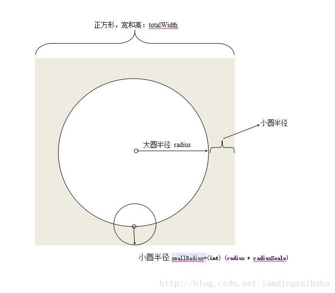
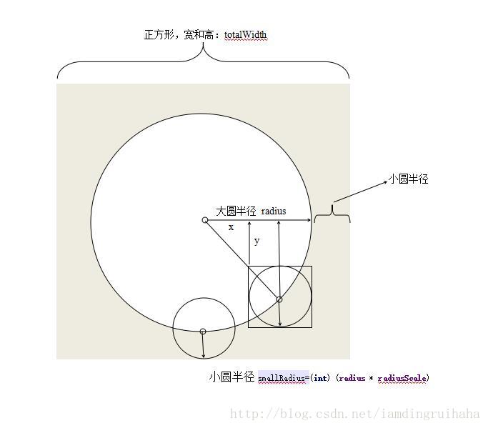
其实这种图片可以这样理解,就是一个正方形里面有个大圆,还有个小圆,小圆和大圆的和为长方形边长,如图:
那么这个时候就可以自定义一个View继承ViewGroup,命名为:IdentityImageView;由于小圆和大圆半径是有关系的,那么重写onMeasure方法可为:
    @Override
    protected void onMeasure(int widthMeasureSpec, int heightMeasureSpec) {
        super.onMeasure(widthMeasureSpec, heightMeasureSpec);
        int viewWidthMode = MeasureSpec.getMode(widthMeasureSpec);
        int viewHeightMode = MeasureSpec.getMode(heightMeasureSpec);
        int viewWidht = MeasureSpec.getSize(widthMeasureSpec);
        int viewHeight = MeasureSpec.getSize(heightMeasureSpec);
        switch (viewWidthMode) {
            case MeasureSpec.EXACTLY:   //说明在布局文件中使用的是具体值:100dp或者match_parent
                //为了方便,让半径等于宽高中小的那个,再设置宽高至半径大小
                totalwidth = viewWidht < viewHeight ? viewWidht : viewHeight;
                float scale = 1 + radiusScale;
                int radius2 = totalwidth / 2;
                radius = (int) (radius2 / scale);
                break;
            case MeasureSpec.AT_MOST:  //说明在布局文件中使用的是wrap_content:
                //这时我们也写死宽高
                radius = 200;
                totalwidth = (int) ((radius + radius * radiusScale) * 2);
                break;
            default:
                radius = 200;
                totalwidth = (int) ((radius + radius * radiusScale) * 2);
                break;
        }
        setMeasuredDimension(totalwidth, totalwidth);
        adjustThreeView();
    }
神之愤怒
二、初始化IdentityImageView:
public class IdentityImageView extends ViewGroup {
    private Context mContext;
    private CircleImageView bigImageView;//大圆
    private CircleImageView smallImageView;//小圆
    private float radiusScale = 0.2f;//小图片与大图片的比例,默认0.4
    int radius;//大图片半径
    private int smallRadius;//小图片半径
    private double angle = 45; //标识角度大小
    private boolean isprogress;//是否可以加载进度条,必须设置为true才能开启
    private int progressCollor;//进度条颜色
    private int borderColor;//边框颜色
    private int borderWidth;//边框、进度条宽度
    private TextView textView;//标识符为文字,用的地方比较少
    private boolean hintSmallView;//标识符是否隐藏
    private Paint mBorderPaint;//边框画笔
    private Paint mProgressPaint;//进度条画笔
    private float progresss;
    private Drawable bigImage;//大图片
    private Drawable smallimage;//小图片
    private int setprogressColor = 0;//动态设置进度条颜色值

    public IdentityImageView(Context context) {
        this(context, null);
    }

    public IdentityImageView(Context context, AttributeSet attrs) {
        this(context, attrs, 0);
    }

    public IdentityImageView(Context context, AttributeSet attrs, int defStyleAttr) {
        super(context, attrs, defStyleAttr);
        mContext = context;
        setWillNotDraw(false);//是的ondraw方法被执行


        addThreeView();

        initAttrs(attrs);
    }
其中addThreeView()方法就是实例化出我们需要的两个圆形图片和一个TextView;但是实例化出来的大小不是我们想要的,因此在onMeasure方法的结尾处,我们重新调整了一下各个控件的大小。
 private void addThreeView() {

        bigImageView = new CircleImageView(mContext);//大圆

        smallImageView = new CircleImageView(mContext);//小圆

        textView = new TextView(mContext);//文本
        textView.setGravity(Gravity.CENTER);
        addView(bigImageView, 0, new LayoutParams(radius, radius));
        smallRadius = (int) (radius * radiusScale);
        addView(smallImageView, 1, new LayoutParams(smallRadius, smallRadius));
        addView(textView, new LayoutParams(LayoutParams.WRAP_CONTENT, LayoutParams.WRAP_CONTENT));
        smallImageView.bringToFront();//使小图片位于最上层
    }


//调整图片的大小
    private void adjustThreeView() {
        bigImageView.setLayoutParams(new LayoutParams(radius, radius));
        smallRadius = (int) (radius * radiusScale);
        smallImageView.setLayoutParams(new LayoutParams(smallRadius, smallRadius));
        textView.setLayoutParams(new LayoutParams(LayoutParams.WRAP_CONTENT, LayoutParams.WRAP_CONTENT));
    }
这些步骤大家都很熟悉,需要注意的是setWillNotDraw(false)这个方法,因为这里没有加载布局,如果没有此方法,onDraw方法走不到,initAttrs(attrs)就是获取自定义的属性,属性有:
     <declare-styleable name="IdentityImageView">
        <attr name="iciv_bigimage" format="reference"></attr><!--大图片-->
        <attr name="iciv_smallimage" format="reference"></attr><!--小图片-->
        <attr name="iciv_angle" format="float"></attr><!--标识角度-->
        <attr name="iciv_radiusscale" format="float"></attr><!--大小图片比例-->
        <attr name="iciv_isprogress" format="boolean"></attr><!--是否有进度条-->
        <attr name="iciv_progress_collor" format="color|reference"></attr><!--进度条颜色-->
        <attr name="iciv_border_color" format="color|reference"></attr><!--边框颜色-->
        <attr name="iciv_border_width" format="integer"></attr><!--边框宽度-->
        <attr name="iciv_hint_smallimageview" format="boolean"></attr><!--是否隐藏小图片-->
    </declare-styleable>
三、标识图片的位置
属性中smallRadius的值为:
smallRadius = (int) (radius * radiusScale);要放入小图片,肯定是在重写onLayout方法,大图片也是如此,重写onLayout方法,大图片容易实现,left和top为smallRadius,right和bottom都为控件宽减去totalwidth-smallRadius,关键是小图片的坐标如何确定,说肯定说不清楚,还是借一张西川地理位置图比较容易知道情况,如下:
只要得到图中所标的下x,y坐标,那么就可以得到小圆左上角坐标的具体值了,仔细看图就能明白,这是个几何问题,用到正弦余弦,也就是三角函数的sin,cos,具体代码如下:
        double cos = Math.cos(angle * Math.PI / 180);//调用三角函数,这里的angle为图中的角a
        double sin = Math.sin(angle * Math.PI / 180);
        double left = totalwidth/2 + (radius * cos - smallRadius);
//图中x的值
double top = totalwidth/2 + (radius * sin - smallRadius);//图中y的值right和bottom加上小圆的直径smallRadius*2就可以了;
所以onLayout方法重写如下:
    @Override
    protected void onLayout(boolean b, int i, int i1, int i2, int i3) {
        //重点在于smallImageView的位置确定,默认为放在右下角,可自行拓展至其他位置


        double cos = Math.cos(angle * Math.PI / 180);
        double sin = Math.sin(angle * Math.PI / 180);
        double left = totalwidth/2 + (radius * cos - smallRadius);
        double top = totalwidth/2 + (radius * sin - smallRadius);
        int right = (int) (left + 2 * smallRadius);
        int bottom = (int) (top + 2 * smallRadius);
        bigImageView.layout(smallRadius, smallRadius, totalwidth-smallRadius, totalwidth-smallRadius);
        textView.layout((int) left, (int) top, right, bottom);
        smallImageView.layout((int) left, (int) top, right, bottom);

    }

    }
四、增加边框、进度条
下面就剩下外圆和进度条了,不用想是在onDraw里面用画笔画出来的,只不过这里面有几个坑:
- Paint的setStrokeWidth方法,并不是往圆内侧增加圆环(圆弧)宽度的,而是往外侧增加一半,往内侧增加一半。
add进来的View(比如两个图片View)显示在画出来的圆弧上面,时间紧迫就没去搞明白怎么回事。
这两个坑让我调整了一下代码,把大圆的半径减去了圆弧宽度的一半,这样刚好,能看见圆弧,小图又能遮盖住圆弧,功能实现了就没想那么多,以后有时间再琢磨一下图层关系。
外圆边框和进度条的代码如下:
       canvas.drawCircle(totalwidth/2, totalwidth/2, radius - borderWidth / 2, mBorderPaint);//画边框,之所以半径减半,是因为第一个坑


        RectF rectf = new RectF(smallRadius+borderWidth / 2, smallRadius+borderWidth / 2, getWidth() -smallRadius- borderWidth / 2, getHeight()-smallRadius - borderWidth / 2);
    //定义的圆弧的形状和大小的范围

        canvas.drawArc(rectf, (float) angle, progresss, false, mProgressPaint);
        //画进度条,angle为起始角度,和上图的a值一样,progress为弧度角度,false为不显示半径线条
五、对外提供一些动态设置参数的方法
这里没涉及到点击滑动事件,所以没有重写分发事件一系列的方法,主要对外提供的方法有:
getBigCircleImageView();
getSmallCircleImageView();
//获得大、小图CircleImageView;拿到以后
//可以调用setImageDrawable、setImageResource()等方法直接设置图片进去,也可以加载网络图片设置进去,

 public void setAngle(int angles);//设置标识的角度
 public void setRadiusScale(float v);//设置标识的大小
 public void setIsprogress(boolean b) ;//设置是否可以有进度条
 public void setBorderColor(int color) ;//设置填充的颜色
 public void setProgressColor(int color);//设置进度条颜色
public void setBorderWidth(int width) ;//设置进度条以及边框宽度这样,带进度条和标识功能的原型图片就完成了,不熟悉自定义View的同学可以练一下,坑只有自己踩了才知道,源码已上传github,点击查看;有问题欢迎大家指正,共同进步,!
另外我的线上项目为空艺术,点击可以下载,朋友可以看下我的 页面的头像线上效果。
安卓问题交流群:661614986


 165
165


 被折叠的 条评论
为什么被折叠?
被折叠的 条评论
为什么被折叠?
 到【灌水乐园】发言


