CSS3 transition 属性实现小米商城商品展示效果

前端小白一个,最近学习了CSS3的transition属性,就想做一个效果练练手,下面是参考小米商城的商品展示做的一个动态效果。


下面贴上代码:

<!DOCTYPE html>
<html>
	<head>
		<meta charset="UTF-8">
		<title>小米商品展示css3动画</title>
		<style>
			
			*{
				margin: 0;
				padding: 0;
			}
			
			body{
				background-color: #F5F5F5;
			}
	
			#box .box-con{
				width: 294px;
				height: 375px;
				background-color: white;
			}
			
			#box .box-con .new{
				width: 80px;
				height: 25px;
				background-color: #83c44e;

				margin-left: 106px;
				color: white;
				line-height: 25px;
				font-size: 14px;
				text-align: center;
			}
			
			#box .box-con a img{
				max-width: 150px;
				display: block;
				margin-bottom: 28px;
				margin-top: 50px;
				margin-left: 70px;
				
			}
			
			#box .box-con a.name{
				
				margin-top: 25px;
				margin-left: 97px;
				text-align: center;
				text-decoration: none;
				color: #000000;
			}
			
			#box .box-con p{
				margin-top: 1px;
				margin-left:10px;
				color: #B0B0B0;
				font-size: 13px;
				text-align: center;
			}
			
			#box .box-con .price{
				
				margin-top: 10px;
				margin-left: 129px;
				color: #FF6700;
				font-size: 13px;
			}
			
			#box .box-con .say{
				
				background-color: #FF6700;
				/*width:294px ;
				height: 95px;*/
				position: absolute;
				bottom: 24px;
				width:0px ;
				height: 1px;
				transition: all 0.5s;
			}
			
		
			#box{
				position: relative;
				width: 294px;
				height: 375px;
				/*outline: 1px solid black;*/
				margin: 150px auto;
				transition: margin-top 0.5s;
				transition: all 0.5s;
			}
			
			
			#box:hover .say{
				border: 1px solid red;
				width: 294px;
				height: 95px;
				right: 0px;
				bottom: 0px;
				background-image: url(http://i4.bvimg.com/651693/82fb1226524cbca7.gif);
			}
			
			#box:hover{
				margin-top: 145px;
				box-shadow: 0px 0px 25px  rgba(46,46,46,0.2);
				
			}
			
			
		</style>
	</head>
	<body>

		<div id="box">
			<div class="box-con">
				<div class="new">新品</div>
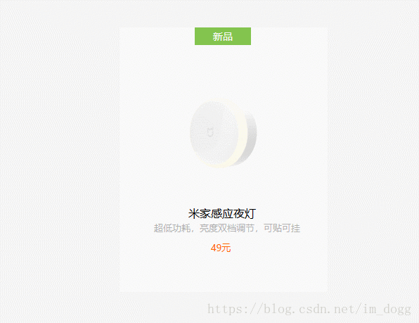
				<a href=""> <img src="http://i4.bvimg.com/651693/2c5c372c75630066.jpg" /></a>
				<a href="" class="name">米家感应夜灯</a>
				<p>超低功耗,亮度双档调节,可贴可挂</p>
				<div class="price">49元</div>
				<div class="say">
					
				</div>

			</div>
		</div>
	</body>
</html>

  • 5
    点赞
  • 26
    收藏
    觉得还不错? 一键收藏
  • 1
    评论
可以使用CSS3的transition属性实现图片的淡入淡出效果。具体步骤如下: 1. 在HTML中创建一个包含图片的容器,如下: ``` <div class="slider"> <img src="image1.jpg"> <img src="image2.jpg"> <img src="image3.jpg"> </div> ``` 2. 使用CSS样式设置容器的宽度和高度,并将容器中的图片的位置设置为绝对定位。 ``` .slider { width: 100%; height: 500px; position: relative; } .slider img { position: absolute; top: 0; left: 0; opacity: 0; transition: opacity 1s ease-in-out; } ``` 3. 使用JavaScript代码来控制图片的淡入淡出效果。首先,获取所有的图片元素和它们的数量。 ``` var sliderImages = document.querySelectorAll('.slider img'); var currentImage = 0; var sliderImageCount = sliderImages.length; ``` 4. 创建一个函数,用于控制图片的淡入淡出效果。该函数将当前图片的opacity值设置为0,将下一张图片的opacity值设置为1,并将currentImage变量加1,以便下一次调用该函数时切换到下一张图片。 ``` function nextImage() { sliderImages[currentImage].style.opacity = 0; currentImage = (currentImage + 1) % sliderImageCount; sliderImages[currentImage].style.opacity = 1; } ``` 5. 使用setInterval函数来周期性地调用该函数,以实现图片的自动轮播效果。 ``` setInterval(nextImage, 5000); ``` 完整代码如下: HTML代码: ``` <div class="slider"> <img src="image1.jpg"> <img src="image2.jpg"> <img src="image3.jpg"> </div> ``` CSS代码: ``` .slider { width: 100%; height: 500px; position: relative; } .slider img { position: absolute; top: 0; left: 0; opacity: 0; transition: opacity 1s ease-in-out; } ``` JavaScript代码: ``` var sliderImages = document.querySelectorAll('.slider img'); var currentImage = 0; var sliderImageCount = sliderImages.length; function nextImage() { sliderImages[currentImage].style.opacity = 0; currentImage = (currentImage + 1) % sliderImageCount; sliderImages[currentImage].style.opacity = 1; } setInterval(nextImage, 5000); ```

“相关推荐”对你有帮助么?

  • 非常没帮助
  • 没帮助
  • 一般
  • 有帮助
  • 非常有帮助
提交
评论 1
添加红包

请填写红包祝福语或标题

红包个数最小为10个

红包金额最低5元

当前余额3.43前往充值 >
需支付:10.00
成就一亿技术人!
领取后你会自动成为博主和红包主的粉丝 规则
hope_wisdom
发出的红包
实付
使用余额支付
点击重新获取
扫码支付
钱包余额 0

抵扣说明:

1.余额是钱包充值的虚拟货币,按照1:1的比例进行支付金额的抵扣。
2.余额无法直接购买下载,可以购买VIP、付费专栏及课程。

余额充值