


文章目录
ClusterGVis——时间序列聚类可视化
ClusterGVis 提供了时间序列的 RNA-seq 数据的模糊 c-means 算法和 kmeans 算法聚类的可视化,还可以实现对 WGCNA 输出的可视化,同时可以使用 clusterProfiler 的 enrichCluster 完成每个 cluster 的富集分析,直接生成发表级图形。
**官网:**https://github.com/junjunlab/ClusterGVis
安装
可以直接在 r 中完成安装,重新安装可以获取新功能。
# Note: please update your ComplexHeatmap to the latest version!
# install.packages("devtools")
devtools::install_github("junjunlab/ClusterGVis")
如果出现某些依赖项无法安装的情况,可以使用如下相应命令使用 conda 完成安装,如果仍然出现错误可以尝试创建新环境运行。
# 此处可能需要创建一个新环境才安装成功
# conda create -n demo
# conda activate demo
conda install -c bioconda r-monocle3 r-seurat
conda install conda-forge::r-magick
conda install bioconductor-org.mm.eg.db
conda install bioconductor-clusterprofiler
conda install -c conda-forge r-terra
conda install -c conda-forge r-devtools
在实际的安装中,可能会出现 jjAnno 包(https://github.com/junjunlab/jjAnno)无法安装的情况,一般情况下按上述命令完成对应依赖项安装后在 r 中重新运行如下命令即可成功安装。
devtools::install_github("junjunlab/jjAnno")
使用
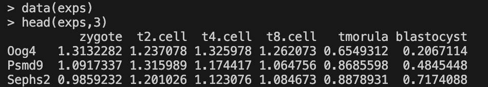
1. 输入
输入数据为标准化的 tpm/fpkm/rpkm 表达矩阵,结合源码和 Mfuzz 包(http://193.136.227.155/sysbiolab/mfuzz/)的文档,此处在 cluster.method == "mfuzz" 时也可以使用其他方法标准化后的数据,如 edgeR/DESeq2。

# 载入示例数据
library(ClusterGVis)
data(exps)
2. 确定最佳聚类数目
getClusters 函数计算均方和, 用户可根据拐点确定最佳聚类个数,也可以结合热图结果进行选择。
getClusters(exp = exps)
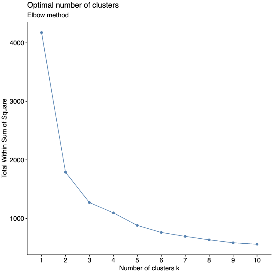
此处选择了 8 个聚类数量作为最佳聚类数目。
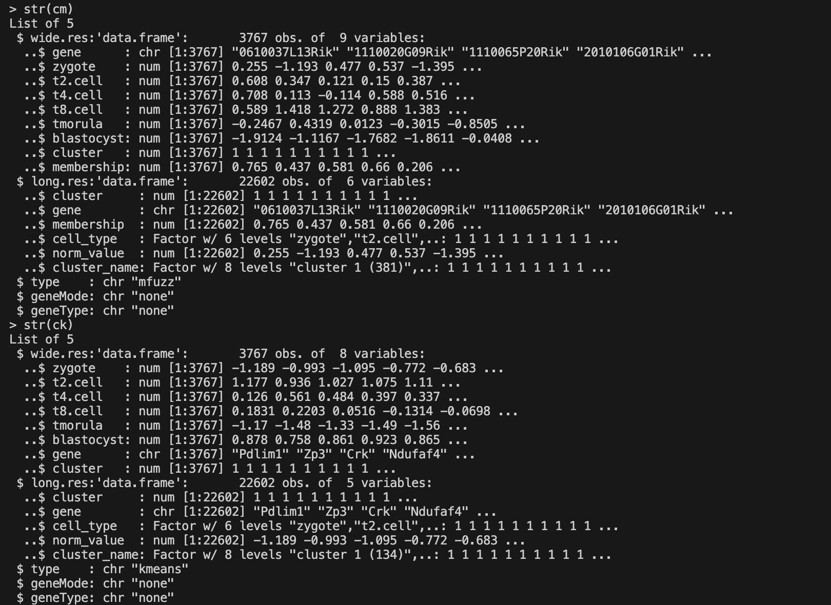
3. 聚类
此处可以使用 clusterData 完成聚类, 共有两种方法:
Mfuzz的 fuzzy c-means 聚类算法ComplexHeatmap的 row_km 的 Kmeans 聚类算法
为了保证结果的可重复性,clusterData 函数内部设置了随机种子,可以更改随机种子来改变聚类结果。
# Mfuzz 聚类
cm <- clusterData(exp = exps,
                  cluster.method = "mfuzz",
                  cluster.num = 8)

# Kmeans 聚类
ck <- clusterData(exp = exps,
                  cluster.method = "kmeans",
                  cluster.num = 8)
4. 输出
聚类返回的结果为 list,包含聚类结果的长数据格式和宽数据格式,可以使用该数据自行绘图,其中对于 Mfuzz 聚类的结果会多一列 membership 的信息。
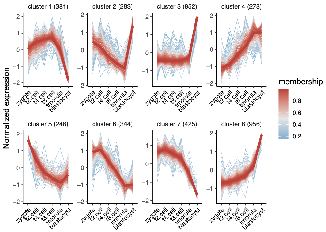
5. 可视化
visCluster 函数接收来自 clusterData 的结果,支持生成三种绘图结果,包括折线图,热图,热图+折线(+ GO 通路) 。
(1)折线图
折线图本质上为 ggplot2 对象,可以通过添加其它相关的参数来修改细节。
# 基础绘图
visCluster(object = cm,
           plot.type = "line")

# 高阶绘图
visCluster(object = cm,
           plot.type = "line",
           ms.col = c("green","orange","red"), # 更改颜色
           add.mline = FALSE) # 去除中位线

# kmeans 结果的折线图没有 membership 的信息,所以没有颜色映射
visCluster(object = ck,
           plot.type = "line")
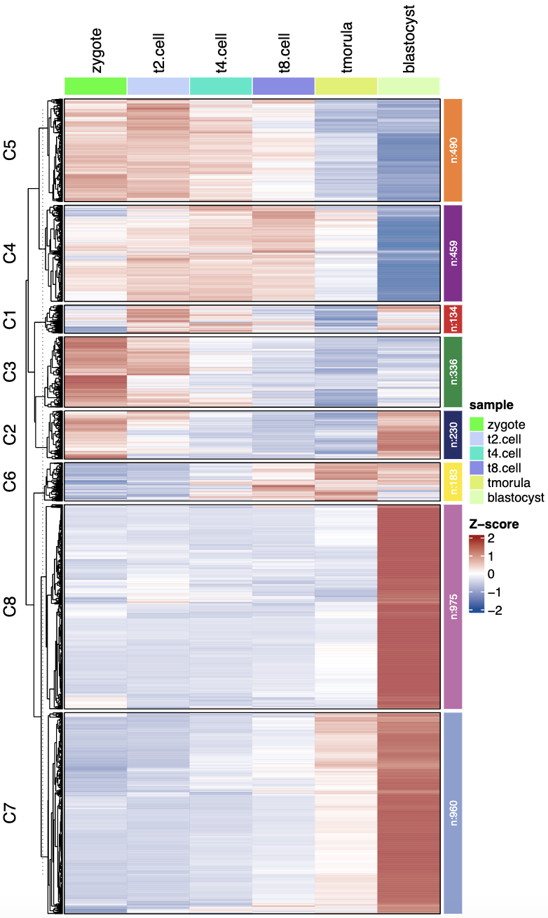
(2)热图
# 基础绘图
visCluster(object = ck,
           plot.type = "heatmap")

# 高阶绘图
visCluster(object = ck,
           plot.type = "heatmap",
           column_names_rot = 45, # 修改列名角度
           ctAnno.col = ggsci::pal_npg()(8)) # 修改注释条颜色
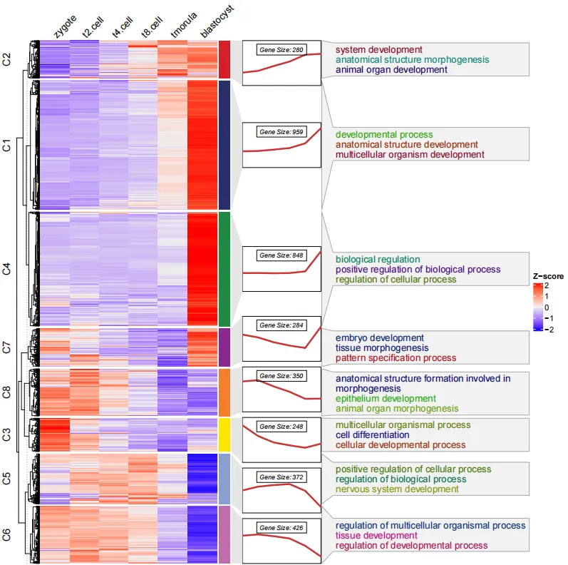
(3)热图 + 折线图/箱形图/GO富集
# 热图 + 折线图
visCluster(object = ck,
           plot.type = "both",
           column_names_rot = 45)

# 热图 + 箱形图
visCluster(object = ck,
           plot.type = "both",
           column_names_rot = 45,
           add.box = T,
           add.line = F, # 移除折线
           boxcol = ggsci::pal_npg()(8)), # 修改箱形图颜色
					 add.point = T) # 添加点

# 热图 + 折线图 + GO富集
data("termanno")
head(termanno,4)
#   id                               term
# 1 C1              developmental process
# 2 C1   anatomical structure development
# 3 C1 multicellular organism development
# 4 C2                 system development
visCluster(object = ck,
           plot.type = "both",
           column_names_rot = 45,
           annoTerm.data = termanno)
补充:
- 富集通路的数据必须是亚群 id 和通路名称,顺序不能反,此外亚群 id 和聚类结果名称(C1…) 需要保持一致
- 可以通过
line.side = "left"调整折线注释的位置 - 可以通过
show_row_dend = F去除左边的聚类树
补充
此部分总结了 ClusterGVis 可以实现的个性化功能,具体可查看 https://github.com/junjunlab/ClusterGVis/wiki/version-0.0.2 了解。
-
当聚类基因数量不多时,可以通过
show_row_names=TRUE标注基因名;当 基因数量特别多的时候,可以设置markGenes来标注指定基因。 -
当把 ClusterGVis 应用到单细胞数据上时可以使用单细胞的 scaledata 作为输入,并设置
scaleData=TRUE。 -
当有多个时间点的数据,需要分为处理组和对照组的表达谱数据时,可以通过设置
mulGroup指明组数。 -
可以使通路文字大小随 P 值变化,也可以指定颜色,同时可以使用
enrichCluster函数完成一键富集。
报错
viscluster 使用过程中 dplyr::arrange() 报错

解决方案:https://github.com/junjunlab/ClusterGVis/issues/91
# 重新安装
devtools::install_github("junjunlab/ClusterGVis")
参考
- 【老俊俊的生信笔记】ClusterGVis 对基因表达时间序列聚类和可视化:https://mp.weixin.qq.com/s?__biz=MzkyMTI1MTYxNA==&mid=2247507094&idx=1&sn=7c2872e4e7d92f0f16831f9e3b13f6ca&chksm=c184e6e7f6f36ff10ec1e41b1e45e90ffe8f0918878a6045fe0471c77729ea6af5d7e14beb5b&token=503374955&lang=zh_CN#rd
- Jun Zhang (2022). ClusterGVis: One-step to Cluster and Visualize Gene Expression Matrix. https://github.com/junjunlab/ClusterGVis
- ClusterGVis 的问题解答及优化:https://github.com/junjunlab/ClusterGVis/wiki/version-0.0.2


 1016
1016

 被折叠的 条评论
为什么被折叠?
被折叠的 条评论
为什么被折叠?
 到【灌水乐园】发言


