


 这篇博客介绍了如何利用Android的Gallery组件创建可左右滑动的Tab,以解决传统Tab在多条目时的拥挤问题。通过适配器的特殊设置和背景处理,实现了Tab的循环显示和选中状态的改变,最终达到类似滑动效果。
今天还是来讲下Tab的实现。android自带的Tab在有比较多条目的时候会显得非常挤,这样不仅不美观,更加影响操作。如果Tab能做成左右滑动的,那就非常好了。其实实现这种效果并不难,而且方法也不少。今天给大家介绍下用gallery这个组件来实现的方法。
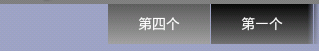
首先我们需要写Gallery的适配器。这里我们要注意的是Gallery有一个特点,就是起始一个元素的左边会留下一块空位,如下图所示:
这样我们的Tab显然不是很完美,如何解决?开始想的就是去看gallery的源码,重写他。不过既然我们做的是滑动的,让他左右都可滑动不就ok了?要实现左右滑动,要做的事情就是让里面的元素循环。Gallery是即时显示图像的,可以通过两点来做到:
1.让getCount()方法返回一个非常大的值。
2.在getView()中显示的时候通过循环取余来实现一直显示数组中的有限值。
而且Gallery还提供了一个setSelection()方法,用来设置当前选择的条目,我们将显示的位置放在比较靠后的位置,这样就不会在左滑的时候滑到头,那样就可以以假乱真了。
下面来看下适配器代码:
	public class TabAdapter extends BaseAdapter {
		private Context mContext;
		private List<String> mList;
		private int mSelectedTab;
		public TabAdapter(Context context, List<String> list) {
			mContext = context;
		  /*使用attrs里的 <declare-styleable>属性*/
			TypedArray a = obtainStyledAttributes(R.styleable.Gallery);
			a.recycle();//重复使用对象的styleable属性
			if (list == null)
				list = Collections.emptyList();
			mList = list;
		}
		/*
		 * 设置选中的Tab,并且刷新界面
		 */
		public void setSelectedTab(int tab) {
			if (tab != mSelectedTab) {
				mSelectedTab = tab;
				notifyDataSetChanged();
			}
		}

		public int getSelectedTab() {
			return mSelectedTab;
		}
		public int getCount() {
			return  Integer.MAX_VALUE;//返回最大值
		}
		public Object getItem(int position) {
			return mList.get(position);
		}
		public long getItemId(int position) {
			return position;
		}
		public View getView(int position, View convertView, ViewGroup parent) {
			TextView text = null;//这里只放一个TextView,可以根据需要来定制
			if (convertView == null ) {
				 text = new TextView(mContext);
			} else {
				text = (TextView) convertView;
			}

			text.setTextColor(Color.WHITE);
			text.setText(mList.get(position % mList.size()));//循环取余设置显示内容

			text.setLayoutParams(new Gallery.LayoutParams(102, 40));
			text.setGravity(Gravity.CENTER);

			/*
			 * 对于选中的Tab,给他一个选中的背景
			 */
			if (position == mSelectedTab)
				text.setBackgroundResource(R.drawable.tab_button_select);
			else
				text.setBackgroundResource(R.drawable.tab_button_unselect);

			return text;
		}
	}
注释已经写的很清楚了,应该没什么问题。
这里程序中使用了
TypedArray a = obtainStyledAttributes(R.styleable.Gallery);
			a.recycle();//重复使用对象的styleable属性
这是一个引用自制layout 元素的用法,必须在res/values 下面添加一个attrs.xml,并在其中定义 <declare-styleable> 标签TAG,目的是自定义layout 的背景风格,并且通过TypeArray 的特性,让相同的Layout 元素可以重复用于每一张图片,大家可以看下apiDemos里gallery1s的用法,这里也是参考它的用法。看下attrs.xml的代码:
<?xml version="1.0" encoding="utf-8"?>
<resources>
    <declare-styleable name="Gallery">
        <attr name="android:galleryItemBackground" />
    </declare-styleable>
</resources>
还要说一点的是,对于选中和未选中的背景处理。我们在onItemClick中得到选中的Tab,然后为选中的和未选中的设置一个背景。这个背景这里用自定义图形shape的方法来定义,在res/drawable下新建xml文件,tab_button_select.xml中内容如下:
<?xml version="1.0" encoding="utf-8"?>
<shape xmlns:android="http://schemas.android.com/apk/res/android">
	<gradient android:startColor="#FFA2A2A2" android:endColor="#FF5F5F5F"
		android:angle="90.0">
	</gradient>
</shape>
其中的gradient标签实现一个从startColor到endColor角度为90渐变色。其实我们经常用这种方式来自定义我们的控件,可以用来实现圆角,渐变,描边等效果,分别在shape根节点下用gradient,corners,stroke标签实现,大家可以自己去试试,效果还是很好的,也很简单。
下面来看下MainActivity的代码,显示layout的方法和我以前一篇仿Iphone效果的Tab中一样,通过隐藏和显示相应的layout来实现。当然,也可以通过intent来指向不同的Activity等方法来做。注意定义要显示的Tab数组的时候,因为我们第一个显示的不是第一个Tab,所以适当调整下数组的定义顺序,同样对应的layou也是。
public class MainActivity extends Activity {
	private Gallery gallery;
	private TabAdapter textAdapter;
	private static final String[] TAB_NAMES = {

		"第四个",
		"第一个",
		"第二个",
		"第三个",
	};//注意调整顺序

	private LinearLayout 	mTabLayout_One;
	private LinearLayout 	mTabLayout_Two;
	private LinearLayout 	mTabLayout_Three;
	private LinearLayout 	mTabLayout_Four;
	@Override
	public void onCreate(Bundle savedInstanceState) {
		super.onCreate(savedInstanceState);
		setContentView(R.layout.main);

		gallery = (Gallery) findViewById(R.id.gallery);
		textAdapter = new TabAdapter(this, Arrays.asList(TAB_NAMES));
		gallery.setAdapter(textAdapter);
		gallery.setSelection(34);//这里根据你的Tab数自己算一下,让左边的稍微多一点,不要一滑就滑到头

        mTabLayout_One = (LinearLayout) this.findViewById( R.id.TabLayout_One );
        mTabLayout_Two = (LinearLayout) this.findViewById( R.id.TabLayout_Two );
        mTabLayout_Three = (LinearLayout) this.findViewById( R.id.TabLayout_Three );
        mTabLayout_Four = (LinearLayout) this.findViewById( R.id.TabLayout_Four );

        mTabLayout_One.setVisibility( View.GONE );
        mTabLayout_Two.setVisibility( View.VISIBLE );
        mTabLayout_Three.setVisibility( View.GONE );
        mTabLayout_Four.setVisibility( View.GONE );

		gallery.setOnItemClickListener(new OnItemClickListener() {
			@Override
			public void onItemClick(AdapterView<?> parent, View view, int position,
					long id) {
				TabAdapter adapter = (TabAdapter)parent.getAdapter();
				adapter.setSelectedTab(position);
				switch(position %TAB_NAMES.length ){
				case 0:
					mTabLayout_One.setVisibility( View.VISIBLE );
	    			mTabLayout_Two.setVisibility( View.GONE );
	    			mTabLayout_Three.setVisibility( View.GONE );
	    			mTabLayout_Four.setVisibility( View.GONE );
	    			break;
				case 1:
					mTabLayout_One.setVisibility( View.GONE );
	    			mTabLayout_Two.setVisibility( View.VISIBLE );
	    			mTabLayout_Three.setVisibility( View.GONE );
	    			mTabLayout_Four.setVisibility( View.GONE );
	    			break;
				case 2:
					mTabLayout_One.setVisibility( View.GONE );
	    			mTabLayout_Two.setVisibility( View.GONE );
	    			mTabLayout_Three.setVisibility( View.VISIBLE );
	    			mTabLayout_Four.setVisibility( View.GONE );
	    			break;
				case 3:
					mTabLayout_One.setVisibility( View.GONE );
	    			mTabLayout_Two.setVisibility( View.GONE );
	    			mTabLayout_Three.setVisibility( View.GONE );
	    			mTabLayout_Four.setVisibility( View.VISIBLE );
				}
			}

		});

	}
最后就是main.xml布局文件了:
<?xml version="1.0" encoding="utf-8"?>
<RelativeLayout xmlns:android="http://schemas.android.com/apk/res/android"
	android:orientation="vertical" android:layout_width="fill_parent"
	android:layout_height="fill_parent"
	android:background="#C5CCD4FF">
	<LinearLayout
			android:id = "@+id/TabLayout_One"
			android:layout_width = "fill_parent"
			android:layout_height = "fill_parent"
			android:layout_below = "@+id/gallery"
			>
			<ScrollView android:layout_width="fill_parent" android:layout_height="wrap_content">
				<RelativeLayout
					android:layout_width = "fill_parent"
					android:layout_height = "fill_parent"
					android:visibility = "visible"
					>
					<TextView
						android:textColor="@android:color/black"
						android:textSize="30sp"
						android:layout_width = "wrap_content"
						android:layout_height = "wrap_content"
						android:text = "这是第四个布局"
					/>
					</RelativeLayout>
				</ScrollView>
			</LinearLayout>

		<LinearLayout
			android:id = "@+id/TabLayout_Two"
			android:layout_width = "fill_parent"
			android:layout_height = "fill_parent"
			android:layout_below = "@+id/gallery"
			>
			<ScrollView android:layout_width="fill_parent" android:layout_height="wrap_content">
					<RelativeLayout
						android:layout_width = "fill_parent"
						android:layout_height = "fill_parent"
						android:visibility = "visible"
						android:layout_above = "@+id/Tabs"
						>
						<Button
							android:layout_width = "wrap_content"
							android:layout_height = "wrap_content"
							android:text = "这是第一个布局"
							android:textSize = "30sp"
						/>
					</RelativeLayout>
			</ScrollView>
		</LinearLayout>
		<LinearLayout
			android:id = "@+id/TabLayout_Three"
			android:layout_width = "fill_parent"
			android:layout_height = "fill_parent"
			android:layout_below = "@+id/gallery"
			>
			<ScrollView android:layout_width="fill_parent" android:layout_height="wrap_content">
				<RelativeLayout
					android:layout_width = "fill_parent"
					android:layout_height = "fill_parent"
					android:visibility = "visible"
					android:layout_above = "@+id/Tabs"
					>
					<TextView
						android:layout_width = "fill_parent"
						android:layout_height = "fill_parent"
						android:textSize="25sp"
						android:textColor="#ffffff"
						android:text="dddddddddddddddddddddddddddddddddddd"
					/>
				</RelativeLayout>
			</ScrollView>
		</LinearLayout>
		<LinearLayout
			android:id = "@+id/TabLayout_Four"
			android:layout_width = "fill_parent"
			android:layout_height = "fill_parent"
			android:layout_below = "@+id/gallery"
			>
			<ScrollView android:layout_width="fill_parent" android:layout_height="wrap_content">
				<RelativeLayout
					android:id = "@+id/TabLayout_Four"
					android:layout_width = "fill_parent"
					android:layout_height = "fill_parent"
					android:visibility = "visible"
					android:layout_above = "@+id/Tabs"
					>
					<TextView
						android:textColor="@android:color/black"
						android:layout_width = "wrap_content"
						android:layout_height = "wrap_content"
						android:text = "很简单,是么"
					/>
				</RelativeLayout>
			</ScrollView>
		</LinearLayout>
	<Gallery
		android:id="@+id/gallery"
		android:layout_alignParentTop="true"
		android:layout_width="fill_parent"
		android:layout_height="wrap_content"
		android:unselectedAlpha="1"
		android:spacing="1dip"/>
</RelativeLayout>
这样我们用gallery实现的可滑动的Tab就完成了,看下最后的效果。

大家有什么问题可以留言交流哈。特别是对让左边不留空的方法有好的解决办法的话,希望能提出来,大家一起学习交流。


 扫一扫
扫一扫
 1262
1262

 被折叠的 条评论
为什么被折叠?
被折叠的 条评论
为什么被折叠?
 到【灌水乐园】发言


