


2d转换
transform
translate()
rotate()
scale()
skew()
matrix()
值 rotate(30deg) 把元素顺时针旋转 30 度。
值 translate(50px,100px) 把元素从左侧移动 50 像素,从顶端移动 100 像素。
值 scale(2,4) 把宽度转换为原始尺寸的 2 倍,把高度转换为原始高度的 4 倍。
值 skew(30deg,20deg) 围绕 X 轴把元素翻转 30 度,围绕 Y 轴翻转 20 度。
matrix() 方法需要六个参数,包含数学函数,允许您:旋转、缩放、移动以及倾斜元素。
3D 转换
通过 rotateX() 方法,元素围绕其 X 轴以给定的度数进行旋转。
180度的效果
通过 rotateY() 方法,元素围绕其 Y 轴以给定的度数进行旋转。
180度的效果
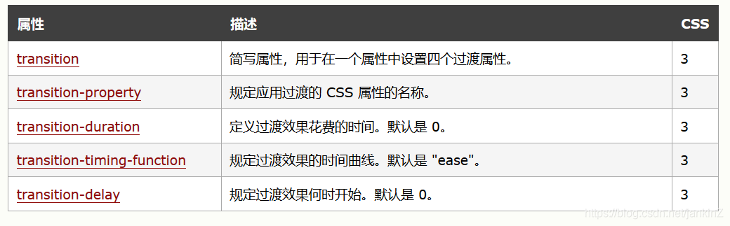
过渡
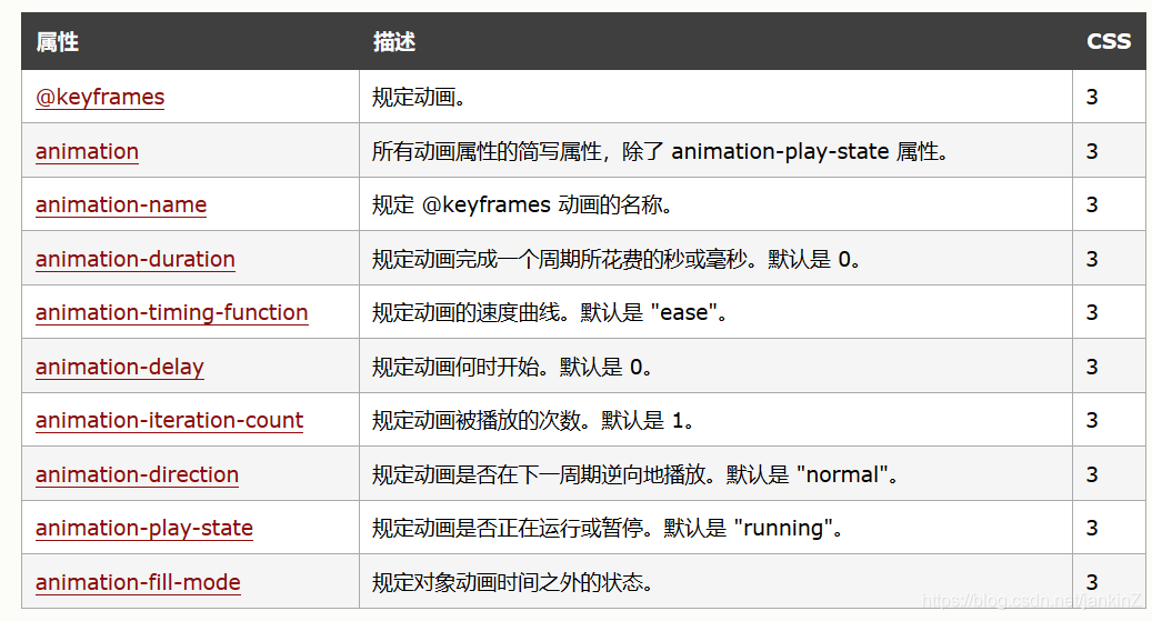
动画
请用百分比来规定变化发生的时间,或用关键词 “from” 和 “to”,等同于 0% 和 100%。
0% 是动画的开始,100% 是动画的完成。
 简单例子
简单例子
从红到黄到蓝最后变绿
@keyframes myfirst
{
0%   {background: red;}
25%  {background: yellow;}
50%  {background: blue;}
100% {background: green;}
}
多列
column-count属性指定元素的列数
olumn-gap属性指定的列之间的差距
column-rule属性设置列之间的宽度,样式和颜色
绘制图形
当宽度为0时可以设置边框实现绘制图形
            width: 0px;
            border-top: 90px solid red;
            border-right: 90px solid blue;
            border-left: 90px solid green;
            border-bottom: 90px solid yellow;

可以将其他边框设置为透明实现三角形
甚至可以省略下边框
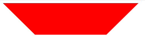
梯形
            width: 200px;
            border-top: 90px solid red;
            border-right: 90px  solid transparent ;
            border-left: 90px  solid transparent ;
            border-bottom: 90px solid transparent;


 1138
1138


 被折叠的 条评论
为什么被折叠?
被折叠的 条评论
为什么被折叠?
 到【灌水乐园】发言


