


参考网站:
https://pyecharts.org/#/zh-cn/intro
柱形图
折线图
饼图
词云
动态散点图
关系图
散点图
树图
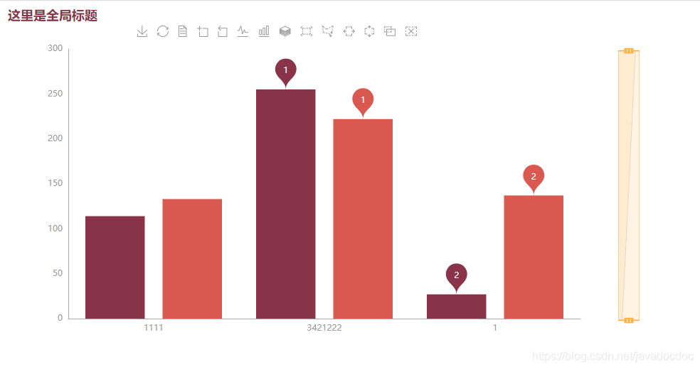
1,柱形图
rom pyecharts.charts import Bar
from pyecharts import options as opts
from pyecharts.globals import RenderType,ThemeType

bar = (
    # 设置图片的长和宽
    Bar(init_opts=opts.InitOpts(width='900px',
                                height='500px',
                                chart_id=12,
                                # 渲染风格
                                renderer=RenderType.SVG,
                                page_title="柱形图标题",
                                # 主题
                                theme=ThemeType.ESSOS,
                                # 图标背景设置
                                bg_color='white'))
    # 设置x轴
    #.add_xaxis(["衬衫", "毛衣", "领带", "裤子", "风衣", "高跟鞋", "袜子"])
    # 这个函数只能用一次,不然后面会将前面的给覆盖掉
    .add_xaxis(["1111", "3421222", "1"])
    # 设置y轴,, stack='stack' 设置为堆叠式的展示,当有多个y的时候,只有都设置了才会生效
    .add_yaxis("商家A", [114,255, 27])
    .add_yaxis("商家c", [133, 222, 137])

)
# 是否修改为横线显示(将x轴和y轴进行反转)
#bar.reversal_axis()
# 设置全局变量,如果要设置多个全部变量的话,只能调用一次进行设置,不然后面的会将前面的覆盖掉
bar.set_global_opts(title_opts=opts.TitleOpts(title='这里是全局标题'),
                    # 工具箱配置,is_show 标识是否显示,orient 标志是横向(horizontal)还是纵向(vertical)显示
                    toolbox_opts=opts.ToolboxOpts(is_show=True,
                                                  orient='horizontal',
                                                  # 工具箱的位置
                                                  pos_left='20%',
                                                  pos_right='20%',
                                                  pos_top='20px'),
                    # 图例相关的配置
                    legend_opts=opts.LegendOpts(is_show=False),
                    # 提示框的配置(当鼠标放在柱状图上的时候是否会有提示),
                    # trigger标识的是触发类型,柱状图和折线图一般是使用axis,散点图或饼图多选用item
                    # axis_pointer_type 标识指示器的类型,line为直线指示器,shadow为阴影指示器,none表示无指示器,cross表示十字准星指示器,
                    # 具体使用每种指示器效果可以测试使用
                    tooltip_opts=opts.TooltipOpts(is_show=True,trigger='axis',axis_pointer_type='shadow'),
                    # 区域缩放配置,可以通过滑动滑块限制查看的范围
                    datazoom_opts=opts.DataZoomOpts(orient='vertical', is_realtime=True,),


                    )
# label指的是柱状图上面的数字
bar.set_series_opts(label_opts=opts.LabelOpts(is_show=False,
                                              position='right',
                                              # 标签的颜色
                                              color='black',
                                              # 距离图形的距离,只有当position为top等位置描述的时候才会有效
                                              distance='20px',
                                              font_size='15px',
                                              # 'normal','italic','oblique'
                                              font_style='italic',
                                              rotate=90),
                    # 需要注意的是这里的标记项是针对于所有的y来计算的,如果x和y的列对不上的话,那么可能会导致无法完全展示
                    markpoint_opts=opts.MarkPointOpts(
                        # value_index可以用来指定标记的是x轴还是y轴(0:x 1:y),当然也可以用value_dim来进行区分
                        data=[opts.MarkPointItem(type_='min', name='最小值', value_index=0,coord=['x','y'],value='xxxxx'),
                              opts.MarkPointItem(type_='max', name='最大值', value_index=0),
                              opts.MarkPointItem(type_='average', name='平均值', value_index=0)],

                    ))
#bar.set_series_opts(markline_opts=opts.MarkLineOpts(data=[opts.MarkLineItem(type_='average',name='平均值')]))
bar.render()
2,折线图
from pyecharts.charts import Line
from pyecharts import options as opts

line = Line()
line.add_xaxis(['c1','c2','c3','c4'])
line.add_yaxis(series_name='name',y_axis=[1,2,3,9])
line.add_yaxis(series_name='name2',y_axis=[11,21,13,19])
line.set_global_opts(title_opts=opts.TitleOpts('sssss'),
                     legend_opts=opts.LegendOpts(is_show=True),
                     toolbox_opts=opts.ToolboxOpts(is_show=True),
                     tooltip_opts=opts.TooltipOpts(is_show=True,trigger='axis',axis_pointer_type='cross')
                     )
line.render()

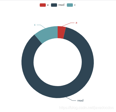
3,饼图
from pyecharts.charts import Pie

pie = Pie()
a = ['a', 'read', 'c']
b = [1, 23, 3]
# radius 参数可以将饼状图修改为环形图
pie.add(series_name='hhhh', data_pair=list(zip(a, b)), radius=['40%', '60%'])
pie.render()
4,词云
from pyecharts.charts import WordCloud

s = '''The Zen of Python, by Tim Peters
Beautiful is better than ugly.
Explicit is better than implicit.
Simple is better than complex.
Complex is better than complicated.
Flat is better than nested.
Sparse is better than dense.
Readability counts.
Special cases aren't special enough to break the rules.
Although practicality beats purity.
Errors should never pass silently.
Unless explicitly silenced.
In the face of ambiguity, refuse the temptation to guess.
There should be one-- and preferably only one --obvious way to do it.
Although that way may not be obvious at first unless you're Dutch.
Now is better than never.
Although never is often better than *right* now.
If the implementation is hard to explain, it's a bad idea.
If the implementation is easy to explain, it may be a good idea.
Namespaces are one honking great idea -- let's do more of those!'''
s = s.lower().split()
# 记录每一个单词出现的次数
d = {}
for i in s:
    d[i] = d.get(i, 0) + 1

di = list(d.items())
print(di)
w = WordCloud()
w.add(series_name='词云测试', data_pair=di)
w.render()

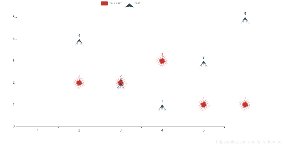
5,动态散点图
from pyecharts.charts import EffectScatter
from pyecharts import options as opts
from pyecharts.globals import SymbolType

bar = (
    # 设置图片的长和宽
    EffectScatter(init_opts=opts.InitOpts(width='900px',
                                          height='500px',
                                          page_title="动态散点图各种图形示例"))
        .add_xaxis([1, 2, 3, 4, 5])
        .add_yaxis("te333st", [2, 2, 3, 1, 1], symbol=SymbolType.ROUND_RECT, symbol_size=16, symbol_rotate=30)
        .add_yaxis("test", [4, 2, 1, 3, 5], symbol=SymbolType.ARROW, symbol_size=10)

)
bar.render()
print()
print('===========')
6,关系图
from pyecharts.charts import Graph
from pyecharts import options as opts
from pyecharts.globals import RenderType, ThemeType

# nodes = [{'name': 'node1', 'symbolSize': 10},
#          {'name': 'node2', 'symbolSize': 20},
#          {'name': 'node3', 'symbolSize': 30},
#          {'name': 'node4', 'symbolSize': 40}]
# links = [{'source': 'node1', 'target': 'node1'},
#          {'source': 'node1', 'target': 'node2'},
#          {'source': 'node1', 'target': 'node3'},
#          {'source': 'node3', 'target': 'node4'},
#          {'source': 'node4', 'target': 'node2'},
#          {'source': 'node4', 'target': 'node1'}]

nodes = [opts.GraphNode(name='node1', symbol_size=10, value=1),
         opts.GraphNode(name='node2', symbol_size=20, value=2),
         opts.GraphNode(name='node3', symbol_size=30, value=3),
         opts.GraphNode(name='node4', symbol_size=40, value=4), ]
links = [opts.GraphLink(source='node1', target='node1', value='l1'),
         opts.GraphLink(source='node1', target='node2', value='l1'),
         opts.GraphLink(source='node1', target='node3', value='l1'),
         opts.GraphLink(source='node3', target='node1', value='l1'),
         opts.GraphLink(source='node2', target='node1', value='l4'),
         opts.GraphLink(source='node4', target='node1', value='l3')]
bar = (
    # 设置图片的长和宽
    Graph(init_opts=opts.InitOpts(page_title="关系图-力引导布局示例"))
        .add('test_name',
             nodes,
             links,
             repulsion=10000,
             edge_label=opts.LabelOpts(is_show=True, position='middle', formatter='{b}还是{c}'),
             linestyle_opts=opts.LineStyleOpts(is_show=True, curve=1)
             )

).set_global_opts(legend_opts=opts.LegendOpts(is_show=False))
bar.render()
print()
print('===========')

7,散点图
from pyecharts import options as opts
from pyecharts.charts import Scatter
import numpy as np

x = np.linspace(0, 20)
y = np.cos(x)
scatter = Scatter()
scatter.add_xaxis(xaxis_data=x)
scatter.add_yaxis(series_name='测试名',
                  y_axis=y,
                  # 每一个散点的数据值是否展示
                  label_opts=opts.LabelOpts(is_show=False),
                  # 控制点的大小
                  symbol_size=10,
                  # 控制点的形状
                  symbol='triangle')
scatter.render()

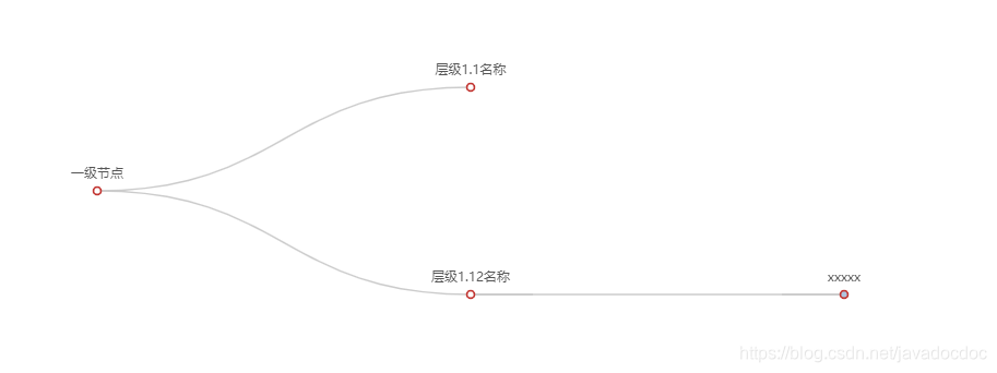
8,树图
from pyecharts.charts import Tree
from pyecharts import options as opts

data = [
    {
        'name': '一级节点',
        'children': [
            {'name': '层级1.1名称'},
            {'children': [
                {'name': 'xxxxx',
                 'children': [{'name': 'ddddd'}, {'name': '2.2'}]}

            ], 'name': '层级1.12名称'}
        ]
    }
]
c = (
    Tree(init_opts=opts.InitOpts(page_title='树图测试')
         ).add('ddd', data)

)
c.render()


 3650
3650


 被折叠的 条评论
为什么被折叠?
被折叠的 条评论
为什么被折叠?
 到【灌水乐园】发言


