


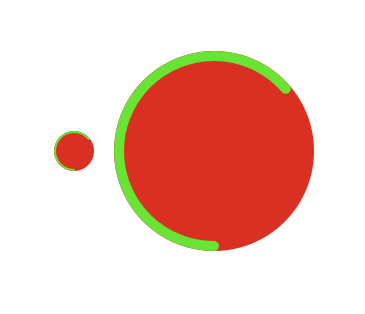
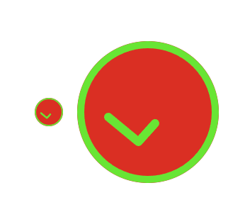
支持移动端(rem),PC端,CSS SVG 实现成功动画、打勾动画、对号动画
借鉴了其他博客的内容,但设置了一个关键属性
viewbox来支持自适应(rem)
<!DOCTYPE html>
<html lang="en">

<head>
  <meta charset="UTF-8" />
  <meta http-equiv="X-UA-Compatible" content="IE=edge" />
  <script src="http://g.tbcdn.cn/mtb/lib-flexible/0.3.4/??flexible_css.js,flexible.js"></script>
  <title>支持移动端,PC端,CSS SVG 实现成功动画、对钩动画、对号动画</title>
  <style>
    html,
    body {
      display: flex;
      justify-content: center;
      align-items: center;
      min-height: 100vh;
    }

    .small-svg {
      flex-grow: 0;
      flex-shrink: 0;
      width: 1rem;
      height: 1rem;
      background: #da2f23;
      border-radius: 50%;
      margin-right: 20px;
    }

    .big-svg {
      flex-grow: 0;
      flex-shrink: 0;
      width: 5rem;
      height: 5rem;
      background: #da2f23;
      border-radius: 50%;
    }

    .tick {
      stroke-dasharray: 400;
      stroke-dashoffset: 400;
      animation: tick .6s ease-in-out 1.2s forwards;
    }

    @keyframes tick {
      from {
        stroke-dashoffset: 400;
      }

      to {
        stroke-dashoffset: 0;
      }
    }

    .circle {
      /* stroke-dasharray用于创建虚线 */
      /* 190 * 2 * Math.PI = 1194*/
      /* 这个值表示两个虚线之间的距离 */
      stroke-dasharray: 1194;
      /* 指定了dash模式到路径开始的距离,就是实线虚线绘制的起点距路径开始的距离 */
      stroke-dashoffset: 1194;
      animation: circle .6s ease-in-out .6s forwards;
    }

    @keyframes circle {
      from {
        stroke-dashoffset: 1194;
      }

      to {
        stroke-dashoffset: 0;
      }
    }
  </style>
</head>

<body>
  <svg xmlns="http://www.w3.org/2000/svg" version="1.1" viewbox="0 0 400 400" class="small-svg">
    <!-- 绘制圆形 -->
    <!-- transform-origin="200 200" 设置基准点 -->
    <circle class="circle" fill="none" stroke="#68e534" stroke-width="20" cx="200" cy="200" r="190"
      stroke-linecap="round" transform="rotate(90)" transform-origin="200 200"></circle>
    <!-- 绘制多边形 ,points:多边形的转折点坐标 stroke-linejoin:转折点-->
    <polyline class="tick" fill="none" stroke="#68e534" stroke-width="24" points="88,214 173,284 304,138"
      stroke-linecap="round" stroke-linejoin="round"></polyline>
  </svg>
  <svg xmlns="http://www.w3.org/2000/svg" version="1.1" viewbox="0 0 400 400" class="big-svg">
    <circle class="circle" fill="none" stroke="#68e534" stroke-width="20" cx="200" cy="200" r="190"
      stroke-linecap="round" transform="rotate(90)" transform-origin="200 200"></circle>
    <polyline class="tick" fill="none" stroke="#68e534" stroke-width="24" points="88,214 173,284 304,138"
      stroke-linecap="round" stroke-linejoin="round"></polyline>
  </svg>
</body>

</html>


 1万+
1万+


 被折叠的 条评论
为什么被折叠?
被折叠的 条评论
为什么被折叠?
 到【灌水乐园】发言


