


 本文介绍了如何在Flutter中使用Container和BoxDecoration的gradient属性创建线性颜色渐变效果,包括纵向和横向渐变。此外,详细展示了如何构建一个具有关注状态切换功能的按钮,该按钮具有线性渐变背景,并在状态改变时更新颜色和内容。代码示例展示了完整的实现过程。
一、线性颜色渐变
实现一个容器,大多使用 Container Widget,边框 border 通过 decoration 属性控制,而 BoxDecoration 除了支持 border 的控制外,还支持 gradient 的控制。
  const BoxDecoration({
    this.color,
    this.image,
    this.border,
    this.borderRadius,
    this.boxShadow,
    this.gradient,
    this.backgroundBlendMode,
    this.shape = BoxShape.rectangle,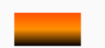
})一般情况下都是使用线性渐变,Fultter 中通过 LinearGradient 来支持实现线性渐变
// 线性渐变
Container(
  width: 200,
  height: 100,
  decoration: BoxDecoration(
    gradient: LinearGradient(
      // Alignment(x,y)  (0,0) 是由 rectangle 中心点计算的
      begin: Alignment(0.0, -1.0),
      end: Alignment(0.0, 1.0),
      colors: <Color>[
        Color(0xFFFF5000),
        Color(0xFFFF9000),
        Colors.black,
      ],
    ),
  ),
),
LinearGradient 定义如下:
  const LinearGradient({
    this.begin = Alignment.centerLeft,
    this.end = Alignment.centerRight,
    @required List<Color> colors,
    List<double> stops,
    this.tileMode = TileMode.clamp,
  })
colors 可以传入多个颜色,用来实现渐变
默认值是 Aligment.centerLeft 和 Aligment.centerRight
关于 Aligment 默认属性和 (x,y) 坐标的关系简单如下:
  /// The top left corner.
  static const Alignment topLeft = Alignment(-1.0, -1.0);

  /// The center point along the top edge.
  static const Alignment topCenter = Alignment(0.0, -1.0);

  /// The top right corner.
  static const Alignment topRight = Alignment(1.0, -1.0);

  /// The center point along the left edge.
  static const Alignment centerLeft = Alignment(-1.0, 0.0);

  /// The center point, both horizontally and vertically.
  static const Alignment center = Alignment(0.0, 0.0);

  /// The center point along the right edge.
  static const Alignment centerRight = Alignment(1.0, 0.0);

  /// The bottom left corner.
  static const Alignment bottomLeft = Alignment(-1.0, 1.0);

  /// The center point along the bottom edge.
  static const Alignment bottomCenter = Alignment(0.0, 1.0);

  /// The bottom right corner.
  static const Alignment bottomRight = Alignment(1.0, 1.0);
Flutter 中 View(典型表现是 Container Widget)中心点(0,0)实际上是真正的中心位置,而不是平常理解的 topLeft 这个点
所以上面渐变的效果如下:
二、横向线性渐变
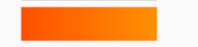
上面实现的是纵向线性渐变,如果要使用横向的线性渐变,其实就是将 start 和 begin 的点改变一下:
Container(
  width: 200,
  height: 50,
  decoration: BoxDecoration(
    gradient: LinearGradient(
      begin: Alignment(-1, 0),
      end: Alignment(1.0, 0),
      colors: <Color>[
        const Color(0xFFFF5000),
        const Color(0xFFFF9000),
      ],
    ),
  ),
),
Alignment(-1, 0) 表示左边中间,Alignment(1.0, 0) 表示右边中间
效果:
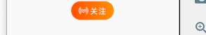
三、模拟手机淘宝的关注按钮
这个关注按钮核心是一个 radius 的形状以及横向的线性颜色渐变
从 iconfont 找到一个微淘的关注图标(白色的,这里看不见):

尴尬的是这个图标是白色的,贴在这里看不出来。搞个背景色如下所示:
颜色渐变分析下来是:const Color(0xFFFF5000), const Color(0xFFFF9000)
除此之外,点击关注后,变成已关注的文案,并且可以多次改变状态
实现:
class FollowWidget extends StatefulWidget {
  FollowWidget({Key key}) : super(key: key);

  _FollowWidgetState createState() => _FollowWidgetState();
}

class _FollowWidgetState extends State<FollowWidget> {
  bool _followStatus = false;

  void _followClickHandle() {
    setState(() {
      this._followStatus = !this._followStatus;
    });
  }

  List<Color> _getGradient() {
    if (this._followStatus) {
      return <Color>[Colors.grey, Colors.grey];
    } else {
      return <Color>[const Color(0xFFFF5000), const Color(0xFFFF9000)];
    }
  }

  List<Widget> _getContent() {
    List<Widget> defaultContent = <Widget>[
      Text(
        this._followStatus ? '已关注' : '关注',
        style: TextStyle(
          fontSize: 16,
          color: Colors.white,
          letterSpacing: 1.2,
        ),
      )
    ];
    List<Widget> prefixContent = <Widget>[
      Image.network(
        'https://gw.alicdn.com/tfs/TB1OC0TXMMPMeJjy1XcXXXpppXa-108-84.png',
        height: 16,
      ),
      SizedBox(width: 3)
    ];
    if (!this._followStatus) {
      defaultContent.insertAll(0, prefixContent);
    }
    return defaultContent;
  }

  @override
  Widget build(BuildContext context) {
    return InkWell(
      child: Container(
        width: 90,
        height: 40,
        decoration: BoxDecoration(
          borderRadius: BorderRadius.all(Radius.circular(20)),
          gradient: LinearGradient(
            begin: Alignment(-1, 0),
            end: Alignment(1.0, 0),
            colors: this._getGradient(),
          ),
        ),
        child: Row(
          mainAxisAlignment: MainAxisAlignment.center,
          crossAxisAlignment: CrossAxisAlignment.center,
          children: this._getContent(),
        ),
      ),
      onTap: this._followClickHandle,
    );
  }
}
效果:
四、完整代码
FlutterHelloWorld/main.45-颜色渐变-follow组件.dart at dev1 · postbird/FlutterHelloWorld · GitHub
FlutterHelloWorld/main.45-2-渐变关注按钮.dart at dev1 · postbird/FlutterHelloWorld · GitHub
如果打不开github,看这里的源码即可。
import 'package:flutter/material.dart';

void main() {
  runApp(MyApp());
}

class MyApp extends StatelessWidget {
  const MyApp({Key key}) : super(key: key);

  @override
  Widget build(BuildContext context) {
    return MaterialApp(
      home: Scaffold(
        appBar: AppBar(
          title: Text('渐变'),
        ),
        body: HomeContent(),
      ),
    );
  }
}

class HomeContent extends StatelessWidget {
  const HomeContent({Key key}) : super(key: key);

  @override
  Widget build(BuildContext context) {
    return Center(
      child: Column(
        mainAxisAlignment: MainAxisAlignment.center,
        children: <Widget>[
          // 径向渐变
          Container(
            width: 200,
            height: 100,
            decoration: BoxDecoration(
              gradient: LinearGradient(
                // Alignment(x,y)  (0,0) 是由 rectangle 中心点计算的
                begin: Alignment(0.0, -1.0),
                end: Alignment(0.0, 1.0),
                colors: <Color>[
                  Color(0xFFFF5000),
                  Color(0xFFFF9000),
                  Colors.black,
                ],
              ),
            ),
          ),
          SizedBox(height: 10),
          // 横向渐变
          Container(
            width: 200,
            height: 50,
            decoration: BoxDecoration(
              gradient: LinearGradient(
                begin: Alignment(-1, 0),
                end: Alignment(1.0, 0),
                colors: <Color>[
                  const Color(0xFFFF5000),
                  const Color(0xFFFF9000),
                ],
              ),
            ),
          ),
          SizedBox(height: 10),
          FollowWidget(),
        ],
      ),
    );
  }
}

class FollowWidget extends StatefulWidget {
  FollowWidget({Key key}) : super(key: key);

  _FollowWidgetState createState() => _FollowWidgetState();
}

class _FollowWidgetState extends State<FollowWidget> {
  bool _followStatus = false;

  void _followClickHandle() {
    setState(() {
      this._followStatus = !this._followStatus;
    });
  }

  List<Color> _getGradient() {
    if (this._followStatus) {
      return <Color>[Colors.grey, Colors.grey];
    } else {
      return <Color>[const Color(0xFFFF5000), const Color(0xFFFF9000)];
    }
  }

  List<Widget> _getContent() {
    List<Widget> defaultContent = <Widget>[
      Text(
        this._followStatus ? '已关注' : '关注',
        style: TextStyle(
          fontSize: 16,
          color: Colors.white,
          letterSpacing: 1.2,
        ),
      )
    ];
    List<Widget> prefixContent = <Widget>[
      Image.network(
        'https://gw.alicdn.com/tfs/TB1OC0TXMMPMeJjy1XcXXXpppXa-108-84.png',
        height: 16,
      ),
      SizedBox(width: 3)
    ];
    if (!this._followStatus) {
      defaultContent.insertAll(0, prefixContent);
    }
    return defaultContent;
  }

  @override
  Widget build(BuildContext context) {
    return InkWell(
      child: Container(
        width: 90,
        height: 40,
        decoration: BoxDecoration(
          borderRadius: BorderRadius.all(Radius.circular(20)),
          gradient: LinearGradient(
            begin: Alignment(-1, 0),
            end: Alignment(1.0, 0),
            colors: this._getGradient(),
          ),
        ),
        child: Row(
          mainAxisAlignment: MainAxisAlignment.center,
          crossAxisAlignment: CrossAxisAlignment.center,
          children: this._getContent(),
        ),
      ),
      onTap: this._followClickHandle,
    );
  }
}
import 'package:flutter/material.dart';
void main() {
runApp(MyApp());
}
class MyApp extends StatelessWidget {
const MyApp({Key key}) : super(key: key);
@override
Widget build(BuildContext context) {
return MaterialApp(
home: Scaffold(
appBar: AppBar(
title: Text('AnimatedContainer Follow'),
),
body: FollowWidget(),
),
);
}
}
class FollowWidget extends StatefulWidget {
FollowWidget({Key key}) : super(key: key);
_FollowWidgetState createState() => _FollowWidgetState();
}
class _FollowWidgetState extends State<FollowWidget> {
bool _followStatus = false;
void _followClickHandle() {
setState(() {
this._followStatus = !this._followStatus;
});
}
List<Color> _getGradient() {
if (this._followStatus) {
return <Color>[Colors.grey, Colors.grey];
} else {
return <Color>[const Color(0xFFFF5000), const Color(0xFFFF9000)];
}
}
List<Widget> _getContent() {
List<Widget> defaultContent = <Widget>[
Text(
this._followStatus ? '已关注' : '关注',
style: TextStyle(
fontSize: 16,
color: Colors.white,
letterSpacing: 1.2,
),
)
];
List<Widget> prefixContent = <Widget>[
Image.network(
'https://gw.alicdn.com/tfs/TB1OC0TXMMPMeJjy1XcXXXpppXa-108-84.png',
height: 16,
),
SizedBox(width: 3)
];
if (!this._followStatus) {
defaultContent.insertAll(0, prefixContent);
}
return defaultContent;
}
@override
Widget build(BuildContext context) {
return InkWell(
child: AnimatedContainer(
width: 90,
height: 40,
duration: Duration(milliseconds: 500),
decoration: BoxDecoration(
borderRadius: BorderRadius.all(Radius.circular(20)),
gradient: LinearGradient(
begin: Alignment(-1, 0),
end: Alignment(1.0, 0),
colors: this._getGradient(),
),
),
child: Row(
mainAxisAlignment: MainAxisAlignment.center,
crossAxisAlignment: CrossAxisAlignment.center,
children: this._getContent(),
),
),
onTap: this._followClickHandle,
);
}
}


 扫一扫
扫一扫


 3054
3054

 被折叠的 条评论
为什么被折叠?
被折叠的 条评论
为什么被折叠?
 到【灌水乐园】发言


