


css定位布局及其特性
1、定位其实就是玩的一个position属性,就和浮动玩的是float属性一样。
position属性用于指定一个元素在文档中的定位方式,其中top,left,right,bottom属性则最终决定了该元素在文档中的位置。
position有五大属性分别是:
- static 静态定位
- relative 相对定位
- absolute 决定定位
- fixed 固定定位
- sticky 粘性定位
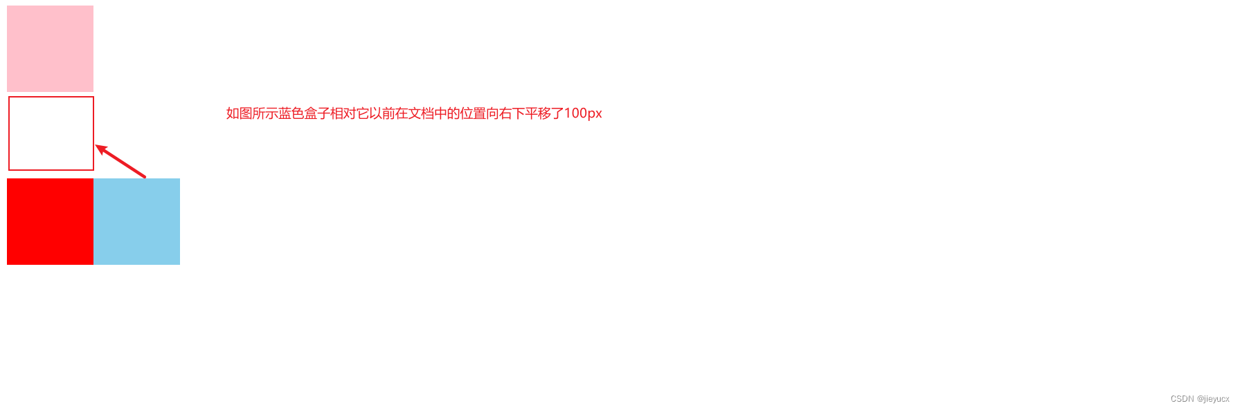
相对定位及其特性
相对定位的元素是在文档中的正常位置偏移给定的值。也可以理解为,相对定位的元素时相对元素本身在文档中的位置进行偏移的。
看个实例:
<!DOCTYPE html>
<html lang="en">
<head>
    <meta charset="UTF-8">
    <meta http-equiv="X-UA-Compatible" content="IE=edge">
    <meta name="viewport" content="width=device-width, initial-scale=1.0">
    <title>Document</title>
    <style>
        .box1{
            width:100px;
            height:100px;
            background:pink;
        }
        .box2{
            width:100px;
            height:100px;
            background:skyblue;
            position: relative;
            left:100px;
            top:100px;
        }
        .box3{
            width:100px;
            height:100px;
            background:red;
        }
    </style>
</head>
<body>
    <div class="box1"></div>
    <div class="box2"></div>
    <div class="box3"></div>
</body>
</html>
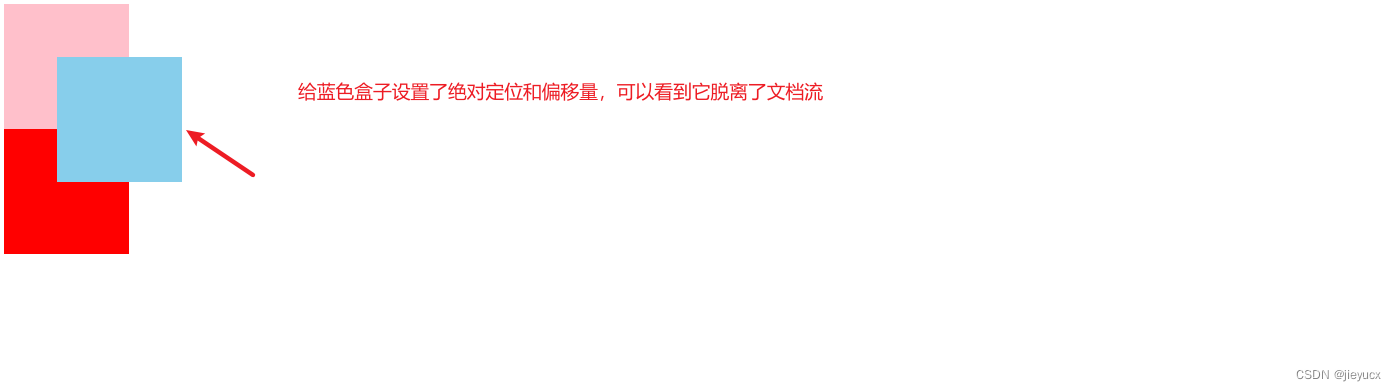
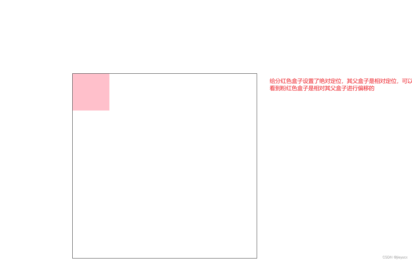
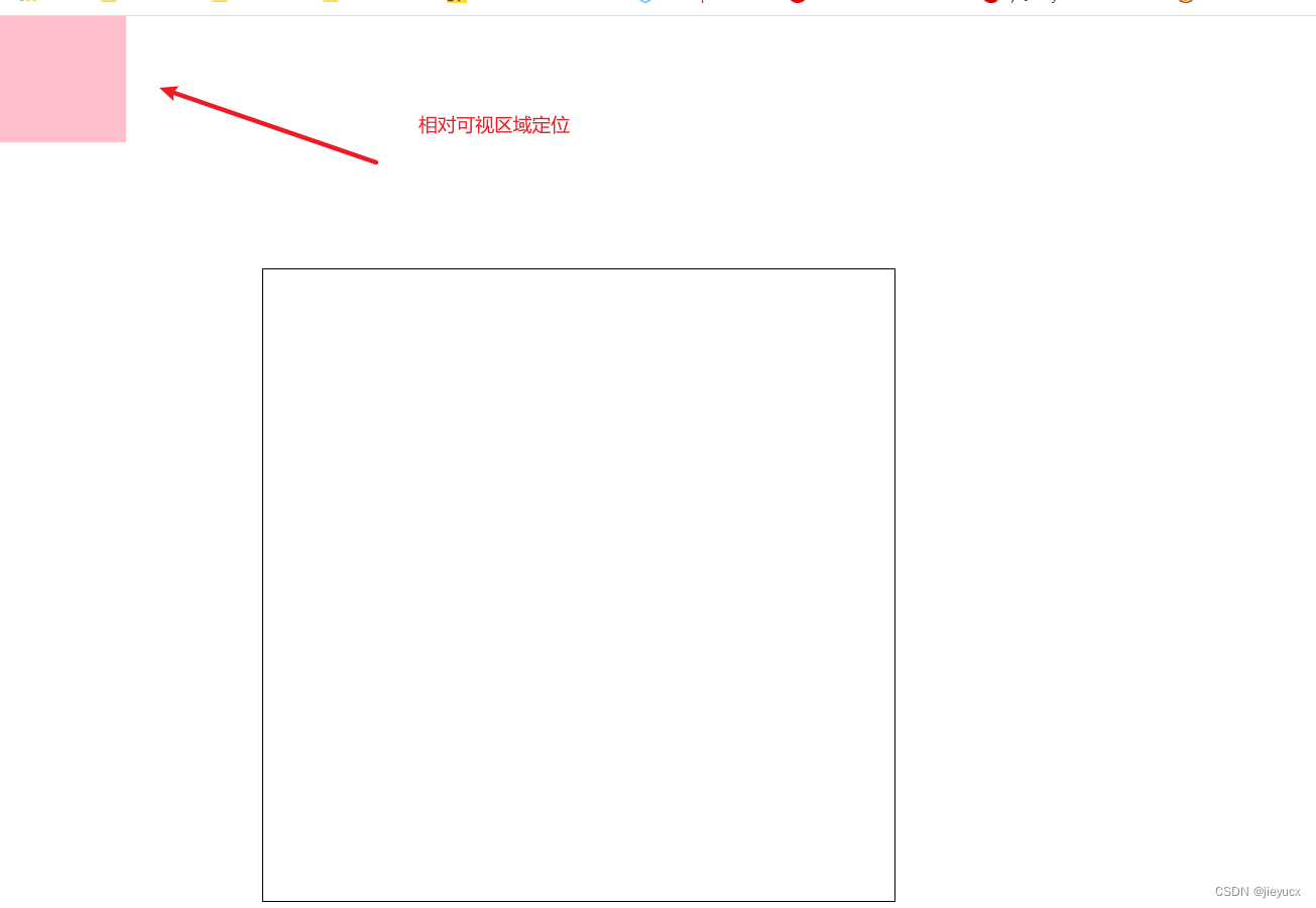
绝对定位及其特性
绝对定位的元素脱离了文档流,并且不占据空间;绝对定位的元素是相对于最近的非static祖先元素定位,当这样的祖先元素不存在时,则相对于可视区域。
<!DOCTYPE html>
<html lang="en">
<head>
    <meta charset="UTF-8">
    <meta http-equiv="X-UA-Compatible" content="IE=edge">
    <meta name="viewport" content="width=device-width, initial-scale=1.0">
    <title>Document</title>
    <style>
        .box1{
            width:100px;
            height:100px;
            background:pink;
        }
        .box2{
            width:100px;
            height:100px;
            background:skyblue;
            position: absolute;
            left: 50px;
            top: 50px;
        }
        .box3{
            width:100px;
            height:100px;
            background:red;
        }
    </style>
</head>
<body>
    <div class="box1"></div>
    <div class="box2"></div>
    <div class="box3"></div>
</body>
</html>
<!DOCTYPE html>
<html lang="en">
<head>
    <meta charset="UTF-8">
    <meta http-equiv="X-UA-Compatible" content="IE=edge">
    <meta name="viewport" content="width=device-width, initial-scale=1.0">
    <title>Document</title>
    <style>
        body{
            height:2000px;
            position: relative;
        }
        .box1{
            width:500px;
            height:500px;
            border:1px black solid;
            margin:200px;
            position: relative;
        }
        .box2{
            width:100px;
            height:100px;
            background:pink;
            position: absolute;
            left:0;
            top:0;
        }
    </style>
</head>
<body>
    <div class="box1">
        <div class="box2"></div>
    </div>
</body>
</html>
当我们把其祖先元素的position:relitive注释掉之后:
固定定位及其特性
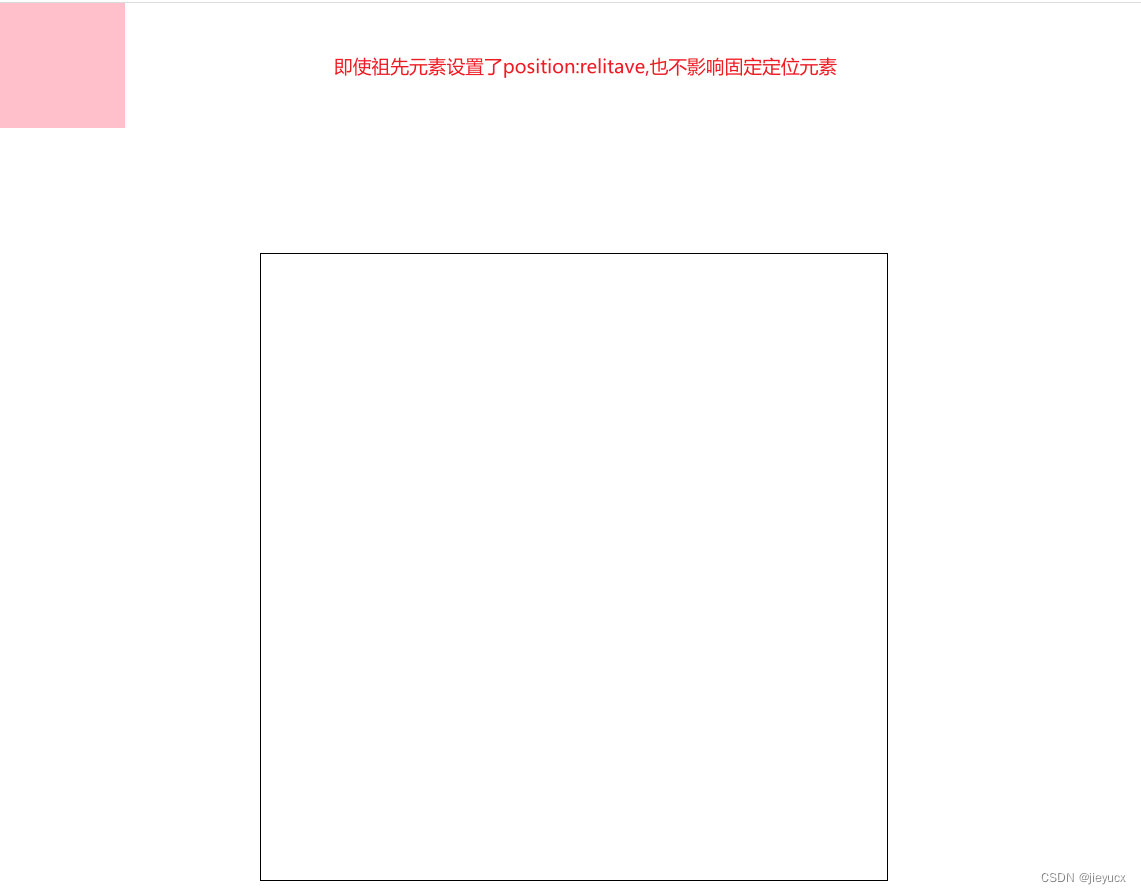
固定定位是相对于可视区域定位,不受祖先元素影响。也就是在这个可视区域内你设置多少偏移量,它就偏移多少。
<!DOCTYPE html>
<html lang="en">
<head>
    <meta charset="UTF-8">
    <meta http-equiv="X-UA-Compatible" content="IE=edge">
    <meta name="viewport" content="width=device-width, initial-scale=1.0">
    <title>Document</title>
    <style>
        body{
            height:2000px;
            position: relative;
        }
        .box1{
            width:500px;
            height:500px;
            border:1px black solid;
            margin:200px;
            position: relative;
        }
        .box2{
            width:100px;
            height:100px;
            background:pink;
            position: fixed;
            left:0;
            top:0;
        }
    </style>
</head>
<body>
    <div class="box1">
        <div class="box2"></div>
    </div>
</body>
</html>
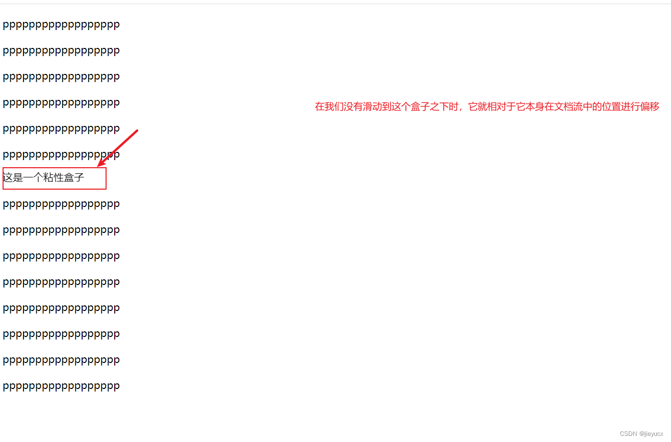
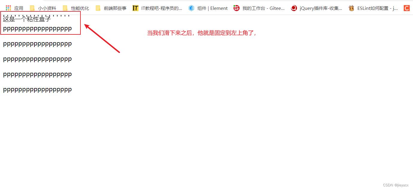
粘性定位及其特性
粘性定位可以看做是相对定位和固定定位的组合,元素在跨越特定阈值之前为相对定位,之后为固定定位
<!DOCTYPE html>
<html lang="en">

<head>
    <meta charset="UTF-8">
    <meta http-equiv="X-UA-Compatible" content="IE=edge">
    <meta name="viewport" content="width=device-width, initial-scale=1.0">
    <title>Document</title>
    <style>
        body{
            height:2000px;
        }
        p {
            margin-top: 20px;
        }
        div{
            position: sticky;
            top : 0;
        }
    </style>
</head>

<body>
    <p>pppppppppppppppppp</p>
    <p>pppppppppppppppppp</p>
    <p>pppppppppppppppppp</p>
    <p>pppppppppppppppppp</p>
    <p>pppppppppppppppppp</p>
    <p>pppppppppppppppppp</p>
    <div>这是一个粘性盒子</div>
    <p>pppppppppppppppppp</p>
    <p>pppppppppppppppppp</p>
    <p>pppppppppppppppppp</p>
    <p>pppppppppppppppppp</p>
    <p>pppppppppppppppppp</p>
    <p>pppppppppppppppppp</p>
    <p>pppppppppppppppppp</p>
    <p>pppppppppppppppppp</p>
</body>

</html>
以上就是定位啦,其实项目开发中运用最多的还是‘子绝父相’


 154
154


 被折叠的 条评论
为什么被折叠?
被折叠的 条评论
为什么被折叠?
 到【灌水乐园】发言


