一款很漂亮的CSS3登录界面

一款很漂亮的CSS3登录界面

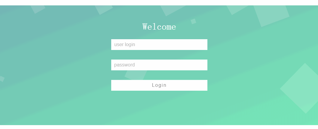
-随着高级浏览器的出现,对css3的支持也很不错了,下面我展现自己用CSS3做的一款登陆界面。
-效果如图
效果图
-代码如下:

<!DOCTYPE html>
<html>
<head lang="en">
    <meta charset="UTF-8">
    <title>一款很漂亮的CSS3登录界面</title>
    <style type="text/css">
        * {
            box-sizing: border-box;
        }
        body {
            margin: 0; 
            padding: 0;
            font: 16px/20px microsft yahei;
        }
        .wrap {
            width: 100%;
            height: 400px;
            padding: 40px 0;
            position: fixed;
            top: 50%;
            margin-top: -200px;
            opacity: 0.8;
            background: linear-gradient(to bottom right,#50a3a2,#53e3a6);
            background: -webkit-linear-gradient(to bottom right,#50a3a2,#53e3a6);
        }
        .container {
            width: 60%;
            margin: 0 auto;
        }
        .container h1 {
            text-align: center;
            color: #FFFFFF;
            font-weight: 500;
        }
        .container input {
            width: 320px;
            display: block;
            height: 36px;
            border: 0;
            outline: 0;
            padding: 6px 10px;
            line-height: 24px;
            margin: 32px auto;
            -webkit-transition: all 0s ease-in 0.1ms;
            -moz-transition: all 0s ease-in 0.1ms;
            transition: all 0s ease-in 0.1ms;
        }
        .container input[type="text"] , .container input[type="password"]  {
            background-color: #FFFFFF;
            font-size: 16px;
            color: #50a3a2;
        }
        .container input[type='submit'] {
            font-size: 16px;
            letter-spacing: 2px;
            color: #666666;
            background-color: #FFFFFF;
        }
        .container input:focus {
            width: 400px;
        }
        .container input[type='submit']:hover {
            cursor: pointer;
            width: 400px;
        }

        .wrap ul {
            position: absolute;
            top: 0;
            left: 0;
            width: 100%;
            height: 100%;
            z-index: -10;
        }
        .wrap ul li {
            list-style-type: none;
            display: block;
            position: absolute;
            bottom: -120px;
            width: 15px;
            height: 15px;
            z-index: -8;
            background-color:rgba(255, 255, 255, 0.15);
            animotion: square 25s infinite;
            -webkit-animation: square 25s infinite;
        }
        .wrap ul li:nth-child(1) {
            left: 0;
            animation-duration: 10s;
            -moz-animation-duration: 10s;
            -o-animation-duration: 10s;
            -webkit-animation-duration: 10s;
        }
        .wrap ul li:nth-child(2) {
            width: 40px;
            height: 40px;
            left: 10%;
            animation-duration: 15s;
            -moz-animation-duration: 15s;
            -o-animation-duration: 15s;
            -webkit-animation-duration: 15s;
        }
        .wrap ul li:nth-child(3) {
            left: 20%;
            width: 25px;
            height: 25px;
            animation-duration: 12s;
            -moz-animation-duration: 12s;
            -o-animation-duration: 12s;
            -webkit-animation-duration: 12s;
        }
        .wrap ul li:nth-child(4) {
            width: 50px;
            height: 50px;
            left: 30%;
            -webkit-animation-delay: 3s;
            -moz-animation-delay: 3s;
            -o-animation-delay: 3s;
            animation-delay: 3s;
            animation-duration: 12s;
            -moz-animation-duration: 12s;
            -o-animation-duration: 12s;
            -webkit-animation-duration: 12s;
        }
        .wrap ul li:nth-child(5) {
            width: 60px;
            height: 60px;
            left: 40%;
            animation-duration: 10s;
            -moz-animation-duration: 10s;
            -o-animation-duration: 10s;
            -webkit-animation-duration: 10s;
        }
        .wrap ul li:nth-child(6) {
            width: 75px;
            height: 75px;
            left: 50%;
            -webkit-animation-delay: 7s;
            -moz-animation-delay: 7s;
            -o-animation-delay: 7s;
            animation-delay: 7s;
        }
        .wrap ul li:nth-child(7) {
            left: 60%;
            animation-duration: 8s;
            -moz-animation-duration: 8s;
            -o-animation-duration: 8s;
            -webkit-animation-duration: 8s;
        }
        .wrap ul li:nth-child(8) {
            width: 90px;
            height: 90px;
            left: 70%;
            -webkit-animation-delay: 4s;
            -moz-animation-delay: 4s;
            -o-animation-delay: 4s;
            animation-delay: 4s;
        }
        .wrap ul li:nth-child(9) {
            width: 100px;
            height: 100px;
            left: 80%;
            animation-duration: 20s;
            -moz-animation-duration: 20s;
            -o-animation-duration: 20s;
            -webkit-animation-duration: 20s;
        }
        .wrap ul li:nth-child(10) {
            width: 120px;
            height: 120px;
            left: 90%;
            -webkit-animation-delay: 6s;
            -moz-animation-delay: 6s;
            -o-animation-delay: 6s;
            animation-delay: 6s;
            animation-duration: 30s;
            -moz-animation-duration: 30s;
            -o-animation-duration: 30s;
            -webkit-animation-duration: 30s;
        }

        @keyframes square {
            0%  {
                    -webkit-transform: translateY(0);
                    transform: translateY(0)
                }
            100% {
                    bottom: 400px;
                    transform: rotate(600deg);
                    -webit-transform: rotate(600deg);
                    -webkit-transform: translateY(-500);
                    transform: translateY(-500)
            }
        }
        @-webkit-keyframes square {
            0%  {
                -webkit-transform: translateY(0);
                transform: translateY(0)
            }
            100% {
                bottom: 400px;
                transform: rotate(600deg);
                -webit-transform: rotate(600deg);
                -webkit-transform: translateY(-500);
                transform: translateY(-500)
            }
        }
    </style>
</head>
<body>
    <div class="wrap">
        <div class="container">
            <h1>Welcome</h1>
            <form>
                <input type="text" placeholder="user login"/>
                <input type="password" placeholder="password"/>
                <input type="submit" value="Login"/>
            </form>
        </div>
        <ul>
            <li></li>
            <li></li>
            <li></li>
            <li></li>
            <li></li>
            <li></li>
            <li></li>
            <li></li>
            <li></li>
            <li></li>
        </ul>
    </div>
</body>
</html>
  • 29
    点赞
  • 169
    收藏
    觉得还不错? 一键收藏
  • 16
    评论
### 回答1: 好的,以下是一个简单的示例代码,用HTML和CSS编写了一个漂亮的登录界面: HTML代码: ``` <!DOCTYPE html> <html> <head> <title>登录</title> <link rel="stylesheet" type="text/css" href="style.css"> </head> <body> <div class="login"> <h1>欢迎登录</h1> <form> <label for="username">用户名:</label> <input type="text" id="username" name="username" required> <label for="password">密码:</label> <input type="password" id="password" name="password" required> <input type="submit" value="登录"> </form> </div> </body> </html> ``` CSS代码: ``` body { background-color: #F0F0F0; } .login { background-color: #FFF; border-radius: 10px; box-shadow: 0px 0px 10px #888; margin: 100px auto; padding: 20px; width: 400px; } h1 { text-align: center; color: #555; } form { display: flex; flex-direction: column; } label { margin-top: 10px; color: #555; } input[type=text], input[type=password] { padding: 10px; border: 1px solid #CCC; border-radius: 5px; margin-bottom: 20px; } input[type=submit] { background-color: #4CAF50; border: none; color: white; padding: 10px; border-radius: 5px; cursor: pointer; margin-bottom: 20px; } input[type=submit]:hover { background-color: #45a049; } ``` 这个登录界面使用了一个带圆角和阴影的白色框作为背景,以及一些简单的HTML表单元素。登录按钮在鼠标悬停时会变成深绿色。这只是一个简单的示例,你可以根据自己的需要和品味进行更改和扩展。 ### 回答2: 编写一个漂亮的登录界面需要使用HTML和CSS来实现。下面是一个示例代码: ```html <!DOCTYPE html> <html> <head> <title>登录界面</title> <style> body { background-color: #f2f2f2; font-family: Arial, sans-serif; } .login-container { width: 300px; margin: 50px auto; padding: 20px; background-color: #ffffff; border-radius: 5px; box-shadow: 0px 0px 10px rgba(0, 0, 0, 0.1); } .login-container h2 { text-align: center; color: #333333; } .login-container input[type="text"], .login-container input[type="password"] { width: 100%; padding: 10px; margin-bottom: 10px; border: 1px solid #cccccc; border-radius: 3px; } .login-container button { width: 100%; padding: 10px; background-color: #4CAF50; border: none; color: #ffffff; font-size: 16px; font-weight: bold; cursor: pointer; border-radius: 3px; } .login-container button:hover { background-color: #45a049; } </style> </head> <body> <div class="login-container"> <h2>用户登录</h2> <input type="text" placeholder="用户名"> <input type="password" placeholder="密码"> <button>登录</button> </div> </body> </html> ``` 上述代码中,我们创建了一个登录容器(login-container),该容器位于屏幕中央,具有漂亮圆角和阴影效果。在该容器内,我们添加了一个标题、一个输入框用于输入用户名、一个输入框用于输入密码,以及一个登录按钮。其中,用CSS定义了容器的样式,包括宽度、边距、背景色、阴影等;定义了输入框的样式,包括宽度、内边距、边框等;定义了按钮的样式,包括宽度、内边距、背景色、边框等。这些样式都帮助我们创建了一个漂亮的登录界面

“相关推荐”对你有帮助么?

  • 非常没帮助
  • 没帮助
  • 一般
  • 有帮助
  • 非常有帮助
提交
评论 16
添加红包

请填写红包祝福语或标题

红包个数最小为10个

红包金额最低5元

当前余额3.43前往充值 >
需支付:10.00
成就一亿技术人!
领取后你会自动成为博主和红包主的粉丝 规则
hope_wisdom
发出的红包
实付
使用余额支付
点击重新获取
扫码支付
钱包余额 0

抵扣说明:

1.余额是钱包充值的虚拟货币,按照1:1的比例进行支付金额的抵扣。
2.余额无法直接购买下载,可以购买VIP、付费专栏及课程。

余额充值