


Plotly是一个非常著名且强大的开源数据可视化框架,它通过构建基于浏览器显示的web形式的可交互图表来展示信息,可创建多达数十种精美的图表和地图,本文就将以jupyter notebook为开发工具,详细介绍Plotly的基础内容。
Figure
-
Data
- Trace1
- Trace2
…
-
Layout
- Layout options
import plotly.graph_objects as go
import numpy as np
import pandas as pd
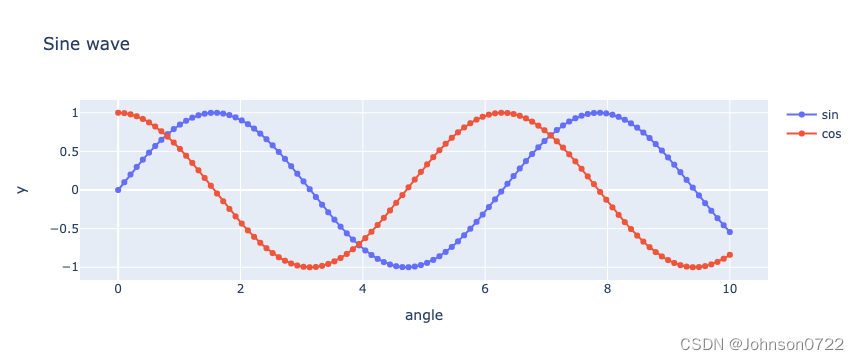
scatter plot
N = 1000
t = np.linspace(0, 10, 100)
y1 = np.sin(t)
y2 = np.cos(t)

trace1 = go.Scatter(x=t, y=y1, mode='lines+markers', name="sin")
trace2 = go.Scatter(x=t, y=y2, mode='lines+markers', name="cos")
data = [trace1, trace2]

layout = go.Layout(title = "Sine wave",
                   xaxis = {'title':'angle'},
                   yaxis = {'title':'y'},
                  showlegend=True)

fig = go.Figure(data=data, layout=layout)
fig.show()
N = 10000
x = np.random.randn(N)
y = np.random.randn(N)
trace = go.Scattergl(x=x, y=y, mode="markers")
data = [trace]
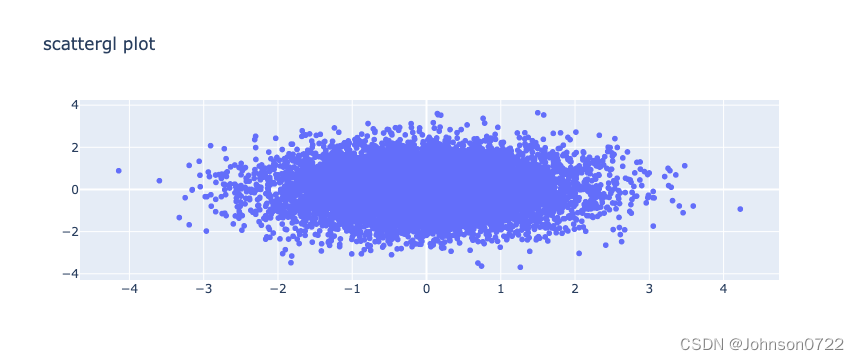
layout = go.Layout(title="scattergl plot")
fig = go.Figure(data=data, layout=layout)
fig.show()
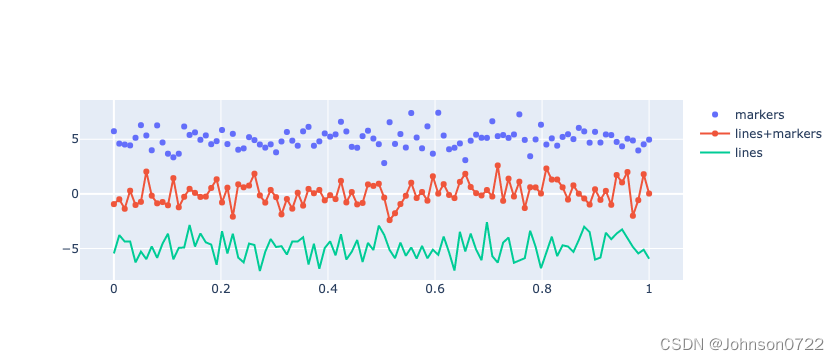
line
N = 100
random_x = np.linspace(0, 1, N)
random_y0 = np.random.randn(N) + 5
random_y1 = np.random.randn(N)
random_y2 = np.random.randn(N) - 5

fig = go.Figure()
fig.add_trace(go.Scatter(x=random_x, y=random_y0, mode='markers', name='markers'))
fig.add_trace(go.Scatter(x=random_x, y=random_y1, mode='lines+markers', name='lines+markers'))
fig.add_trace(go.Scatter(x=random_x, y=random_y2, mode='lines', name='lines'))
fig.show()
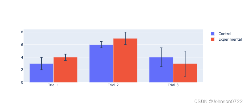
bar
fig = go.Figure()
fig.add_trace(go.Bar(
    name='Control',
    x=['Trial 1', 'Trial 2', 'Trial 3'], y=[3, 6, 4],
    error_y=dict(type='data', array=[1, 0.5, 1.5])
))
fig.add_trace(go.Bar(
    name='Experimental',
    x=['Trial 1', 'Trial 2', 'Trial 3'], y=[4, 7, 3],
    error_y=dict(type='data', array=[0.5, 1, 2])
))
fig.update_layout(barmode='group')
fig.show()
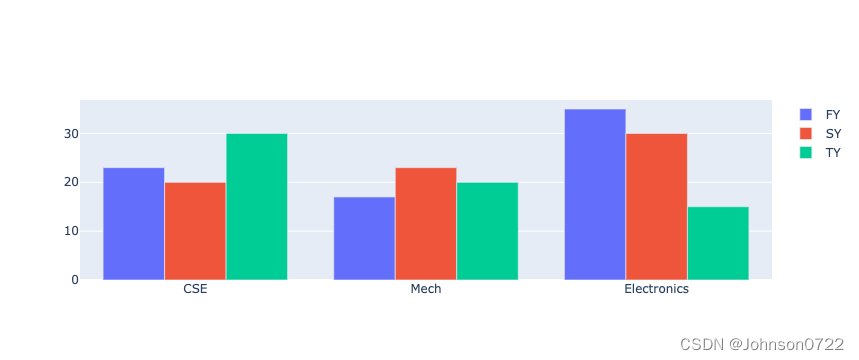
branches = ['CSE', 'Mech', 'Electronics']
fy = [23,17,35]
sy = [20, 23, 30]
ty = [30,20,15]
trace1 = go.Bar(
   x = branches,
   y = fy,
   name = 'FY'
)
trace2 = go.Bar(
   x = branches,
   y = sy,
   name = 'SY'
)
trace3 = go.Bar(
   x = branches,
   y = ty,
   name = 'TY'
)

data = [trace1, trace2, trace3]
layout = go.Layout(barmode="group")
fig = go.Figure(data=data, layout=layout)
fig.show()
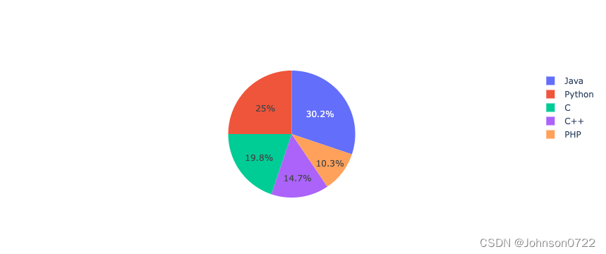
Pie chart
langs = ['C', 'C++', 'Java', 'Python', 'PHP']
students = [23,17,35,29,12]
trace = go.Pie(labels=langs, values = students)
data = [trace]
fig = go.Figure(data = data)
fig.show()
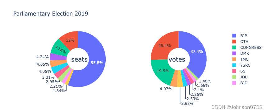
parties = ['BJP', 'CONGRESS', 'DMK', 'TMC', 'YSRC', 'SS', 'JDU','BJD', 'BSP','OTH']
seats = [303,52,23,22,22,18,16,12,10, 65]
percent = [37.36, 19.49, 2.26, 4.07, 2.53, 2.10, 1.46, 1.66, 3.63, 25.44]
import plotly.graph_objs as go
data1 = {
   "values": seats,
   "labels": parties,
   "domain": {"column": 0},
   "name": "seats",
   "hoverinfo":"label+percent+name",
   "hole": .4,
   "type": "pie"
}
data2 = {
   "values": percent,
   "labels": parties,
   "domain": {"column": 1},
   "name": "vote share",
   "hoverinfo":"label+percent+name",
   "hole": .4,
   "type": "pie"
}
data = [data1,data2]
layout = go.Layout(
   {
      "title":"Parliamentary Election 2019",
      "grid": {"rows": 1, "columns": 2},
      "annotations": [
         {
            "font": {
               "size": 20
            },
            "showarrow": False,
            "text": "seats",
            "x": 0.20,
            "y": 0.5
         },
         {
            "font": {
               "size": 20
            },
            "showarrow": False,
            "text": "votes",
            "x": 0.8,
            "y": 0.5
         }
      ]
   }
)
fig = go.Figure(data = data, layout = layout)
fig.show()
box plot
fig = go.Figure()
trace1 = go.Box(y = [1140,1460,489,594,502,508,370,200])
data = [trace1]
fig = go.Figure(data)
fig.show()

violin plot
c1 = np.random.normal(100, 10, 200)
c2 = np.random.normal(80, 30, 200)

trace1 = go.Violin(y=c1, meanline_visible = True, name="c1")
trace2 = go.Violin(y=c2, box_visible = True, name="c2")

data = [trace1, trace2]
fig = go.Figure(data = data)
fig.show()

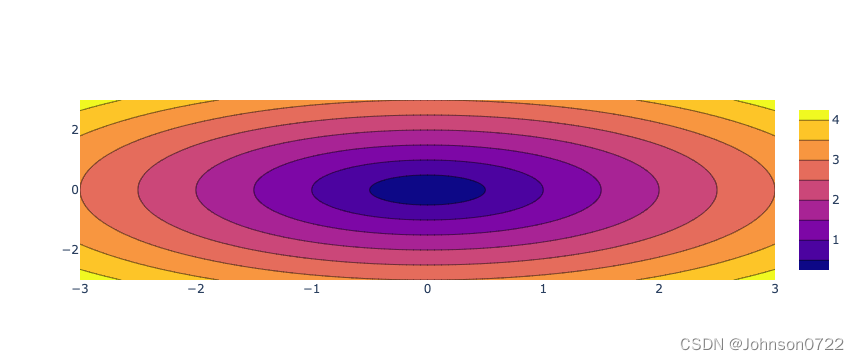
Contour plot
xlist = np.linspace(-3.0, 3.0, 100)
ylist = np.linspace(-3.0, 3.0, 100)
X, Y = np.meshgrid(xlist, ylist)
Z = np.sqrt(X**2 + Y**2)
trace = go.Contour(x = xlist, y = ylist, z = Z)
data = [trace]
fig = go.Figure(data)
fig.show()
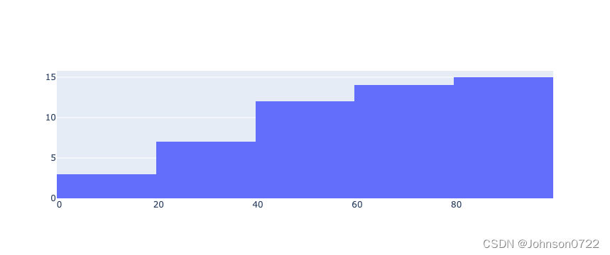
Histogram
x = np.array([22,87,5,43,56,73,55,54,11,20,51,5,79,31,27])
trace = go.Histogram(x=x, cumulative_enabled=True)
data = [trace]

fig = go.Figure(data)
fig.show()
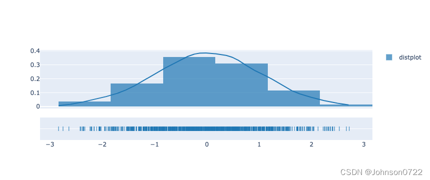
Displots
from plotly import figure_factory
x = np.random.randn(1000)
hist_data = [x]
group_labels = ['distplot']
fig = figure_factory.create_distplot(hist_data, group_labels)
fig.show()
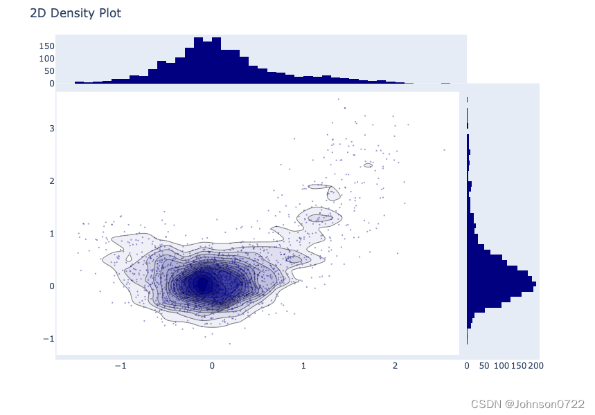
t = np.linspace(-1, 1.2, 2000)
x = (t**3) + (0.3 * np.random.randn(2000))
y = (t**6) + (0.3 * np.random.randn(2000))
fig = figure_factory.create_2d_density( x, y)
fig.show()
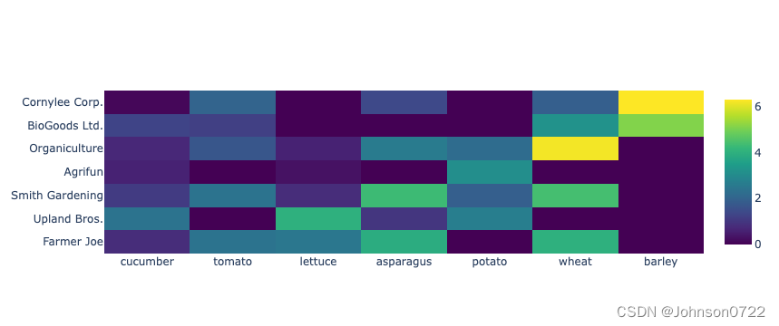
heatmap
vegetables = [
   "cucumber",
   "tomato",
   "lettuce",
   "asparagus",
   "potato",
   "wheat",
   "barley"
]
farmers = [
   "Farmer Joe",
   "Upland Bros.",
   "Smith Gardening",
   "Agrifun",
   "Organiculture",
   "BioGoods Ltd.",
   "Cornylee Corp."
]
harvest = np.array(
   [
      [0.8, 2.4, 2.5, 3.9, 0.0, 4.0, 0.0],
      [2.4, 0.0, 4.0, 1.0, 2.7, 0.0, 0.0],
      [1.1, 2.4, 0.8, 4.3, 1.9, 4.4, 0.0],
      [0.6, 0.0, 0.3, 0.0, 3.1, 0.0, 0.0],
      [0.7, 1.7, 0.6, 2.6, 2.2, 6.2, 0.0],
      [1.3, 1.2, 0.0, 0.0, 0.0, 3.2, 5.1],
      [0.1, 2.0, 0.0, 1.4, 0.0, 1.9, 6.3]
   ]
)
trace = go.Heatmap(
   x = vegetables,
   y = farmers,
   z = harvest,
   type = 'heatmap',
   colorscale = 'Viridis'
)
data = [trace]
fig = go.Figure(data = data)
fig.show()
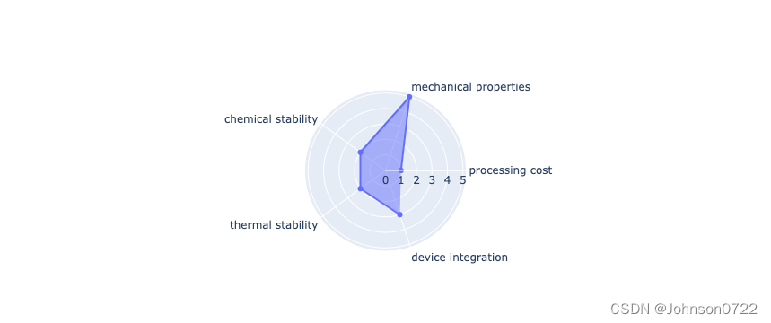
Rader chart
radar = go.Scatterpolar(
   r = [1, 5, 2, 2, 3],
   theta = [
      'processing cost',
      'mechanical properties',
      'chemical stability',
      'thermal stability',
      'device integration'
   ],
   fill = 'toself'
)
data = [radar]
fig = go.Figure(data = data)
fig.show()
OHLC chart
import datetime

open_data = [33.0, 33.3, 33.5, 33.0, 34.1]
high_data = [33.1, 33.3, 33.6, 33.2, 34.8]
low_data = [32.7, 32.7, 32.8, 32.6, 32.8]
close_data = [33.0, 32.9, 33.3, 33.1, 33.1]
date_data = ['10-10-2013', '11-10-2013', '12-10-2013','01-10-2014','02-10-2014']
dates = [
    datetime.datetime.strptime(date_str, '%m-%d-%Y').date()
    for date_str in date_data
]

trace = go.Ohlc(
    x = dates,
    open = open_data,
    high = high_data,
    low = low_data,
    close = close_data
)
data = [trace]
fig = go.Figure(data = data)
fig.show()

plot with multiple axes
x = np.arange(1,11)
y1 = np.exp(x)
y2 = np.log(x)
trace1 = go.Scatter(
   x = x,
   y = y1,
   name = 'exp'
)
trace2 = go.Scatter(
   x = x,
   y = y2,
   name = 'log',
   yaxis = 'y2'
)

data = [trace1, trace2]

layout = go.Layout(
   title = 'Double Y Axis Example',
   yaxis = dict(
      title = 'exp',zeroline=True,
      showline = True
   ),
   yaxis2 = dict(
      title = 'log',
      zeroline = True,
      showline = True,
      overlaying = 'y',
      side = 'right'
   )
)

fig = go.Figure(data=data, layout=layout)
fig.show()
subplots
import plotly

x = np.arange(1,11)
y1 = np.exp(x)
y2 = np.log(x)
trace1 = go.Scatter(
   x = x,
   y = y1,
   name = 'exp'
)
trace2 = go.Scatter(
   x = x,
   y = y2,
   name = 'log'
)

fig = plotly.subplots.make_subplots(rows=1, cols=2)
fig.append_trace(trace1, 1, 1)
fig.append_trace(trace2, 1, 2)
fig.show()
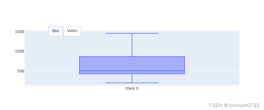
Adding Buttons/Dropdown
fig = go.Figure()
fig.add_trace(go.Box(y = [1140,1460,489,594,502,508,370,200]))
fig.layout.update(
   updatemenus = [
      go.layout.Updatemenu(
         type = "buttons", direction = "left", buttons=list(
            [
               dict(args = ["type", "box"], label = "Box", method = "restyle"),
               dict(args = ["type", "violin"], label = "Violin", method = "restyle")
            ]
         ),
         pad = {"r": 2, "t": 2},
         showactive = True,
         x = 0.11,
         xanchor = "left",
         y = 1.1,
         yanchor = "top"
      ),
   ]
)
fig.show()
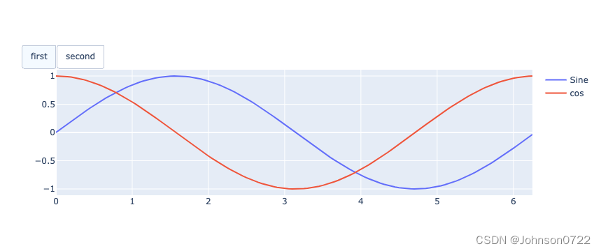
import math

xpoints = np.arange(0, math.pi*2, 0.05)
y1 = np.sin(xpoints)
y2 = np.cos(xpoints)
fig = go.Figure()
# Add Traces
fig.add_trace(
   go.Scatter(
      x = xpoints, y = y1, name = 'Sine'
   )
)
fig.add_trace(
   go.Scatter(
      x = xpoints, y = y2, name = 'cos'
   )
)
fig.layout.update(
   updatemenus = [
      go.layout.Updatemenu(
         type = "buttons", direction = "right", active = 0, x = 0.1, y = 1.2,
         buttons = list(
            [
               dict(
                  label = "first", method = "update",
                  args = [{"visible": [True, False]},{"title": "Sine"} ]
               ),
               dict(
                  label = "second", method = "update",
                  args = [{"visible": [False, True]},{"title": "Cos"}]
               )
            ]
         )
      )
   ]
)
fig.show()

basic example
import numpy as np
import plotly.express as px
import plotly.graph_objects as go
from sklearn.linear_model import LinearRegression

df = px.data.tips()
X = df.total_bill.values.reshape(-1, 1)

model = LinearRegression()
model.fit(X, df.tip)

x_range = np.linspace(X.min(), X.max(), 100)
y_range = model.predict(x_range.reshape(-1, 1))

fig = px.scatter(df, x='total_bill', y='tip', opacity=0.65)
fig.add_traces(go.Scatter(x=x_range, y=y_range, name='Regression Fit'))
fig.show()


 5万+
5万+


 被折叠的 条评论
为什么被折叠?
被折叠的 条评论
为什么被折叠?
 到【灌水乐园】发言


