


本人平时做项目时,这两个控件使用的较少,一般都用TextView代替,这里重新学习下他们的用法。
参考文章 :http://www.runoob.com/w3cnote/android-tutorial-button-imagebutton.html
1.点击变色效果
StateListDrawable是Drawable资源的一种,可以根据不同的状态,设置不同的图片效果,关键节点 < selecotr >,我们只需要讲Button的blackground属性设置为该drawable资源即可轻松实现,按下 按钮时不同的按钮颜色或背景!
我们可以设置的属性:
drawable:引用的Drawable位图,我们可以把他放到最前面,就表示组件的正常状态~
state_focused:是否获得焦点
state_window_focused:是否获得窗口焦点
state_enabled:控件是否可用
state_checkable:控件可否被勾选,eg:checkbox
state_checked:控件是否被勾选
state_selected:控件是否被选择,针对有滚轮的情况
state_pressed:控件是否被按下
state_active:控件是否处于活动状态,eg:slidingTab
state_single:控件包含多个子控件时,确定是否只显示一个子控件
state_first:控件包含多个子控件时,确定第一个子控件是否处于显示状态
state_middle:控件包含多个子控件时,确定中间一个子控件是否处于显示状态
state_last:控件包含多个子控件时,确定最后一个子控件是否处于显示状态
代码实现:
1)先准备两种不同颜色的背景,这里也用drawable实现,用图片也行。
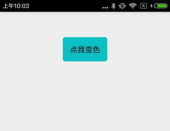
按下后的背景 文件名: round_stroke_shape_background.xml
<?xml version="1.0" encoding="utf-8"?>
<shape xmlns:android="http://schemas.android.com/apk/res/android" >

    <corners android:radius="5dp" />
    <solid android:color="#0dbfc6"/>

</shape>
默认的背景 文件名:round_stroke_shape_background_default.xml
<?xml version="1.0" encoding="utf-8"?>
<shape xmlns:android="http://schemas.android.com/apk/res/android" >
<corners android:radius="5dp" />
<solid android:color="#ffffff"/>
</shape>2)用StateListDrawable资源设置按下效果
文件名:myselect.xml
<?xml version="1.0" encoding="utf-8"?>
<selector xmlns:android="http://schemas.android.com/apk/res/android" >

    <item android:state_pressed="true" android:drawable="@drawable/round_stroke_shape_background"></item>
    <item android:state_enabled="false" android:drawable="@drawable/round_stroke_shape_background_default"></item>
    <item android:drawable="@drawable/round_stroke_shape_background_default"></item>
</selector>
3)将myselect.xml设置为Button的背景
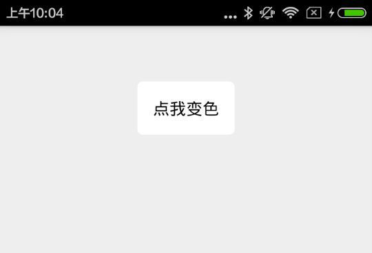
 <Button
        android:layout_width="wrap_content"
        android:layout_height="wrap_content"
        android:layout_gravity="center_horizontal"
        android:background="@drawable/myselect"
        android:padding="15dp"
        android:text="点我变色"
        android:textSize="16sp" />
效果图如下:
2.按钮按下的波纹效果
待续,直接给demo
http://download.csdn.net/detail/kinglong68/9468962 eclipse


 1116
1116


 被折叠的 条评论
为什么被折叠?
被折叠的 条评论
为什么被折叠?
 到【灌水乐园】发言


