


批量导入自定义svg图片
如果项目中需要用到自定义的svg图片,则可用如下方法批量导入svg图片:
安装插件
在项目目录下,安装svg-sprite-loader插件;
npm install svg-sprite-loader --save创建SvgIcon组件
在components文件夹下新建SvgIcon文件夹,并在SvgIcon文件夹下新建index.vue文件,内容如下:
<template>
  <svg :class="svgClass" aria-hidden="true">
    <use :xlink:href="iconName"></use>
  </svg>
</template>

<script>
export default {
  name: 'svg-icon',
  props: {
    iconClass: {
      type: String,
      required: true
    },
    className: {
      type: String
    }
  },
  computed: {
    iconName() {
      return `#icon-${this.iconClass}`
    },
    svgClass() {
      if (this.className) {
        return 'svg-icon ' + this.className
      } else {
        return 'svg-icon'
      }
    }
  }
}
</script>

<style scoped>
.svg-icon {
  width: 1em;
  height: 1em;
  vertical-align: -0.15em;
  fill: currentColor;
  overflow: hidden;
}
</style>
创建icons文件夹
在src文件夹下新建icons文件夹,并在icons文件夹下新建svg文件夹(用于存放svg图片)和index.js文件,内容如下:
import Vue from 'vue'
import SvgIcon from '@/components/SvgIcon'// svg组件

// 注册到全局
Vue.component('svg-icon', SvgIcon)

const requireAll = requireContext => requireContext.keys().map(requireContext)
// map传入一个函数,遍历数组中的每个对象,被webpack自动进行导入
// eslint-disable-next-line
const req = require.context('./svg', false, /\.svg$/)
/*
 第一个参数是:'./svg' => 需要检索的目录,
 第二个参数是:false => 是否检索子目录,
 第三个参数是: /\.svg$/ => 匹配文件的正则
 返回值有三个属性: resolve/keys/id
 resolve是一个函数,返回已解析请求的模块id
 keys是一个函数,它返回上下文模块可以处理的所有可能请求的数组
*/
requireAll(req)
可通过打印requireAll(req)的结果来看是否将svg文件夹下的svg图片遍历出来,正常情况下,应该是如下结果:
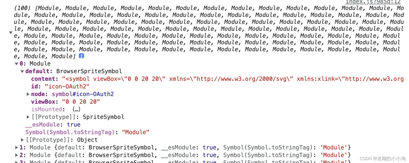
如果出现结果是img/atuth2这种情况,则说明并未加载预设的svg-sprite-loader来处理,要检测下一步的配置(vue.config.js)是否生效;
在main.js中引入index.js
import './icons'配置vue.config.js文件
module.exports = {
chainWebpack: config => {
// svg rule loader
const svgRule = config.module.rule('svg') // 找到svg-loader
svgRule.uses.clear() // 清除已有的loader, 如果不这样做会添加在此loader之后
svgRule.exclude.add(/node_modules/) // 正则匹配排除node_modules目录
svgRule.test(/\.svg$/).use('svg-sprite-loader').loader('svg-sprite-loader').options({ symbolId: 'icon-[name]' })
}
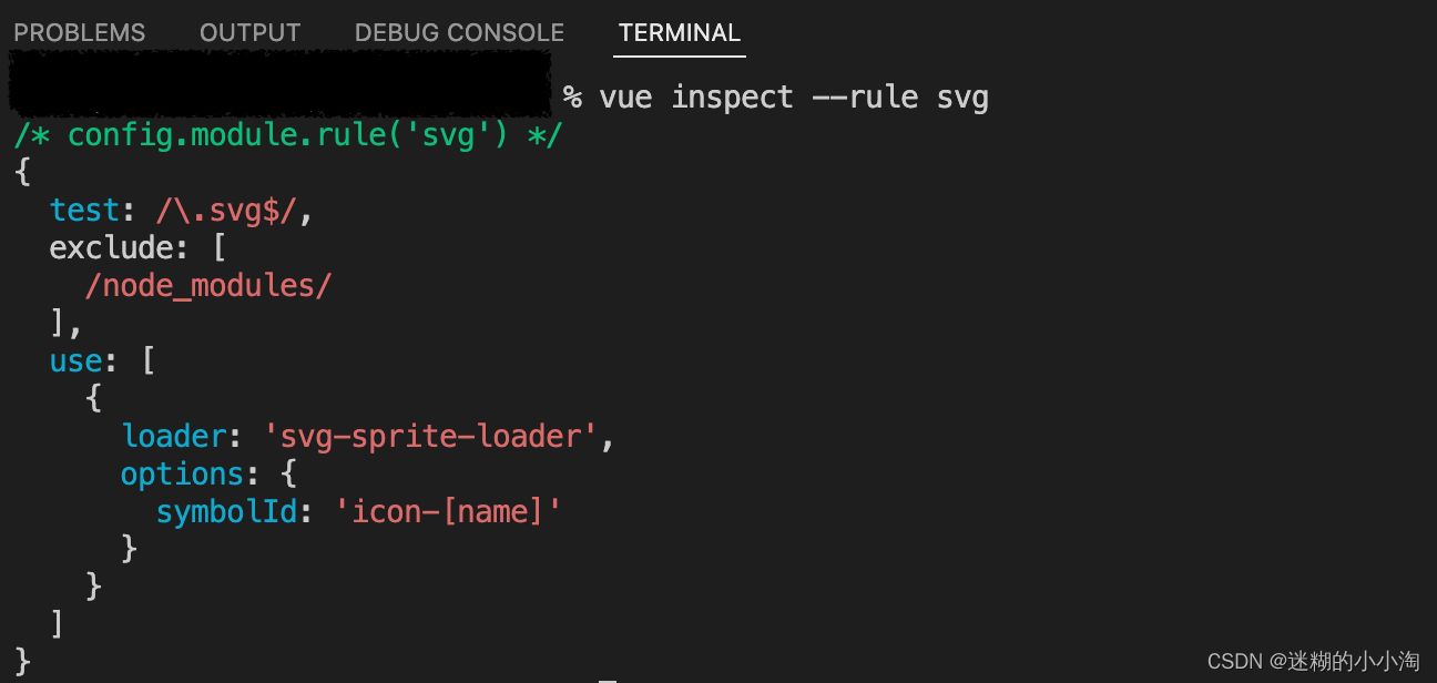
}可以通过如下命令查看对于svg的配置是否和我们预设的一样,一样的话,则没问题;
作为标签使用
<svg-icon icon-class="user" />将svg图片封装成按钮组件
在components下新建svgbutton文件夹,并在其下建立index.vue文件,内容如下:
<template>
   <button type="button"
    :disabled="buttonDisabled"
    :class="[
      'svg-button',
      {
        'is-disabled': buttonDisabled
      }
    ]"
    :iconClass = "iconClass"
    :title="title"
    @click="$event => $emit('click', $event)">
    <svg class = "svg-icon" aria-hidden="true">
        <use :xlink:href="iconName"></use>
    </svg>
  </button>
</template>

<script>
export default {
  name: 'SvgButton',
  props: {
    title: {
      type: String
    },
    svgicon: {
      type: String
    },
    iconClass: {
      type: String,
      required: true
    },
    disabled: Boolean
  },
  computed: {
    buttonDisabled () {
      return this.disabled
    },
    iconName() {
      return `#icon-${this.iconClass}`
    },
  }
}
</script>

<style lang="scss" scoped>
button {
    background-color: transparent;
    cursor: pointer;
    padding: 10px;
    .svg-icon {
        height: 24px;
        width: 24px;
        border: none;
        fill: currentColor;
        color: #D3002C;
        &.is-disabled,&.is-disabled:focus,&.is-disabled:hover {
        cursor: not-allowed;
        color: yellow;
        }
    }
}

</style>
将标签注册到全局main.js,
import SvgButton from './SvgButton'

Vue.component(SvgButton.name, SvgButton)
使用如下方法:
<svg-button title="删除" iconClass="delete" @click="delete" :disabled="!canceldDelete"></svg-button>ps:若要修改svg颜色,需要将svg图片中的fill改为currentColor,即
fill="currentColor"这样就可以在使用时任意修改图片颜色啦~


 2584
2584


 被折叠的 条评论
为什么被折叠?
被折叠的 条评论
为什么被折叠?
 到【灌水乐园】发言


