


前言
又到了金三银四面试季,这里我整理了... 欸!?不好意思,跑题了... 感觉近来掘金首页全是面试相关的内容,我是打开掘金也不知道该看啥,实在无奈。
上个礼拜看了许多关于平面构成的资料,我就边用 CSS 画了一些类似背景图案的玩意儿。这里给大家选了12种,从观察者的角度由易到难的给大家解一下思路。本文包含大量图片及代码所以较长,建议先点赞收藏。
⚠预警,本文没有对基础知识的详解,不过推荐一边看文章实践一边学习,效率更高。
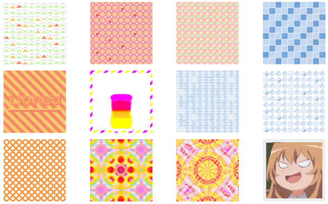
效果图展示
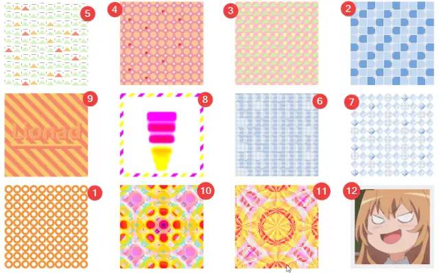
分析顺序介绍
粗略看过效果之后,我们按照图案种元素的多少及元素变异程度、动画难易程度、有无头绪等因素给文章小节排一个序,顺序见下图。每小节都有源码,你可以通过标题直接跳转到你想看的图案。
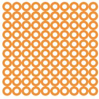
1. 圆环变形
  <div class="card">
    <div class="node" v-for="item in 100"></div>
  </div>
  <style>
    // 其余所有图案的 card 类标签都套用了这段样式,为了减少文章长度,下略。
    .card {
      width: 200px;
      height: 200px;
      display: flex;
      flex-wrap: wrap;
      justify-content: center;
      align-items: center;
    }
</style>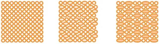
通过图片动画效果,我们大致得出动画变化的模式。
-
有部分圆环变形成两个圆环的长度,并改变了底色。
观察变长圆环的顺序,能发现“每逢三就变长”这种规律,推测使用了 :nth-child(3) 选择器。
下面是 CSS 源码。
.card {
    justify-content: flex-start;
    overflow: hidden;
    cursor: pointer;

    // 每逢三个元素,则执行动画,源代码和我们分析的动画的顺序相反,圆环是从长变短,不过不影响
    .node {
      border: solid 5px #F29338;
      border-radius: 50%;


      &:nth-child(3n) {
        width: 40px;
        flex-basis: 40px;
        background: #F8C798;
        animation: change-circle-width 2s ease alternate infinite;
      }
    }
  }

  @keyframes change-circle-width {
    from {
      width: 40px;
      flex-basis: 40px;
      background: #F8C798;
    }
    60% {
      width: 20px;
      flex-basis: 20px;
      background: transparent;
    }
    // 动画 60% - 100% 这段时间,属性没有变动,所以图案看起来像是静止的。
    to {
      width: 20px;
      flex-basis: 20px;
      background: transparent;
    }
  }
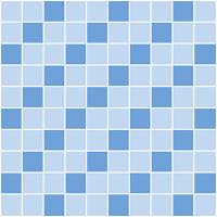
2. 厕所里的瓷砖
 <div class="card">
    <div class="node" v-for="item in 100"></div>
  </div>
和上一张图思路类似,只是多出了一些圆形小球。
-
小球的动画应该包含位置的偏移和颜色、透明度的改变。
-
当鼠标悬浮时(注意图片右下角的鼠标手势),图中多了一排小圆球,样式和行为和前一排原球几乎一样。
推测第二排圆球使用了 animation-delay 效果。
-
观察小球的个数,欸?貌似有些问题,圆形小球数量和瓷砖数量对不上。应该是对小球的显隐的顺序做了特殊处理。
下面是 CSS 源码。
  .card {
    cursor: pointer;

    // 鼠标悬浮时显示第二排的小圆球
    &:hover {
      .node {
        &:nth-child(2n)::after {
          visibility: unset;
        }
      }
    }

    .node {
      background: #71A2DB;
      outline: solid 1px white;

      // 3n-1,3n+1 一起使用时等价于 3n
      &:nth-child(3n-1),
      &:nth-last-child(3n+1) {
        background: #C2D7F0;
      }

      // 去除末行及每行末尾的伪元素
      &:nth-child(10n)::after,
      &:nth-last-child(-n+10)::after {
        display: none;
      }

      &::after {
        left: 75%;
        top: 75%;
        width: 50%;
        height: 50%;
        border-radius: 50%;
        background: white;
        animation: card-4-circle-move 1s linear alternate infinite;
      }
      &:nth-child(2n)::after {
        animation: card-4-circle-move-delay 1s linear alternate infinite;
        animation-delay: .3s;
        visibility: hidden;
      }
    }
  }

  @keyframes card-4-circle-move {
    from {
      left: 45%;
      top: 45%;
      opacity: 1;
      background: white;
    }
    to {
      left: 130%;
      top: 130%;
      opacity: 0;
      background: #F2C07D;
    }
  }
  @keyframes card-4-circle-move-delay {
    from {
      left: 45%;
      top: 45%;
      opacity: 1;
      background: #F2C07D;
      z-index: 2;
    }
    to {
      left: 130%;
      top: 130%;
      opacity: 0;
      background: white;
    }
  }
 最低0.47元/天 解锁文章


 783
783


 被折叠的 条评论
为什么被折叠?
被折叠的 条评论
为什么被折叠?
 到【灌水乐园】发言


