


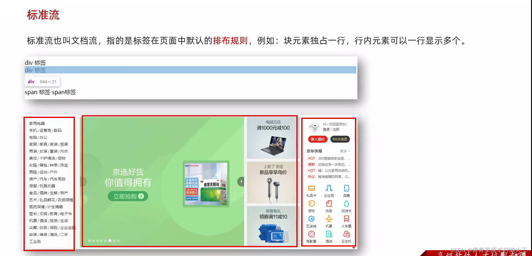
标准流
浮动
特点:
具备顶对齐,行内块显示特点,浮动的盒子是脱离了标准流。
如果父级的宽度不够,浮动的盒子会掉下来
<style>
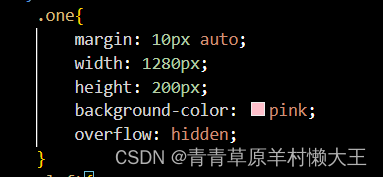
.one{
width: 200px;
height: 200px;
background-color: aqua;
float: left;
}
.two{
width: 200px;
height: 200px;
background-color: brown;
float: left;
}
</style>
</head>
<body>
<div class="one"></div>
<div class="two"></div>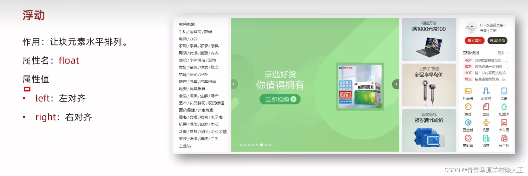
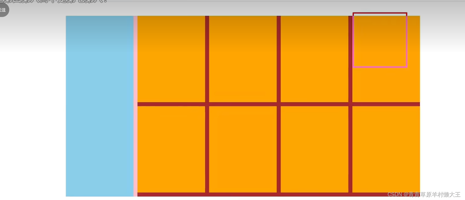
小米页面的布局
    <title>Document</title>
    <style>
        *{
            margin: 0;
            padding: 0;
        }

        li{
            list-style: none;
        }
        .product{
            margin: 50px auto;
            width: 1226px;
            height: 628px;
            background-color: pink;

        }
        .left{
            width: 234px;
            height: 628px;
            background-color: blue;
            float: left;

        }
        .right{
            width: 978px;
            height: 628px;
            background-color: brown;
            float: right;

        }
        .right li {
            margin-right: 14px;
            margin-bottom: 14px;
            width: 234px;
            height: 300px;
            background-color: orange;
            float: left;
        }
        .right li:nth-child(4n){
            margin-right: 0;
        }
    </style>
</head>
<body>
    <div class="product">
        <div class="left"></div>
        <div class="right">
        <ul>
            <li></li>
            <li></li>
            <li></li>
            <li></li>
            <li></li>
            <li></li>
            <li></li>
            <li></li>
        </ul>
    </div>
    </div>
</body>
</html>
清除浮动
额外标签法
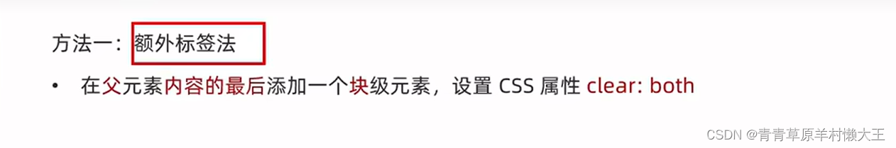
额外添加一个块级清除标签。
<title>Document</title>
<style>
one{
margin: 10px auto;
width: 1280px;
height: 200px;
background-color: pink;
}
.left{
float: left;
width: 200px;
height: 300px;
background-color: skyblue;
}
.right{
float: right;
width: 950px;
height: 300px;
background-color: yellowgreen;
}
.two{
height: 100px;
background-color: red;
}
.clearfix{
clear: both;
}
</style>
</head>
<body>
<div class="one ">
<div class="left"></div>
<div class="right"></div>
<div class="clearfix"></div>
</div>
<div class="two"></div>
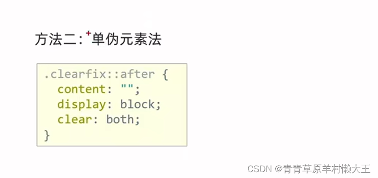
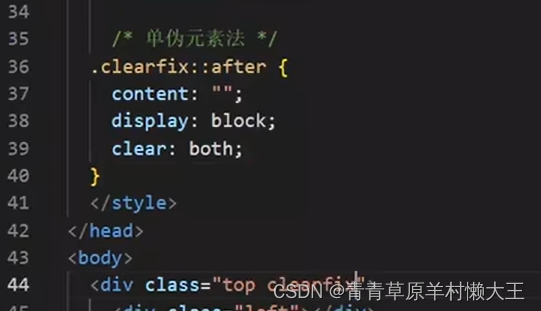
</body>单伪元素法
在父级开头加标签
注意:content:“”;
双伪元素
在父级结尾加标签。
befor在这:解决外边界塌陷问题
.clearfix::before,
.clearfix::after {
content: "";
display:table;
}
after:清楚浮动影响。
.clearfix::after{
clear: both;
}
<title>Document</title>
<style>
one{
margin: 10px auto;
width: 1280px;
height: 200px;
background-color: pink;
}
.left{
float: left;
width: 200px;
height: 300px;
background-color: skyblue;
}
.right{
float: right;
width: 950px;
height: 300px;
background-color: yellowgreen;
}
.two{
height: 100px;
background-color: red;
}
/* .clearfix{
clear: both;
} */
/* .clearfix::after{
content:"" ;
display: block;
clear: both;
} */
.clearfix::before,
.clearfix::after {
content: "";
display:table;
}
.clearfix::after{
clear: both;
}
</style>
</head>
<body>
<!-- <div class="one clearfix"> -->
<div class="one clearfix">
<div class="left"></div>
<div class="right"></div>
<!-- <div class="clearfix"></div> -->
</div>
<div class="two"></div>
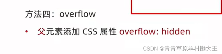
</body>4.overflow法
给浮动的父级加。
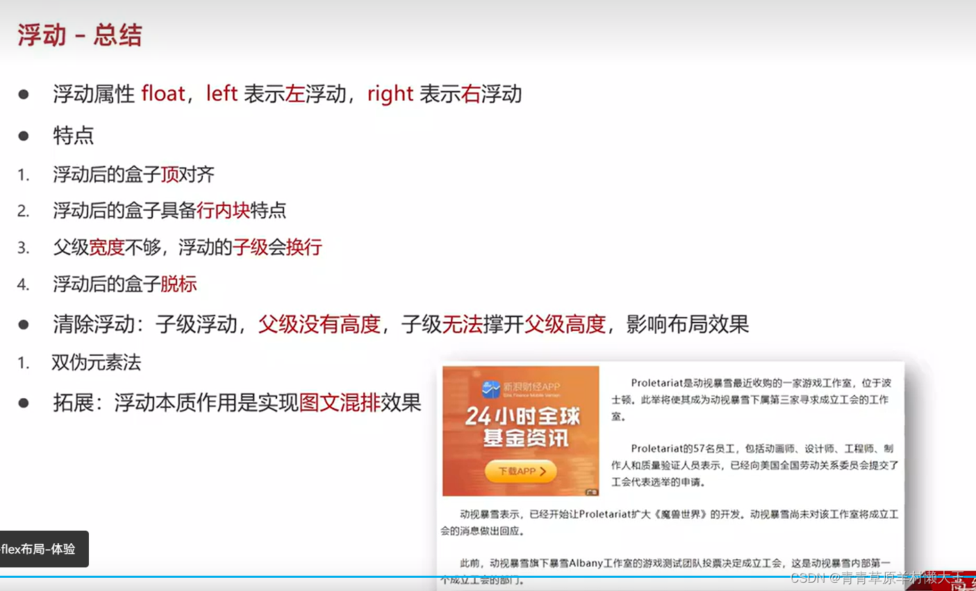
浮动总结
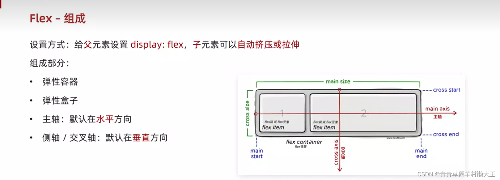
flex布局
组成

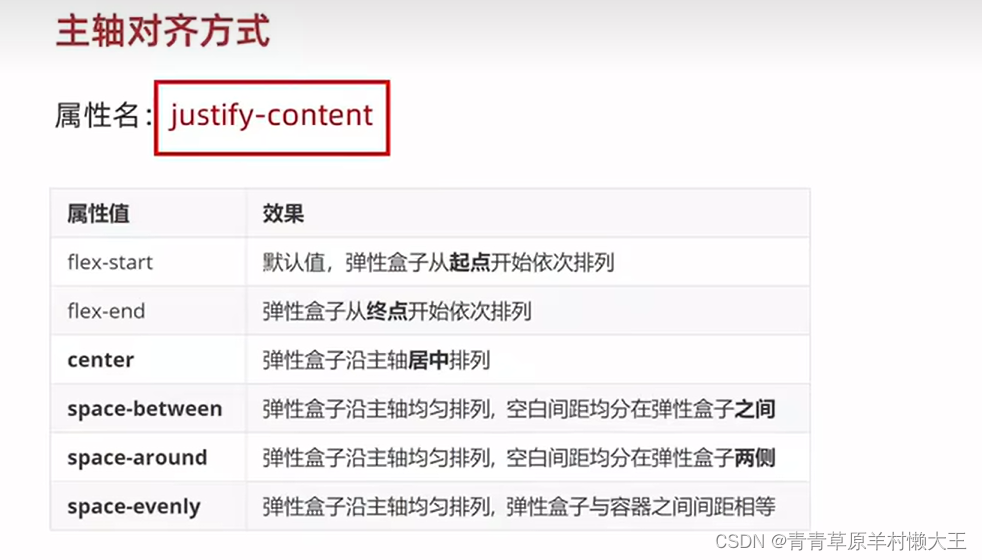
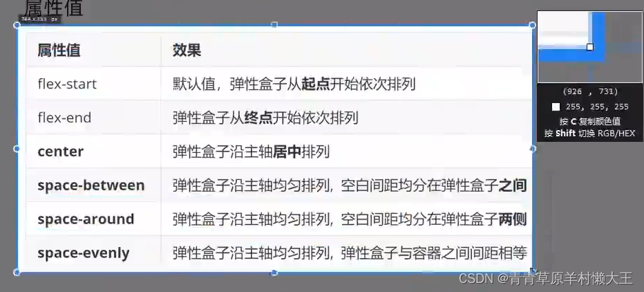
主轴对齐方式
display: flex;
/* 默认值 */
/* justify-content: start; */
/* justify-content: end; */
/* justify-content: center; */
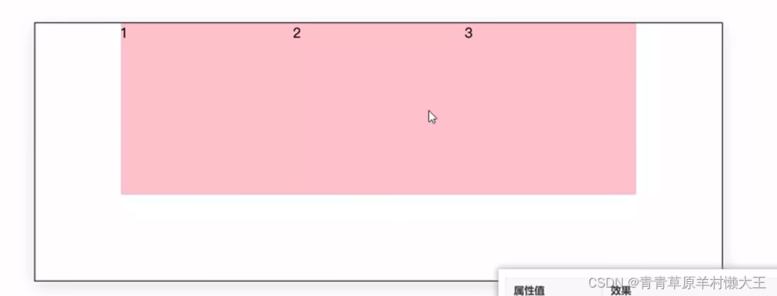
/* 把父级剩余尺寸分配成间距,间距相等 */
/* justify-content: space-between; */
/* 间距出现在弹性盒子两侧, */
/* 视觉效果:弹性盒子之间的间距是两端间距的2倍 */
/* justify-content: space-around; */
/* 个个间距都相等 */
justify-content:space-evenly ;
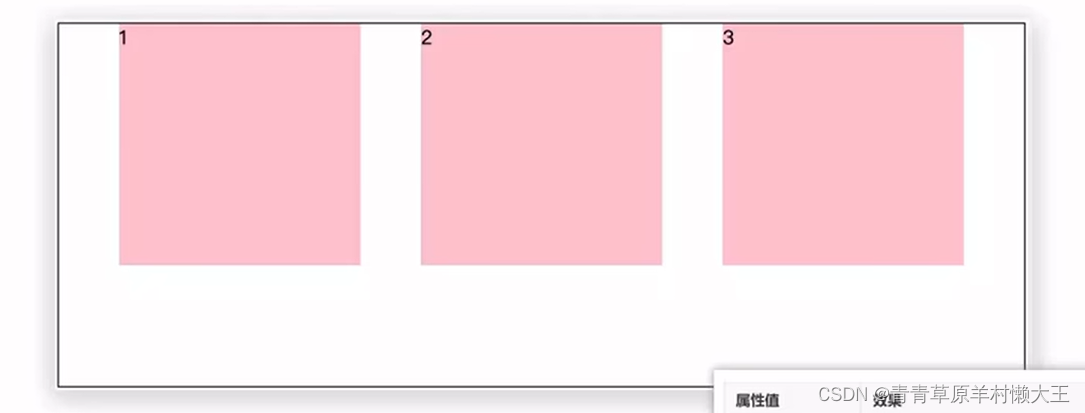
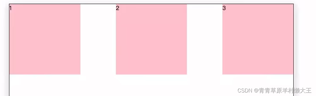
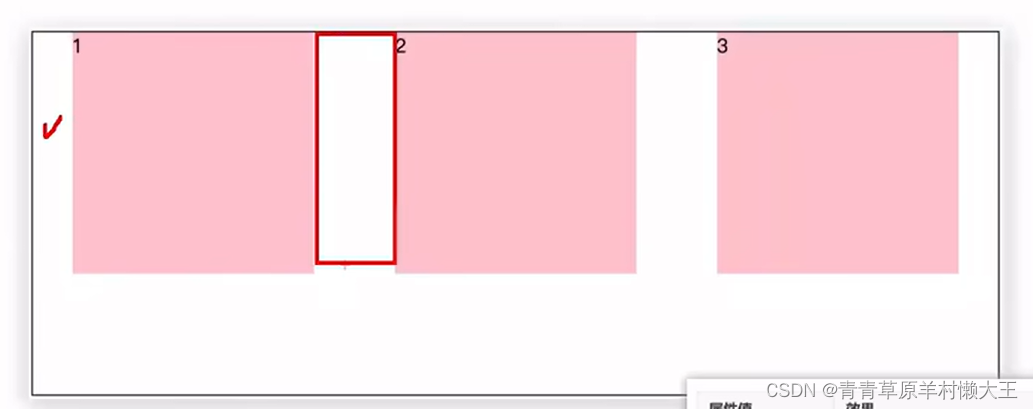
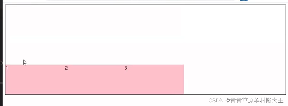
在侧轴对齐方式
align:使一致,排列;校准;(尤指)使成一条直线;排整齐;
item:项目;一则,一条(新闻);一件商品(或物品);
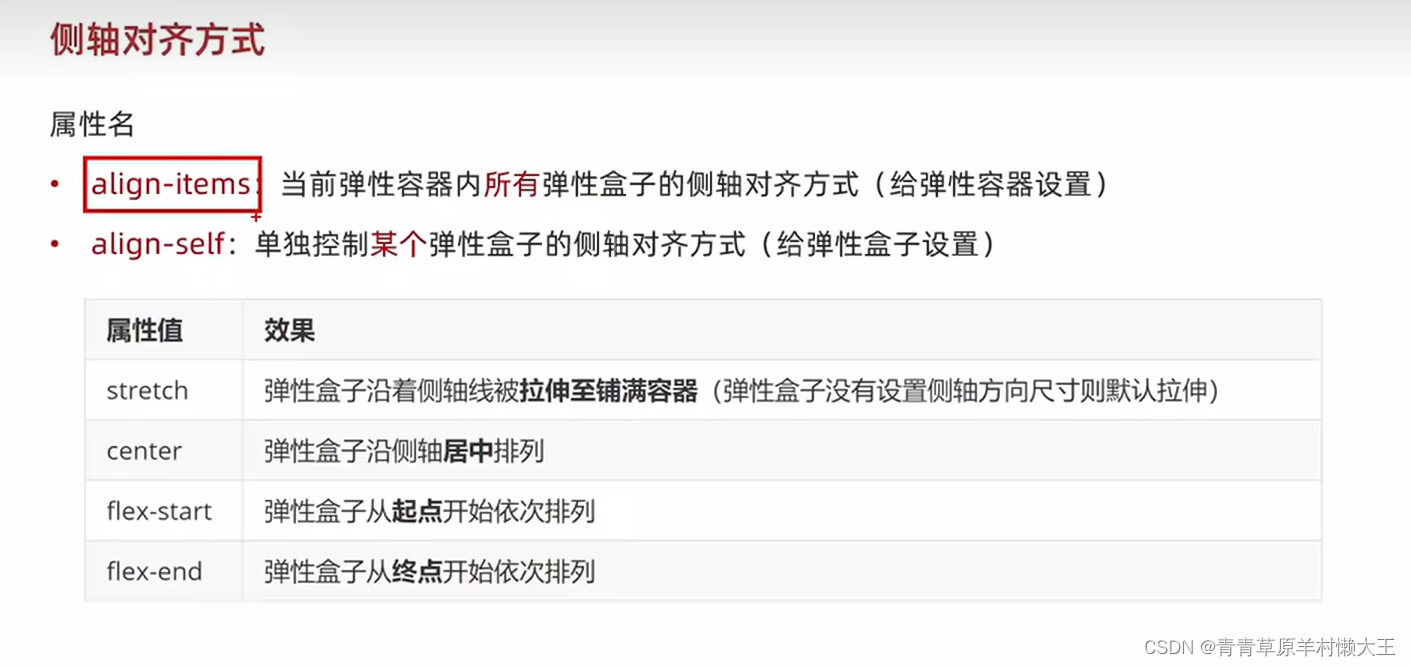
display: flex;
/* 弹性盒子在侧轴没有尺寸才能拉伸 */
/* align-items: stretch; */
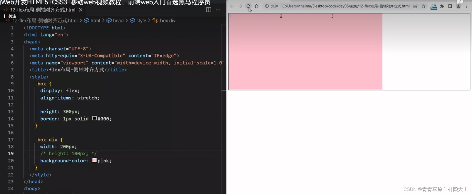
/* align-items: center; */
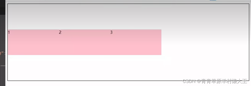
/* align-items: flex-start; */
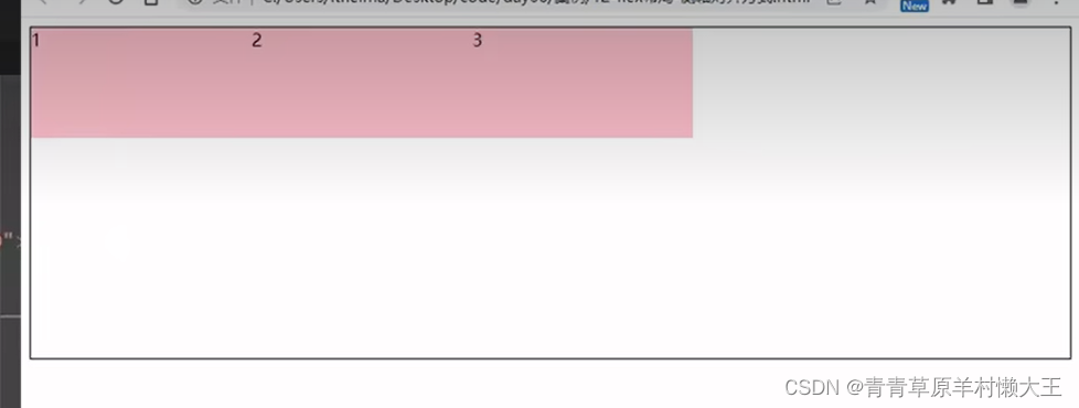
align-items: flex-end;
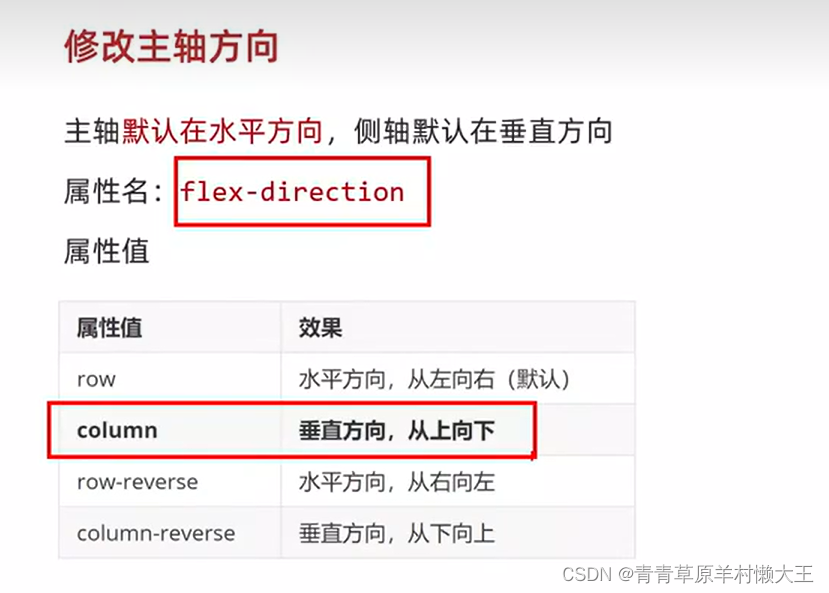
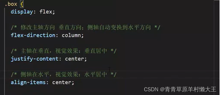
修改主轴方向

<title>Document</title>
<style>
div{
display: flex;
flex-direction: column;
justify-content: center;
align-items: center;
width: 200px;
height: 200px;
background-color: pink;
}
img{
width: 50px;
height: 50px;
}
</style>
</head>
<body>
<div>
<img src="https://ts1.cn.mm.bing.net/th?id=OIP-C.2LN_bFdwF2lhpxv-f_R_fAHaHa&w=250&h=250&c=8&rs=1&qlt=90&o=6&dpr=1.4&pid=3.1&rm=2" alt="">
<span>媒体</span>
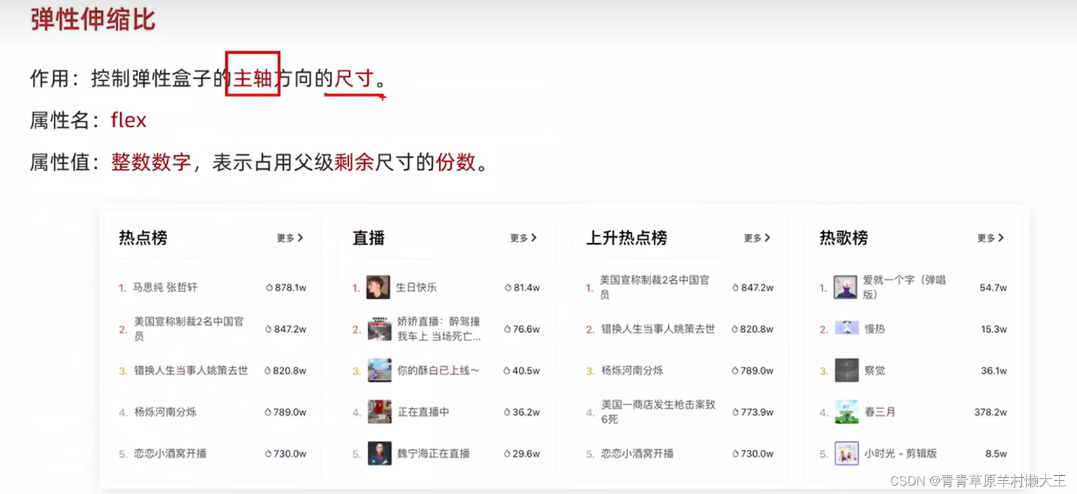
</div>弹性伸缩比
<title>Document</title>
<style>
.box{
height: 500px;
width: 500px;
border: 1px black solid;
display: flex;
flex-direction: column;
}
.box div{
background-color: pink;
}
.box div:nth-child(4){
flex: 1;
border: 1px black solid;
}
.box div:nth-child(3){
flex: 2;
border: 1px black solid;
}
.box div:nth-child(2){
flex: 3;
border: 1px black solid;
}
.box div:nth-child(1){
flex: 4;
border: 1px black solid;
}
div
</style>
</head>
<body>
<div class="box">
<div>4</div>
<div>3</div>
<div>2</div>
<div>1</div>
</div>
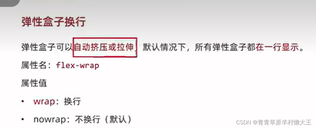
</body>换行显示和行对齐方式
flex-wrap:wrap
flex-wrap:no-wrap:这个是默认值
行对齐方式
对单行盒子不生效。
space-evenly:没有代码提示。
    <style>
        .box{


            display: flex;
            flex-wrap: wrap;
            justify-content: space-between;
            height: 300px;
            border: 1px solid #000;
            /* 调整行对其方式 */
            /* align-content: start; */
            /* align-content:flex-end ; */
            /* align-content: center; */
            /* align-content: space-between; */
            /* align-content: space-around; */
            align-content: space-evenly;
        }
        .box div{
            width: 200px;
            height: 100px;
            background-color: pink;
        }
    </style>


 5931
5931


 被折叠的 条评论
为什么被折叠?
被折叠的 条评论
为什么被折叠?
 到【灌水乐园】发言


