vue3+echarts 绘制扇形进度图

实现样式为:
在这里插入图片描述
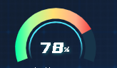
是不是还可以。反正我自己认为so beautiful(沾沾自喜)
这个实现起来就有点费劲了。
代码

option = {
  series: [
    {
      name: 'Indicator',
      type: 'gauge',
      startAngle: 200,//扇形开始的角度
      endAngle: -20,//扇形结束的角度
      detail: {
        formatter: '{a|{value}}{b|%}',

        rich: {
          a: {
            color: '#fff',
            verticalAlign: 'bottom',
            fontSize: 25,
            fontFamily: 'YouSheBiaoTiHei',
            textShadowColor: 'rgba(54, 255, 242, 0.36)',
            textShadowBlur: 4,
            textShadowOffsetX: 1,
            textShadowOffsetY: 1
          },
          b: {
            color: '#fff',
            verticalAlign: 'bottom',
            padding: [0, 0, 4, 0],
            fontSize: 12,
            fontFamily: 'YouSheBiaoTiHei',
            textShadowColor: 'rgba(54, 255, 242, 0.36)',
            textShadowBlur: 4,
            textShadowOffsetX: 1,
            textShadowOffsetY: 1
          }
        },
        show: true,
        color: '#fff',
        offsetCenter: ['0', '-5%'],
        fontSize: 25,
        fontFamily: 'YouSheBiaoTiHei'
      },
      data: [
        {
          value: 78,//中间的值
          name: '健康率'
        }
      ],
      radius: '90%',//扇形的大小100%为最大
      axisLine: {
        show: true,
        lineStyle: {
          width: 15, // 这个是修改宽度的属性
          color: [[1, '#173449']]
        }
      },
      progress: {
        show: true,
        width: 100,
        overlap: false,
        itemStyle: {
          color: {
            type: 'linear',
            x: 0,
            y: 0,
            x2: 1,
            y2: 0,
            colorStops: [
              {
                offset: 0,
                color: 'rgba(0, 255, 163, 1)' // 0% 处的颜色
              },
              {
                offset: 0.2,
                color: 'rgba(168, 255, 159, 1)' // 20% 处的颜色
              },
              {
                offset: 0.5,
                color: 'rgba(255, 225, 116, 1)' // 50% 处的颜色
              },
              {
                offset: 0.8,
                color: 'rgba(255, 171, 139, 1)' // 80% 处的颜色
              },
              {
                offset: 1,
                color: 'rgba(240, 64, 64, 1)' // 100% 处的颜色
              }
            ],
            global: false 
          }
        }
      },
      splitLine: {
        show: false,
        length: 0
      },
      axisTick: {
        show: false
      },
      axisLabel: {
        show: false
      },
      pointer: {
        show: false
      },
      title: {
        show: false,
        offsetCenter: ['0', '71%'],
        color: '#fff',
        fontSize: 12,
        fontFamily: 'Source Han Sans CN-Normal'
      }
    },
    {
      name: '内边框',
      type: 'gauge',
      startAngle: 205,
      endAngle: -25,
      radius: '80%',
      axisLine: {
        show: true,
        lineStyle: {
          width: 2, // 这个是修改宽度的属性
          color: [
            [
              0.2,
              {
                type: 'linear',
                x: 0,
                y: 1,
                x2: 0,
                y2: 0,
                colorStops: [
                  {
                    offset: 0,
                    color: 'rgba(77, 234, 255, 0)' // 0% 处的颜色
                  },
                  {
                    offset: 1,
                    color: 'rgba(77, 234, 255, 1)' // 100% 处的颜色
                  }
                ],
                global: false // 缺省为 false
              }
            ],
            [0.8, 'rgba(77, 234, 255, 1)'],
            [
              1,
              {
                type: 'linear',
                x: 0,
                y: 1,
                x2: 0,
                y2: 0,
                colorStops: [
                  {
                    offset: 1,
                    color: 'rgba(77, 234, 255, 1)' // 0% 处的颜色
                  },
                  {
                    offset: 0,
                    color: 'rgba(77, 234, 255, 0)' // 100% 处的颜色
                  }
                ],
                global: false // 缺省为 false
              }
            ]
          ]
        }
      },
      splitLine: {
        show: false,
        length: 0
      },
      axisTick: {
        show: false
      },
      axisLabel: {
        show: false
      },
      pointer: {
        show: false
      }
    }
  ]
};

  • 0
    点赞
  • 2
    收藏
    觉得还不错? 一键收藏
  • 打赏
    打赏
  • 0
    评论
Vue Echarts 是一个基于Vue.js框架的表库,用于绘制各种类型的表,包括 k 线。 要使用 Vue Echarts 绘制 k 线,首先需要在项目中引入 EchartsVue Echarts,可以通过 npm 或者通过 CDN 引入。 在 Vue 组件中,可以创建一个 div 元素作为容器,将其绑定到 Echarts 实例上。代码类似于以下形式: ```html <template> <div ref="chart"></div> </template> <script> import echarts from 'echarts'; import VueECharts from 'vue-echarts'; export default { components: { VueECharts }, mounted() { this.chart = echarts.init(this.$refs.chart); this.renderChart(); }, methods: { renderChart() { // 设置表配置项和数据 const option = { // ... }; // 调用 setOption 方法,将配置项应用到表中 this.chart.setOption(option); } } } </script> ``` 在上述代码中,mounted 钩子函数中初始化了 Echarts 实例,并将其绑定到 ref 为 "chart" 的 div 元素上。然后,在 renderChart 方法中,设置表的配置项和数据,并使用 setOption 方法将配置项应用到表中。 绘制 k 线的具体配置项和数据根据需求和数据源的格式而定,可能包括 x 轴和 y 轴的设置、k 线的样式设置等。 在配置项中,需要指定 k 线的类型为 "candlestick",并根据实际情况设置相关参数。 以上是使用 Vue Echarts 绘制 k 线的基本流程,通过设置配置项和数据,可以实现自定义的 k 线效果。

“相关推荐”对你有帮助么?

  • 非常没帮助
  • 没帮助
  • 一般
  • 有帮助
  • 非常有帮助
提交
评论
添加红包

请填写红包祝福语或标题

红包个数最小为10个

红包金额最低5元

当前余额3.43前往充值 >
需支付:10.00
成就一亿技术人!
领取后你会自动成为博主和红包主的粉丝 规则
hope_wisdom
发出的红包

打赏作者

lbchenxy

你的鼓励将是我创作的最大动力

¥1 ¥2 ¥4 ¥6 ¥10 ¥20
扫码支付:¥1
获取中
扫码支付

您的余额不足,请更换扫码支付或充值

打赏作者

实付
使用余额支付
点击重新获取
扫码支付
钱包余额 0

抵扣说明:

1.余额是钱包充值的虚拟货币,按照1:1的比例进行支付金额的抵扣。
2.余额无法直接购买下载,可以购买VIP、付费专栏及课程。

余额充值