


可以通过纯 CSS 来实现诸如多级菜单, 折叠菜单, 导航栏等菜单的效果
不需要使用 js 即可完成, 但少了一些 js 的特效, 胜在简单
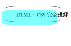
1.效果图
这里实现的是一个二级导航栏的例子, 更多级的选单可以通过类似的方法实现, 因此不进行过多的实现
- 没展开前的样子

- 展开一级选单
做了选中效果, 首先是主菜单的背景色加深,
若选中了一级选项, 一级选项的背景色也加深
选项3 和 选项4 没做二级选项, 下面会对选项1 和 选项2 进行展示

- 展开二级选单
二级选单也有选中效果

- 展开选项2

2. html 结构代码
    <div id="thefirst">
        <span>主菜单</span>
        <div id="thesecond">
            <ul>
                <li id="child1">
                    <span>一级选项1</span>
                    <div id="thethird">
                        <ul>
                            <li>二级选项1</li>
                            <li>二级选项2</li>
                            <li>二级选项3</li>
                            <li>二级选项4</li>
                        </ul>
                    </div>
                </li>
                <li id="child2">
                    <span>一级选项2</span>
                    <div id="thefourth">
                        <ul>
                            <li>二级选项1</li>
                            <li>二级选项2</li>
                        </ul>
                    </div>
                </li>
                <li>一级选项3</li>
                <li>一级选项4</li>
            </ul>
        </div>
    </div>
备注:
- 这里给 html 元素加的是 id 而不是 class, 建议使用 class 这样更方便管理样式
3. CSS 样式表代码
    <style>
        #thefirst {
            line-height: 50px;
            top: 200px;
            min-width: 100px;
            height: 50px;
            background-color: darkgray;
            display: inline-block;
            position: relative;
        }

            #thefirst:hover {
                background-color: dimgrey;
            }

                #thefirst:hover #thesecond {
                    display: block;
                }

        #thesecond {
            display: none;
            width: 100px;
            background-color: darkgray;
            top: 50px;
            position: absolute
        }

            #thesecond li {
                border: 1px solid black;
                height: 50px;
            }

                #thesecond li:hover {
                    background-color: dimgrey;
                }

            #thesecond #child1:hover #thethird {
                display: block;
            }

            #thesecond #child2:hover #thefourth {
                display: block;
            }

        #thethird {
            bottom: 0px;
            left: 100px;
            width: 100px;
            display: none;
            background-color: darkgrey;
            position: absolute;
        }

        #thefourth {
            bottom: 50px;
            left: 100px;
            width: 100px;
            display: none;
            background-color: darkgrey;
            position: absolute;
        }
    </style>
备注:
-
注意父元素的定位是相对定位, 子元素的是绝对定位
但是二级菜单也是绝对定位, 且它属于一级菜单的子元素,
因此二级菜单需要调节一下位置 -
一级菜单和主菜单之间会触发BFC, 导致 margin 塌陷,
通过使用绝对定位进行调节, 或者使用其它的位置调节方式可以避免


 扫一扫
扫一扫
 1617
1617

 被折叠的 条评论
为什么被折叠?
被折叠的 条评论
为什么被折叠?
 到【灌水乐园】发言


