


转自:http://blog.csdn.net/fdipzone/article/details/18827069
ApacheBench 测试性能并使用 GnuPlot 绘制图表
Apache Bench 是 web 性能测试工具,功能强大。但输出的结果只是数字形式,不容易看到数据的变化。因此,GnuPlot 的强大绘制功能正好可以弥补Apache Bench 这方面的不足。
关于 ApacheBench 的安装与使用可以参考我之前写的《ubuntu 中安装 apache ab 命令进行简单压力测试》
GnuPlot 下载地址:http://www.gnuplot.info/download.html
GnuPlot 文档地址:http://www.gnuplot.info/documentation.html
GnuPlot 的安装:
- tar zxvf gnuplot-4.6.4.tar.gz
- cd gnuplot-4.6.4
- ./configure
- sudo make && sudo make install
GnuPlot 的使用:
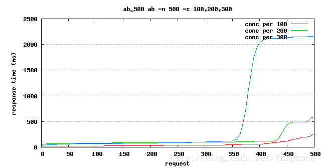
首先,使用 Apache Bench 测试性能,并将测试结果写入文件,我们分别对 http://localhost/index.php 进行三次性能测试。
- ab -n 500 -c 100 -g ./ab_500_100.dat http://localhost/index.php
- ab -n 500 -c 200 -g ./ab_500_200.dat http://localhost/index.php
- ab -n 500 -c 300 -g ./ab_500_300.dat http://localhost/index.php
gnuplot 文件内容格式如下:
- starttime seconds ctime dtime ttime wait
- Mon Jan 27 21:03:02 2014 1390827782 89 503 592 28
- Mon Jan 27 21:03:02 2014 1390827782 84 591 676 24
- Mon Jan 27 21:03:02 2014 1390827782 93 616 710 24
- Mon Jan 27 21:03:02 2014 1390827782 94 628 722 28
- Mon Jan 27 21:03:02 2014 1390827782 84 741 824 26
- Mon Jan 27 21:03:02 2014 1390827782 84 741 825 26
- Mon Jan 27 21:03:02 2014 1390827782 101 725 826 23
- Mon Jan 27 21:03:02 2014 1390827782 124 707 831 80
- Mon Jan 27 21:03:02 2014 1390827782 204 629 833 28
- Mon Jan 27 21:03:02 2014 1390827782 95 741 836 26
- Mon Jan 27 21:03:02 2014 1390827782 96 743 838 50
- Mon Jan 27 21:03:02 2014 1390827782 96 744 840 40
- Mon Jan 27 21:03:02 2014 1390827782 109 773 883 36
- Mon Jan 27 21:03:02 2014 1390827782 109 774 883 37
- Mon Jan 27 21:03:02 2014 1390827782 153 765 918 51
- Mon Jan 27 21:03:02 2014 1390827782 141 778 919 76
- Mon Jan 27 21:03:02 2014 1390827782 115 814 929 28
- Mon Jan 27 21:03:02 2014 1390827782 103 831 934 23
- Mon Jan 27 21:03:02 2014 1390827782 103 831 934 23
- Mon Jan 27 21:03:02 2014 1390827782 108 831 939 36
- Mon Jan 27 21:03:02 2014 1390827782 115 825 940 64
- Mon Jan 27 21:03:02 2014 1390827782 162 783 945 87
- Mon Jan 27 21:03:02 2014 1390827782 119 831 950 32
- Mon Jan 27 21:03:02 2014 1390827782 108 844 952 15
- Mon Jan 27 21:03:02 2014 1390827782 128 830 958 32
- Mon Jan 27 21:03:02 2014 1390827782 128 831 958 35
- Mon Jan 27 21:03:02 2014 1390827782 108 856 964 87
- Mon Jan 27 21:03:02 2014 1390827782 123 843 967 15
- 后面省略。。
然后,根据导出的 gnuplot 文件绘制图表,绘制脚本如下:
- # 设定输出图片的格式
- set terminal png
- # 设定输出的图片文件名
- set output "ab_500.png"
- # 图表的标题
- set title "ab_500 ab -n 500 -c 100,200,300"
- # 设定图表的 X 轴和 Y 轴缩放比例(相当于调整图片的纵横比例,方形的不好看啊)
- set size 1,0.7
- # 设定以 Y 轴数据为基准绘制栅格(就是示例图表中的横向虚线)
- set grid y
- # X 轴标题
- set xlabel "request"
- # Y 轴标题
- set ylabel "response time (ms)"
- # 设定 plot 的数据文件,曲线风格和图例名称,以第九列数据 ttime 为基准数据绘图
- plot "ab_500_100.dat" using 9 smooth sbezier with lines title "conc per 100","ab_500_200.dat" using 9 smooth sbezier with lines title "conc per 200","ab_500_300.dat" using 9 smooth sbezier with lines title "conc per 300"
参数说明:
set size 1,0.7 缩放比例,前面是 X 轴,后面是 Y 轴, (0, 1] 的一个浮点数,1 为原始值
using 9 表示用哪一列数据绘图,数字是数据行按照空格或制表符分割的字段数字索引,从 1 开始
smooth sbezier plot 提供的一些数据填充算法以保证线条平滑度的,包含如下选项:smooth {unique | csplines | acsplines | bezier | sbezier},更详细解释请参考官方文档
with lines title "xxx" 这个会在右上角生成一个图例,用于区分什么颜色的线条是哪一项数据
生成的图表如下:


 196
196

 被折叠的 条评论
为什么被折叠?
被折叠的 条评论
为什么被折叠?
 到【灌水乐园】发言


