


未知宽高元素的垂直水平居中
第一种方法:组合使用display:table-cell和vertical-align、text-align,使父元素内的所有行内元素水平垂直居中(内部div设置display:inline-block即可)这在子元素不确定宽度和高度时,特别适用哦
咳咳,敲黑板划重点啦:
与其他一些display属性类似,table-cell同样会被其他一些css属性破坏,例如float,position:absolute,所以在使用display:table-cell时,尽量不要使用float或者position:absolute(可以考虑为之增加一个父div定义float等属性。);设置了table-cell的元素对宽度和高度敏感(在父元素上设置table-row等属性,也会使其不感知height。),对margin值无反应,响应padding属性
嗯,下面是例子
    <style>
       .father{width:400px; height:200px; border:1px solid #000;display:table-cell; text-align:center;vertical-align:middle;}
        .son{width:200px; height:100px; background:red;display:inline-block;}
    </style>

<div class="father">
    <div class="son">
       display:table-cell;</br>text-align:center;</br> vertical-align:middle
    </div>
</div>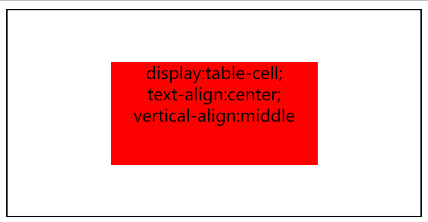
对table-cell元素设置百分比(如100%)的宽高值是无效的,但是可以将元素设置display:table,再将父元素设置百分比跨高,子元素table-cell会自动撑满父元素。这就可以做相对于整个页面的水平垂直居中。嗯,看下面的代码
    <style>
        html,body{height:100%; margin:0;padding:0;}
        #box{display:table; width:100%;height:100%;}
       .father{width:400px; height:200px; border:1px solid #000;display:table-cell; text-align:center;vertical-align:middle;}
        .son{width:200px; height:100px; background:red;display:inline-block;}
    </style>
<div id="box">
    <div class="father">
        <div class="son">
            display:table-cell;</br>text-align:center;</br> vertical-align:middle
        </div>
    </div>
</div>
第二种方法:display:flex-box
Flexbox(伸缩盒)是CSS3中新增的特性,利用这个属性可以解决页面中的居中问题。只需要3行代码就可以实现,不需要设置元素的尺寸,能够自适应页面。
这个方法只能在现代浏览器上有效,IE10+、chrome、Safari、Firefox。例如:
   <style>
       .father{width:400px; height:200px; border:1px solid #000;display:flex; align-items:center;justify-content:center;}
        .son{width:200px; height:100px; background:red;}
    </style>
    <div class="father">
        <div class="son">
            display:flex;</br>align-items:center;</br> justify-content:center;
        </div>
    </div>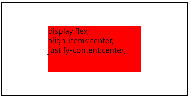
敲黑板喽,敲黑板喽
1.设置container的display的类型为flex,激活为flexbox模式。
2.justify-content定义水平方向的元素位置
3.align-items定义垂直方向的元素位置
第三种方法:display:inline-block +伪元素生成content内容
实现原理:原理:利用inline-block的vertical-align: middle去对齐before伪元素,before伪元素的高度与父对象一样,就实现了高度方向的对齐。居中块的尺寸可以做包裹性、自适应内容,兼容性也相当好。缺点是水平居中需要考虑inline-block间隔中的留白(代码换行符遗留问题。)。(宽度是已知的,高度可以是未知的)
    <style>
       .father{width:400px; height:200px; border:1px solid #000;text-align:center;}
       .father:before{content:".";display:inline-block; vertical-align:middle; height:100%;}
        .son{width:200px; height:100px; background:red;display:inline-block; vertical-align:middle;}
    </style>
</head>
<body>

    <div class="father">
        <div class="son">
            display:inline-block;</br>伪元素生成content内容</br>
        </div>
    </div>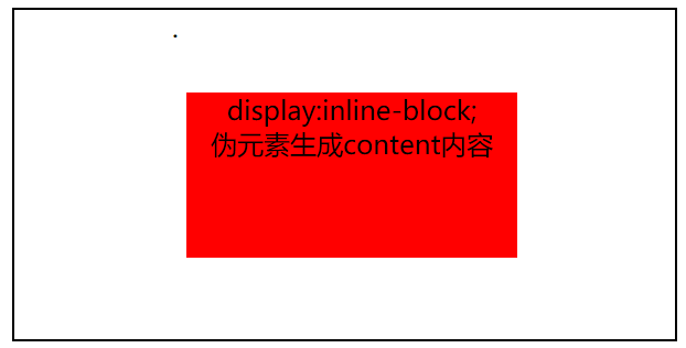
咳咳,同学,敲黑板提问了,什么是伪元素?
“伪元素”,顾名思义。它创建了一个虚假的元素,并插入到目标元素内容之前或之后。
:before 和 :after 伪元素编码非常简单(和大多数的css属性一样不需要一大堆的前缀)。这里是一个简单的例子。
#example:before {
  content: "#";
}

#example:after {
  content: ".";
}
这个例子中提到了两件事情,第一,我们用#example:before和#example:after来目标锁定相同的元素.严格的说,在代码中他们是伪元素。
第二,在内容模块中提到,伪元素如果没有设置“content”属性,伪元素是无用的。
嗯,先补充这一点小知识,后面我会找时间把伪元素的知识详细的总结一下的
第四种方法:绝对定位+transform反向偏移。position:absolute; transform:translate(-50%,-50%);
原理很简单:由于top、left偏移了父对象的50%宽度高度,所以需要利用transform反向偏移居中块的50%宽高
嘿嘿,敲黑板了:transform的计算基准是元素本身,所以这里可以用50%来做反向偏移
    <style>
       .father{width:400px; height:200px; border:1px solid #000;position:relative;}

        .son{width:200px; height:100px; background:red;position:absolute; left:50%; top:50%;transform:translate(-50%,-50%);}
    </style>

    <div class="father">
        <div class="son">
            position:absolute;</br>left:50%;top:50%;</br>transform
        </div>
    </div>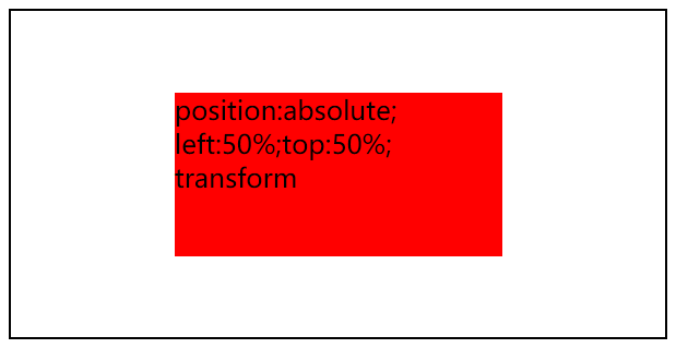
已知宽度和高度的水平垂直居中
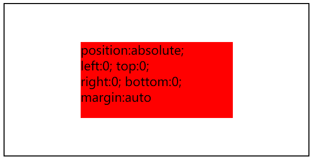
第五种方法:绝对定位+margin:auto(position:absolute; left:0; top:0; right:0; bottom:0; margin:auto)都要写哦,缺一不可滴
下面先看一下例子
    <style>
        .father{width:400px; height:200px; position:relative; border:1px solid #000;}
        .son{width:200px; height:100px; background:red; position:absolute; left:0; top:0; bottom:0; right:0; margin:auto;}
    </style>

<div class="father">
    <div class="son">
        position:absolute;</br> left:0; top:0;</br> right:0; bottom:0; </br>margin:auto
    </div>
</div>
下面是效果图
解释一下为什么要把几个定位方向值都要写了(其实本来我也不懂,是看了张鑫旭的博客后才恍然大悟的,下面是他的解释)
当一个绝对定位元素,其对立定位方向属性同时有具体定位数值的时候,流体特性就发生了。
具有流体特性绝对定位元素的margin:auto的填充规则和普通流体元素一模一样:
- 如果一侧定值,一侧
auto,auto为剩余空间大小; - 如果两侧均是
auto, 则平分剩余空间;
例如,下面的CSS代码:
.father {
    width: 300px; height:150px;
    position: relative;
}
.son {
    position: absolute;
    top: 0; right: 0; bottom: 0; left: 0;
}此时.son这个元素的尺寸表现为“格式化宽度和格式化高度”,和<div>的“正常流宽度”一样,同属于外部尺寸,也就是尺寸自动填充父级元素的可用尺寸的,然后,此时我们给.son设置尺寸,例如:
.son {
    position: absolute;
    top: 0; right: 0; bottom: 0; left: 0;
    width: 200px; height: 100px;
}此时宽高被限制,原本应该填充的空间就被多余了出来,这多余的空间就是margin:auto计算的空间,因此,如果这时候,我们再设置一个margin:auto,那么:
.son {
    position: absolute;
    top: 0; right: 0; bottom: 0; left: 0;
    width: 200px; height: 100px;
    margin: auto;
}我们这个.son元素就水平和垂直方向同时居中了。因为,auto正好把上下左右剩余空间全部等分了,自然就居中啦!
第六种方法:绝对定位+margin反向偏移
position:absolute; top:50%; left:50%; margin-left:-(width+padding)/2+'px'; margin-top:-(height+padding)/2+'px';
咳咳,敲黑板划重点了:margin值的设置不能使用百分比哦,因为margin是基于父元素的宽度来计算百分比的
这个原理和上面的方案4很相似,由于top、left偏移了父对象的50%宽度高度,所以需要利用margin反向偏移居中块的50%宽高
    <style>
        .father{width:400px; height:200px; position:relative; border:1px solid #000;}
        .son{width:200px; height:100px; background:red; position:absolute; left:50%; top:50%;  margin-left:-100px; margin-top:-50px;}
    </style>

<div class="father">
    <div class="son">
        position:absolute;</br>  left:50%; top:50%;</br>margin-left/top
    </div>
</div>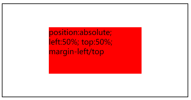
咳咳,敲黑板啦,下课,哈哈


 8418
8418


 被折叠的 条评论
为什么被折叠?
被折叠的 条评论
为什么被折叠?
 到【灌水乐园】发言


