


- 原文地址:新手引导功能的四种姿势
- 原文作者:清夜
- 温馨提示:如果你对文章有歧义或者建议,欢迎来 Github 里提 PR 或者 Issue 一起维护文章~
- 文章著作权归原文作者所有,转载请注明出处哦~
产品新功能的开发,一般需要遵循的其中两条原则:
-
不要信任用户
这个意思并不是说要把用户当成敌人,而是站在系统安全的角度,更具体点说,是不要信任用户的任何输入,尽可能地不要在系统中留下任何漏洞,基本的比如 csrf、xss 的防范,这条原则一般由后端来保证 -
将用户当成傻子
同样不是敌对用户的意思,而是要求产品能从用户的角度去适应用户的行为,降低用户的使用门槛,比如表单填写的各种提示、显眼的提交按钮等,因为涉及到与用户的直接接触,所以这一条主要从前端层面进行保证
可能对于经常跟互联网产品打交道的你我来说,对于一个新功能甚至是新产品可以做到边使用边摸索边学会,但你不能保证所有人都具备这个能力,很多人根本不知道 Ctrl + F 是啥,更不可能知道浏览器的兼容模式是什么意思,如果产品的流量够大,那么哪怕只有 1% 的用户在使用产品时遇到困难,都是不小的损失
针对这种情况,早就有了很多成熟的解决方案,比如,新手引导
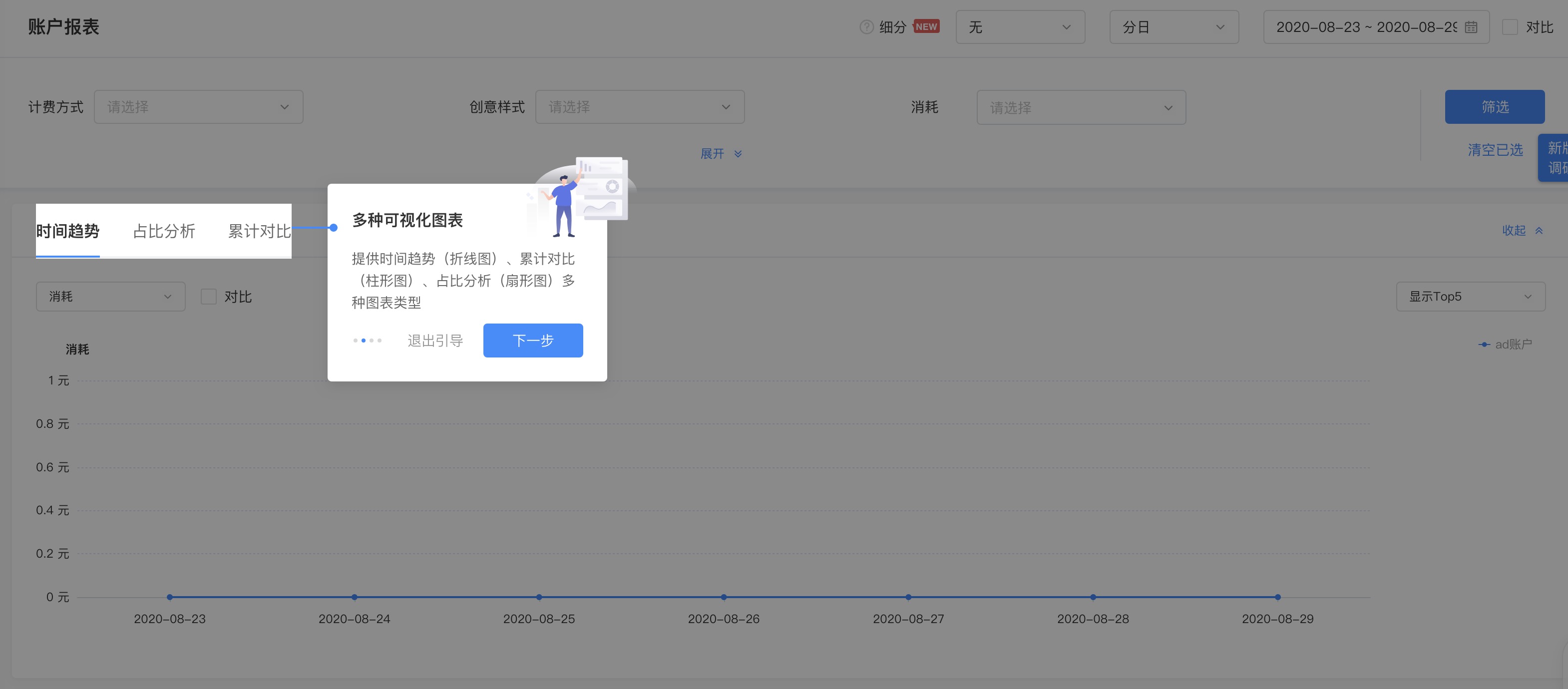
如上图,其实就是一个遮罩层加一个弹窗,只不过比一般弹窗稍微复杂一点的是,遮罩层之上除了弹窗之外,还有需要高亮引导的元素区域,并且弹窗的位置也并不是固定的,而是跟随高亮引导区域进行定位
解释性弹窗这块没什么可说的,主要是遮罩层这块稍微有点意思,最近我刚好遇到了这个需求,所以就多思考了一下,发现这个这遮罩层的实现思路倒是不少~
第一种姿势 - mask 拼接
看图说话
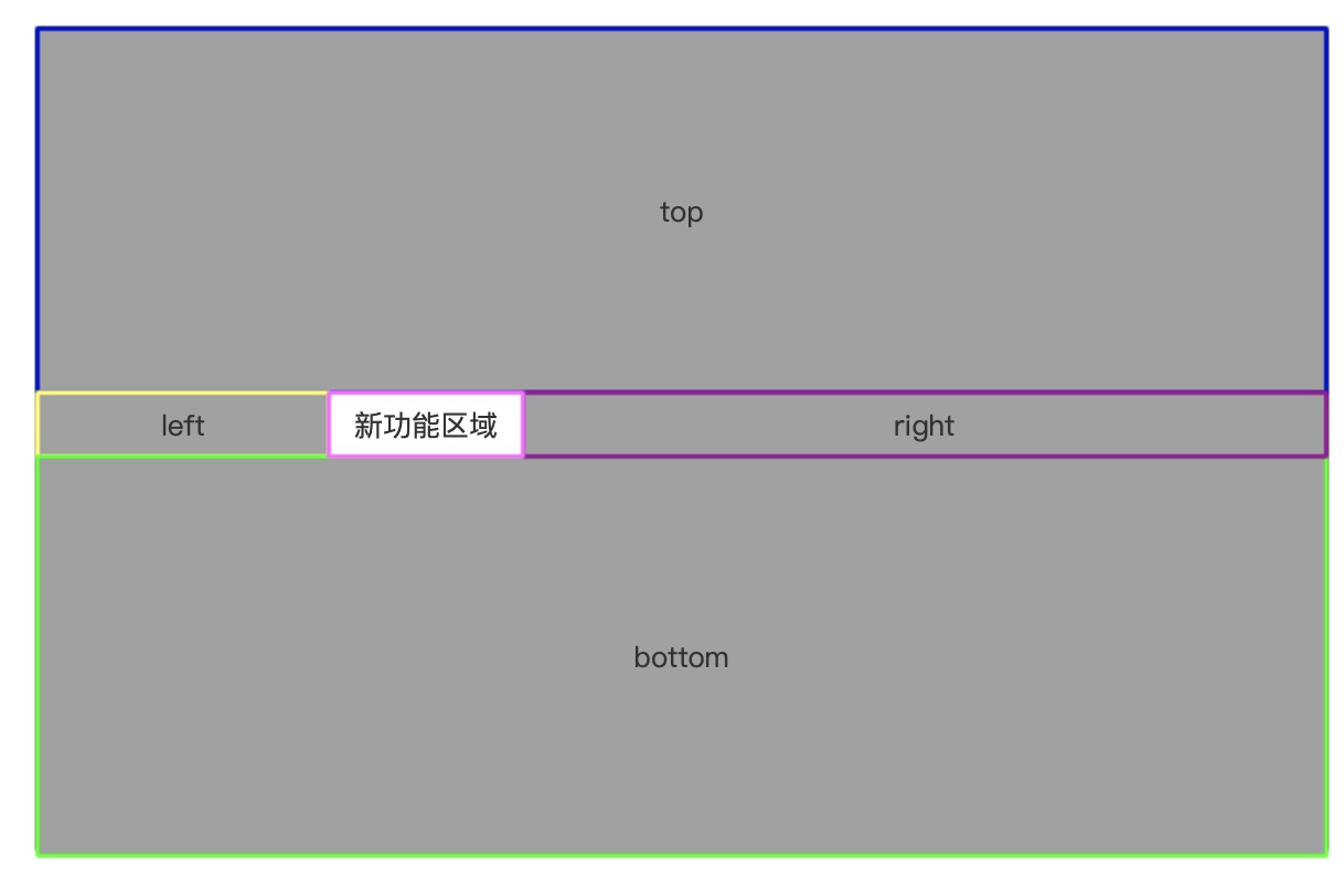
上图整个大矩形看成是浏览器页面,页面区域被五个区块瓜分:top、right、bottom、left 以及 新功能区域
其中 新功能区域 元素就是我们所要展示的新功能区域,而 top、right、bottom、left 则都是遮罩元素,它们一起将除了 新功能区域 这块区域之外的剩余区域填满,这样看起来可能像是页面上有一个充满整个页面区域的遮罩层,然后 新功能区域 悬浮在这个遮罩层之上,其实并不是
原因呢也很简单,新功能区域 元素并不是悬浮在页面之上的弹窗,而是位于页面的主体文档流中,一般而言不会是悬浮的,也不会主动设置一个比较大的 z-index 属性的,那么如果直接一个大遮罩层遮在整个页面之上,肯定也就将 新功能区域 给遮罩住了,然后你又想高亮显示 新功能区域,这就矛盾了,所以不能部分三七二十一直接一整个遮罩层盖上去,而是要专门避开 新功能区域 才可以
实际上,除了这五块之外,还有第六块元素,它遮罩在 新功能区域 元素的上层,尺寸和位置都和 新功能区域 完全相同,只不过这个元素是透明的(即 background-color: transparent;),你看不到它,但是却能透过它看到位于它底层的 新功能区域
这块区域是干啥用的呢?如果没有做过这个功能可能一下子想不到,这个隐形的遮罩层其实是为了防止用户真的触达到 新功能区域
因为 新功能区域 在实际的场景中,可能是一个菜单,可能是一个按钮,悬浮上去或者点了之后会触发某些操作,比如页面跳转等,我们肯定不希望在给用户介绍新功能的时候页面元素突然被更改了,甚至是直接打断了对用户的引导流程,所以必须要屏蔽掉,那么直接给 新功能区域 加个透明的 盖子,就是一个很简单的解决手段了
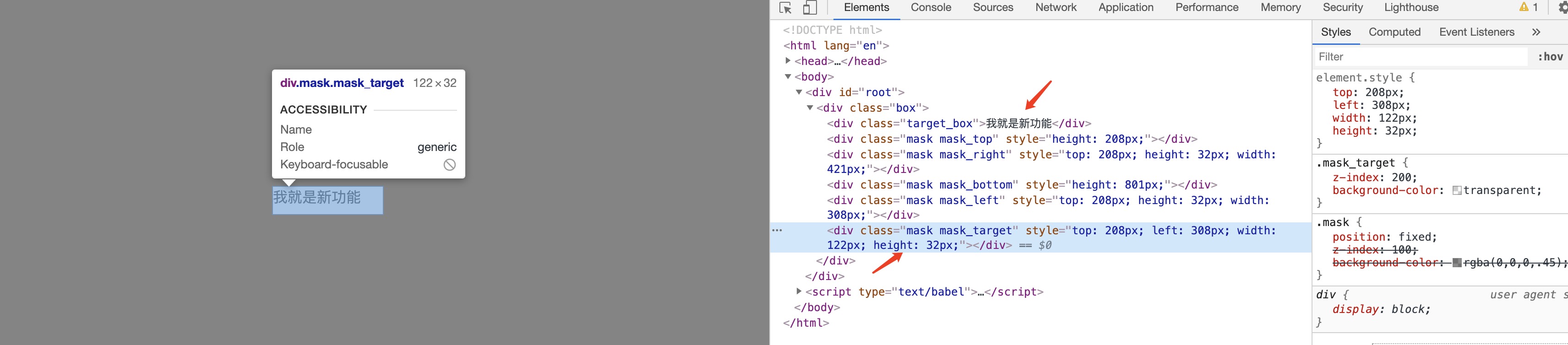
看代码可能更清楚点,主要是DOM计算
function Guide() {
  const [maskTop, setMaskTop] = useState({})
  const [maskRight, setMaskRight] = useState({})
  const [maskBottom, setMaskBottom] = useState({})
  const [maskLeft, setMaskLeft] = useState({})
  const [maskTarget, setMaskTarget] = useState({})
  const targetRef = React.createRef()

  const computeEle = () => {
    const rect = targetRef.current.getBoundingClientRect()
    const clientHeight = document.documentElement.clientHeight || document.body.clientHeight
    const clientWidth = document.documentElement.clientWidth || document.body.clientWidth
    setMaskTop({ height: rect.top + 'px' })
    setMaskRight({
      top: rect.top + 'px',
      height: rect.height + 'px',
      width: clientWidth - rect.right + 'px'
    })
    setMaskBottom({ height: clientHeight - rect.bottom + 'px' })
    setMaskLeft({
      top: rect.top + 'px',
      height: rect.height + 'px',
      width: rect.left + 'px'
    })
    setMaskTarget({
      top: rect.top + 'px',
      left: rect.left + 'px',
      width: rect.width + 'px',
      height: rect.height + 'px'
    })
  }

  useEffect(() => {
    computeEle()
  }, [])

  return (
    <div className="box">
      <div className="target_box" ref={targetRef}>我就是新功能</div>
      <div className="mask mask_top" style={maskTop}></div>
      <div className="mask mask_right" style={maskRight}></div>
      <div className="mask mask_bottom" style={maskBottom}></div>
      <div className="mask mask_left" style={maskLeft}></div>
      <div className="mask mask_target" style={maskTarget}></div>
    </div>
  )
}
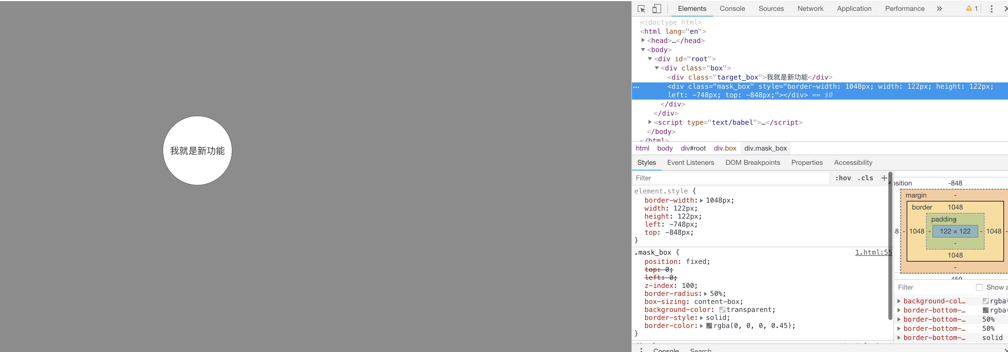
第二种姿势 - border
还是直接上图
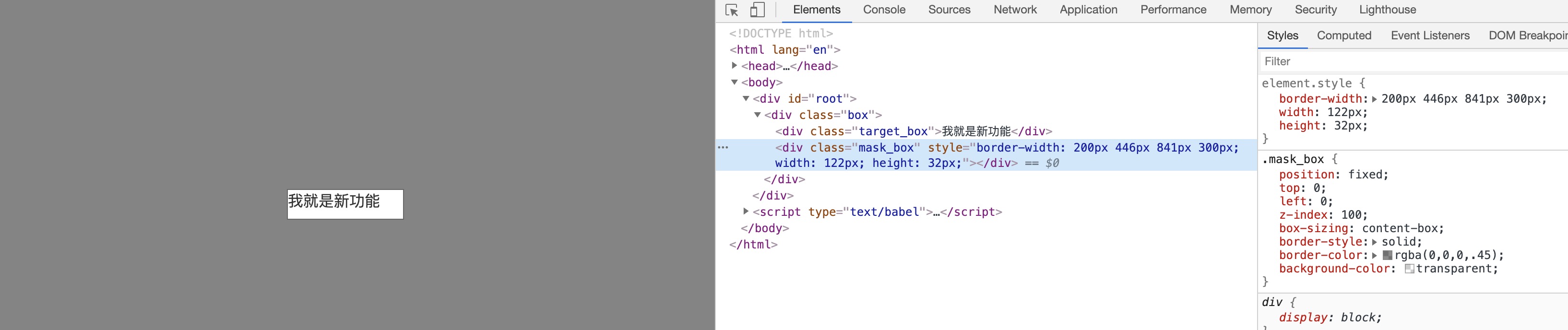
这种实现方法只用到了一个额外元素,脑洞也稍微大一点,第一种方法中的 top、right、bottom、left 四个元素分别使用一个元素的四条边(border)来代替,相比于正常元素的border来说,这个元素的border-width会比较大,以至于可以填充满除了 新功能区域 之外页面剩余的区域,再将 border-color设置为正常遮罩层的背景色,border就伪装好了~
function Guide() {
  const [maskBox, setMaskBox] = useState({})
  const targetRef = React.createRef()

  const computeEle = () => {
    const rect = targetRef.current.getBoundingClientRect()
    const clientHeight = document.documentElement.clientHeight || document.body.clientHeight
    const clientWidth = document.documentElement.clientWidth || document.body.clientWidth
    setMaskBox({
      'borderTopWidth': rect.top + 'px',
      'borderRightWidth': clientWidth - rect.right + 'px',
      'borderBottomWidth': clientHeight - rect.bottom + 'px',
      'borderLeftWidth': rect.left + 'px',
      width: rect.width + 'px',
      height: rect.height + 'px'
    })
  }

  React.useEffect(() => {
    computeEle()
  }, [])

  return (
    <div className="box">
      <div className="target_box" ref={targetRef}>我就是新功能</div>
      <div className="mask_box" style={maskBox}></div>
    </div>
  )
}
不仅如此,这种方法还可以实现一个第一种姿势无法实现的效果,比如,当 新功能区域 是圆形的时候
如果采取第一种方法,因为拼接遮罩层的四个元素都是矩形,无法凑出一个圆形的镂空,但是如果采取当前方法,实际上只要给 border所在的元素一个 border-radius: 50%的属性就可以了,不仅限于圆,椭圆甚至是可以使用 border-radius实现的任何效果的形状也是同样的道理
当然啦,如果是这种思路的话,border的计算以及元素的定位就不是上述的逻辑了,给 border所在的元素加了 border-radius: 50%之后,border同样也会受到这个属性的影响,所以需要适当调整 border 的尺寸,避免遮罩层露馅
function Guide() {
  const [maskBox, setMaskBox] = useState({})
  const targetRef = React.createRef()
  const computeEle = () => {
    const rect = targetRef.current.getBoundingClientRect()
    const clientHeight = document.documentElement.clientHeight || document.body.clientHeight
    const clientWidth = document.documentElement.clientWidth || document.body.clientWidth
    const rX = rect.left + rect.width / 2
    const rY = rect.top + rect.height / 2
    // 需要高亮的 圆形的新功能区域 圆心距离四个拐角的最大长度作为遮罩层圆的半径
    const lt = Math.sqrt(Math.pow(rX, 2) + Math.pow(rY, 2))
    const lb = Math.sqrt(Math.pow(rX, 2) + Math.pow(clientHeight - rY, 2))
    const rt = Math.sqrt(Math.pow(clientWidth - rX, 2) + Math.pow(rY, 2))
    const rb = Math.sqrt(Math.pow(clientWidth - rX, 2) + Math.pow(clientHeight - rY, 2))
    const r = Math.ceil(Math.max(lt, lb, rt, rb))
    setMaskBox({
      borderWidth: r + 'px',
      width: rect.width + 'px',
      height: rect.height + 'px',
      left: rX - r - rect.width / 2 + 'px',
      top: rY - r - rect.height / 2 + 'px'
    })
  }

  React.useEffect(() => {
    computeEle()
  }, [])

  return (
    <div className="box">
      <div className="target_box" ref={targetRef}>我就是新功能</div>
      <div className="mask_box" style={maskBox}></div>
    </div>
  )
}
第三种姿势 - box-shadow
这种姿势是从上面的 border启发而来的,既然 border的尺寸在足够大的情况下,可以模拟遮罩层,那么 box-shadow在尺寸足够大、数量足够多的情况下,也可以模拟
只不过呢,使用 box-shadow实现这个效果,比使用 border麻烦了很多,因为一个元素在不设置 box-shadow 阴影的大小(spread)属性的情况下,其 box-shadow 尺寸最大也只能和元素本身相同,也就是元素的 box-shadow 完全从元素本身偏移出来的效果
<style>
  .box {
    width: 50px;
    height: 50px;
    background-color: green;
    box-shadow: 50px 0px indianred;
  }
</style>
而如果设置了 box-shadow的阴影的大小(spread)属性,那么因为这个属性会以元素为中心同时向四个方向扩展,就不好控制 box-shadow 占据的区域位置了,没办法通过对一个 box-shadow扩展来达到放大阴影的效果,好在 box-shadow 的值可以设置不止一个,通过多个 box-shadow 的组合,最终也可以实现一个覆盖住全屏幕的遮罩层

我随便写了一个 Demo,然后为了实现这个效果,box-shadow 一共设置了 1316 个值!而 box-shadow 这个属性对于浏览器的消耗是比较大的,同时渲染那么多 box-shadow显然是不可能用于实际生产环境的,并且计算这些值相对而言也比较伤脑筋
const clientHeight = document.documentElement.clientHeight || document.body.clientHeight
const clientWidth = document.documentElement.clientWidth || document.body.clientWidth
const shadowPositionMap = {
  top: {
    index: 1,
    flag: -1
  },
  right: {
    index: 0,
    flag: 1
  },
  bottom: {
    index: 1,
    flag: 1
  },
  left: {
    index: 0,
    flag: -1
  },
}
const maskColor = 'rgba(0, 0, 0, 0.45)'
function getOneSideBoxShadow(totalSize, targetSize, direction) {
  const shadowArr = []
  let i = 0
  let shadowItem = null
  while (targetSize * i < totalSize) {
    shadowItem = [0, 0]
    shadowItem[direction.index] = direction.flag * targetSize * (i + 1)
    shadowArr.push(shadowItem)
    i++
  }
  return shadowArr
}
function genBoxShadow(shadowArr) {
  return shadowArr.reduce((t, c) => {
    return t + `${c[0]}px ${c[1]}px ${maskColor},`
  }, '').slice(0, -1)
}
function repeatBoxShadow(arr, targetWidth, leftW, rightW) {
  const leftCount = Math.ceil(leftW / targetWidth)
  const rightCount = Math.ceil(rightW / targetWidth)
  const repeatArr = []
  ;[leftCount, rightCount].forEach((count, index) => {
    const flag = index === 0 ? -1 : 1
    for (let i = 1; i <= count; i++) {
      repeatArr.push(...arr.map(item => {
        return [flag * i * targetWidth, item[1]]
      }))
    }
  })
  return repeatArr
}

function Guide() {
  const [maskBox, setMaskBox] = useState({})
  const targetRef = React.createRef()
  const computeEle = () => {
    const rect = targetRef.current.getBoundingClientRect()
    const rightGap = clientWidth - rect.right
    const color = 'rgba(0,0,0,0.45)'
    const topSingle = getOneSideBoxShadow(rect.top, rect.height, shadowPositionMap.top)
    const bottomSingle = getOneSideBoxShadow(clientHeight - rect.bottom, rect.height, shadowPositionMap.bottom)
    setMaskBox({
      boxShadow: `
        ${genBoxShadow(topSingle)},
        ${genBoxShadow(getOneSideBoxShadow(rightGap, rect.width, shadowPositionMap.right))},
        ${genBoxShadow(bottomSingle)},
        ${genBoxShadow(getOneSideBoxShadow( rect.left, rect.width, shadowPositionMap.left))},
        ${genBoxShadow(repeatBoxShadow(topSingle, rect.width, rect.left, rightGap))},
        ${genBoxShadow(repeatBoxShadow(bottomSingle, rect.width, rect.left, rightGap))}
      `,
      left: rect.left + 'px',
      top: rect.top + 'px',
      width: rect.width + 'px',
      height: rect.height + 'px'
    })
  }

  React.useEffect(() => {
    computeEle()
  }, [])

  return (
    <div className="box">
      <div className="target_box" ref={targetRef}>我就是新功能</div>
      <div className="mask_box" style={maskBox}></div>
    </div>
  )
}
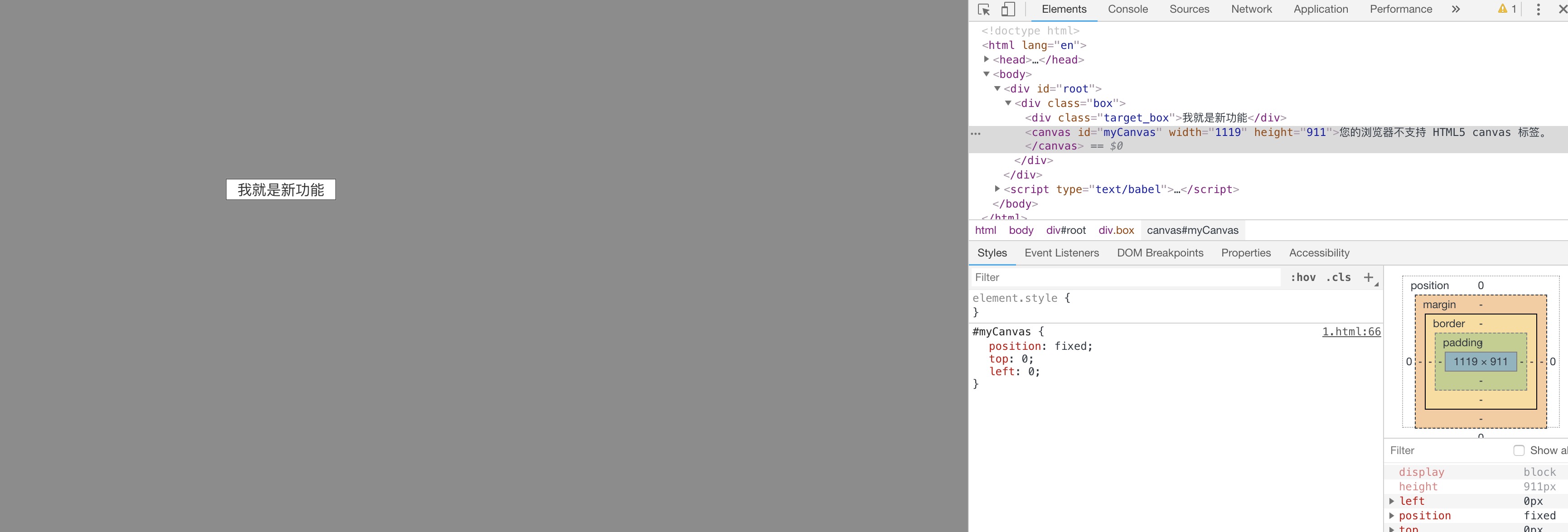
第四种姿势 - canvas
css能实现的东西,一般情况下 js也能(我凭着经验乱说的没有证据),利用 canvas直接将所需的效果画出来,省心又直接~
canvas 画布大小和页面一致,然后使用遮罩色填充画布,最后将挡在所需高亮的 新功能区域 的 canvas区域擦除掉,就完成了
function Guide() {
  const [width, setWidth] = useState(0)
  const [height, setHeight] = useState(0)
  const targetRef = React.createRef()
  const canvasRef = React.createRef()
  const computeEle = () => {
    const clientHeight = document.documentElement.clientHeight || document.body.clientHeight
    const clientWidth = document.documentElement.clientWidth || document.body.clientWidth
    setWidth(clientWidth)
    setHeight(clientHeight)
    const rect = targetRef.current.getBoundingClientRect()
    const c = canvasRef.current
    const ctx = c.getContext('2d')
    ctx.fillStyle = 'rgba(0, 0, 0, 0.45)'
    ctx.fillRect(0, 0, c.width, c.height)
    ctx.clearRect(rect.left,rect.top, rect.width, rect.height)
  }

  React.useEffect(() => {
    computeEle()
  }, [])

  return (
    <div className="box">
      <div className="target_box" ref={targetRef}>我就是新功能</div>
      <canvas id="myCanvas" ref={canvasRef} width={clientWidth} height={clientHeight}>您的浏览器不支持 HTML5 canvas 标签。</canvas>
    </div>
  )
}
相比于第二种姿势的 border,canvas 就更厉害啦,可以进行任意形状元素的高亮,只要你知道怎么画出来就行
The End
只是一个小小的新功能引导就有那么多的实现方式,可见前端确实是灵活又有趣的,大家平时在做需求的时候都可以多加思考一二,不要总是局限于以往的思维,放开脑洞,或许就能找到更好的解决方案~


 扫一扫
扫一扫


 1万+
1万+

 被折叠的 条评论
为什么被折叠?
被折叠的 条评论
为什么被折叠?
 到【灌水乐园】发言


