


CSS:
 body{
           min-width:800px;
       }
       h1,
       h2,
       div p{
           margin:0;
           padding:10px;
       }
       /*#wrapper{*/
           /*width:90%;*/
           /*margin:0 auto;*/
           /*background:#ddd;*/
       /*}*/
       #content{
           background:#ff6;
       }
       #left,
       #right{
           width:200px;
           float:left;
           background:#fc0;
       }
       #middle{
           float:left;
           width:100%;
           margin:0 -200px;
       }
       #middle .inner{
           margin:0 200px;
           background:#ccc;
       }
       #right{
           float:right;
       }
       #footer{
           clear:both;
       }
       /* Clearfix */
       .clearfix:after{content:".";display:block;height:0;clear:both;visibility:hidden;}
       .clearfix{display:inline-table;}
       /* Hides from IE-mac /*/
       * html .clearfix{height:1%;}
       .clearfix{display:block;}
       /* End hide from IE-mac */
       *+html .clearfix{min-height:1%;}/* IE7 */
html:
<div id="wrapper">
    <div id="content" class="clearfix">
        <div id="left">
            <h2>Left</h2>
            <p>左边栏宽度固定为200px</p>
        </div>
        <div id="middle">
            <div class="inner">
                <h2>Middle</h2>
                <p>中间栏宽度可以自适应</p>
                <p><b>原理:</b>利用margin的负值错别固定的宽度</p>
            </div>
        </div>
        <div id="right">
            <h2>Right</h2>
            <p>右边栏宽度固定为200px</p>
        </div>
    </div>
    <div id="footer">
        <h1>Footer</h1>
    </div>
</div>
效果如图:
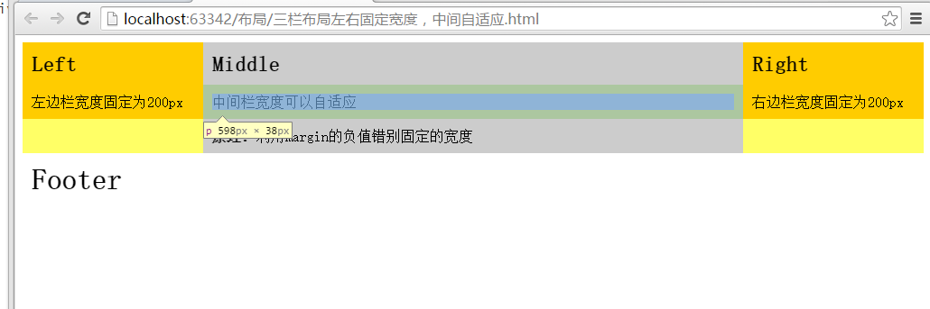
- 三栏float left left right
- 中间栏宽度100%,设置左margin为-200
- 中间栏内部margin:0 200
- 并且去浮动。


 扫一扫
扫一扫
 1692
1692

 被折叠的 条评论
为什么被折叠?
被折叠的 条评论
为什么被折叠?
 到【灌水乐园】发言


