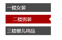
css实现 三角

仿照天猫左侧导航选中时有个三角。
效果如图所示:
效果图

实现步骤:

  • 创建html
<ul>

    <li class="item">
        一楼女装
        <s class="triangle">
          </s>
    </li>

    <li class="item">
       二楼男装
        <s class="triangle">
        </s>
    </li>

    <li class="item">
        三楼婴儿用品
        <s class="triangle">
        </s>
    </li>
</ul>
  • 写css 主要运用border属性
ul li{
    font-family: "microsoft yahei";
    list-style-type: none;
    margin-bottom: 10px;
    padding-left: 5px;
    height: 30px;
    line-height: 30px;
    color:white ;
    background-color: #4a4a4a;
    width: 150px;
    overflow: hidden;
    position: relative;
}
.triangle{
    display: none;
    position: absolute;
    right:0px;
    top: 8px;
    border-style: solid;
    border-width: 7px 7px 7px 0;
    border-color: transparent #f3f3f3;
}
li:hover{
    background-color: #a90000;
    color: white;
    text-indent: 20px;

}
li:hover .triangle{
    display: block;
}
  • 0
    点赞
  • 0
    收藏
    觉得还不错? 一键收藏
  • 0
    评论

“相关推荐”对你有帮助么?

  • 非常没帮助
  • 没帮助
  • 一般
  • 有帮助
  • 非常有帮助
提交
评论
添加红包

请填写红包祝福语或标题

红包个数最小为10个

红包金额最低5元

当前余额3.43前往充值 >
需支付:10.00
成就一亿技术人!
领取后你会自动成为博主和红包主的粉丝 规则
hope_wisdom
发出的红包
实付
使用余额支付
点击重新获取
扫码支付
钱包余额 0

抵扣说明:

1.余额是钱包充值的虚拟货币,按照1:1的比例进行支付金额的抵扣。
2.余额无法直接购买下载,可以购买VIP、付费专栏及课程。

余额充值