


Activity是Android应用中负责与用户交互的组件-----大致上可以想象成Swing编程中的JFrame类,与JFrame类似,需要布局管理器和各种组件,与JPanel和JButton等类似,容器和组件都是共同祖先的,Android中的布局管理器和UI组件同样也是共同祖先:View类。
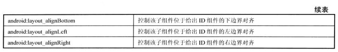
ViewGroup抽象类是View类的子类,主要用于容器作用,各种布局管理器就是实现ViewGroup的,例如LinearLayout,RelativeLayout等,除此之外,ViewGroup类还有2个内部类:ViewGroup.LayoutParams,ViewGroup.MarginLayoutParams用于控制布局,match_parent指定组件和父容器组件的高度,宽度相同;wrap_content指定组件大小恰好能包裹它的内容即可。
控制UI界面的方式可以使用XML布局文件:在Activity中setContentView(R.layout.<资源文件名字>);再在布局文件中添加多个UI组件,通过findViewById(R.id.<id值>);可以找到唯一的View组件。
控制UI界面的方式可以使用代码直接控制:直接在java代码中LinearLayout layout=new LinearLayout(this);创建一个布局管理器,TextView show=new TextView(this);创建一个文本显示区;layout.addView(show);把show选进布局管理器中。这里创建View对象的时候参数都有一个this,真正的参数是Context参数,Context参数包含了Android应用环境的全局信息,让UI组件持有一个Context参数可以获取各种全局信息,而Activity,Service都继承了Context,所以就传this作为参数了。
自定义View:众多的UI组件,甚至布局管理器全部都是继承于View类,当SDK提供的组件不足以应付需求的时候,可以自己继承View类,自定义一个View。首先构造函数必须有,调用super()就是,其次就是可供重写的方法:onDraw(Canvas)当需要绘制其内容的时候就回调该方法 onTouchEvent(MotionEvent)当触摸屏时间发生就调用该方法,还有其他许多的。
第一组UI组件:布局管理器
Handler handler=new Handler()
	{
		@Override
		public void handleMessage(Message msg)
		{
			if(msg.what==0x123)
			{
				for(int i=0;i<id.length;i++)
				{
					views[i].setBackgroundResource(color[(i+index)%6]);
				}
				index++;
			}
			super.handleMessage(msg);
		}
	};
	@Override
	protected void onCreate(Bundle savedInstanceState) {
		super.onCreate(savedInstanceState);
		setContentView(R.layout.framelayout);
		for(int i=0;i<id.length;i++)
		{
			views[i]=(TextView)findViewById(id[i]);
		}
		new Timer().schedule(new TimerTask()
		{

			@Override
			public void run()
			{
				// TODO Auto-generated method stub
				handler.sendEmptyMessage(0x123);
			}
		}, 0, 200);


	}
<TextView
        android:layout_x="20dp"
        android:layout_y="20dp"
        android:layout_width="wrap_content"
        android:layout_height="wrap_content"
android:text="用户名:" />第二组UI组件:TextView
<TextView
        android:layout_width="match_parent"
        android:layout_height="wrap_content"
        android:text="我爱Java"
       	android:background="@drawable/bg_border2"
        android:textSize="20pt"/>
    <TextView
        android:layout_width="match_parent"
        android:layout_height="wrap_content"
        android:text="我爱Java我爱Java我爱Java我爱Java我爱Java我爱aaaaJava"
        android:singleLine="true"
        android:ellipsize="middle"
        android:textAllCaps="true"/>
    <TextView
        android:layout_width="match_parent"
        android:layout_height="wrap_content"
        android:text="Email:810921141@qq.com phone:13286196866"
        android:autoLink="phone|email"/>
    <TextView
        android:layout_width="match_parent"
        android:layout_height="wrap_content"
        android:text="测试文字"
        android:textColor="#f00"
        android:textSize="18pt"
        android:shadowColor="#00f"
        android:shadowDx="10.0"
        android:shadowDy="8.0"
        android:shadowRadius="3.0"/>
    <TextView
        android:layout_width="match_parent"
        android:layout_height="wrap_content"
        android:text="hello"
android:password="true"/><?xml version="1.0" encoding="utf-8"?>
<shape xmlns:android="http://schemas.android.com/apk/res/android" android:shape="rectangle">
<corners
android:topLeftRadius="20px"
android:topRightRadius="5px"
android:bottomLeftRadius="5px"
android:bottomRightRadius="20px" />
<stroke
android:width="4px"
android:color="#f0f"/>
<gradient
android:startColor="#f00"
android:centerColor="#0f0"
android:endColor="#00f"
android:type="sweep" />
</shape>EditText主要用于接收用户的输入:通过代码认识它吧,主要属性有android:hint(一开始没输入的时候写在EditText上的提示),android:inputtype(输入的内容种类),android:selectAllonFoucus(选中该EditText时候,选中它的所有文本)
<?xml version="1.0" encoding="utf-8"?>
<TableLayout xmlns:android="http://schemas.android.com/apk/res/android"
    android:layout_width="match_parent"
    android:layout_height="match_parent" >
    <TableRow >
        <TextView
            android:layout_width="match_parent"
            android:layout_height="wrap_content"
            android:text="用户名"
            android:textSize="16sp"/>
        <EditText
            android:layout_width="match_parent"
            android:layout_height="wrap_content"
            android:hint="请填写登陆用户名"
            android:selectAllOnFocus="true"/>
    </TableRow>
    <TableRow >
        <TextView
            android:layout_width="match_parent"
            android:layout_height="wrap_content"
            android:text="密码"
            android:textSize="16sp"/>
        <EditText
            android:layout_width="match_parent"
            android:layout_height="wrap_content"
            android:password="true"
            android:inputType="numberPassword"/>
    </TableRow>
    <TableRow >
        <TextView
            android:layout_width="match_parent"
            android:layout_height="wrap_content"
            android:text="年龄"
            android:textSize="16sp"/>
        <EditText
            android:layout_width="match_parent"
            android:layout_height="wrap_content"
            android:inputType="number"/>
    </TableRow>
    <TableRow >
        <TextView
            android:layout_width="match_parent"
            android:layout_height="wrap_content"
            android:text="生日"
            android:textSize="16sp"/>
        <EditText
            android:layout_width="match_parent"
            android:layout_height="wrap_content"
            android:inputType="date"/>
    </TableRow>
    <TableRow >
        <TextView
            android:layout_width="match_parent"
            android:layout_height="wrap_content"
            android:text="电话号码"
            android:textSize="16sp"/>
        <EditText
            android:layout_width="match_parent"
            android:layout_height="wrap_content"
            android:hint="请填写电话号码"
            android:inputType="phone"
            android:selectAllOnFocus="true"/>
    </TableRow>
    <Button
        android:layout_width="wrap_content"
        android:layout_height="wrap_content"
        android:text="注册"
        android:layout_gravity="center_horizontal"/>

</TableLayout>
Button:按钮也是View的子类所以继承了View的属性,按钮主要有事件响应的特性,另外对于按钮,背景很重要,让人有按下的视觉感受来源于背景的更换,所以换android:background的时候要注意了,可以用 drawable中的Selecter来针对按下一种情况,松开一种情况来处理:
<?xml version="1.0" encoding="utf-8"?>
<selector xmlns:android="http://schemas.android.com/apk/res/android" >
    <item android:state_pressed="true" android:drawable="@color/color1"></item>
    <item android:state_pressed="false" android:drawable="@color/color2"></item>

</selector><RadioGroup
android:id="@+id/rg"
android:orientation="horizontal"
android:layout_gravity="center_horizontal">
<RadioButton
android:layout_width="wrap_content"
android:layout_height="wrap_content"
android:id="@+id/man"
android:text="男性"
android:checked="true"/>
<RadioButton
android:layout_width="wrap_content"
android:layout_height="wrap_content"
android:id="@+id/woman"
android:text="女性"/>
</RadioGroup> <CheckBox
android:id="@+id/check_red"
android:layout_width="wrap_content"
android:layout_height="wrap_content"
android:text="红色"/>rGroup.setOnCheckedChangeListener(new OnCheckedChangeListener()
{
@Override
public void onCheckedChanged(RadioGroup arg0, int arg1)
{
// TODO Auto-generated method stub
if(arg1==R.id.man)
show.setText("you are a man!");
else {
show.setText("you are a woman!");
}
}
});Button.setOnCheckedChangeListener(new CompoundButton.OnCheckedChangeListener()
{
public void onCheckedChanged(CompoundButton arg0, boolean arg1)
{
// TODO Auto-generated method stub
if(arg1)
linearLayout.setOrientation(1);
else {
linearLayout.setOrientation(0);
}
}
});<ToggleButton
android:id="@+id/toggle"
android:layout_width="wrap_content"
android:layout_height="wrap_content"
android:textOff="横向排列"
android:textOn="纵向排列"/><AnalogClock
android:layout_width="wrap_content"
android:layout_height="wrap_content" />
<DigitalClock
android:layout_width="wrap_content"
android:layout_height="wrap_content"
android:textSize="16pt"
android:textColor="#00f"
android:drawableRight="@drawable/ic_launcher"/>第三组UI组件:ImageView
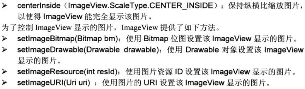
TextView负责显示文字,那么 ImageView就负责显示图片了,android:src属性指明显示那个图片,还有一个较为重要的属性就是android:scaleType: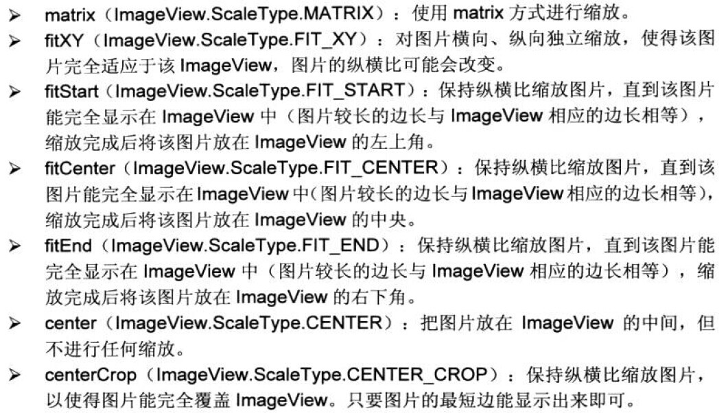
<ImageView
        android:id="@+id/imageview1"
        android:layout_width="match_parent"
        android:layout_height="240px"
        android:src="@drawable/photo2"
android:scaleType="fitCenter"/>BitmapDrawable bitmapDrawable=(BitmapDrawable)imageview1.getDrawable();
Bitmap bitmap=bitmapDrawable.getBitmap();imageview2.setImageBitmap(bitmap.createBitmap(bitmap, x, y, 120, 120));<ImageButton
android:layout_width="wrap_content"
android:layout_height="wrap_content"
android:src="@drawable/btn_selector"
android:scaleType="fitCenter"/><ZoomControls
android:layout_width="wrap_content"
android:layout_height="wrap_content"
android:layout_gravity="center_horizontal"/>第四组UI组件:AdapterView
AdapterView是ViewGroup类的子类,所以也是容器,但是它并非是装各种组件的布局管理器,它主要拿来装列表项的。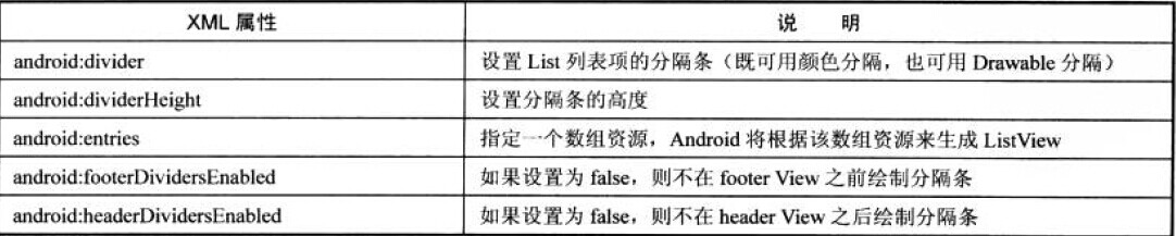
纯利用这些属性设置的列表例子:
<ListView
        android:id="@+id/list"
        android:layout_width="match_parent"
        android:layout_height="wrap_content"
        android:layout_gravity="center_horizontal"
        android:entries="@array/books"
        android:divider="#f00"
        android:dividerHeight="2px">

</ListView><?xml version="1.0" encoding="utf-8"?>
<resources>
<string-array name="books">
<item>"疯狂Java讲义"</item>
<item >"疯狂XML讲义"</item>
<item >"疯狂Ajax讲义"</item>
<item >“疯狂Android讲义”</item>
</string-array>
</resources>
listView.setOnItemClickListener(new OnItemClickListener()
		{

			@Override
			public void onItemClick(AdapterView<?> arg0, View arg1, int arg2,
					long arg3)
			{
				// TODO Auto-generated method stub
				System.out.println(names[arg2]+"被单击了");
			}
		});
String[] strings={"孙悟空","猪八戒","牛魔王"};
ArrayAdapter<String> adp=new ArrayAdapter<>(this, R.layout.array_item, strings);
ListView lView=(ListView)findViewById(R.id.list);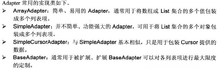
lView.setAdapter(adp);SimpleAdapter:
SimpleAdapter adp=new SimpleAdapter(this, contentList, R.layout.simple_item, from, to);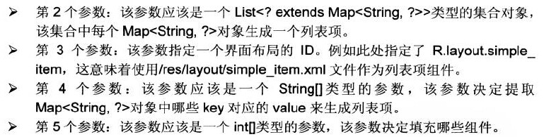
ArrayAdapter<String> aa=new ArrayAdapter<>(this, R.layout.array_item, books);
		AutoCompleteTextView auto=(AutoCompleteTextView)findViewById(R.id.auto);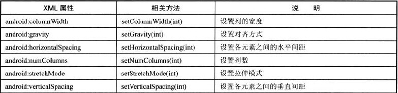
auto.setAdapter(aa);GridView:和ListView类似,但是一行可以显示好几列,主要属性有:
BaseExpandableListAdapter myadapter=new BaseExpandableListAdapter()
		{
			String[] armsType={"神族","蟲族","人族"};
			String[][] arms={{"狂戰士","龍騎士","黑暗聖堂","電兵"},
					{"小狗","刺蛇","飛龍","自爆飛機"},
					{"機槍兵","護士MM","幽靈"}};
			@Override
			public boolean isChildSelectable(int arg0, int arg1)
			{
				// TODO Auto-generated method stub
				return true;
			}

			@Override
			public boolean hasStableIds()
			{
				// TODO Auto-generated method stub
				return true;
			}

			@Override
			public View getGroupView(int arg0, boolean arg1, View arg2, ViewGroup arg3)
			{
				// TODO Auto-generated method stub
				TextView show=new TextView(MainActivity.this);
				show.setText(armsType[arg0]);
				show.setTextSize((float) 20.0);
				show.setTextColor(Color.RED);
				return show;
			}

			@Override
			public long getGroupId(int arg0)
			{
				// TODO Auto-generated method stub
				return arg0;
			}

			@Override
			public int getGroupCount()
			{
				// TODO Auto-generated method stub
				return armsType.length;
			}

			@Override
			public Object getGroup(int arg0)
			{
				// TODO Auto-generated method stub
				return armsType[arg0];
			}

			@Override
			public int getChildrenCount(int arg0)
			{
				// TODO Auto-generated method stub
				return arms[arg0].length;
			}

			@Override
			public View getChildView(int arg0, int arg1, boolean arg2, View arg3,
					ViewGroup arg4)
			{
				// TODO Auto-generated method stub
				TextView textView=new TextView(MainActivity.this);
				textView.setText(arms[arg0][arg1]);
				return textView;
			}

			@Override
			public long getChildId(int arg0, int arg1)
			{
				// TODO Auto-generated method stub
				return arg1;
			}

			@Override
			public Object getChild(int arg0, int arg1)
			{
				// TODO Auto-generated method stub
				return arms[arg0][arg1];
			}
		};
		ExpandableListView ev=(ExpandableListView)findViewById(R.id.expend_list);
		ev.setAdapter(myadapter);


 4216
4216


 被折叠的 条评论
为什么被折叠?
被折叠的 条评论
为什么被折叠?
 到【灌水乐园】发言


