


浅谈Android View
何为View
Android中所有可视化组件,都是从View类派生而来的,通常我们把它们称为视图。
ViewGroup是视图组,是对View类的扩展,一般来说,视图组主要用于管理子视图的布局,但是也可以用来构建原子的可重用组件。那些用来实现前一种功能的视图组通常被称为布局。
View是怎样呈现给用户的
我们知道,加载布局的任务通常都是在Activity中调用setContentView()方法来完成的,但是setContentView()方法具体是怎么来加载的呢?
其实,setContentView()方法内部,也是通过LayoutInflater来加载的布局,LayoutInflater的作用,我们看一下文档里面是怎么说的,”Instantiates a layout XML file into its corresponding View objects.”,意思就是实例化一个布局XML文件到相应的视图对象,但是文档中还有一句很重要的,我们来看一下,”It is never used directly. Instead, use getLayoutInflater() or getSystemService(String) to retrieve a standard LayoutInflater instance that is already hooked up to the current context and correctly configured for the device you are running on.”,是的,我们不能直接使用LayoutInflater,而是必须要通过一个当前的上下文来加载它,具体的做法就是:
LayoutInflater inflater=(LayoutInflater)context.getSystemService
      (Context.LAYOUT_INFLATER_SERVICE);
通常,为了方便,我们使用的是Android给我们封装的另一个方法,那就是
LayoutInflater layoutInflater = LayoutInflater.from(context); 。有了LayoutInflater,我们还没有完成布局的加载,因为LayoutInflater的作用相当于只是把View的容器找出来,实际的View,我们还需要去找,我们最后,可以通过layoutInflater.inflate(resourceId, root)方法,来加载实例化的XML文件。
这个过程描述的比较模糊,现在我们来回想一个我们经常使用的例子,那就是使用适配器来填充ListView,没错,ListView我们经常使用,而且通常是通过适配器来一块使用,还记得适配器里面我们重写的getView()方法吗,我们正是通过在适配器外面,把ListView上下文传到适配器里面,然后通过Listview的上下文,在getVIew()方法里面实例化一个LayoutInflater,然后再通过layoutInflater.inflate(resourceId, root),来加载具体的ListView Item XML文件,再去弄好每一个控件,这样一个流程下来,我们就能把我们的数据,都填充到ListView里面了。有没有突然醒悟,我们平时经常使用的ListView,ScrollView,正是这样的原理。
View的绘制流程
上面我们看了一下View是怎么加载到界面的,现在,我们再来具体的看一下,每一个View的绘制流程是怎么样的,因为我们只有明白了View的绘制流程,才有可能去自定义View。
Android里面视图的绘制过程都必须经历三个最主要的阶段,即onMeasure()、onLayout()和onDraw()。
我们分别来简单的看一下这三个阶段的作用:
onMeasure
通常,视图大小的控制是由父视图、布局文件、以及视图本身共同完成的,父视图会提供给子视图参考的大小,而开发人员可以在XML布局文件中指定视图的大小。
我们先来看一下OnMeasure方法的原型:
@Override
protected void onMeasure(int widthMeasureSpec, int heightMeasureSpec) {
        super.onMeasure(widthMeasureSpec, heightMeasureSpec);
}
我们可以看到,onMeasure方法接受两个参数,这两个值,分别确定视图的宽度和高度的规格大小,我们可以看到这两个参数有一个共同的MeasureSpec,经验丰富一点的同学马上就能想到这应该是一个类型,没错,我们来看一下Android稳定里面对它的介绍:
A MeasureSpec encapsulates the layout requirements passed from parent to child. Each MeasureSpec represents a requirement for either the width or the height. A MeasureSpec is comprised of a size and a mode. There are three possible modes:

UNSPECIFIED
    The parent has not imposed any constraint on the child. It can be whatever size it wants.

EXACTLY
The parent has determined an exact size for the child. The child is going to be given those bounds regardless of how big it wants to be.

AT_MOST
    The child can be as large as it wants up to the specified size.
意思就是,MeasureSpec是父视图传给子视图的已经封装好的布局要求。MeasureSpec由一个size和mode组成,mode分为三种,一个是
UNSPECIFIED,这个的意思是子视图的大小完全由自己控制,父视图没有任何意见,这个平时很少见;另一个是EXACTLY,意思是父视图希望子视图的大小视specsize大小而定,系统默认会把子视图的大小设置成这个,当然开发人员也可以决定视图的真正大小,EXACTLY一般对应的情况就是MATCH_PARENT;最后一个是AT_MOST,意思是在不超过specsize大小的情况下,子视图应该尽可能的小,我们应该已经能够猜出,这个对应的就是WRAP_CONTENT的情况。
总体来说,onMeasure阶段就是用来确定视图的大小的。
onLayout
我们从名字上可以猜出来,onLayout就是给视图进行布局的,没错,onMeasure确定好视图的大小后,就开始执行onLayout来进行布局了。我们来看一下onLayout方法的原型
    @Override
    protected void onLayout(boolean changed, int left, int top, int right, int bottom) {
        super.onLayout(changed, left, top, right, bottom);
    }
我们可以看到,一共有五个参数,第一个boolean类型的参数是用来确定视图是否改变,改变的话,我们就需要重新确定布局;后面四个参数分别是上下左右的位置,相对于父视图来说的,我们需要知道的是,这个上下左右的值是相对于父容器的最大值。一会,我们将在下面演示一个完整的Demo,来更详细的说明。
onDraw
正如名字一样,我们在第一步完成了View的测量,第二部完成了View的布局,这这一阶段,我们应该真正的开始绘制View了。
前面我们介绍的onMeasure和onLayout,主要是作用于布局的,比如我们自定义一个布局的时候,我们就需要继承ViewGroup,重写onMeasure和onLayout,onDraw是作用于View的,我们在自定义空间的时候,有的时候就需要重写onDraw,来绘制我们自己的控件。
布局管理器Demo
我们通过一个Android文档中的Demo,看一下onMeasure和onLayout的详细过程。这个Demo比较简单,而且关键部分都有注释,就不再多啰嗦了,大家自己看一下Demo。
package com.example.linukey.myapplication;
import android.content.Context;
import android.content.res.TypedArray;
import android.graphics.Rect;
import android.util.AttributeSet;
import android.view.Gravity;
import android.view.View;
import android.view.ViewGroup;
import android.widget.RemoteViews;
/**
Example of writing a custom layout manager. This is a fairly full-featured
layout manager that is relatively general, handling all layout cases. You
can simplify it for more specific cases.
*/
@RemoteViews.RemoteView
public class CustomLayout extends ViewGroup {
/** The amount of space used by children in the left gutter. */
private int mLeftWidth;
/** The amount of space used by children in the right gutter. */
private int mRightWidth;
/** These are used for computing child frames based on their gravity. */
private final Rect mTmpContainerRect = new Rect();
private final Rect mTmpChildRect = new Rect();
public CustomLayout(Context context) {
super(context);
}
public CustomLayout(Context context, AttributeSet attrs) {
this(context, attrs, 0);
}
public CustomLayout(Context context, AttributeSet attrs, int defStyle) {
super(context, attrs, defStyle);
}
/**
* Any layout manager that doesn't scroll will want this.
*/
@Override
public boolean shouldDelayChildPressedState() {
return false;
}
/**
* Ask all children to measure themselves and compute the measurement of this
* layout based on the children.
*/
@Override
protected void onMeasure(int widthMeasureSpec, int heightMeasureSpec) {
int count = getChildCount();
// These keep track of the space we are using on the left and right for
// views positioned there; we need member variables so we can also use
// these for layout later.
mLeftWidth = 0;
mRightWidth = 0;
// Measurement will ultimately be computing these values.
int maxHeight = 0;
int maxWidth = 0;
int childState = 0;
// Iterate through all children, measuring them and computing our dimensions
// from their size.
for (int i = 0; i < count; i++) {
final View child = getChildAt(i);
if (child.getVisibility() != GONE) {
// Measure the child.
measureChildWithMargins(child, widthMeasureSpec, 0, heightMeasureSpec, 0);
// Update our size information based on the layout params. Children
// that asked to be positioned on the left or right go in those gutters.
final LayoutParams lp = (LayoutParams) child.getLayoutParams();
if (lp.position == LayoutParams.POSITION_LEFT) {
mLeftWidth += Math.max(maxWidth,
child.getMeasuredWidth() + lp.leftMargin + lp.rightMargin);
} else if (lp.position == LayoutParams.POSITION_RIGHT) {
mRightWidth += Math.max(maxWidth,
child.getMeasuredWidth() + lp.leftMargin + lp.rightMargin);
} else {
maxWidth = Math.max(maxWidth,
child.getMeasuredWidth() + lp.leftMargin + lp.rightMargin);
}
maxHeight = Math.max(maxHeight,
child.getMeasuredHeight() + lp.topMargin + lp.bottomMargin);
childState = combineMeasuredStates(childState, child.getMeasuredState());
}
}
// Total width is the maximum width of all inner children plus the gutters.
maxWidth += mLeftWidth + mRightWidth;
// Check against our minimum height and width
maxHeight = Math.max(maxHeight, getSuggestedMinimumHeight());
maxWidth = Math.max(maxWidth, getSuggestedMinimumWidth());
// Report our final dimensions.
setMeasuredDimension(resolveSizeAndState(maxWidth, widthMeasureSpec, childState),
resolveSizeAndState(maxHeight, heightMeasureSpec, childState << MEASURED_HEIGHT_STATE_SHIFT));
}
/**
* left top right bottom 是相对于布局容器的最值
*/
@Override
protected void onLayout(boolean changed, int left, int top, int right, int bottom) {
final int count = getChildCount();
// 这是子View能够到达的最左边和最右边的距离
int leftPos = getPaddingLeft(); //获取布局的左内距,这就是子View能够到达的最左边位置
int rightPos = right - left - getPaddingRight(); //同理
// This is the middle region inside of the gutter.
final int middleLeft = leftPos + mLeftWidth;
final int middleRight = rightPos - mRightWidth;
// 这是子View所能到达的最上和最下位置,道理同上
final int parentTop = getPaddingTop();
final int parentBottom = bottom - top - getPaddingBottom();
for (int i = 0; i < count; i++) {
final View child = getChildAt(i);
if (child.getVisibility() != GONE) {
final LayoutParams lp = (LayoutParams) child.getLayoutParams();
final int width = child.getMeasuredWidth();
final int height = child.getMeasuredHeight();
// 计算这个子view在布局中的位置
if (lp.position == LayoutParams.POSITION_LEFT) {
mTmpContainerRect.left = leftPos + lp.leftMargin;
mTmpContainerRect.right = leftPos + width + lp.rightMargin;
leftPos = mTmpContainerRect.right;
} else if (lp.position == LayoutParams.POSITION_RIGHT) {
mTmpContainerRect.right = rightPos - lp.rightMargin;
mTmpContainerRect.left = rightPos - width - lp.leftMargin;
rightPos = mTmpContainerRect.left;
} else {
mTmpContainerRect.left = middleLeft + lp.leftMargin;
mTmpContainerRect.right = middleRight - lp.rightMargin;
}
mTmpContainerRect.top = parentTop + lp.topMargin;
mTmpContainerRect.bottom = parentBottom - lp.bottomMargin;
// Use the child's gravity and size to determine its final
// frame within its container.
Gravity.apply(lp.gravity, width, height, mTmpContainerRect, mTmpChildRect);
// 根据我们上面的计算结果,对子view进行布局
child.layout(mTmpChildRect.left, mTmpChildRect.top,
mTmpChildRect.right, mTmpChildRect.bottom);
}
}
}
// ----------------------------------------------------------------------
// The rest of the implementation is for custom per-child layout parameters.
// If you do not need these (for example you are writing a layout manager
// that does fixed positioning of its children), you can drop all of this.
@Override
public LayoutParams generateLayoutParams(AttributeSet attrs) {
return new CustomLayout.LayoutParams(getContext(), attrs);
}
@Override
protected LayoutParams generateDefaultLayoutParams() {
return new LayoutParams(LayoutParams.MATCH_PARENT, LayoutParams.MATCH_PARENT);
}
@Override
protected ViewGroup.LayoutParams generateLayoutParams(ViewGroup.LayoutParams p) {
return new LayoutParams(p);
}
@Override
protected boolean checkLayoutParams(ViewGroup.LayoutParams p) {
return p instanceof LayoutParams;
}
/**
* Custom per-child layout information.
*/
public static class LayoutParams extends MarginLayoutParams {
/**
* The gravity to apply with the View to which these layout parameters
* are associated.
*/
public int gravity = Gravity.TOP | Gravity.START;
public static int POSITION_MIDDLE = 0;
public static int POSITION_LEFT = 1;
public static int POSITION_RIGHT = 2;
public int position = POSITION_MIDDLE;
public LayoutParams(Context c, AttributeSet attrs) {
super(c, attrs);
// Pull the layout param values from the layout XML during
// inflation. This is not needed if you don't care about
// changing the layout behavior in XML.
TypedArray a = c.obtainStyledAttributes(attrs, R.styleable.CustomLayoutLP);
gravity = a.getInt(R.styleable.CustomLayoutLP_android_layout_gravity, gravity);
position = a.getInt(R.styleable.CustomLayoutLP_layout_position, position);
a.recycle();
}
public LayoutParams(int width, int height) {
super(width, height);
}
public LayoutParams(ViewGroup.LayoutParams source) {
super(source);
}
}
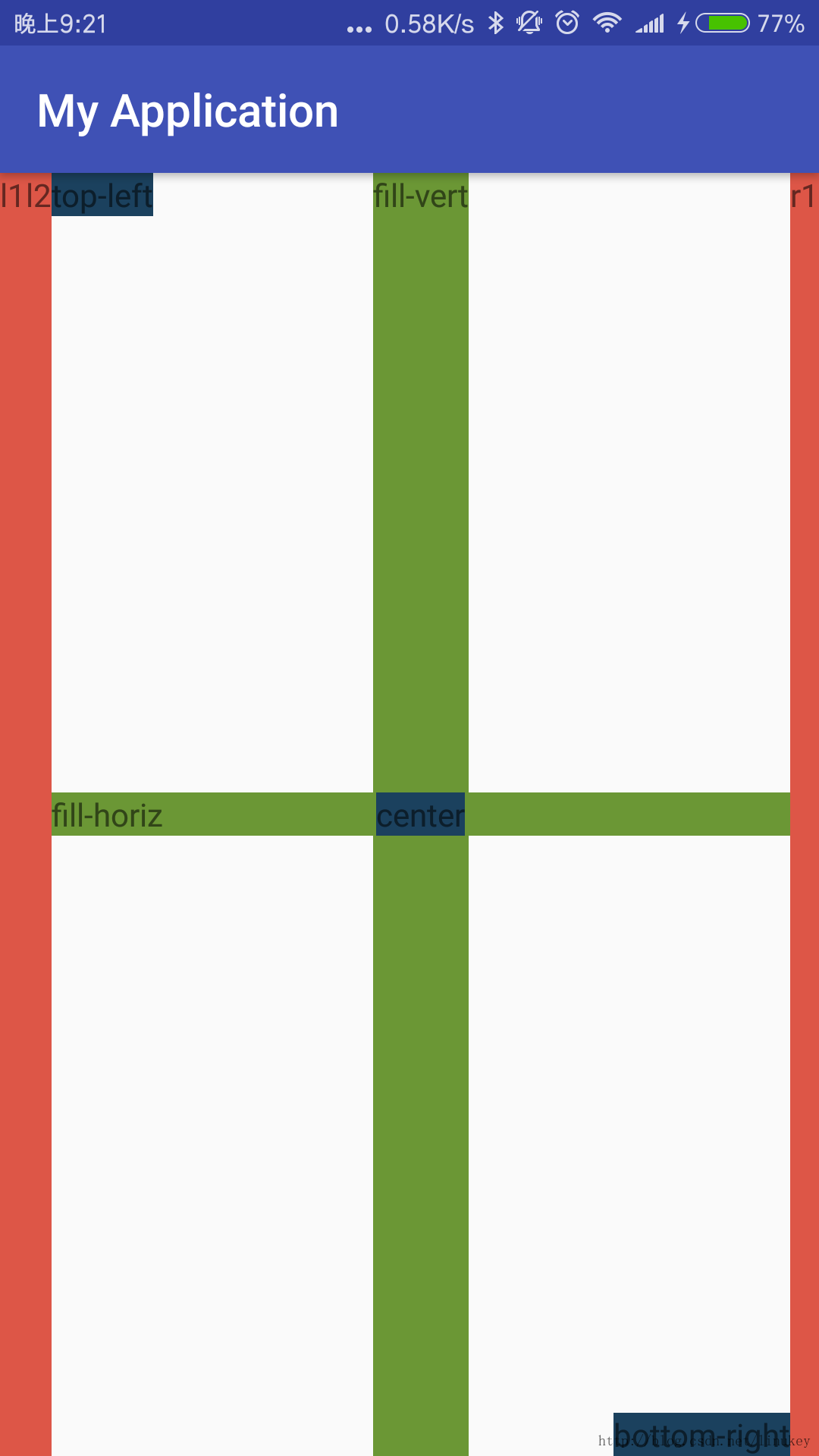
}<?xml version="1.0" encoding="utf-8"?>
<com.example.linukey.myapplication.CustomLayout xmlns:android="http://schemas.android.com/apk/res/android"
android:layout_width="match_parent"
android:layout_height="match_parent"
xmlns:app="http://schemas.android.com/apk/res-auto">
<!-- put first view to left. -->
<TextView
android:background="#DD5647"
android:layout_width="wrap_content"
android:layout_height="wrap_content"
app:layout_position="left"
android:layout_gravity="fill_vertical|center_horizontal"
android:text="l1"/>
<!-- stack second view to left. -->
<TextView
android:background="#DD5647"
android:layout_width="wrap_content"
android:layout_height="wrap_content"
app:layout_position="left"
android:layout_gravity="fill_vertical|center_horizontal"
android:text="l2"/>
<!-- also put a view on the right. -->
<TextView
android:background="#DD5647"
android:layout_width="wrap_content"
android:layout_height="wrap_content"
app:layout_position="right"
android:layout_gravity="fill_vertical|center_horizontal"
android:text="r1"/>
<!-- by default views go in the middle; use fill vertical gravity -->
<TextView
android:background="#6B9735"
android:layout_width="wrap_content"
android:layout_height="wrap_content"
android:layout_gravity="fill_vertical|center_horizontal"
android:text="fill-vert"/>
<!-- by default views go in the middle; use fill horizontal gravity -->
<TextView
android:background="#6B9735"
android:layout_width="wrap_content"
android:layout_height="wrap_content"
android:layout_gravity="center_vertical|fill_horizontal"
android:text="fill-horiz"/>
<!-- by default views go in the middle; use top-left gravity -->
<TextView
android:background="#1B415E"
android:layout_width="wrap_content"
android:layout_height="wrap_content"
android:layout_gravity="top|left"
android:text="top-left"/>
<!-- by default views go in the middle; use center gravity -->
<TextView
android:background="#1B415E"
android:layout_width="wrap_content"
android:layout_height="wrap_content"
android:layout_gravity="center"
android:text="center"/>
<!-- by default views go in the middle; use bottom-right -->
<TextView
android:background="#1B415E"
android:layout_width="wrap_content"
android:layout_height="wrap_content"
android:layout_gravity="bottom|right"
android:text="bottom-right"/>
</com.example.linukey.myapplication.CustomLayout>
效果如下:
自定义View
有了前面内容作为基础,我们就可以掌握自定义View技术了。
自定义View大体有三种实现方式:自绘控件、组合控件、继承控件。
我们可以很容易的通过名字看出这三种方式的区别,下面,我们分别来看一下这三种方式的实现:
自绘控件
自绘控件就是我们的View,完全是我们自己绘制出来的,通过继承View,重写onDraw方法,来达到自绘控件的目的。onDraw方法前面我们已经提到过了,正是View绘制流程的最后一步,下面我们来看一个点击计数Demo
package com.example.linukey.myapplication;

import android.content.Context;
import android.graphics.Canvas;
import android.graphics.Color;
import android.graphics.Paint;
import android.graphics.Rect;
import android.util.AttributeSet;
import android.view.View;

public class CounterView extends View implements View.OnClickListener {

    private Paint mPaint;

    private Rect mBounds;

    private int mCount;

    public CounterView(Context context, AttributeSet attrs) {
        super(context, attrs);
        mPaint = new Paint(Paint.ANTI_ALIAS_FLAG);
        mBounds = new Rect();
        setOnClickListener(this);
    }

    @Override
    protected void onDraw(Canvas canvas) {
        super.onDraw(canvas);
        mPaint.setColor(Color.YELLOW);
        canvas.drawRect(0, 0, getWidth(), getHeight(), mPaint);
        mPaint.setColor(Color.YELLOW);
        mPaint.setTextSize(30);
        String text = String.valueOf(mCount);
        mPaint.getTextBounds(text, 0, text.length(), mBounds);
        float textWidth = mBounds.width();
        float textHeight = mBounds.height();
        canvas.drawText(text, getWidth() / 2 - textWidth / 2, getHeight() / 2
                + textHeight / 2, mPaint);
    }

    @Override
    public void onClick(View v) {
        mCount++;
        //进行重绘
        invalidate();
    }

}
<?xml version="1.0" encoding="utf-8"?>
<com.example.linukey.myapplication.CustomLayout xmlns:android="http://schemas.android.com/apk/res/android"
android:layout_width="match_parent"
android:layout_height="match_parent"
xmlns:app="http://schemas.android.com/apk/res-auto">
<com.example.linukey.myapplication.CounterView
android:layout_width="wrap_content"
android:layout_height="wrap_content" />
</com.example.linukey.myapplication.CustomLayout>
效果如下:
这个Demo比较简单,只是让大家感受一下自绘控件是什么样子。
组合控件
组合控件就是利用现有的Android控件,来搭配出我们需要的控件。
我们都见过qq消息上的消息数量气泡,下面我们来通过组合控件,简单的实现一下这个功能。
package com.example.linukey.myapplication;

import android.content.Context;
import android.support.annotation.NonNull;
import android.support.annotation.Nullable;
import android.util.AttributeSet;
import android.view.LayoutInflater;
import android.view.View;
import android.widget.FrameLayout;
import android.widget.TextView;

/**
 * Created by linukey on 17-3-19.
 */

public class Message extends FrameLayout {
    private int count;
    private TextView cnt;

    public Message(@NonNull Context context, @Nullable AttributeSet attrs) {
        super(context, attrs);
        LayoutInflater layoutInflater = LayoutInflater.from(context);
        View view = layoutInflater.inflate(R.layout.message, this);
        cnt = (TextView)view.findViewById(R.id.cnt);
    }

    public void setCount(int count) {
        if(count == 0) return;
        this.count = count;
        cnt.setText(count+"");
        cnt.setBackgroundResource(R.drawable.buttonshape);
    }
}
<?xml version="1.0" encoding="utf-8"?>
<RelativeLayout xmlns:android="http://schemas.android.com/apk/res/android"
    android:layout_width="match_parent"
    android:layout_height="match_parent"
    android:background="@color/colorPrimaryDark">
    <TextView
        android:layout_width="wrap_content"
        android:layout_height="wrap_content"
        android:layout_alignParentLeft="true"
        android:textSize="20sp"
        android:layout_centerVertical="true"
        android:layout_marginLeft="100dp"
        android:text="哈哈"/>
    <TextView
        android:layout_width="wrap_content"
        android:layout_height="wrap_content"
        android:layout_alignParentRight="true"
        android:layout_centerVertical="true"
        android:layout_marginRight="20dp"
        android:textColor="#3C3F41"
        android:textSize="25sp"
        android:id="@+id/cnt"
        android:background="@null" />
</RelativeLayout>
效果如下:
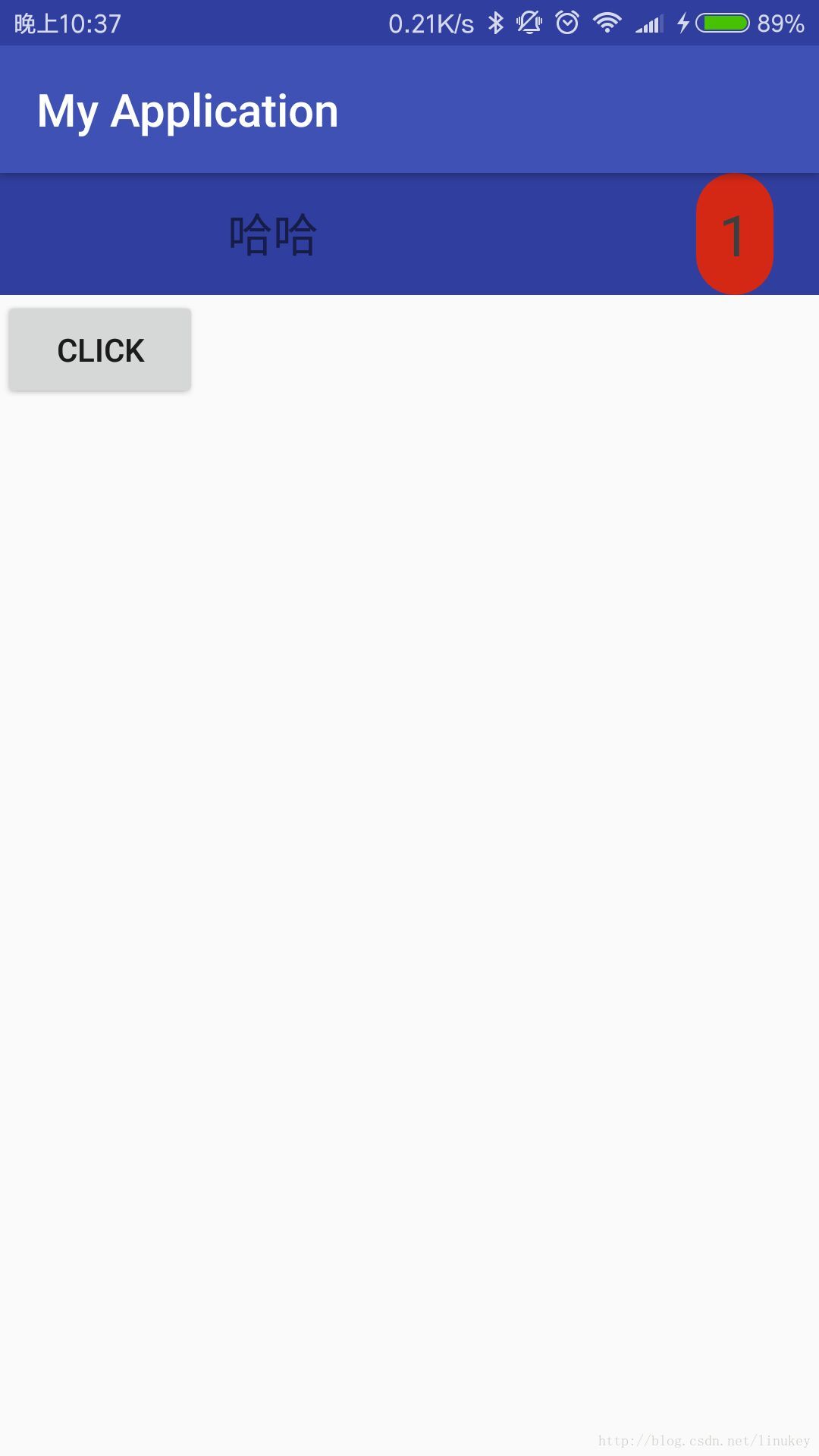
简单起见,做的比较简陋,下面我们继续看继承控件
继承控件
继承控件的原理和上面两种相似,我们这里不再提供Demo,大家可以网上自行搜索一下,多得很。
总结
到这里的话,我们这篇博客就完结了。这篇博客的目的主要是对Android的View方面的知识做一个浅陋的总结,起到入门的作用,文中介绍的知识都比较浅层次,大家对哪一部分感兴趣的话,可以自己去Android文档或者其他地方深入的学习一下。
转载请注明地址:http://blog.csdn.net/linukey/article/details/63682720


 扫一扫
扫一扫
 3882
3882

 被折叠的 条评论
为什么被折叠?
被折叠的 条评论
为什么被折叠?
 到【灌水乐园】发言


