See It in Action First
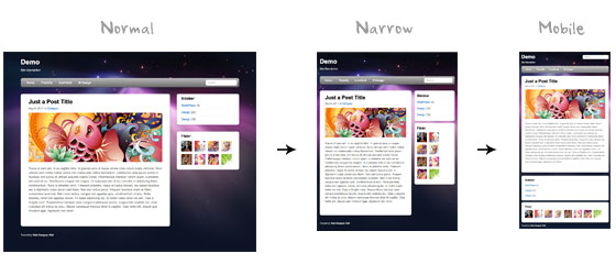
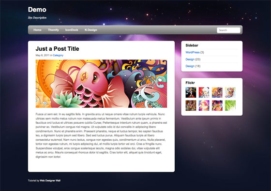
Before you start, check the final demo to see how it looks like. Resize your browser to see how the layout automatically flows based on the width of the viewport (browser viewing area).
More Examples
If you want to see more examples, check out the following WordPress themes that I designed with media queries: Tisa, Elemin, Suco, iTheme2, Funki, Minblr, andWumblr.
Overview
The page's container has a width of 980px which is optimized for any resolution wider than 1024px. Media query is used to check if the viewport is narrower than 980px, then the layout will turn to fluid width instead of fixed width. If the viewport is narrower than 650px, it expands the content container and sidebar to fullwidth to form a single column layout.

HTML Code
I'm not going to go through the details of the HTML code. Below is the main structure of the layout. I have a "pagewrap" container that wraps the "header", "content", "sidebar", and "footer" together.
<div id="pagewrap">

	<header id="header">

		<hgroup>
			<h1 id="site-logo">Demo</h1>
			<h2 id="site-description">Site Description</h2>
		</hgroup>

		<nav>
			<ul id="main-nav">
				<li><a href="#">Home</a></li>
			</ul>
		</nav>

		<form id="searchform">
			<input type="search">
		</form>

	</header>

	<div id="content">

		<article class="post">
			blog post
		</article>

	</div>

	<aside id="sidebar">

		<section class="widget">
			 widget
		</section>

	</aside>

	<footer id="footer">
		footer
	</footer>

</div>
HTML5.js
Note that I use HTML5 markup in my demo. Internet Explorer prior than version 9 doesn't support the new elements introduced in HTML5 such as <header>, <article>, <footer>, <figure>, etc. Including the html5.js Javscript file in the HTML document will enable IE to acknowledge the new elements.
<!--[if lt IE 9]>
	<script src="http://html5shim.googlecode.com/svn/trunk/html5.js"></script>
<![endif]-->
CSS
Reset HTML5 Elements to Block
The following CSS will reset the HTML5 elements (article, aside, figure, header, footer, etc.) to block element.
article, aside, details, figcaption, figure, footer, header, hgroup, menu, nav, section {
    display: block;
}
Main Structure CSS
Again, I'm not going to get into the details. The main "pagewrap" container is 980px wide. Header has a fixed height 160px. The "content" container is 600px wide floated left. The "sidebar" content is 280px wide floated right.
#pagewrap {
	width: 980px;
	margin: 0 auto;
}

#header {
	height: 160px;
}

#content {
	width: 600px;
	float: left;
}

#sidebar {
	width: 280px;
	float: right;
}

#footer {
	clear: both;
}
Step 1 Demo
Here is the design demo. Note that the media queries haven't been implemented yet. Resize the browser window and you should see that the layout is not scalable.
CSS3 Media Query Stuffs
Now here comes the fun part — media queries.
Include Media Queries Javascript
Internet Explorer 8 or older versions doesn't support CSS3 media queries. You can enable it by adding the css3-mediaqueries.js Javascript file.
<!--[if lt IE 9]>
	<script src="http://css3-mediaqueries-js.googlecode.com/svn/trunk/css3-mediaqueries.js"></script>
<![endif]-->
Include Media Queries CSS
Create a new stylesheet for the media queries. Check out my previous tutorial to see how media queries work.
<link href="media-queries.css" rel="stylesheet" type="text/css">
Viewport Smaller Than 980px (Fluid Layout)
For viewport narrower than 980px, the following rules will apply:
- pagewrap = reset width to 95%
- content = reset width to 60%
- sidebar = reset width to 30%
TIPS: use percentage (%) value to make the containers fluid.
@media screen and (max-width: 980px) {

	#pagewrap {
		width: 95%;
	}

	#content {
		width: 60%;
		padding: 3% 4%;
	}

	#sidebar {
		width: 30%;
	}
	#sidebar .widget {
		padding: 8% 7%;
		margin-bottom: 10px;
	}

}
Viewport Smaller Than 650px (One-Column Layout)
Next I have another set of CSS for viewport narrower than 650px:
- header = reset height to auto
- searchform = re-position the searchform to 5px top
- main-nav = reset the position to static
- site-logo = reset the position to static
- site-description = reset the position to static
- content = reset the width to auto (this will make the container to expand fullwidth) and get rid of the float
- sidebar = reset width to 100% and get rid of the float
@media screen and (max-width: 650px) {

	#header {
		height: auto;
	}

	#searchform {
		position: absolute;
		top: 5px;
		right: 0;
	}

	#main-nav {
		position: static;
	}

	#site-logo {
		margin: 15px 100px 5px 0;
		position: static;
	}

	#site-description {
		margin: 0 0 15px;
		position: static;
	}

	#content {
		width: auto;
		float: none;
		margin: 20px 0;
	}

	#sidebar {
		width: 100%;
		float: none;
		margin: 0;
	}

}
Viewport Smaller Than 480px
The following CSS will apply if the viewport is narrower than 480px which is the width of the iPhone screen in landscape orientation.
- html = disable text size adjustment. By default, iPhone enlarges the text size so it reads more comfortably. You can disable the text size adjustment by adding
-webkit-text-size-adjust: none; - main-nav = reset the font size to 90%
@media screen and (max-width: 480px) {

	html {
		-webkit-text-size-adjust: none;
	}

	#main-nav a {
		font-size: 90%;
		padding: 10px 8px;
	}

}
Flexible Images
To make the images flexible, simply add max-width:100% and height:auto. Imagemax-width:100% and height:auto works in IE7, but not in IE8 (yes, another weird IE bug). To fix this, you need to add width:auto\9 for IE8.
img {
	max-width: 100%;
	height: auto;
	width: auto\9; /* ie8 */
}
Flexible Embedded Videos
To make the embedded videos flexible, use the same trick as mentioned above. For unknown reason, max-width:100% (for embed element) doesn't work in Safari. The work around is to use width:100% instead.
.video embed,
.video object,
.video iframe {
	width: 100%;
	height: auto;
}
Initial Scale Meta Tag (iPhone)
By default, iPhone Safari shrinks HTML pages to fit into the iPhone screen. The following meta tag tells iPhone Safari to use the width of the device as the width of the viewport and disable the initial scale.
<meta name="viewport" content="width=device-width; initial-scale=1.0">
Final Demo
View the final demo and resize your browser window to see the media queries in action. Don't forget to check the demo with the iPhone, iPad, Blackberry (newer versions), and Android phones to see the mobile version.
Summaries
- Media Queries Javascript Fallback:
css3-mediaqueries.js is required to enable media queries for browsers that don't support media queries.<!--[if lt IE 9]> <script src="http://css3-mediaqueries-js.googlecode.com/svn/trunk/css3-mediaqueries.js"></script> <![endif]--> - CSS Media Queries:
The trick for creating an adaptive design is to use CSS to override the layout structure based on the viewport width.@media screen and (max-width: 560px) { #content { width: auto; float: none; } #sidebar { width: 100%; float: none; } } - Flexible Images:
Use max-width:100% and height:auto to make the images flexible.img { max-width: 100%; height: auto; width: auto\9; /* ie8 */ } - Flexible Embedded Videos:
Use width:100% and height:auto to make the embedded videos flexible..video embed, .video object, .video iframe { width: 100%; height: auto; } - Webkit Text Size Adjust:
Use -webkit-text-size-adjust:none to disable text size adjust on the iPhone.html { -webkit-text-size-adjust: none; } - Reset iPhone Viewport & Initial Scale:
The following meta tag resets the viewport and inital scale on the iPhone:<meta name="viewport" content="width=device-width; initial-scale=1.0">


 213
213


 被折叠的 条评论
为什么被折叠?


