本篇博文主要介绍使用Python中的matplotlib模块进行简单画图功能,我们这里画出了一个柱形图来对比两位同学之间的不同成绩,和使用pandas进行简单的数据分析工作,主要包括打开csv文件读取特定行列进行加减增加删除操作,计算滑动均值,进行画图显示等等;其中还包括一段关于ipython的基本使用指令,比较naive欢迎各位指正交流!
mlp.rc动态配置
你可以在python脚本或者python交互式环境里动态的改变默认rc配置。所有的rc配置变量称为matplotlib.rcParams 使用字典格式存储,它在matplotlib中是全局可见的。rcParams可以直接修改,如:
import matplotlib as mpl
mpl.rcParams['lines.linewidth'] = 2
mpl.rcParams['lines.color'] = 'r'
Matplotlib还提供了一些便利函数来修改rc配置。matplotlib.rc()命令利用关键字参数来一次性修改一个属性的多个设置:
import matplotlib as mpl
mpl.rc('lines', linewidth=2, color='r')
这里matplotlib.rcdefaults()命令可以恢复为matplotlib标准默认配置。
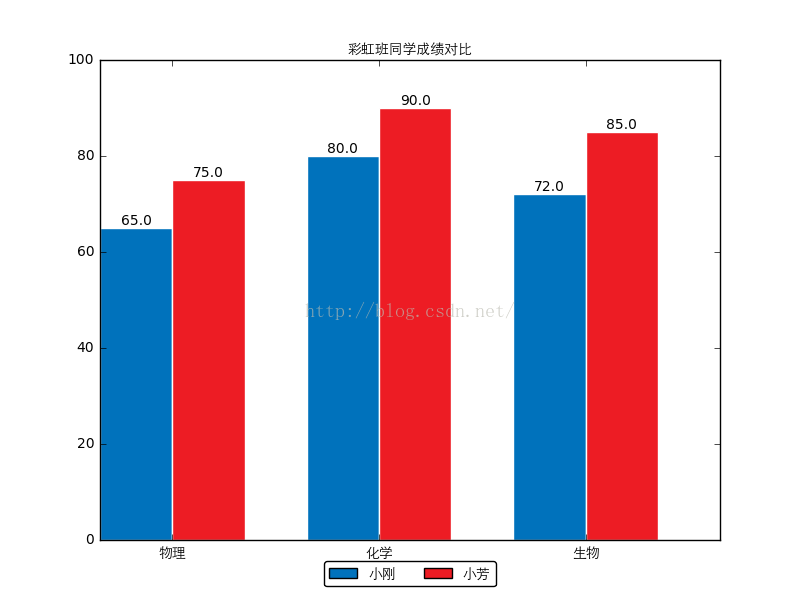
在日常的数据统计分析的过程当中,大量的数据无法直观的观察出来,需要我们使用各种工具从不同角度侧面分析数据之间的变化与差异,而画图无疑是一个比较有效的方法;下面我们将使用python中的画图工具包matplotlib.pyplot来画一个柱形图,通过一个小示例的形式熟悉了解一下mpl的基本使用:
- <span style="font-size:14px;">
-
-
- import matplotlib.pyplot as plt
- import matplotlib as mpl
- mpl.use('Agg')
- import numpy as np
- from PIL import Image
- import pylab
-
- custom_font = mpl.font_manager.FontProperties(fname='C:\\Anaconda\\Lib\\site-packages\\matplotlib\\mpl-data\\fonts\\ttf\\huawenxihei.ttf')
-
-
-
- font_size = 10
- fig_size = (8, 6)
-
- names = (u'小刚', u'小芳')
- subjects = (u'物理', u'化学', u'生物')
- scores = ((65, 80, 72), (75, 90, 85))
-
-
- mpl.rcParams['font.size'] = font_size
- mpl.rcParams['figure.figsize'] = fig_size
- bar_width = 0.35
-
- index = np.arange(len(scores[0]))
-
-
- rects1 = plt.bar(index, scores[0], bar_width, color='#0072BC', label=names[0])
-
- rects2 = plt.bar(index + bar_width, scores[1], bar_width, color='#ED1C24', label=names[1])
-
- plt.xticks(index + bar_width, subjects, fontproperties=custom_font)
- plt.ylim(ymax=100, ymin=0)
-
- plt.title(u'彩虹班同学成绩对比', fontproperties=custom_font)
-
- plt.legend(loc='upper center', bbox_to_anchor=(0.5, -0.03), fancybox=True, ncol=2, prop=custom_font)
-
-
-
-
-
- def add_labels(rects):
- for rect in rects:
- height = rect.get_height()
- plt.text(rect.get_x() + rect.get_width() / 2, height, height, ha='center', va='bottom')
-
-
- rect.set_edgecolor('white')
-
- add_labels(rects1)
- add_labels(rects2)
-
-
- plt.savefig('scores_par.png')
-
- pylab.show('scores_par.png')
- </span>
ipython中程序运行结果:
ipython:
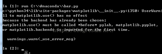
run命令, 运行一个.py脚本, 但是好处是, 与运行完了以后这个.py文件里的变量都可以在Ipython里继续访问;
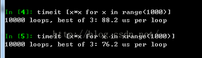
timeit命令, 可以用来做基准测试(benchmarking), 测试一个命令(或者一个函数)的运行时间,
debug命令: 当有exception异常的时候, 在console里输入debug即可打开debugger,在debugger里, 输入u,d(up, down)查看stack, 输入q退出debugger;
$ipython notebook会打开浏览器,新建一个notebook,一个非常有意思的地方;
alt+Enter: 运行程序, 并自动在后面新建一个cell;
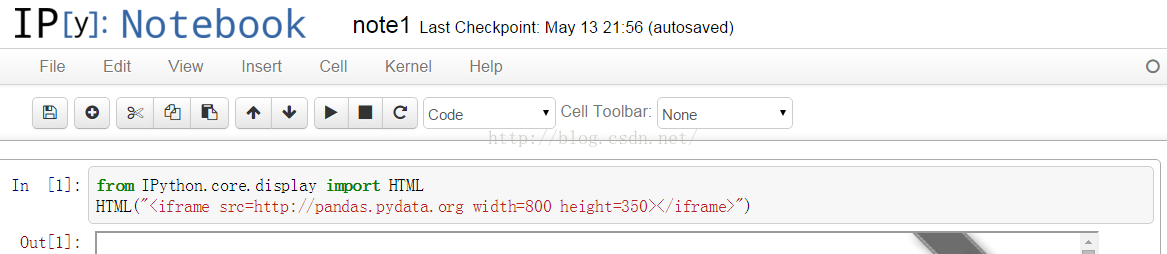
在notebook中是可以实现的
- <span style="font-size:14px;">from IPython.core.display import HTML
- HTML("<iframe src=http://pandas.pydata.org width=800 height=350></iframe>")</span>
- <span style="font-size:14px;">import datetime
-
- import pandas as pd
- import pandas.io.data
- from pandas import Series, DataFrame
- pd.__version__</span>
- <span style="font-size:14px;">
- Out[2]:
- '0.11.0'
- In [3]:
- import matplotlib.pyplot as plt
- import matplotlib as mpl
- mpl.rc('figure', figsize=(8, 7))
- mpl.__version__</span>
- <span style="font-size:14px;">
- Out[3]:
- '1.2.1'</span>
- <span style="font-size:14px;">labels = ['a', 'b', 'c', 'd', 'e']
- s = Series([1, 2, 3, 4, 5], index=labels)
- s
- Out[4]:
- a 1
- b 2
- c 3
- d 4
- e 5
- dtype: int64
- In [5]:
- 'b' in s
- Out[5]:
- True
- In [6]:
- s['b']
- Out[6]:
- 2
- In [7]:
- mapping = s.to_dict()
- mapping
- Out[7]:
- {'a': 1, 'b': 2, 'c': 3, 'd': 4, 'e': 5}
- In [8]:
- Series(mapping)
- Out[8]:
- a 1
- b 2
- c 3
- d 4
- e 5
- dtype: int64</span>
pandas自带练习例子数据,数据为金融数据;
Out[9]:
| | Open | High | Low | Close | Volume | Adj Close |
|---|
| Date | | | | | | |
|---|
| 2006-10-02 | 75.10 | 75.87 | 74.30 | 74.86 | 25451400 | 73.29 |
|---|
| 2006-10-03 | 74.45 | 74.95 | 73.19 | 74.08 | 28239600 | 72.52 |
|---|
| 2006-10-04 | 74.10 | 75.46 | 73.16 | 75.38 | 29610100 | 73.80 |
|---|
| 2006-10-05 | 74.53 | 76.16 | 74.13 | 74.83 | 24424400 | 73.26 |
|---|
| 2006-10-06 | 74.42 | 75.04 | 73.81 | 74.22 | 16677100 | 72.66 |
|---|
Out[11]:
| | Open | High | Low | Close | Volume | Adj Close |
|---|
| Date | | | | | | |
|---|
| 2006-10-02 | 75.10 | 75.87 | 74.30 | 74.86 | 25451400 | 73.29 |
|---|
| 2006-10-03 | 74.45 | 74.95 | 73.19 | 74.08 | 28239600 | 72.52 |
|---|
| 2006-10-04 | 74.10 | 75.46 | 73.16 | 75.38 | 29610100 | 73.80 |
|---|
| 2006-10-05 | 74.53 | 76.16 | 74.13 | 74.83 | 24424400 | 73.26 |
|---|
| 2006-10-06 | 74.42 | 75.04 | 73.81 | 74.22 | 16677100 | 72.66 |
|---|
Out[12]:
<class 'pandas.tseries.index.DatetimeIndex'>
[2006-10-02 00:00:00, ..., 2011-12-30 00:00:00]
Length: 1323, Freq: None, Timezone: None
Out[13]:
Date
2011-12-16    381.02
2011-12-19    382.21
2011-12-20    395.95
2011-12-21    396.45
2011-12-22    398.55
2011-12-23    403.33
2011-12-27    406.53
2011-12-28    402.64
2011-12-29    405.12
2011-12-30    405.00
Name: Close, dtype: float64
Out[18]:
| | Open | Close |
|---|
| Date | | |
|---|
| 2006-10-02 | 75.10 | 74.86 |
|---|
| 2006-10-03 | 74.45 | 74.08 |
|---|
| 2006-10-04 | 74.10 | 75.38 |
|---|
| 2006-10-05 | 74.53 | 74.83 |
|---|
| 2006-10-06 | 74.42 | 74.22 |
|---|
New columns can be added on the fly.
Out[19]:
| | Open | High | Low | Close | Volume | Adj Close | diff |
|---|
| Date | | | | | | | |
|---|
| 2006-10-02 | 75.10 | 75.87 | 74.30 | 74.86 | 25451400 | 73.29 | 0.24 |
|---|
| 2006-10-03 | 74.45 | 74.95 | 73.19 | 74.08 | 28239600 | 72.52 | 0.37 |
|---|
| 2006-10-04 | 74.10 | 75.46 | 73.16 | 75.38 | 29610100 | 73.80 | -1.28 |
|---|
| 2006-10-05 | 74.53 | 76.16 | 74.13 | 74.83 | 24424400 | 73.26 | -0.30 |
|---|
| 2006-10-06 | 74.42 | 75.04 | 73.81 | 74.22 | 16677100 | 72.66 | 0.20 |
|---|
...and deleted on the fly.
| | Open | High | Low | Close | Volume | Adj Close |
|---|
| Date | | | | | | |
|---|
| 2006-10-02 | 75.10 | 75.87 | 74.30 | 74.86 | 25451400 | 73.29 |
|---|
| 2006-10-03 | 74.45 | 74.95 | 73.19 | 74.08 | 28239600 | 72.52 |
|---|
| 2006-10-04 | 74.10 | 75.46 | 73.16 | 75.38 | 29610100 | 73.80 |
|---|
| 2006-10-05 | 74.53 | 76.16 | 74.13 | 74.83 | 24424400 | 73.26 |
|---|
| 2006-10-06 | 74.42 | 75.04 | 73.81 | 74.22 | 16677100 | 72.66 |
|---|
Out[22]:
Date
2011-12-16    380.53500
2011-12-19    380.27400
2011-12-20    380.03350
2011-12-21    380.00100
2011-12-22    379.95075
2011-12-23    379.91750
2011-12-27    379.95600
2011-12-28    379.90350
2011-12-29    380.11425
2011-12-30    380.30000
dtype: float64
Out[25]:
<matplotlib.legend.Legend at 0xa17cd8c>
Out[26]:
| | AAPL | GE | GOOG | IBM | KO | MSFT | PEP |
|---|
| Date | | | | | | | |
|---|
| 2010-01-04 | 209.51 | 13.81 | 626.75 | 124.58 | 25.77 | 28.29 | 55.08 |
|---|
| 2010-01-05 | 209.87 | 13.88 | 623.99 | 123.07 | 25.46 | 28.30 | 55.75 |
|---|
| 2010-01-06 | 206.53 | 13.81 | 608.26 | 122.27 | 25.45 | 28.12 | 55.19 |
|---|
| 2010-01-07 | 206.15 | 14.53 | 594.10 | 121.85 | 25.39 | 27.83 | 54.84 |
|---|
| 2010-01-08 | 207.52 | 14.84 | 602.02 | 123.07 | 24.92 | 28.02 | 54.66 |
|---|
Out[28]:
<matplotlib.text.Text at 0xa1b5d8c>


 1820
1820

 被折叠的 条评论
为什么被折叠?
被折叠的 条评论
为什么被折叠?
 到【灌水乐园】发言


