


思路
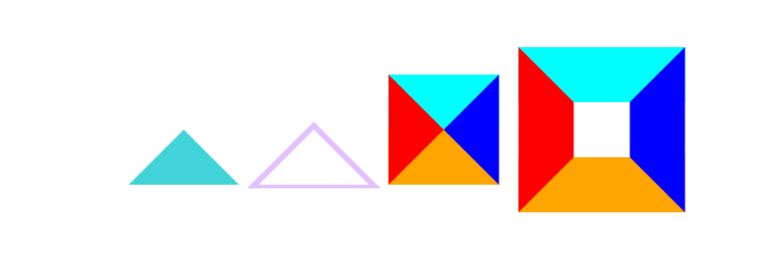
从盒模型来看,如果content宽高为0, border有宽度,那么上下左右的border就会填充满整个盒子,于是四个方向的border都是三在这里插入图片描述 角形形状,这样想要哪边就显示哪边
效果
代码
html
<!DOCTYPE html>
<html lang="en">
<head>
    <meta charset="UTF-8">
    <meta http-equiv="X-UA-Compatible" content="IE=edge">
    <meta name="viewport" content="width=device-width, initial-scale=1.0">
    <link rel="stylesheet" href="index.css">
    <script src="/index.js"></script>
    <title>CSS三角形</title>
</head>
<body>
    <div class="CENTER flex_box">
        <div class="tri no_cotent tri_bottom"></div>
        <div class="tri no_cotent tri_bottom_border"></div>
        <div class="tri no_cotent around"></div>
        <div class="tri content around"></div>
    </div>
</body>
</html>
CSS
.CENTER{
    position: absolute;
    left: 50%;
    top: 50%;
    width: 0;
    height: 0;
    transform: translate(-50%, -50%);
}
.flex_box{
    display: flex;
    width: 500px;
    align-items: center;
    justify-content: space-between;

}
.tri{
    margin: 0;
    padding: 0;
    border-width: 50px;
    border-color: transparent;
    border-style: solid;
}
.content{
    width: 50px;
    height: 50px;
}
/* 如果要绘制三角形, 那么content部分需要设置宽高为0, 只用border填充box */
.no_cotent{
    width: 0;
    height: 0;
}
/* 下三角形 */
.tri_bottom{
    border-bottom-color: rgb(66, 210, 218);
}
/* 带边框下三角形, 思路是两个三角形重叠, 使用伪元素实现边框 */
.tri_bottom_border{
    border-bottom-color: rgb(255, 255, 255);
    border-bottom-style: dashed;
}
.tri_bottom_border::after{
    position: relative;
    content: '';
    padding: 0;
    top: -28px;
    left: -60.5px;
    z-index: -1;
    border-style: solid;
    border-bottom-color: rgb(227, 193, 255) !important;
    border-width: 60px;
    border-color: transparent;
}
/* 三角形四周环绕 */
.around{
    border-left-color: red;
    border-right-color: blue;
    border-top-color: aqua;
    border-bottom-color: orange;
}


 995
995


 被折叠的 条评论
为什么被折叠?
被折叠的 条评论
为什么被折叠?
 到【灌水乐园】发言


