


本文主要是积累记录flutter基础为目的,也可以当做字典翻阅,不断更新中,有好的建议也欢迎大家指正
文章目录
一、组件
1.1、Text文本
1,import ‘package:flutter/material.dart’;为flutter sdk提供的组件
2,main方法可以写成箭头函数的方式
3,快速生成一个类:stless
import 'package:flutter/material.dart';
// void main() => runApp(MyApp());
void main(){
runApp(MyApp());
}
class MyApp extends StatelessWidget {
@override
Widget build(BuildContext context) {
return MaterialApp(
title: 'Welcome to Flutter',
home:Scaffold(
appBar: AppBar(
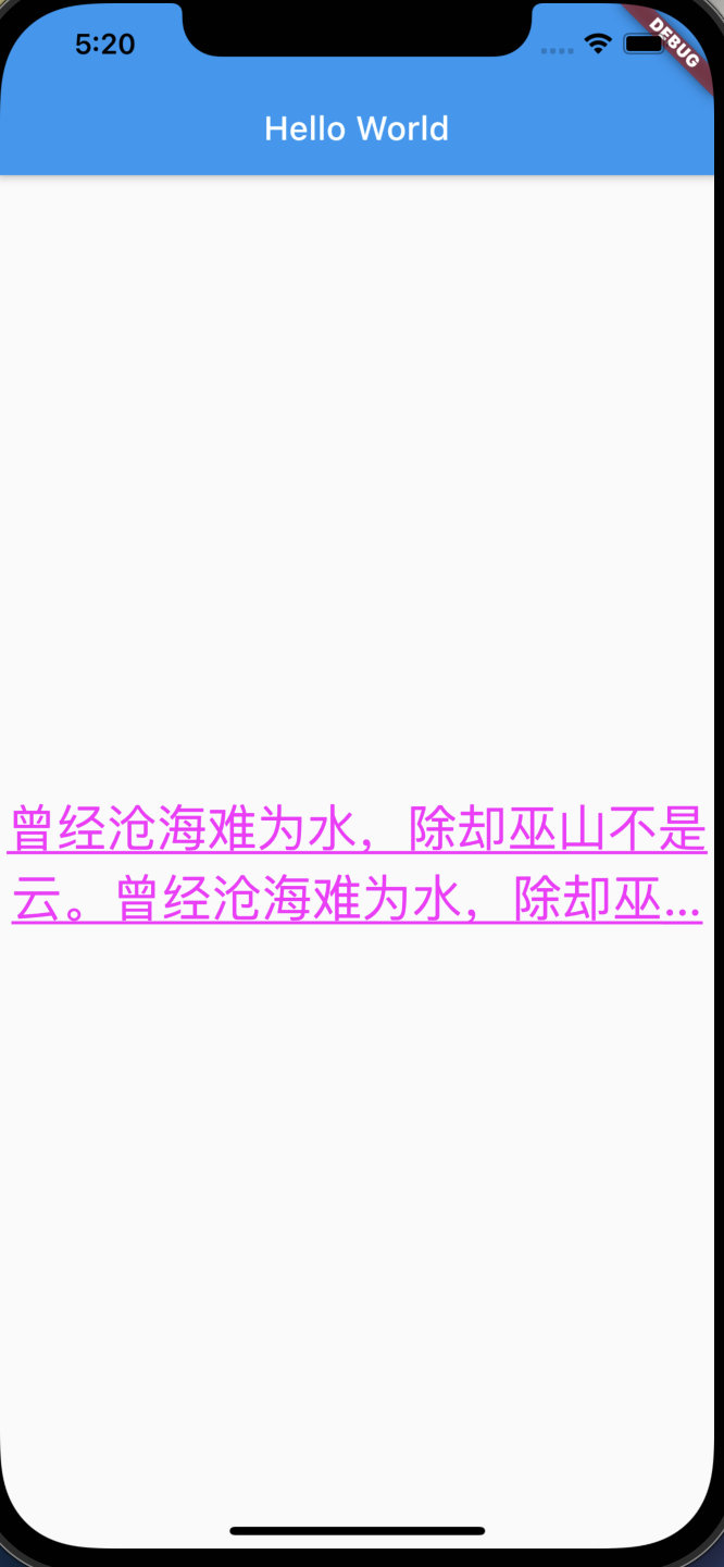
title: Text('Hello World'),
),
body: Center(
child: Text('曾经沧海难为水,除却巫山不是云。曾经沧海难为水,除却巫山不是云。曾经沧海难为水,除却巫山不是云。曾经沧海难为水,除却巫山不是云。',
textAlign: TextAlign.center,
maxLines: 2,
overflow: TextOverflow.ellipsis,
style: TextStyle(
fontSize: 30.0,
color: Color.fromARGB(255, 255, 0, 255),
decoration: TextDecoration.underline,
decorationStyle: TextDecorationStyle.solid
),),
),
)
);
}
}
1.2、Container容器
Container相关属性
1,alignment子控件对其方式:
alignment: Alignment.center,centerLeft、center、bottomLeft、bottomCenter、bottomRight、centerRight、topCenter、topLeft、topRight(前面是纵向,后面是横向)
alignment: const FractionalOffset(0.5,0.5),FractionalOffset取值为0-1,这里的0.5相当于Alignment.center
2,width宽度 浮点或整数类型
double.infinity在撑满到父容器,相当于flex 1
width: double.infinity,3,height高度 浮点或整数类型
4,color背景颜色
5,padding内边距:EdgeInsets.all所有方向边距,EdgeInsets.fromLTRB左上右下的边距
6,margin外边距,用法与padding一样
class MyApp extends StatelessWidget {
  @override
  Widget build(BuildContext context) {
    return MaterialApp(
      title: 'Welcome to Flutter',
      home:Scaffold(
        appBar: AppBar(
          title: Text('Container容器'),
        ),
        body: Center(
          child: Container(
            child: new Text('Hello World', style: TextStyle(fontSize: 40),),
            alignment: Alignment.topLeft,
            width: 500,
            height: 400,
            color: Colors.blue,
            // padding: const EdgeInsets.all(10),
            padding: const EdgeInsets.fromLTRB(10, 100, 30, 40),
          ),
        ),
      )
    );
  }
}
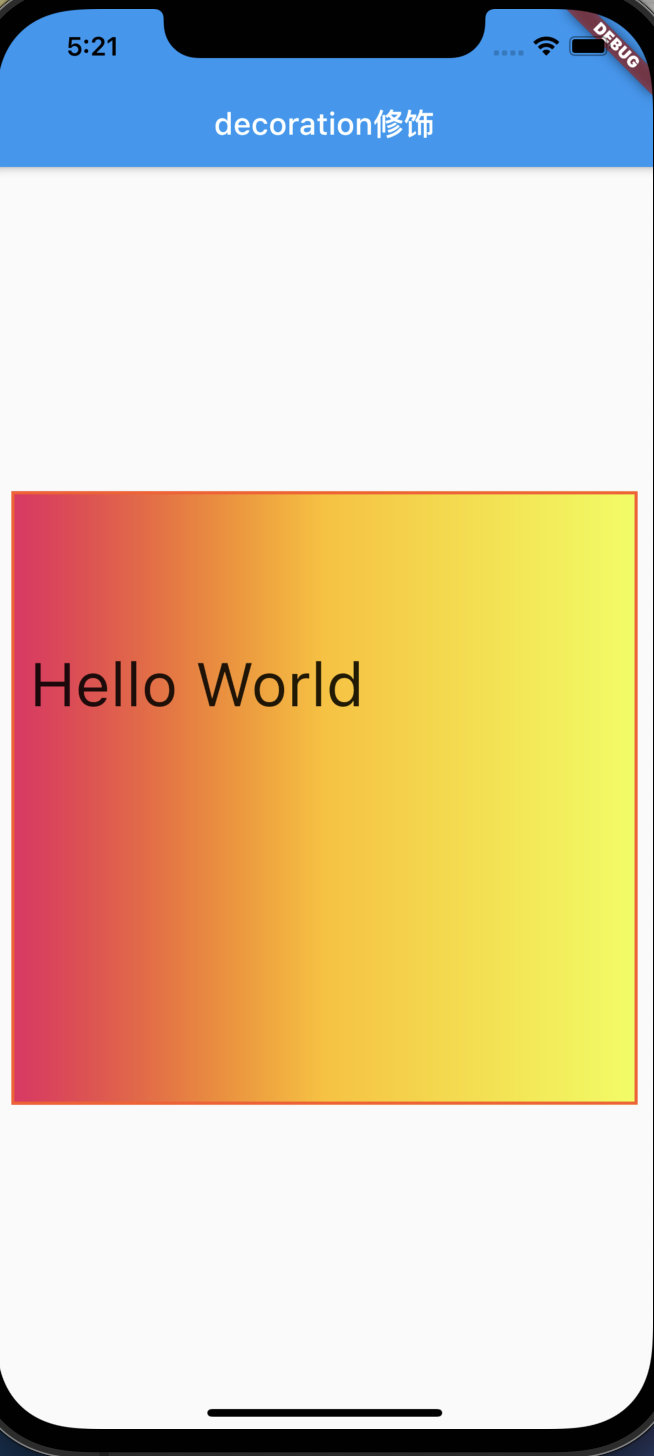
decoration修饰图片背景
1,渐变色:这里与color冲突,需要去掉color属性
2,border边框样式
class MyApp extends StatelessWidget {
  @override
  Widget build(BuildContext context) {
    return MaterialApp(
      title: 'Welcome to Flutter',
      home:Scaffold(
        appBar: AppBar(
          title: Text('decoration修饰'),
        ),
        body: Center(
          child: Container(
            child: new Text('Hello World', style: TextStyle(fontSize: 40),),
            alignment: Alignment.topLeft,
            width: 500,
            height: 400,
            margin: const EdgeInsets.all(10),
            padding: const EdgeInsets.fromLTRB(10, 100, 30, 40),
            decoration: new BoxDecoration(
              gradient: const LinearGradient(colors: [Colors.pink,Colors.amber,Colors.limeAccent]),
              border: Border.all(width: 2,color: Colors.deepOrange)
            ),
          ),
        ),
      )
    );
  }
}
1.3、Image图片
1.3.1、网络图片、本地资源
Image.network(网络图片)、Image.asset(本地资源)、Image.file(sd卡资源)、Image.memory
- 网络图片
Container(
              child: new Image.network(
                'https://tva1.sinaimg.cn/large/008i3skNly1gtbnmq97aag30k814qb29.gif',
                fit: BoxFit.scaleDown,
                color: Colors.greenAccent,
                colorBlendMode: BlendMode.modulate,
              ),
              width: 300,
              height: 500,
              color: Colors.limeAccent,
            )
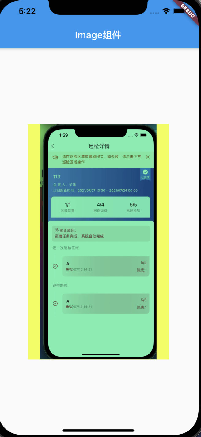
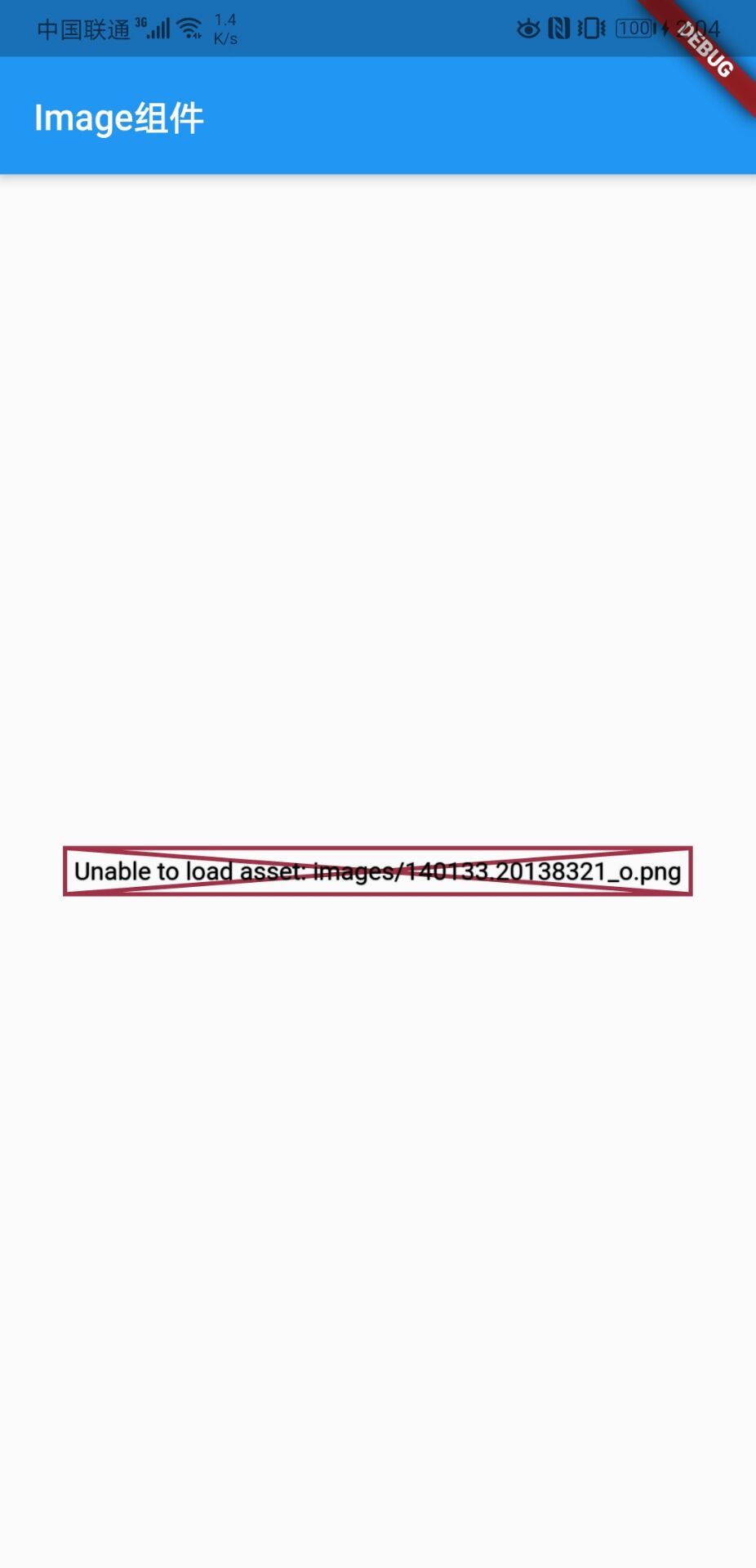
- asset资源
需要在pubspec.yaml中配置图片
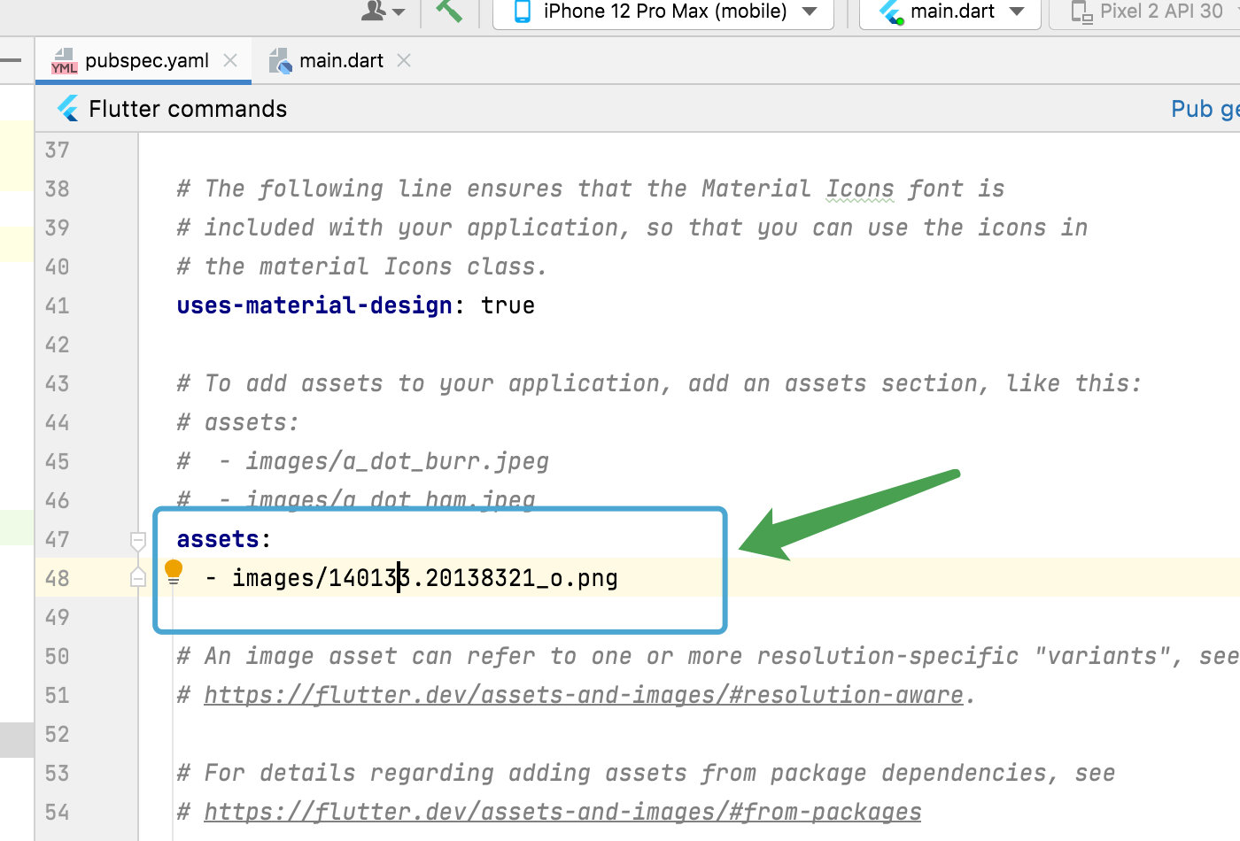
Image.asset(
                'images/140133.20138321_o.png',
                fit: BoxFit.scaleDown,
                color: Colors.greenAccent,
                colorBlendMode: BlendMode.modulate,
              )
如果不配置,打包时会出现这种问题
2,fit属性:
contain:宽高适配其中一个,不变形,无裁切
fitWidth:宽度适配,不变形,高度裁切
fitHeight:高度适配,不变形,宽度裁切
fill:长宽适配,变形,无裁切
cover:长宽适配,不变形,裁切一个方向
3,混合模式
colorBlendMode配合color属性使用,起到颜色叠加等滤镜效果
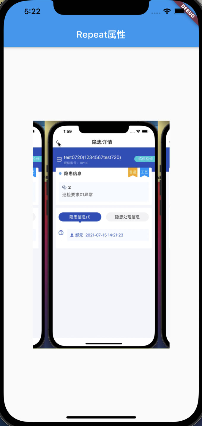
1.3.2、repeat 属性
repeatX:横向重复
repeatY:纵向重复
repeat:横纵向重复
class MyApp extends StatelessWidget {
  @override
  Widget build(BuildContext context) {
    return MaterialApp(
        title: 'Welcome to Flutter',
        home: Scaffold(
          appBar: AppBar(
            title: Text('Repeat属性'),
          ),
          body: Center(
            child: Container(
              child: new Image.network(
                'https://tva1.sinaimg.cn/large/008i3skNly1gtbnmq97aag30k814qb29.gif',
                fit: BoxFit.scaleDown,
                repeat: ImageRepeat.repeatX,
              ),
              width: 300,
              height: 500,
              color: Colors.limeAccent,
            ),
          ),
        ));
  }
}
1.3.3、圆形头像
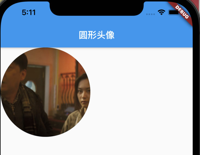
方式一:Container容器
利用Container容器的decoration剪切
final first = Container(
      width: 300,
      height: 300,
      decoration: BoxDecoration(
        color: Colors.yellow, //设置方框背景颜色
//            borderRadius: BorderRadius.all(
//              Radius.circular(150)      //变成圆形,不过一般不这么实现圆形图片
//            ),
        borderRadius: BorderRadius.circular(150), //实现圆形图片的方式一:   有些麻烦
        image:
            DecorationImage(image: NetworkImage('http://img5.mtime.cn/mg/2021/08/24/110937.63038065_285X160X4.jpg'), fit: BoxFit.cover //铺满全屏
                ),
      ),
    );
方式二:ClipOval
使用系统提供的椭圆控件
final second = ClipOval(
      child: Image.network(
        'http://img5.mtime.cn/mg/2021/08/24/110937.63038065_285X160X4.jpg',
        height: 100,
        width: 100,
        fit: BoxFit.cover,
      ),
    );
方式三:CircleAvatar(推荐)
使用系统提供的头像圆形控件
final third = CircleAvatar(
      backgroundImage: new NetworkImage('http://img5.mtime.cn/mg/2021/08/24/110937.63038065_285X160X4.jpg'),
      radius: 100,
    );
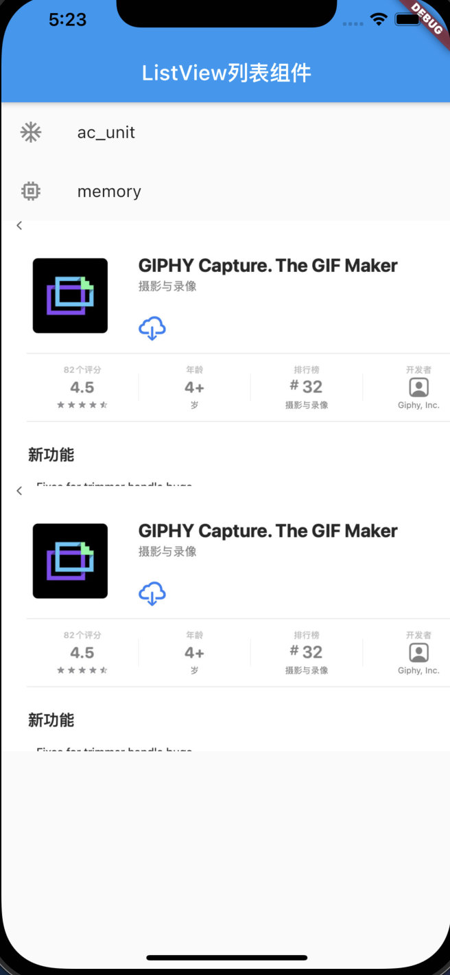
1.4、ListView列表
Flutter使用new和不用new有啥区别?
- dart 1.x的时候,
new是不能省略的。- dart 2.x的时候,
new是可选关键词,可以省略
class MyApp extends StatelessWidget {
  @override
  Widget build(BuildContext context) {

    return MaterialApp(
        title: 'Welcome to Flutter',
        home: Scaffold(
            appBar: AppBar(
              title: Text('ListView列表组件'),
            ),
            body: MyList()
        ));
  }
}

class MyList extends StatelessWidget{
  @override
  Widget build(BuildContext context) {
    return ListView(
      children: [
        ListTile(
          leading: new Icon(Icons.ac_unit),
          title: new Text('ac_unit'),
        ),
        ListTile(
          leading: new Icon(Icons.memory),
          title: new Text('memory'),
        ),
        Image.network('https://tva1.sinaimg.cn/large/008i3skNly1gtbnmryeetj30wq0jagmn.jpg'),
        Image.network('https://tva1.sinaimg.cn/large/008i3skNly1gtbnmryeetj30wq0jagmn.jpg'),
      ],
    );
  }
}
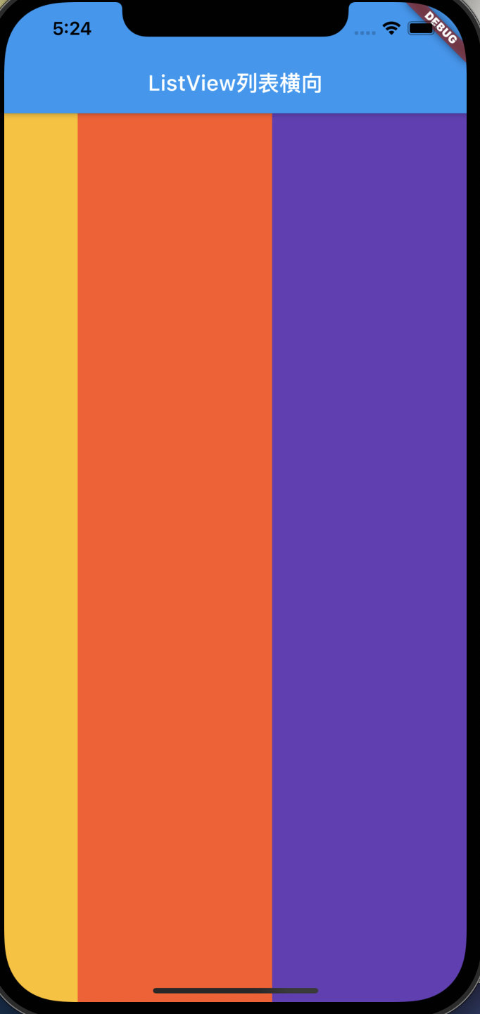
横向列表组件
scrollDirection: Axis.horizontal,
class MyList extends StatelessWidget{
  @override
  Widget build(BuildContext context) {
    return ListView(
      scrollDirection: Axis.horizontal,
      children: [
        Container(
          width: 180,
          color: Colors.lightBlue,
        ),
        Container(
          width: 180,
          color: Colors.amber,
        ),
        Container(
          width: 180,
          color: Colors.deepOrange,
        ),
        Container(
          width: 180,
          color: Colors.deepPurple,
        ),
      ],
    );
  }
}
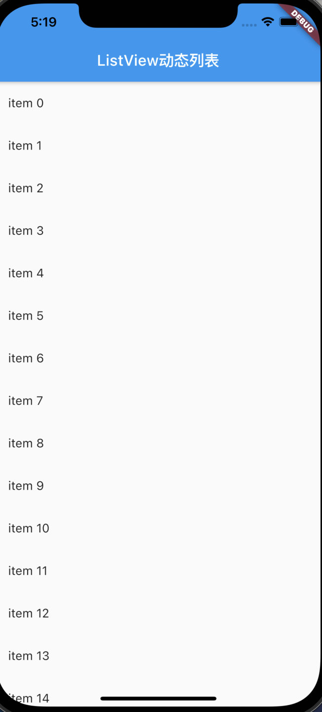
构造函数参数传递,生成动态列表
1,dart里面列表使用list,使用List的generate方法动态赋值
List tempList=new List<String>.generate(100, (index) => "tempList $index");2,MyApp({Key key})其中的key是默认必须要带的
3,@required注解表示字段必传
4,改动main函数里面的东西需要重新运行,否则会不生效或者报错
import 'package:flutter/material.dart';

void main() => runApp(MyApp(items: new List<String>.generate(100, (index) => "item $index")));

class MyApp extends StatelessWidget {
  final List<String> items;

  MyApp({Key key, @required this.items}) : super(key: key);

  @override
  Widget build(BuildContext context) {
    return MaterialApp(
        title: 'Welcome to Flutter',
        home: Scaffold(
            appBar: AppBar(
              title: Text('ListView动态列表'),
            ),
            body: new ListView.builder(
                itemCount: items.length,
                itemBuilder: (context, index) {
                  return new ListTile(
                    title: new Text('${items[index]}'),
                  );
                })));
  }
}
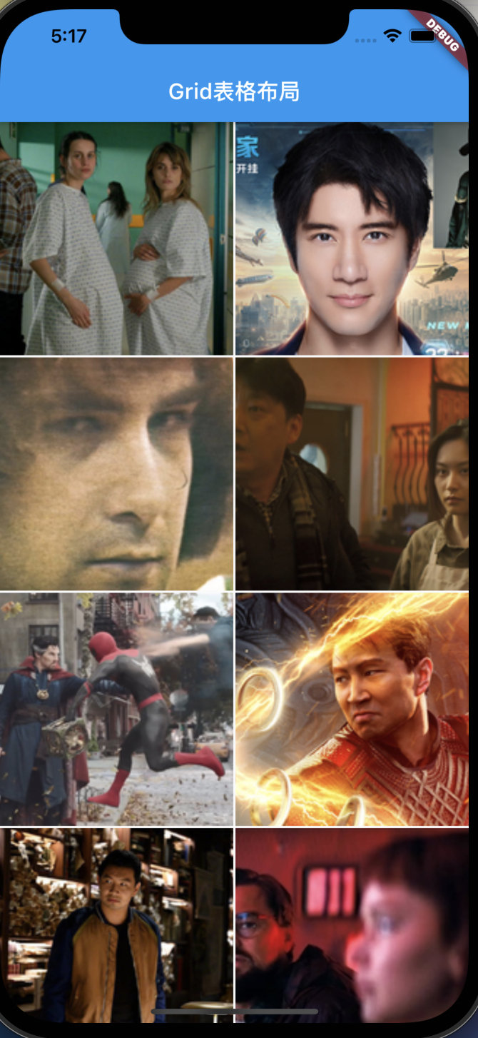
1.5、GridView表格
常用GridView.count创建表格组件,属性解析:
1,crossAxisCount 每行数量
2,crossAxisSpacing 行内间距
3,mainAxisSpacing列内间距
4,childAspectRatio item的宽高比
class MyApp extends StatelessWidget {
  @override
  Widget build(BuildContext context) {
    return MaterialApp(
        title: 'Welcome to Flutter',
        home: Scaffold(
            appBar: AppBar(
              title: Text('Grid表格布局'),
            ),
            body: GridView.count(
              crossAxisCount: 2,
              crossAxisSpacing: 2,
              mainAxisSpacing: 2,
              childAspectRatio: 1,
              // padding: const EdgeInsets.all(20),
              children: [
                Image.network('http://img5.mtime.cn/mg/2021/08/24/141454.81651527_285X160X4.jpg',fit: BoxFit.cover,),
                Image.network('http://img5.mtime.cn/mg/2021/08/24/134535.67957178_285X160X4.jpg',fit: BoxFit.cover,),
                Image.network('http://img5.mtime.cn/mg/2021/08/24/112722.60735295_285X160X4.jpg',fit: BoxFit.cover,),
                Image.network('http://img5.mtime.cn/mg/2021/08/24/110937.63038065_285X160X4.jpg',fit: BoxFit.cover,),
                Image.network('http://img5.mtime.cn/mg/2021/08/24/101606.96675436_285X160X4.jpg',fit: BoxFit.cover,),
                Image.network('http://img5.mtime.cn/mg/2021/08/24/094036.69360356_285X160X4.jpg',fit: BoxFit.cover,),
                Image.network('http://img5.mtime.cn/mg/2021/08/24/093233.40634890_285X160X4.jpg',fit: BoxFit.cover,),
                Image.network('http://img5.mtime.cn/mg/2021/08/24/090626.28438629_285X160X4.jpg',fit: BoxFit.cover,),
              ],
            )));
  }
}
1.6、TextField文本输入框
flutter中文本输入框组件 TextField,下面举例一些常用的
1.6.1、ui样式
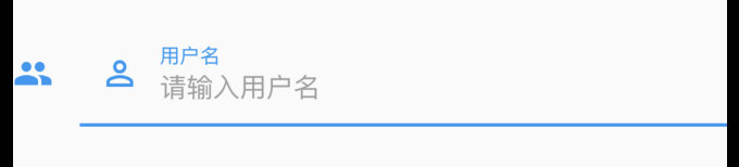
上述组件的ui样式如下
var widget = TextField(
      // autofocus: true,                       //自动获取焦点
      // obscureText: true,                     //密码方式
      // maxLines: 4,                           //设置对最大行数(会撑大高度)
      decoration: InputDecoration(
        icon: Icon(Icons.people),               //在文本框前面加上图标
        prefixIcon: Icon(Icons.perm_identity),  //文本框内的图标
        labelText: "用户名",                     //特殊效果,输入信息时,用户名动态跑到边框届提示
        border: OutlineInputBorder(),           //给表单四周添加边框
        hintText: "请输入用户名",                 //提示文案
        hintStyle: TextStyle(
          color: Colors.grey,
        ),
      ),
    );
此外TextField还有以下构造参数
 const TextField({
    Key key,
    this.controller,    //编辑框的控制器,跟文本框的交互一般都通过该属性完成,如果不创建的话默认会自动创建
    this.focusNode,  //用于管理焦点
    this.decoration = const InputDecoration(),   //输入框的装饰器,用来修改外观
    TextInputType keyboardType,   //设置输入类型,不同的输入类型键盘不一样
    this.textInputAction,   //用于控制键盘动作(一般位于右下角,默认是完成)
    this.textCapitalization = TextCapitalization.none,
    this.style,    //输入的文本样式
    this.textAlign = TextAlign.start,   //输入的文本位置
    this.textDirection,    //输入的文字排列方向,一般不会修改这个属性
    this.autofocus = false,   //是否自动获取焦点
    this.obscureText = false,   //是否隐藏输入的文字,一般用在密码输入框中
    this.autocorrect = true,   //是否自动校验
    this.maxLines = 1,   //最大行
    this.maxLength,   //能输入的最大字符个数
    this.maxLengthEnforced = true,  //配合maxLength一起使用,在达到最大长度时是否阻止输入
    this.onChanged,  //输入文本发生变化时的回调
    this.onEditingComplete,   //点击键盘完成按钮时触发的回调,该回调没有参数,(){}
    this.onSubmitted,  //同样是点击键盘完成按钮时触发的回调,该回调有参数,参数即为当前输入框中的值。(String){}
    this.inputFormatters,   //对输入文本的校验
    this.enabled,    //输入框是否可用
    this.cursorWidth = 2.0,  //光标的宽度
    this.cursorRadius,  //光标的圆角
    this.cursorColor,  //光标的颜色
    this.keyboardAppearance,
    this.scrollPadding = const EdgeInsets.all(20.0),
    this.dragStartBehavior = DragStartBehavior.down,
    this.enableInteractiveSelection,
    this.onTap,    //点击输入框时的回调(){}
    this.buildCounter,
  })
1.6.2、多行文本框
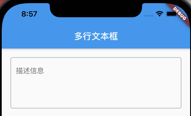
TextField(
  maxLines: 4,
  decoration: InputDecoration(
      hintText: '描述信息',
      border: OutlineInputBorder()
  ),
),
1.6.3、监听数据变化
监听数据变化: 即在TextEditingController的基础上添加监听即可
注意监听方法写在return前面,写在类里面会报错
_userEtController.addListener(() {
      print("controller的监听方法:"+_userEtController.text);
    });
1.6.4、赋值与set值
这里主要用到了TextField的controller属性以及TextEditingController控制器
首先TextField的数据是controller属性控制,输入框的值与TextEditingController的text字段双向绑定。
1,赋值:改变TextEditingController的text属性
2,set值:获取TextEditingController的text属性
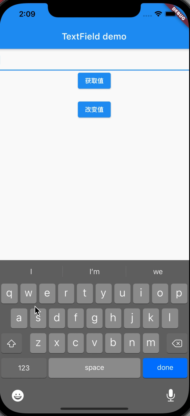
源代码如下
import 'package:flutter/material.dart';

void main() => runApp(MaterialApp(
  home: TextFieldWidget(),
));
class TextFieldWidget extends StatefulWidget {
  @override
  State<StatefulWidget> createState() {
    return _TextFieldState();
  }
}

class _TextFieldState extends State<TextFieldWidget> {
  TextEditingController _userEtController = TextEditingController();

  @override
  Widget build(BuildContext context) {
    return Scaffold(
      appBar: AppBar(
        title: Text("TextField"),
      ),
      body: Container(
        padding: EdgeInsets.all(10),
        child: Column(
          children: <Widget>[
            TextField(
              controller: _userEtController,
            ),
            RaisedButton(
              child: Text("赋值"),
              onPressed: () {
                setState(() {
                  _userEtController.text = "15937600635";
                });
              },
            ),
            RaisedButton(
              child: Text("获取值"),
              onPressed: () {
                setState(() {});
              },
            ),
            Text(_userEtController.text),
          ],
        ),
      ),
    );
  }
}
1.6.5、Overflow错误
flutter在使用TextField,软键盘弹出时候容易提示错误bottom overflowed by xxx PIXELS
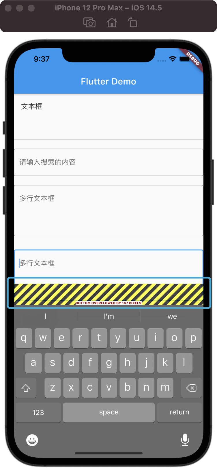
解决办法
SingleChildScrollView 包装一下,否则键盘弹出会报空间溢出
1.7、按钮组件
1.7.1、IconButton
展示icon的按钮

IconButton(           //图标按钮
  icon: Icon(Icons.settings),
  onPressed: (){
  },
)
1.7.2、RaisedButton(过时)
设置文本的按钮 (过时,替代建议->ElevatedButton)
常规属性有
RaisedButton(
  child: Text('RaisedButton'),
  //水波纹颜色
  splashColor: Colors.red,
  //背景颜色
  color: Colors.blue,
  //字体颜色
  textColor: Colors.white,
  //阴影
  elevation: 10,
  onPressed: () {},
),
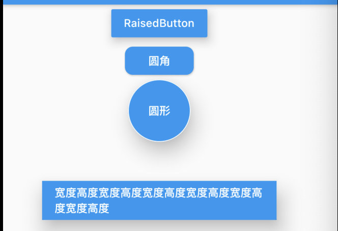
另外可以设置圆角
RaisedButton(
  child: Text('圆角'),
  color: Colors.blue,
  textColor: Colors.white,
  shape: RoundedRectangleBorder(
      //圆角弧度
      borderRadius: BorderRadius.circular(10)),
  onPressed: () {},
),
也可以设置圆形,不过需要依赖于Container容器
Container(
  height: 80, //直径
  child: RaisedButton(
    child: Text('圆形'),
    color: Colors.blue,
    textColor: Colors.white,
    elevation: 20,
    shape: CircleBorder(side: BorderSide(color: Colors.white)),
    onPressed: () {},
  ),
),
设置按钮宽高
Container(
  //利用容器来设置按钮的宽度和高度
  height: 50,
  width: 300,
  color: Colors.blue,
  margin: EdgeInsets.all(50),    //外边距
  child: RaisedButton(
    child: Text('宽度高度宽度高度宽度高度宽度高度宽度高度宽度高度'),
    color: Colors.blue,
    textColor: Colors.white,
    elevation: 20,
    onPressed: () {},
  ),
),
1.7.3、ElevatedButton(替代上面)
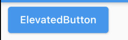
ElevatedButton(
  child: Text('ElevatedButton'),
  onPressed: () {},
),
1.7.4、RaisedButton.icon(过时)、ElevatedButton.icon
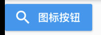
设置图标与文本的按钮 (过时,替代建议->ElevatedButton)
RaisedButton.icon(
  icon: Icon(Icons.search),
  label: Text('图标按钮'),
  color: Colors.blue,
  textColor: Colors.white,
  onPressed: (){
    print('图标按钮');
  },
),
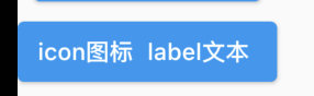
ElevatedButton.icon(
  icon: Text('icon图标'),
  label: Text('label文本'),
  onPressed: () {},
)
1.7.6、FlatButton(过时)、TextButton
文本按钮 (过时,替代建议->TextButton)
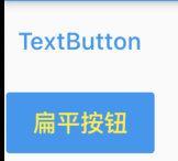
[
  TextButton(onPressed: () {}, child: Text('TextButton')),
  FlatButton(
    child: Text('扁平按钮'),
    color: Colors.blue,
    textColor: Colors.yellow,
    onPressed: () {},
  )
],
1.7.7、OutlineButton(过时)、OutlinedButton
带边框的文本按钮 (过时,替代建议->OutlinedButton)
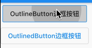
[
  OutlineButton(
    child: Text('OutlineButton边框按钮'),
    onPressed: () {},
  ),
  OutlinedButton(
    child: Text('OutlinedButton边框按钮'),
    onPressed: () {}
  ),
],
1.7.8、自定义按钮
自定义按钮主要是自己利用现有的组件封装
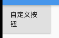
class MyButton extends StatelessWidget {
  final text;
  final pressed;
  final double width;
  final double height;

  const MyButton(
      {this.text = "",
      this.pressed = null,
      this.width = 80.0,
      this.height = 30.0});

  @override
  Widget build(BuildContext context) {
    return Container(
      height: this.height,
      width: this.width,
      child: RaisedButton(
        child: Text(this.text),
        onPressed: this.pressed,
      ),
    );
  }
}
使用如下
MyButton(
  text: '自定义按钮',
  height: 60.0,
  width: 100,
  pressed: () {
    print('自定义按钮');
  })
1.8、AspectRatio组件(宽高比设定)
aspectRatio宽高比
AspectRatio(
  aspectRatio: 30/9,
  child: new Image.network(
'http://img5.mtime.cn/mg/2021/08/24/110937.63038065_285X160X4.jpg',
    fit: BoxFit.fill,
  ),
)
1.9、单选多选按钮
1.9.1、Radio单选按钮
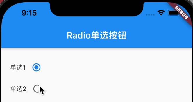
Radio接收value(按钮值)、groupValue(当前外部数据)参数
import 'package:flutter/material.dart';

void main() => runApp(MaterialApp(
      home: FormDemoPage(),
    ));

class FormDemoPage extends StatefulWidget {
  @override
  _FormDemoPageState createState() => _FormDemoPageState();
}

class _FormDemoPageState extends State<FormDemoPage> {
  int sex = 1;

  //将单选组按钮的监听器抽离出来
  void _sexChanged(value) {
    setState(() {
      this.sex = value;
    });
  }

  List<Widget> _singleSelect() {
    List<Widget> tempList = [];
    tempList.add(Row(
      children: [
        Text('单选1'),
        Radio(
          value: 1,
          onChanged: this._sexChanged,
          groupValue: this.sex,
        ),
      ],
    ));
    tempList.add(Row(
      children: [
        Text('单选2'),
        Radio(
          value: 2,
          onChanged: this._sexChanged,
          groupValue: this.sex,
        )
      ],
    ));
    return tempList;
  }

  @override
  Widget build(BuildContext context) {
    return Scaffold(
      appBar: AppBar(
        title: Text('Radio单选按钮'),
      ),
      body: Padding(
        padding: EdgeInsets.all(20),
        child: Column(
          children: <Widget>[
            Wrap(
              children: this._singleSelect(),
            ),
          ],
        ),
      ),
    );
  }
}
1.9.2、RadioListTile单选按钮
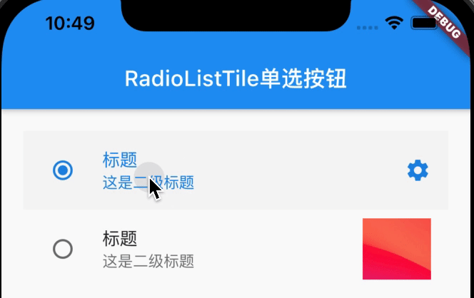
RadioListTile在Radio基础上扩充了title、subtitle、secondary字段,代码:
import 'package:flutter/material.dart';

void main() => runApp(MaterialApp(
      home: RadioPage(),
    ));

class RadioPage extends StatefulWidget {
  @override
  _RadioPageState createState() => _RadioPageState();
}

class _RadioPageState extends State<RadioPage> {
  int singleSelect = 1;

  @override
  Widget build(BuildContext context) {
    return Scaffold(
      appBar: AppBar(
        title: Text('RadioListTile单选按钮'),
      ),
      body: Padding(
        padding: EdgeInsets.all(20),
        child: Column(
          children: <Widget>[
            RadioListTile(
              value: 1,
              onChanged: (v) {
                //Radio改变时,触发事件
                setState(() {
                  //重新渲染界面
                  this.singleSelect = v;
                });
              },
              groupValue: this.singleSelect,
              //如果这里的值是一样的,说明都是属于同一个人单选按钮组
              title: Text('标题'),
              subtitle: Text('这是二级标题'),
              secondary: Icon(Icons.settings),
              //设置:  图标
              selected: this.singleSelect == 1, //选中时,文字发亮
            ),
            RadioListTile(
              value: 2,
              onChanged: (v) {
                //Radio改变时,触发事件
                setState(() {
                  //重新渲染界面
                  this.singleSelect = v;
                });
              },
              groupValue: this.singleSelect,
              //如果这里的值是一样的,说明都是属于同一个人单选按钮组
              title: Text('标题'),
              subtitle: Text('这是二级标题'),
              secondary:
                  Image.network('https://tva1.sinaimg.cn/large/008i3skNly1gsz5k44d39j30ei0d2dfy.jpg'),
              //加载远程图片
              selected: this.singleSelect == 2, //选中时,文字发亮
            ),
          ],
        ),
      ),
    );
  }
}
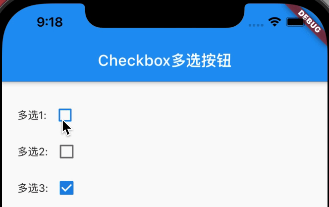
1.9.3、CheckBox多选按钮
import 'package:flutter/material.dart';

void main() => runApp(MaterialApp(
      home: FormDemoPage(),
    ));

class FormDemoPage extends StatefulWidget {
  @override
  _FormDemoPageState createState() => _FormDemoPageState();
}

class _FormDemoPageState extends State<FormDemoPage> {
  int sex = 1; //默认1是男

  List multis = [
    {'checked': true, 'title': '多选1'},
    {'checked': false, 'title': '多选2'},
    {'checked': true, 'title': '多选3'},
  ];

  //多选
  List<Widget> _multiSelect() {
    List<Widget> tempList = [];
    for (var i = 0; i < this.multis.length; i++) {
      tempList.add(Row(
        children: <Widget>[
          Text(this.multis[i]['title'] + ":"),
          Checkbox(
            value: this.multis[i]['checked'],
            onChanged: (value) {
              setState(() {
                this.multis[i]['checked'] = value;
              });
            },
          )
        ],
      ));
    }
    return tempList;
  }

  @override
  Widget build(BuildContext context) {
    return Scaffold(
      appBar: AppBar(
        title: Text('Checkbox多选按钮'),
      ),
      body: Padding(
        padding: EdgeInsets.all(20),
        child: Column(
          children: <Widget>[
            Wrap(
              children: this._multiSelect(),
            ),
          ],
        ),
      ),
    );
  }
}
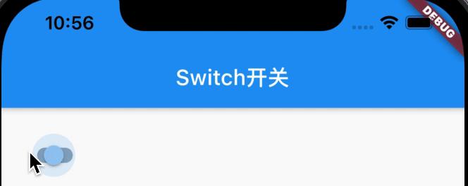
1.10、Switch开关
Switch控件接收value(boolean类型)、onChanged(数据改变回调)
import 'package:flutter/material.dart';

void main() => runApp(MaterialApp(
      home: RadioPage(),
    ));

class RadioPage extends StatefulWidget {
  @override
  _RadioPageState createState() => _RadioPageState();
}

class _RadioPageState extends State<RadioPage> {
  bool flag = true;

  @override
  Widget build(BuildContext context) {
    return Scaffold(
      appBar: AppBar(
        title: Text('Switch开关'),
      ),
      body: Padding(
        padding: EdgeInsets.all(20),
        child: Column(
          children: <Widget>[
            Switch(
              //Android里的开关按钮
              value: this.flag,
              onChanged: (v) {
                setState(() {
                  print((v));
                  this.flag = v;
                });
              },
            )
          ],
        ),
      ),
    );
  }
}
二、布局
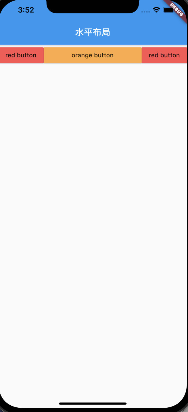
2.1、Row水平布局
Row水平布局组件:
1,子组件嵌套Expanded为灵活布局,子组件相当于加了权重1
2,子组件没有嵌套Expanded为不灵活布局,由子控件实际宽高决定大小
class MyApp extends StatelessWidget {
  @override
  Widget build(BuildContext context) {
    return MaterialApp(
        title: 'Welcome to Flutter',
        home: Scaffold(
            appBar: AppBar(
              title: Text('水平布局'),
            ),
            body: new Row(
              children: [
                RaisedButton(
                  onPressed: () {},
                  color: Colors.redAccent,
                  child: new Text('red button'),
                ),
                Expanded(
                  child: RaisedButton(
                    onPressed: () {},
                    color: Colors.orangeAccent,
                    child: new Text('orange button'),
                  ),
                ),
                RaisedButton(
                  onPressed: () {},
                  color: Colors.redAccent,
                  child: new Text('red button'),
                ),
              ],
            )));
  }
}
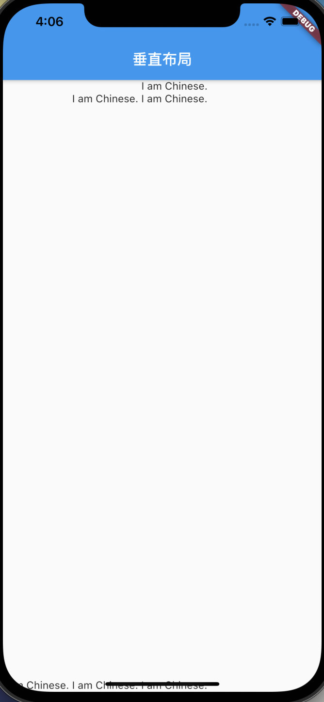
2.2、Column垂直布局
Column垂直布局组件:
1,与Row相反,用法一样
2,crossAxisAlignment:指定副轴对其方式
class MyApp extends StatelessWidget {
  @override
  Widget build(BuildContext context) {
    return MaterialApp(
        title: 'Welcome to Flutter',
        home: Scaffold(
            appBar: AppBar(
              title: Text('垂直布局'),
            ),
            body: new Column(
              crossAxisAlignment: CrossAxisAlignment.end,
              children: [
                Text('I am Chinese.'),
                Expanded(child: Text('I am Chinese. I am Chinese.'),),
                Text('I am Chinese. I am Chinese. I am Chinese.'),
              ],
            )));
  }
}
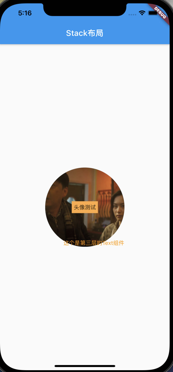
2.3、stack层叠布局
stack层叠布局,相当于css的position布局
1,这里alignment的FractionalOffset(0.5,0.5)等价于Alignment.center
2,CircleAvatar为圆形头像框
3,Positioned控件:用它包裹可以定位子组件位置
var stack = new Stack(
      // alignment: Alignment.center,
      alignment: const FractionalOffset(0.5, 0.5),
      children: [
        new CircleAvatar(
          backgroundImage: new NetworkImage(
              'http://img5.mtime.cn/mg/2021/08/24/110937.63038065_285X160X4.jpg'),
          radius: 100,
        ),
        new Container(
          decoration: new BoxDecoration(color: Colors.orangeAccent),
          padding: EdgeInsets.all(5),
          child: Text('头像测试'),
        ),
        new Positioned(
            bottom: 0,
            right: 0,
            child: new Text(
              '这个是第三层的Text组件',
              style: TextStyle(color: Colors.orange),
            ))
      ],
    );
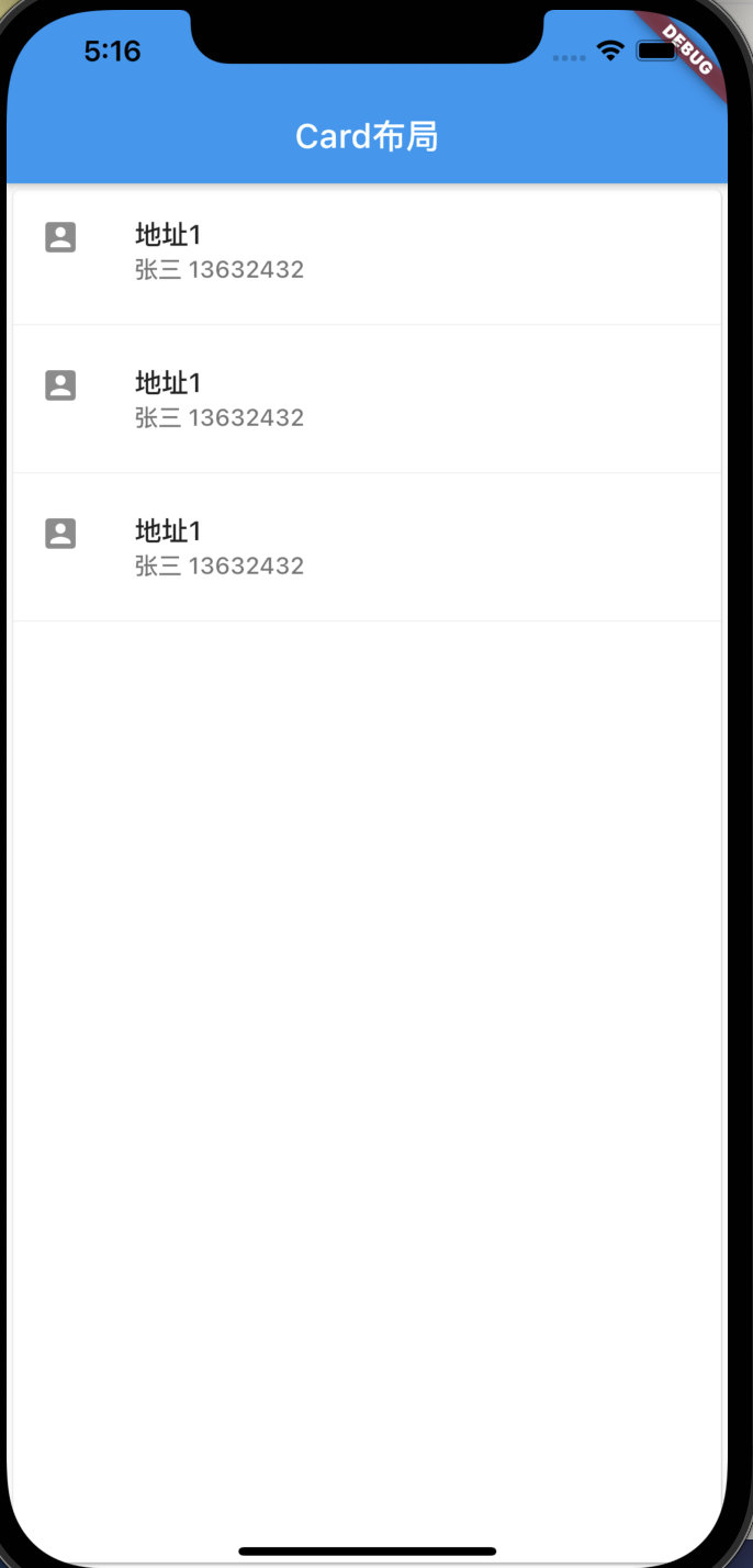
2.4、Card卡片布局
卡片布局
1,卡片布局也就是对布局左右加上了一点阴影
2,Divider()为横向的分割线
var card=Card(
      child: Column(
        children: [
          ListTile(
            title: Text('地址1',style: TextStyle(fontWeight: FontWeight.w500),),
            subtitle: Text('张三 13632432',style: TextStyle(fontWeight: FontWeight.w500),),
            leading: Icon(Icons.account_box),
          ),
          Divider(),
          ListTile(
            title: Text('地址1',style: TextStyle(fontWeight: FontWeight.w500),),
            subtitle: Text('张三 13632432',style: TextStyle(fontWeight: FontWeight.w500),),
            leading: Icon(Icons.account_box),
          ),
          Divider(),
          ListTile(
            title: Text('地址1',style: TextStyle(fontWeight: FontWeight.w500),),
            subtitle: Text('张三 13632432',style: TextStyle(fontWeight: FontWeight.w500),),
            leading: Icon(Icons.account_box),
          ),
          Divider(),
        ],
      ),
    );
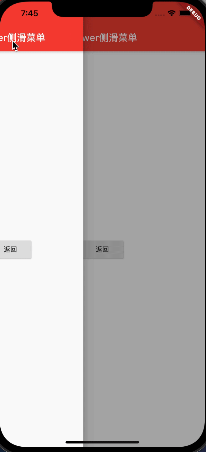
2.5、Drawer侧滑菜单
侧滑菜单用到了Drawer组件
脚手架组件Scaffold中添加drawer参数
import 'package:flutter/material.dart';

class SecondScreen extends StatelessWidget {
  @override
  Widget build(BuildContext context) {
    return new Scaffold(
      appBar: new AppBar(
        title: new Text('drawer侧滑菜单'),
      ),
      body: new Container(
        child:new Center(
          child: new RaisedButton(
            onPressed: () {
              //关闭侧滑栏
              Navigator.pop(context);
            },
            child: new Text('返回'),
          ),
        ),
      ),
      drawer: new Drawer(
        child: new SecondScreen(),
      ),
    );
  }
}
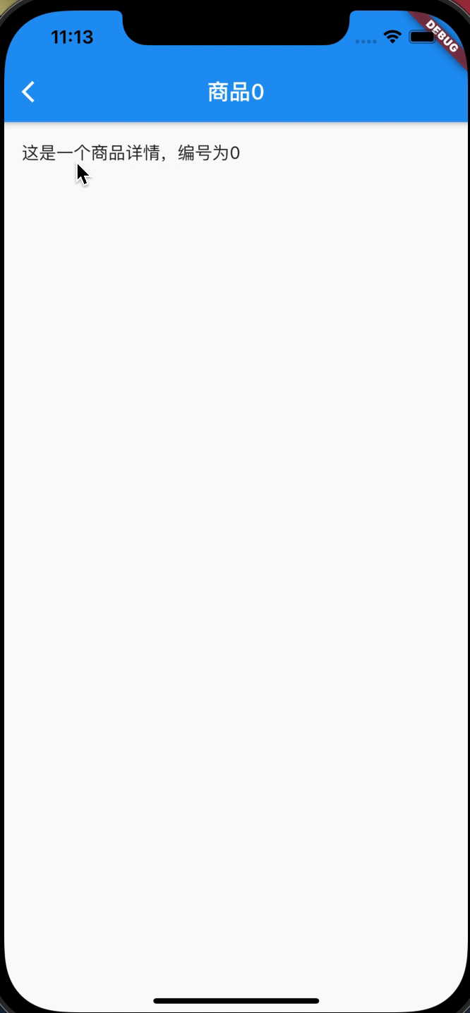
三、路由导航
3.1、路由跳转
不带参数跳转
Navigator.push(context, MaterialPageRoute(builder: (context) => new SecondScreen()))
带参数跳转
final result = await Navigator.push(context, MaterialPageRoute(builder: (context) => ProductDetail(product: products[index])));
3.2、路由返回
不带参数返回
Navigator.pop(context);
带参数返回
Navigator.pop(context,"asdfasdfadsf");
demo示例:
import 'package:flutter/material.dart';

class Product {
  final String title;
  final String description;

  Product(this.title, this.description);
}

void main() {
  runApp(MaterialApp(
    title: '路由导航',
    home: ProductionList(
        products: List.generate(
            20, (index) => Product('商品$index', '这是一个商品详情,编号为$index'))),
  ));
}

class ProductionList extends StatelessWidget {
  final List<Product> products;

  const ProductionList({Key key, @required this.products}) : super(key: key);

  @override
  Widget build(BuildContext context) {
    return Scaffold(
      appBar: AppBar(
        title: Text('商品列表'),
      ),
      body: ListView.builder(
          itemCount: products.length,
          itemBuilder: (context, index) {
            return ListTile(
              title: Text(products[index].title),
              onTap: () async {
                String result = await Navigator.push(
                    context,
                    MaterialPageRoute(
                        builder: (context) =>
                            ProductDetail(product: products[index])));
                ScaffoldMessenger.of(context).showSnackBar(SnackBar(content: Text(result)));
              },
            );
          }),
    );
  }
}

class ProductDetail extends StatelessWidget {
  final Product product;

  const ProductDetail({Key key, @required this.product}) : super(key: key);

  @override
  Widget build(BuildContext context) {
    return Scaffold(
      appBar: AppBar(
        title: Text('${product.title}'),
      ),
      body: ListTile(
        title: Text('${product.description}'),
        onTap: () {
          Navigator.pop(context,'asdfadsf');
        },
      ),
    );
  }
}
四、安卓打包
4.1、androidstudio打包
使用androidstudio上的build打包,会生成apk、flutter-apk文件夹下的apk包65M
4.2、gradlew命令打包
使用gradlew命令打包,包大小也都是65M左右
./gradlew assembleDebug
./gradlew assembleRelease
4.3、flutter命令打包
使用flutter命令打包会生成apk,flutter-apk文件下的包18M
flutter build apk
五、toast与打印
5.1、打印
print('Hello world!');
[外链图片转存中…(img-W6wS4oiN-1631255381037)]
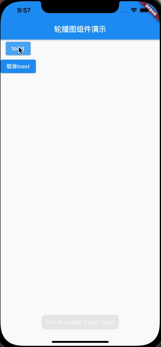
5.2、toast
pubspec.yaml添加dependencies依赖并拉去仓库代码
fluttertoast: ^8.0.8
flutter packages get
使用Toast提示与取消
import 'package:flutter/material.dart';
import 'package:fluttertoast/fluttertoast.dart';

void main() => runApp(new MyApp());

class MyApp extends StatelessWidget {
  @override
  Widget build(BuildContext context) {
    return new MaterialApp(
      title: 'Flutter Demo',
      home: new Scaffold(
        appBar: AppBar(
          title: Text('轮播图组件演示'),
        ),
        body: Column(
          children: [
            ElevatedButton(
              child: Text('toast'),
              onPressed: () {
                Fluttertoast.showToast(
                    msg: "This is Center Short Toast",
                    toastLength: Toast.LENGTH_SHORT,
                    gravity: ToastGravity.BOTTOM,
                    timeInSecForIosWeb: 1,
                    backgroundColor: Colors.black45,
                    textColor: Colors.white,
                    fontSize: 16.0);
              },
            ),
            ElevatedButton(
              child: Text('取消toast'),
              onPressed: () {
                Fluttertoast.cancel();
              },
            ),
          ],
        ),
      ),
    );
  }
}
六、事件通信
6.1、callback
我们可以通过传递一个callback给组件或者下一个页面,然后回调数据。例如在A页面传递callback函数
Navigator.push(
                    context,
                    MaterialPageRoute(
                        builder: (context) => ProductDetail(
                            product: products[index],
                            callback: (c, str) => {
                                  ScaffoldMessenger.of(c).showSnackBar(
                                      SnackBar(content: Text(str)))
                                })));
在B页面调用callback函数
callback(context, '123213');
全部代码
import 'package:flutter/material.dart';

class Product {
  final String title;
  final String description;

  Product(this.title, this.description);
}

void main() {
  runApp(MaterialApp(
    title: '路由导航',
    home: ProductionList(
        products: List.generate(
            20, (index) => Product('商品$index', '这是一个商品详情,编号为$index'))),
  ));
}

class ProductionList extends StatelessWidget {
  final List<Product> products;

  const ProductionList({Key key, @required this.products}) : super(key: key);

  @override
  Widget build(BuildContext context) {
    return Scaffold(
      appBar: AppBar(
        title: Text('商品列表'),
      ),
      body: ListView.builder(
          itemCount: products.length,
          itemBuilder: (context, index) {
            return ListTile(
              title: Text(products[index].title),
              onTap: () async {
                String result = await Navigator.push(
                    context,
                    MaterialPageRoute(
                        builder: (context) => ProductDetail(
                            product: products[index],
                            callback: (c, str) => {
                                  ScaffoldMessenger.of(c).showSnackBar(
                                      SnackBar(content: Text(str)))
                                })));
                ScaffoldMessenger.of(context)
                    .showSnackBar(SnackBar(content: Text(result)));
              },
            );
          }),
    );
  }
}

class ProductDetail extends StatelessWidget {
  final Product product;
  final Function callback;

  const ProductDetail(
      {Key key, @required this.product, @required this.callback})
      : super(key: key);

  @override
  Widget build(BuildContext context) {
    return Scaffold(
      appBar: AppBar(
        title: Text('${product.title}'),
      ),
      body: ListTile(
        title: Text('${product.description}'),
        onTap: () {
          callback(context, '123213');
          Navigator.pop(context, 'asdfadsf');
        },
      ),
    );
  }
}
七、弹窗
flutter sdk中
1,dialog.dart提供了showDialog弹窗
2,bottom_sheet.dart提供了showModalBottomSheet弹窗
弹窗相当于一个页面,因此关闭弹窗的方法为
Navigator.pop(context, 'await回传数据');
7.1、dialog弹窗
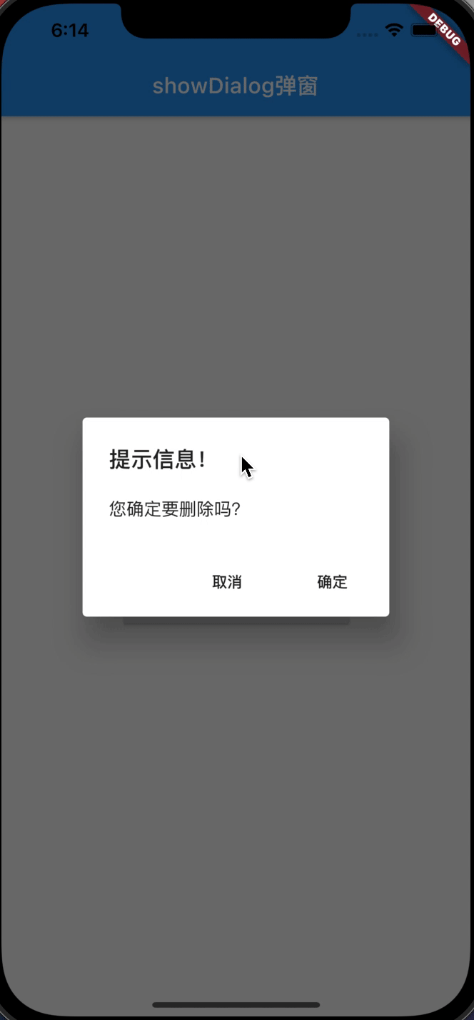
_alertDialog() async {
  var result = await showDialog(
      //通过异步在外面获取值
      context: context,
      builder: (context) {
        return AlertDialog(
          //系统自带: 普通对话框
          title: Text('提示信息!'),
          content: Text('您确定要删除吗?'),
          actions: <Widget>[
            //监听器
            FlatButton(
              //确定监听
              child: Text('取消'),
              onPressed: () {
                print('取消');
                Navigator.pop(context, 'Cancle');
              },
            ),
            FlatButton(
              //取消监听
              child: Text('确定'),
              onPressed: () {
                print('确定');
                Navigator.pop(context, 'OK');
              },
            )
          ],
        );
      });

  print(result); //在外部获取数据并打印
}
7.2、bottom_sheet弹窗
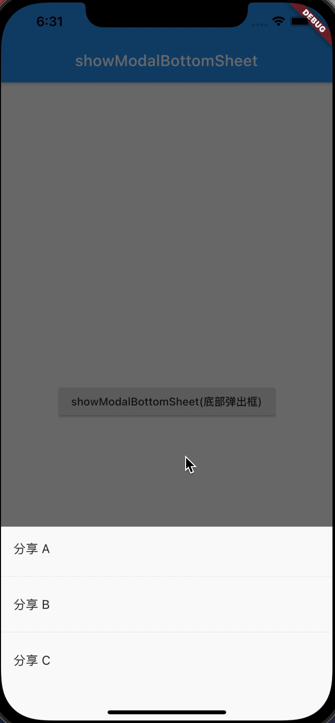
_modelBottomSheet() async {
  var result = await showModalBottomSheet(
      context: context,
      builder: (context) {
        return Container(
          height: 250, //配置底部弹出框高度
          child: Column(
            children: <Widget>[
              ListTile(
                title: Text('分享 A'),
                onTap: () {
                  Navigator.pop(context, '分享A');
                },
              ),
              Divider(),
              ListTile(
                title: Text('分享 B'),
                onTap: () {
                  Navigator.pop(context, '分享B');
                },
              ),
              Divider(),
              ListTile(
                title: Text('分享 C'),
                onTap: () {
                  Navigator.pop(context, '分享C');
                },
              ),
            ],
          ),
        );
      });
  print(result);
}


 2473
2473


 被折叠的 条评论
为什么被折叠?
被折叠的 条评论
为什么被折叠?
 到【灌水乐园】发言


