


 本文详细介绍了Bootstrap的各种组件,包括警示框的默认样式、可关闭和带链接的警示框,媒体对象的嵌套和列表,列表组的多样化应用,面板的基础与彩色样式,以及响应式表格的实现。此外,还涵盖了表格、表单、图像、导航条和分页导航等组件的使用方法和示例。
bootstrap模板为使IE6、7、8版本(IE9以下版本)浏览器兼容html5新增的标签,引入下面代码文件即可。
<script src="https://oss.maxcdn.com/libs/html5shiv/3.7.0/html5shiv.js"></script>同理为使IE6、7、8版本浏览器兼容css3样式,引入下面代码:
<script src="https://oss.maxcdn.com/libs/respond.js/1.4.2/respond.min.js"></script><link href="css/bootstrap.min.css" rel="stylesheet">
<!-- 如果要使用Bootstrap的js插件,必须先调入jQuery -->
<script src="http://libs.baidu.com/jquery/1.9.0/jquery.min.js"></script>
<!-- 包括所有bootstrap的js插件或者可以根据需要使用的js插件调用 -->
<script src="http://maxcdn.bootstrapcdn.com/bootstrap/3.2.0/js/bootstrap.min.js"></script> 一、标题
<!--Bootstrap中的标题-->
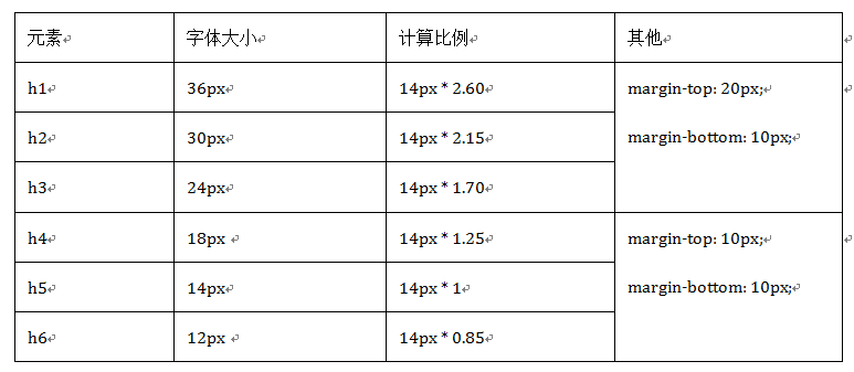
<h1>Bootstrap标题一</h1>
<h2>Bootstrap标题二</h2>
<h3>Bootstrap标题三</h3>
<h4>Bootstrap标题四</h4>
<h5>Bootstrap标题五</h5>
<h6>Bootstrap标题六</h6>
<!--Bootstrap中让非标题元素和标题使用相同的样式-->
<div class="h1">Bootstrap标题一</div>
<div class="h2">Bootstrap标题二</div>
<div class="h3">Bootstrap标题三</div>
<div class="h4">Bootstrap标题四</div>
<div class="h5">Bootstrap标题五</div>
<div class="h6">Bootstrap标题六</div>我们在Web的制作中,常常会碰到在一个标题后面紧跟着一行小的副标题。在Bootstrap中他也考虑了这种排版效果,使用了标签来制作副标题。
<!--Bootstrap中使用了<small>标签来制作副标题-->
<h1>Bootstrap标题一<small>我是副标题</small></h1>
二、强调内容
如果想让一个段落p突出显示,可以通过添加类名“.lead”实现,其作用就是增大文本字号,加粗文本
<p class="lead">我是特意要突出的文本,我的样子成这样。我是特意要突出的文本,我的样子长成这样。</p>除此之外,Bootstrap还通过元素标签:<small>、<strong>、<em>和<cite>给文本做突出样式处理。
粗体<strong>
斜体<em>或<i>
三、强调相关的类
这些强调类都是通过颜色来表示强调,具本说明如下:
.text-muted:提示,使用浅灰色(#999)
.text-primary:主要,使用蓝色(#428bca)
.text-success:成功,使用浅绿色(#3c763d)
.text-info:通知信息,使用浅蓝色(#31708f)
.text-warning:警告,使用黄色(#8a6d3b)
.text-danger:危险,使用褐色(#a94442)
四、文本对齐风格
Bootstrap通过定义四个类名来控制文本的对齐风格:
☑ .text-left:左对齐
☑ .text-center:居中对齐
☑ .text-right:右对齐
☑ .text-justify:两端对齐
<p class="text-left">我居左</p>
<p class="text-center">我居中</p>
<p class="text-right">我居右</p>
<p class="text-justify">两端对齐</p>
五、列表
Bootstrap根据平时的使用情形提供了六种形式的列表:
☑ 普通列表
☑ 有序列表
☑ 去点列表
☑ 内联列表
☑ 描述列表
☑ 水平描述列表
(1)去点列表
Bootstrap为众多开发者考虑的非常周道,通过给无序列表添加一个类名“.list-unstyled”,这样就可以去除默认的列表样式的风格。
<ol class="list-unstyled">
     <li>不带项目编号</li>
     <li>不带项目编号</li>
</ol>
(2)内联列表
通过添加类名“.list-inline”来实现内联列表,简单点说就是把垂直列表换成水平列表,而且去掉项目符号(编号),保持水平显示。也可以说内联列表就是为制作水平导航而生。
<ul class="list-inline">
    <li>W3cplus</li>
    <li>Blog</li>
    <li>CSS3</li>
    <li>jQuery</li>
    <li>PHP</li>
</ul>-
添加类名“.dl-horizontal”给定义列表实现水平显示效果, 只有屏幕大于768px的时候,添加类名“.dl-horizontal”才具有水平定义列表效果。其实现主要方式: 1、将dt设置了一个左浮动,并且设置了一个宽度为160px 2、将dd设置一个margin-left的值为180px,达到水平的效果 3、当标题宽度超过160px时,将会显示三个省略号 (六)代码 在Bootstrap主要提供了三种代码风格:
1、使用<code></code>来显示单行内联代码
2、使用<pre></pre>来显示多行块代码
3、使用<kbd></kbd>来显示用户输入代码不管使用哪种代码风格,在代码中碰到小于号(<)要使用硬编码“<”来替代,大于号(>)使用“>”来替代。
在pre标签上添加类名“.pre-scrollable”,就可以控制代码块区域最大高度为340px,一旦超出这个高度,就会在Y轴出现滚动条。
六、表格
Bootstrap为表格不同的样式风格提供了不同的类名,主要包括:
☑ .table:基础表格
☑ .table-striped:斑马线表格
☑ .table-bordered:带边框的表格
☑ .table-hover:鼠标悬停高亮的表格
☑ .table-condensed:紧凑型表格
☑ .table-responsive:响应式表格
(一)表格行的类
注意要实现悬浮状态,需要在<table>标签上加入table-hover类。
(二)基础表格
在Bootstrap中,对于基础表格是通过类名“.table”来控制。如果在<table>元素中不添加任何类名,表格是无任何样式效果的。想得到基础表格,我们只需要在<table>元素上添加“.table”类名,就可以得到Bootstrap的基础表格:
<table class="table">
…
</table>
(三)斑马线表格
其效果与基础表格相比,仅是在tbody隔行有一个浅灰色的背景色
在<table class="table">的基础上增加类名“.table-striped”即可:

<table class="table table-striped">
…
</table>
(四)带边框的表格
只需要在基础表格<table class="table">基础上添加一个“.table-bordered”类名即可:

<table  class="table table-bordered">
  …
</table>
(五)鼠标悬浮高亮的表格
鼠标悬停高亮的表格使用也简单,仅需要<table class="table">元素上添加类名“table-hover”即可:

<table class="table table-hover">
…
</table>
(六)紧凑型表格
单元格没内距或者内距较其他表格的内距更小,在Bootstrap中,通过类名“table-condensed”重置了单元格内距值。
紧凑型表格的运用,也只是需要在<table class="table">基础上添加类名“table-condensed”:

<table class="table table-condensed">
…
</table>
(七)响应式表格
Bootstrap中响应式表格效果表现为:当你的浏览器可视区域小于768px时,表格底部会出现水平滚动条。当你的浏览器可视区域大于768px时,表格底部水平滚动条就会消失。示例如下:
<div class="table-responsive">
<table class="table table-bordered">
   …
</table>
</div>
七、表单
(一)水平表单
Bootstrap框架默认的表单是垂直显示风格,但很多时候我们需要的水平表单风格(标签居左,表单控件居右)
在Bootstrap框架中要实现水平表单效果,必须满足以下两个条件:
1、在<form>元素是使用类名“form-horizontal”。
2、配合Bootstrap框架的网格系统。(网格布局会在以后的章节中详细讲解)
(二)内联表单
你只需要在<form>元素中添加类名“form-inline”即可。
内联表单实现原理非常简单,欲将表单控件在一行显示,就需要将表单控件设置成内联块元素(display:inline-block)。
(三)表单控件(输入框input)
为了让控件在各种表单风格中样式不出错,需要添加类名“form-control”,如:
<form role="form">
<div class="form-group">
<input type="email" class="form-control" placeholder="Enter email">
</div>
</form>
(四)表单控件(下拉选择框select)
Bootstrap框架中的下拉选择框使用和原始的一致,多行选择设置multiple属性的值为multiple。Bootstrap框架会为这些元素提供统一的样式风格。multiple属性表示可以多选。
<form role="form">
<div class="form-group">
  <select class="form-control">
    <option>1</option>
    <option>2</option>
    <option>3</option>
    <option>4</option>
    <option>5</option>
  </select>
  </div>
  <div class="form-group">
  <select multiple class="form-control">
    <option>1</option>
    <option>2</option>
    <option>3</option>
    <option>4</option>
    <option>5</option>
  </select>
</div>
</form>
(五)表单控件(文本域textarea)
文本域和原始使用方法一样,设置rows可定义其高度,设置cols可以设置其宽度。但如果textarea元素中添加了类名“form-control”类名,则无需设置cols属性。因为Bootstrap框架中的“form-control”样式的表单控件宽度为100%或auto。
<form role="form">
  <div class="form-group">
    <textarea class="form-control" rows="3"></textarea>
  </div>
</form>
(六)表单控件(复选框checkbox和单选择按钮radio)
1、不管是checkbox还是radio都使用label包起来了
2、checkbox连同label标签放置在一个名为“.checkbox”的容器内
3、radio连同label标签放置在一个名为“.radio”的容器内
在Bootstrap框架中,主要借助“.checkbox”和“.radio”样式,来处理复选框、单选按钮与标签的对齐方式。
<form role="form">
  <h3>案例1</h3>
  <div class="checkbox">
    <label>
      <input type="checkbox" value="">
      记住密码
    </label>
  </div>
  <div class="radio">
    <label>
      <input type="radio" name="optionsRadios" id="optionsRadios1" value="love" checked>
      喜欢
    </label>
  </div>
    <div class="radio">
    <label>
      <input type="radio" name="optionsRadios" id="optionsRadios2" value="hate">
      不喜欢
    </label>
  </div>


</form>
(七)表单控件(复选框和单选按钮水平排列)
为了布局的需要,将复选框和单选按钮需要水平排列。Bootstrap框架也做了这方面的考虑:
1、如果checkbox需要水平排列,只需要在label标签上添加类名“checkbox-inline”
2、如果radio需要水平排列,只需要在label标签上添加类名“radio-inline”
<form role="form">
  <div class="form-group">
    <label class="checkbox-inline">
      <input type="checkbox"  value="option1">游戏
    </label>
    <label class="checkbox-inline">
      <input type="checkbox"  value="option2">摄影
    </label>
    <label class="checkbox-inline">
    <input type="checkbox"  value="option3">旅游
    </label>
  </div>
  <div class="form-group">
    <label class="radio-inline">
      <input type="radio"  value="option1" name="sex">男性
    </label>
    <label class="radio-inline">
      <input type="radio"  value="option2" name="sex">女性
    </label>
    <label class="radio-inline">
      <input type="radio"  value="option3" name="sex">中性
    </label>
  </div>
</form>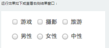
(八)表单控件(按钮)
按钮也是表单重要控件之一,制作按钮通常使用下面代码来实现:
☑ input[type=“submit”]
☑ input[type=“button”]
☑ input[type=“reset”]
☑ <button>
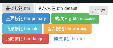
在Bootstrap框架中的按钮都是采用<button>来实现。
<button class="btn" type="button">基础按钮.btn</button>
   <button class="btn btn-default" type="button">默认按钮.btn-default</button>
   <button class="btn btn-primary" type="button">主要按钮.btn-primary</button>
   <button class="btn btn-success" type="button">成功按钮.btn-success</button>
   <button class="btn btn-info" type="button">信息按钮.btn-info</button>
   <button class="btn btn-warning" type="button">警告按钮.btn-warning</button>
   <button class="btn btn-danger" type="button">危险按钮.btn-danger</button>
   <button class="btn btn-link" type="button">链接按钮.btn-link</button>
(九)表单控件大小
Bootstrap框架还提供了两个不同的类名,用来控制表单控件的高度。这两个类名是:
1、input-sm:让控件比正常大小更小
2、input-lg:让控件比正常大小更大
这两个类适用于表单中的input,textarea和select控件,具体使用如下:
<input class="form-control input-lg" type="text" placeholder="添加.input-lg,控件变大">
<input class="form-control" type="text" placeholder="正常大小">
<input class="form-control input-sm" type="text" placeholder="添加.input-sm,控件变小">
(十)表单控件状态(焦点状态)
焦点状态是通过伪类“:focus”来实现。Bootstrap框架中表单控件的焦点状态删除了outline的默认样式,重新添加阴影效果。
(十一)表单控件状态(禁用状态)
Bootstrap框架的表单控件的禁用状态和普通的表单禁用状态实现方法是一样的,在相应的表单控件上添加属性“disabled”。和其他表单的禁用状态不同的是,Bootstrap框架做了一些样式风格的处理。
使用方法为:只需要在需要禁用的表单控件上加上“disabled”即可:

<input class="form-control" type="text" placeholder="表单已禁用,不能输入" disabled>
(十二)表单控件状态(验证状态)
在制作表单时,不免要做表单验证。同样也需要提供验证状态样式,在Bootstrap框架中同样提供这几种效果。
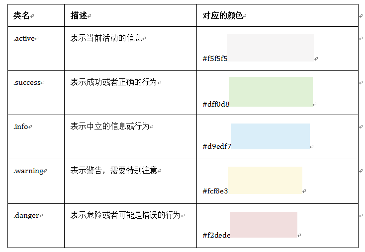
1、.has-warning:警告状态(黄色)
2、.has-error:错误状态(红色)
3、.has-success:成功状态(绿色)
使用的时候只需要在form-group容器上对应添加状态类名。
<form role="form">
<div class="form-group has-success">
  <label class="control-label" for="inputSuccess1">成功状态</label>
  <input type="text" class="form-control" id="inputSuccess1" placeholder="成功状态" >
</div>
<div class="form-group has-warning">
  <label class="control-label" for="inputWarning1">警告状态</label>
  <input type="text" class="form-control" id="inputWarning1" placeholder="警告状态">
</div>
<div class="form-group has-error">
  <label class="control-label" for="inputError1">错误状态</label>
  <input type="text" class="form-control" id="inputError1" placeholder="错误状态">
</div>
</form>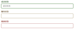
其他两种状态省略源码不在此展示。
很多时候,在表单验证的时候,不同的状态会提供不同的 icon,比如成功是一个对号(√),错误是一个叉号(×)等。在Bootstrap框中也提供了这样的效果。如果你想让表单在对应的状态下显示 icon 出来,只需要在对应的状态下添加类名“has-feedback”。请注意,此类名要与“has-error”、“has-warning”和“has-success”在一起:
<form role="form">
<div class="form-group has-success has-feedback">
  <label class="control-label" for="inputSuccess1">成功状态</label>
  <input type="text" class="form-control" id="inputSuccess1" placeholder="成功状态" >
  <span class="glyphiconglyphicon-ok form-control-feedback"></span>
</div>
<div class="form-group has-warning has-feedback">
  ......
</div>
<div class="form-group has-error has-feedback">
  ......
</div>
</form>
(十三)表单提示信息
平常在制作表单验证时,要提供不同的提示信息。在Bootstrap框架中也提供了这样的效果。使用了一个”help-block”样式,将提示信息以块状显示,并且显示在控件底部。
<form role="form">
<div class="form-group has-success has-feedback">
  <label class="control-label" for="inputSuccess1">成功状态</label>
  <input type="text" class="form-control" id="inputSuccess1" placeholder="成功状态" >
  <span class="help-block">你输入的信息是正确的</span>
  <span class="glyphiconglyphicon-ok form-control-feedback"></span>
</div>
  …
</form>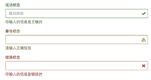
(十四)按钮大小
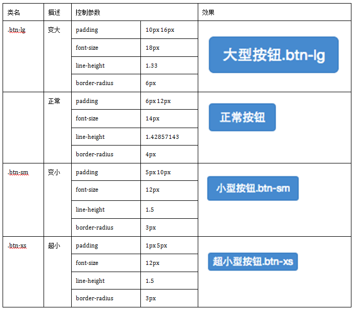
<button class="btn btn-primary btn-lg" type="button">大型按钮.btn-lg</button>
<button class="btn btn-primary" type="button">正常按钮</button>
<button class="btn btn-primary btn-sm" type="button">小型按钮.btn-sm</button>
<button class="btn btn-primary btn-xs" type="button">超小型按钮.btn-xs</button>
(十五)块状按钮
Bootstrap框架中提供了一个类名“btn-block”。按钮使用这个类名就可以让按钮充满整个容器。
<button class="btnbtn-primary btn-lg btn-block" type="button">大型按钮.btn-lg</button>
<button class="btnbtn-primary btn-block" type="button">正常按钮</button>
<button class="btnbtn-primary btn-sm btn-block" type="button">小型按钮.btn-sm</button>
<button class="btnbtn-primary btn-xs btn-block" type="button">超小型按钮.btn-xs</button>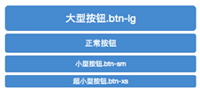
(十六)按钮状态——活动状态
Bootstrap按钮的活动状态主要包括按钮的悬浮状态(:hover),点击状态(:active)和焦点状态(:focus)几种。
(十七)按钮状态——禁用状态
在Bootstrap框架中,要禁用按钮有两种实现方式:
方法1:在标签中添加disabled属性
方法2:在元素标签中添加类名“disabled”
<button class="btnbtn-primary btn-lgbtn-block" type="button" disabled="disabled">通过disabled属性禁用按钮</button>
<button class="btnbtn-primary btn-block disabled" type="button">通过添加类名disabled禁用按钮</button>
<button class="btnbtn-primary btn-smbtn-block" type="button">未禁用的按钮</button>
八、图像
在Bootstrap框架中对于图像的样式风格提供以下几种风格:
1、img-responsive:响应式图片,主要针对于响应式设计
2、img-rounded:圆角图片
3、img-circle:圆形图片
4、img-thumbnail:缩略图片
使用方法非常简单,只需要在标签上添加对应的类名,如下代码:
<img  alt="140x140" src="http://placehold.it/140x140">
<img  class="img-rounded" alt="140x140" src="http://placehold.it/140x140">
最低0.47元/天 解锁文章


 2767
2767

 被折叠的 条评论
为什么被折叠?
被折叠的 条评论
为什么被折叠?
 到【灌水乐园】发言


