


 本文介绍了如何使用CSS3的position、transform和rotate属性创建一个照片墙布局,当鼠标悬停在图片上时,图片会放大并覆盖其他图片,提供了一种动态的用户体验。
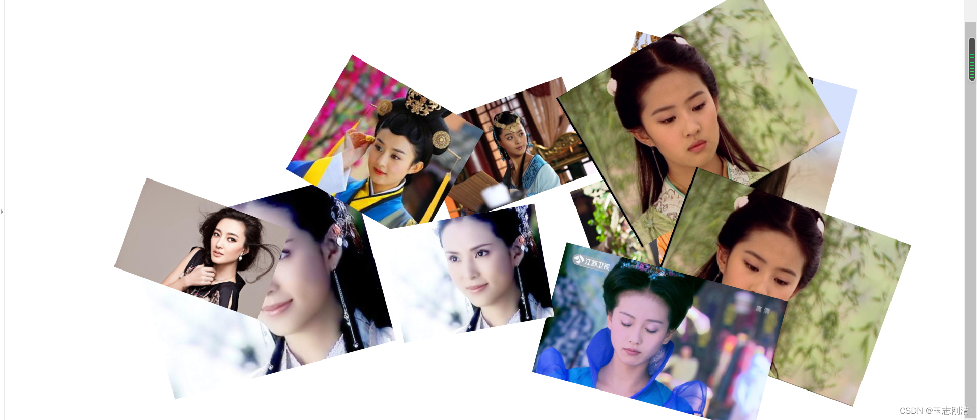
简单利用position, transform,rotate制作如下照片墙效果,鼠标点击放大当前图片并且覆盖其他照片。
主体部分:index.html
<!DOCTYPE html>
<html>
	<head>
		<meta charset="utf-8" />
		<title></title>

	#链接样式部分
	<link rel="stylesheet" type="text/css" href="css/new_file.css"/>
	</head>
	<body>

	<div class="box" id="box">
		#以下为图片地址
		<img src="img/10.jpg" >
		<img src="img/2.jpg" >
		<img src="img/3.jpg" >
		<img src="img/4.jpg" >
		<img src="img/5.jpg" >

		<img src="img/6.jpg" >
		<img src="img/7.jpg" >

		<img src="img/8.jpg" >
		<img src="img/9.jpg" >
		<img src="img/1.jpg" >
	</div>
	</body>
</html>
CSS部分:new_file.css
div img:nth-child(even){

			width: 200px;

		}
		div img:nth-child(odd){

			width: 300px
最低0.47元/天 解锁文章


 550
550


 被折叠的 条评论
为什么被折叠?
被折叠的 条评论
为什么被折叠?
 到【灌水乐园】发言


