


CSS
body{
    font-size: 16px;
    background-color: #48B379;
    max-width: 1200px;
    margin: 10px auto;
    padding: 10px 20px;
    color: #EEE9DC;
}

.content{
    margin: 30px 0px;
}

.tooltip{
    position: relative;
    padding: 20px 5px;
    border: 2px solid #EEE9DC;
    line-height: 4em;
    border-radius: 1em;
}

.tooltip::before,.tooltip::after{
    content: "";
    width: 0px;
    height: 0px;
    position: absolute;
}

.tooltip-left::before{
    border-right: 20px solid #EEE9DC;
    border-top: 20px solid transparent;
    border-bottom: 20px solid transparent;
    left: -20px;
    top: 50%;
    margin-top: -20px;
}

.tooltip-left::after{
    border-right: 17px solid #48B379;
    border-top: 17px solid transparent;
    border-bottom: 17px solid transparent;
    left: -17px;
    top: 50%;
    margin-top: -17px;
}


.tooltip-right::before{
    border-left: 20px solid #EEE9DC;
    border-top: 20px solid transparent;
    border-bottom: 20px solid transparent;
    right: -20px;
    top: 50%;
    margin-top: -20px;
}

.tooltip-right::after{
    border-left: 17px solid #48B379;
    border-top: 17px solid transparent;
    border-bottom: 17px solid transparent;
    right: -17px;
    top: 50%;
    margin-top: -17px;
}


.tooltip-top::before{
    border-left: 20px solid transparent;
    border-right: 20px solid transparent;
    border-bottom: 20px solid #EEE9DC;
    top: -20px;
    left: 50%;
    margin-left: -20px;
}

.tooltip-top::after{
    border-left: 17px solid transparent;
    border-right: 17px solid transparent;
    border-bottom: 17px solid #48B379;
    top: -17px;
    left: 50%;
    margin-left: -17px;

}


.tooltip-bottom::before{
    border-left: 20px solid transparent;
    border-right: 20px solid transparent;
    border-top: 20px solid #EEE9DC;
    bottom: -20px;
    left: 50%;
    margin-left: -20px;
}

.tooltip-bottom::after{
    border-left: 17px solid transparent;
    border-right: 17px solid transparent;
    border-top: 17px solid #48B379;
    bottom: -17px;
    left: 50%;
    margin-left: -17px;
}
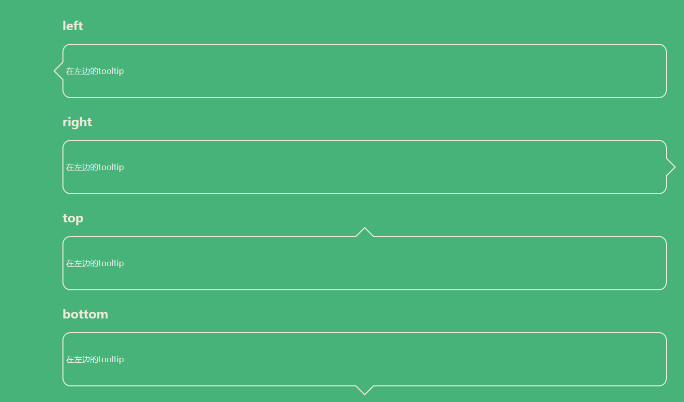
html代码
<!DOCTYPE html>
<html>
<head>
    <meta charset="utf-8">
    <meta name="viewport" content="width=device-width,initial-scale=1">
    <title>TooltipBase</title>
    <link rel="stylesheet" type="text/css" href="css/tooltipbase.css">
</head>
<body>
    <div class="content">
        <h2>left</h2>
        <div class="tooltip tooltip-left">
            在左边的tooltip
        </div>
    </div>

    <div class="content">
        <h2>right</h2>
        <div class="tooltip tooltip-right">
            在左边的tooltip
        </div>
    </div>

    <div class="content">
        <h2>top</h2>
        <div class="tooltip tooltip-top">
            在左边的tooltip
        </div>
    </div>

    <div class="content">
        <h2>bottom</h2>
        <div class="tooltip tooltip-bottom">
            在左边的tooltip
        </div>
    </div>
</body>
</html>
效果图


 1651
1651


 被折叠的 条评论
为什么被折叠?
被折叠的 条评论
为什么被折叠?
 到【灌水乐园】发言


